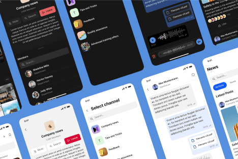
Getting Started on a Menu App Mockup UX
Creating an intuitive user experience (UX) is key to the success of any app. Whether you’re launching a new mobile app for a startup or redesigning a platform for a large company, getting the menu app mockup UX right ensures users can easily navigate through your app.
At Almax, we specialize in designing intuitive, user-friendly interfaces for a range of digital products, whether you’re building a new mobile app, website, or platform. Our team excels at creating seamless menu app mockup UX that enhances the overall user experience, which is critical for any successful product. From startups developing their first mobile apps to large enterprises launching new digital projects, we understand how to craft designs that meet your unique needs. With expertise in UI/UX design, websites, and mobile apps, our goal is to provide high-quality, tailored solutions that align with your business objectives.
In this guide, we’ll share insights into creating an intuitive menu that users will love, starting with understanding your audience and progressing through each step of the design process.
Understanding Your Target Audience: The First Step to a Successful Menu App Mockup UX

Before diving into design, it’s crucial to understand who your audience is. Knowing your users allows you to create a menu app mockup UX that meets their specific needs.
Define the User’s Persona: Demographics, Behavior, and Goals
Your audience’s demographics—such as age, technical proficiency, and goals—should drive your design decisions. For example, a younger, tech-savvy audience might appreciate advanced gestures and sleek transitions, while a broader audience may prefer a more straightforward, accessible interface. Tailoring the menu app mockup UX to fit different personas is key to ensuring usability.
To make your UX accessible to a wide audience, including users with disabilities, it’s essential to follow digital accessibility standards. Creating an app with inclusive design features can improve your app’s usability for all. For example, considering color contrast, text size, and voice navigation options can drastically enhance the experience. Learn more about making your UX accessible in our Digital Accessibility and Inclusion Standard SF guide.
Identify Pain Points and How Your App Menu Will Solve Them
To build a successful menu app mockup, start by identifying your users’ frustrations. Are they struggling with slow navigation or complex menus in other apps? By addressing these issues, you can create an intuitive UX that solves common problems. You can also optimize your design by encouraging brainstorming sessions that bring out new perspectives. Here’s how to get the best brainstorming results for your UX.
Tailoring UX for Startups and Large Enterprises
Startups typically require flexibility and scalability, while larger companies may prioritize stability and long-term usability. Both can benefit from a menu app mockup UX that’s easy to navigate and designed with the end-user in mind, ensuring that users, regardless of app complexity, can easily find what they need. Many interactive UX design agencies focus on creating dynamic, engaging experiences that align with these varied business needs, helping to craft interfaces that cater to different user expectations.
Structuring the Information Architecture for Easy Phone Menu Navigation

How you structure your menu is just as important as its appearance. Good information architecture ensures a phone menu is easy to navigate and intuitive for users.
The Importance of Logical Hierarchies in a Phone Menu
Users expect to find certain information in certain places. For example, a “Settings” menu should always be easily accessible. Logical hierarchies, where the most important elements are prioritized, help users navigate your app without frustration.
Creating Categories Based on User Expectations
Users have mental models of how a phone menu should be structured, often based on their experiences with other apps. For instance, features like “Home,” “Profile,” or “Cart” should be organized into familiar categories. This keeps your app intuitive and ensures users don’t waste time searching for key features.
Avoid Overwhelming Users with Too Many Choices in Mobile Menu Design
While it’s tempting to provide users with every option at once, too many choices can be overwhelming. A clean, minimal mobile menu design with logical categories allows users to navigate smoothly without being paralyzed by too many options.
Choosing the Right Design Patterns for a Seamless Mobile Menu Design
Designing an intuitive mobile menu involves selecting patterns that fit the needs of your app and its users.
Compare Various Menu Styles: Hamburger, Bottom Navigation, or Side Panels
- Hamburger menus: Great for saving space but may hide important features.
- Bottom navigation bars: Best for providing easy access to core features, especially when you have three to five key areas.
- Side panels: These are useful for secondary features, keeping the main screen uncluttered.
Pros and Cons for Different Projects
Hamburger Menus
Great for saving space but may hide important features.
- Best for apps with a lot of features: Apps like social networks (e.g., Facebook) or productivity tools (e.g., Trello) often benefit from hamburger menus because they have many features, but users only need a few at a time. The hamburger menu keeps the interface clean, allowing users to reveal more options as needed.
- Projects with limited screen space: If you’re designing for mobile devices where screen real estate is at a premium, a hamburger menu can save space for the content itself.
- Minimalistic design-focused apps: For projects like lifestyle or meditation apps where the focus is on simplicity and aesthetics, hiding less frequently used options in a hamburger menu can maintain a clean look.
2. Bottom Navigation Bars
Best for providing easy access to core features, especially when you have three to five key areas.

- Best for apps with 3-5 primary functions: Think of apps like Instagram or Spotify. These apps have a few core features (e.g., home, search, profile) that users need constant access to, so a bottom navigation bar ensures they can switch between them easily.
- Ideal for mobile apps where accessibility is key: For apps that rely on frequent navigation between key sections, such as banking apps or shopping apps, a bottom navigation bar puts the most important options right at the user’s fingertips, making it easier to navigate with one hand.
- User-focused apps: If your project involves apps where quick access is critical—like a health-tracking app, where users need to switch between tracking, reports, and settings—a bottom navigation bar works best.
3. Side Panels
Useful for secondary features, keeping the main screen uncluttered.
- Best for apps with a main feature but additional tools: Productivity apps like Gmail or Slack often use side panels to display secondary features (e.g., settings, account info, or filters) while the main focus remains on the primary task, such as sending emails or chatting.

- Ideal for dashboards or admin panels: For more complex projects like management systems or reporting dashboards, a side panel helps organize various tools and options without overwhelming users on the main screen. It allows for quick navigation while keeping secondary actions out of the way.
- Suitable for tablet or desktop applications: Side panels are great for apps on larger screens where space isn’t as limited. For instance, design tools like Adobe Photoshop or video editing software often use side panels for layers, settings, or tools that users access frequently but don’t need on the main workspace.
Intuitive Mobile Menu Design Increases Engagement
When a mobile menu design is intuitive, users stay engaged. A smooth, easy-to-use menu keeps users from abandoning the app, ensuring higher retention rates. The design choices you make—including whether you go with a light or dark mode—can significantly impact engagement, as detailed in our guide on the psychology of light vs dark modes in UX design.
Wireframing Your Menu App Mockup: The Foundation of Flawless UX

Wireframing is where your ideas begin to take shape. It’s crucial to get this step right before moving on to high-fidelity designs.
What is a Wireframe?
A wireframe is a simple visual guide that represents the skeletal framework of a digital product, such as a website or mobile app. It outlines the basic structure and layout of elements like menus, buttons, and content areas without focusing on detailed design or visuals. Wireframes help communicate how the interface will function and allow teams to plan user flow and navigation before moving on to more detailed design phases.
The Wireframing Process: From Low to High Fidelity
Wireframes help you visualize the user journey and pinpoint potential issues early on. Start with low-fidelity sketches to outline the structure, and gradually move toward high-fidelity wireframes as you add detail. This process helps ensure that your menu app mockup flows logically and efficiently.
Examples of Efficient Wireframes Focusing on User Flow
A well-crafted wireframe should emphasize the ease with which users can navigate through the app. For instance, if you’re designing an e-commerce app, ensure the path from product selection to checkout is as short as possible.
Aligning Clients’ Needs with Budget Flexibility
Wireframing can help you balance user experience with project costs. For example, some clients might need an extensive, feature-rich menu app mockup, while others might need a more streamlined version. At Almax, we ensure that our wireframing process remains flexible, meeting the needs of both startups and large enterprises.
Implementing User-Centered Interaction Design Principles for a Phone Menu
Great design goes beyond just how things look—it’s about how they work.
Accessibility and Simplicity in Phone Menu Interactions
A phone menu should be accessible to all users, regardless of their physical abilities. Button sizes, for example, should be designed with the average user’s finger in mind. According to an MIT study, the average human fingertip is between 45-57 pixels wide. Keeping this in mind ensures users can interact comfortably with your app.
Touchpoints, Responsiveness, and Visual Feedback
Every interaction—whether it’s tapping a button or swiping a menu—should provide responsive feedback. Visual cues like color changes or haptic feedback reassure users that their actions have been registered, improving the overall user experience.
Scalable Interaction Design Benefits All Projects
Whether designing for a small startup app or a large corporate platform, scalable designs ensure your app remains intuitive as new features are added.
User Testing and Iteration: Refining Your Menu App Mockup UX for Maximum Usability
No matter how perfect your menu app mockup UX looks on paper, user testing is essential to ensure it works in practice.
The Importance of Prototyping and Gathering Feedback
Testing a prototype allows you to gather crucial user feedback on navigation, ease of use, and overall design. This feedback ensures your menu app mockup meets user needs and expectations before launch.
Implementing Changes During Iterative Phases
At Almax, we believe in an iterative design process. This means continuously refining the menu app mockup UX based on user testing, ensuring the final product is user-centered and meets client goals.
How Almax’s Flexible Approach Meets Client Expectations
Whether you’re a startup with budget constraints or a large corporation with more complex needs, our flexible design process at Almax ensures we can deliver a high-quality menu app mockup UX that aligns with your vision and business objectives.
Conclusion: How to Create an Intuitive Menu App Mockup UX
In conclusion, creating an intuitive menu app mockup UX requires a deep understanding of your users, a clear information architecture, thoughtful design patterns, and a rigorous testing process. Whether you’re developing a new mobile app or redesigning a website, ensuring that your mobile menu design is user-friendly and accessible will significantly improve engagement and overall user satisfaction. By focusing on scalability, accessibility, and seamless navigation, you can create a product that not only meets but exceeds user expectations.
Working with a professional design company can be crucial to achieving an effective menu app design. At Almax, we’re dedicated to helping you craft exceptional user experiences, whether it’s for mobile apps, websites, or any other digital platform. Contact Almax today to see how we can help optimize the UX for your project!
