Top-Quality Design & Development
We’re here to help grow your business through design! With Daily Updates and Custom approach to each project.Design and Development Partner for Progressive brands.
We bring top-tier skills to deliver world-class digital products.

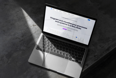
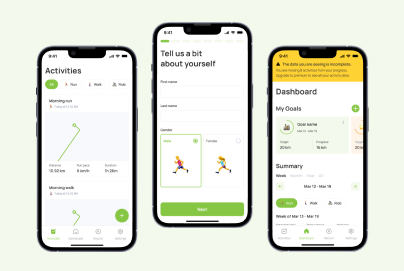
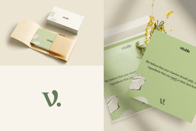
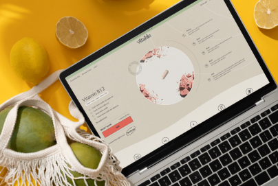
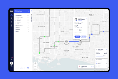
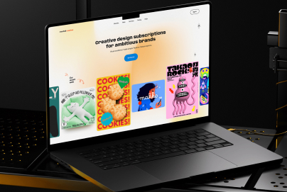
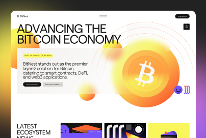
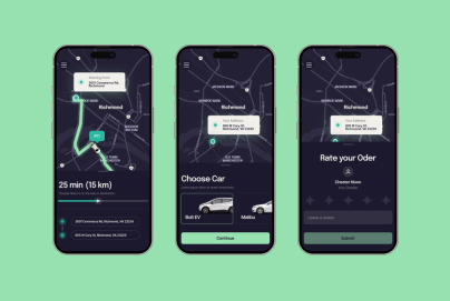
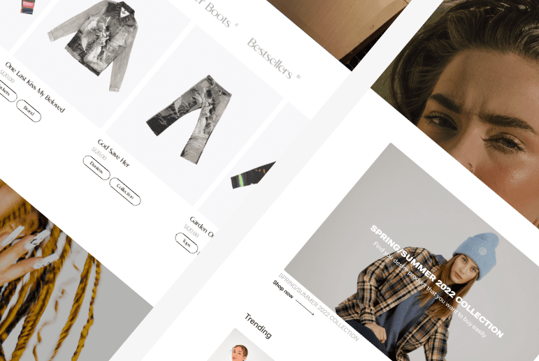
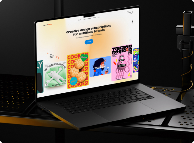
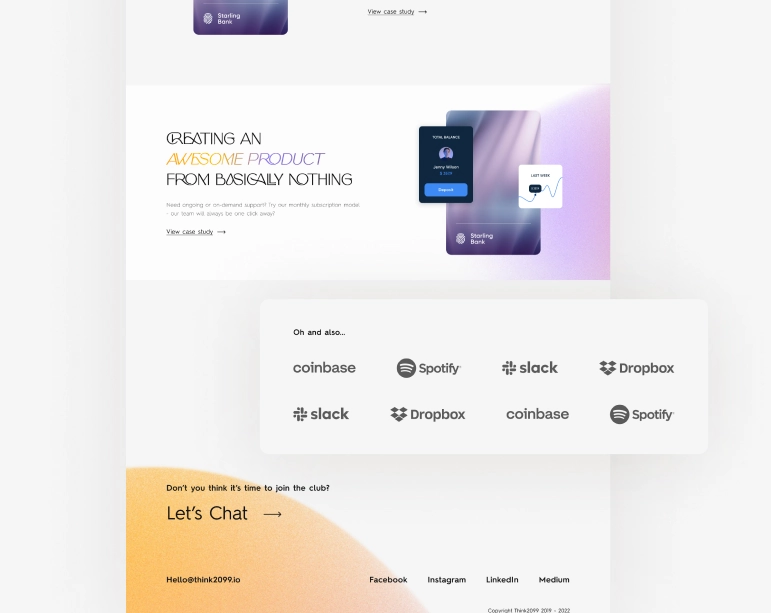
OUR CASES
With every interaction, we strive to exceed expectations, delivering nothing short of perfection. Because to us, your success isn't just a goal; it's a promise we are proud to uphold.
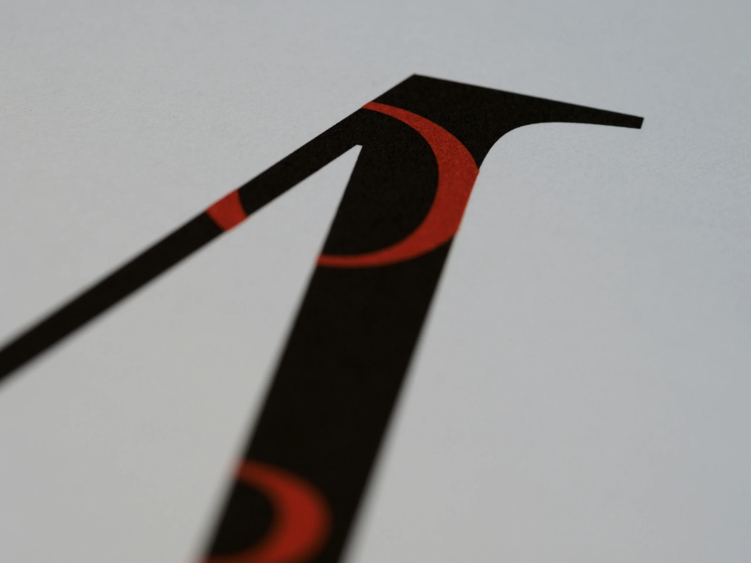
lOGO
A well-crafted logo distills a brand's essence into a memorable and versatile symbol.
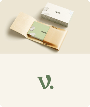


Brand Identity
Logo
UI/UX Audit
UX Research
User Flow
Prototyping

Webflow
WordPress
Shopify
Squarespace
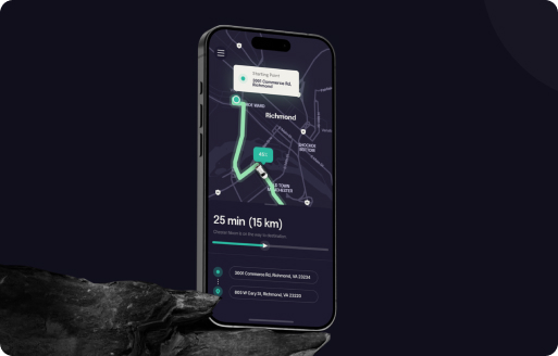
IOS/Android
Website Audit
Design / Redesign
Conversion Rate Optimisation
Mobile Responsive
SEO
Landing Page
Mobile Audit
Design / Redesign
iOS & Android
UX Enhancement
MVP
Investment Pitch Deck
Shopify
WooCommerce
& SERVICES

Explore the different types of mobile apps, including native, web, and hybrid. Discover how each app type enhances our digital experiences.

Discover essential tips on positioning and identity for the brand. Learn how consistent branding can boost revenue!
Did you know that 75% of consumers judge a company’s credibility based on its website design? At Almax Design Agency, we understand that typography plays a critical role in shaping this first impression. Choosing the right font can enhance readability, convey professionalism, and elevate your brand’s online presence. In this blog post, we’ll delve into […]


Available to start the same day you first text us!