At Almax, we know that first impressions are everything—especially in mobile app design. A seamless onboarding experience isn’t just nice to have; it’s a key factor in whether users stick around or disappear after day one. When done right, mobile app onboarding quickly shows users your app’s value, simplifies navigation, and guides them to that “AHA” moment that keeps them coming back. But it takes more than a simple tutorial or a few pop-ups to get there.
In this post, we’ll dive into the essentials of mobile app onboarding, sharing insights from some of the most successful apps and breaking down the key strategies behind a smooth, effective user journey. At Almax, we work closely with clients on everything from UI/UX design and mobile app development to personalized onboarding flows that help bring users on board and keep them engaged. Ready to elevate your app’s onboarding experience? Let’s get started.
What is Mobile App Onboarding and Why is it Important?
Mobile app onboarding introduces new users to the app’s features and benefits. But effective onboarding isn’t just about showing where everything is—it’s about familiarizing users with the app’s value, ensuring they quickly understand its purpose and how it can improve their lives. Here’s why it’s essential:
- User Activation: Without onboarding, users may never engage with your app. A clear onboarding process helps users see the value early, leading to higher activation rates and encouraging them to return.
- Retention and Conversions: Users who have a positive initial experience are more likely to become paying customers. Effective onboarding increases user retention by providing a smooth entry and builds trust that makes users willing to invest.
- Brand Perception in Mobile UX: The quality of onboarding directly impacts how users perceive your brand. A well-executed mobile UX shows that you care about user experience, building a foundation of trust and professionalism.

Mobile UX and the Role of Effective App Onboarding Screens
A strong mobile UX ensures that onboarding feels intuitive, purposeful, and aligned with user expectations. Thoughtfully designed onboarding screens help make a positive first impression by guiding users through essential features without overwhelming them. Here’s how to enhance mobile UX in onboarding:
- User Guidance: Onboarding screens should act as a virtual guide, leading users through key features and highlighting app benefits. Visual cues, like arrows or tooltips, can make interactions feel natural.
- Intuitive UI Design: A user-friendly UI in onboarding can prevent frustration. Elements like large, tappable buttons, clear icons, and clean layouts allow users to explore confidently and understand the app with minimal effort.
- Quick Value Discovery: The faster a user can recognize the value of the app, the higher their likelihood of staying. Streamline screens so that users get to a meaningful interaction as soon as possible, like creating their first post or exploring personalized content.
Types of Mobile App Onboarding Flows
Progressive Onboarding
Progressive onboarding introduces users to the app in stages. Instead of overwhelming them with all features at once, it starts with the basics and gradually reveals more complex functionalities as they use the app.
- Ideal for Layered or Complex Apps: Apps with advanced features (e.g., LinkedIn or Strava) benefit from progressive onboarding, as users can get acquainted with core tasks before diving deeper.
- Incremental Discovery: By revealing features over time, users remain engaged, continually discovering new aspects of the app as they grow more comfortable.
Function-Oriented Onboarding
Function-oriented onboarding focuses on showing users how to complete specific actions, such as sending a message or setting a goal. This approach is highly effective for task-oriented apps.
- Best for Goal-Driven Apps: Apps like MyFitnessPal use function-oriented onboarding to walk users through setting up personal goals, making the experience relevant and immediately impactful.
- Clear Steps for Quick Results: Function-based flows simplify actions, helping users accomplish goals quickly, which reinforces the app’s usefulness.
Benefits-Oriented Onboarding
This approach focuses on how the app can improve the user’s life, highlighting benefits instead of specific features. It’s particularly effective for lifestyle or productivity apps, where the value might not be immediately obvious.
- Ideal for Value-Centric Apps: Apps like Headspace or MyFitnessPal benefit from this approach, as it helps users visualize how the app will benefit them.
- Emphasis on Improvement: Instead of diving into technical details, benefits-oriented onboarding builds an emotional connection by focusing on how the app can help users reach personal goals.
Essential Elements of UI Mobile App Onboarding Screens
Simple Sign-Up Process
A smooth sign-up process removes barriers for new users. The more streamlined the process, the higher the likelihood of completion, as users are less likely to abandon due to frustration.
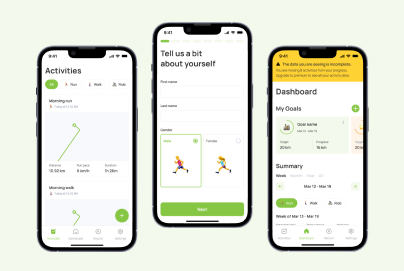
- Limit Required Information: Avoid lengthy forms. Ask only for essential details, like name and email. Non-essential information can be collected later.
- Social Sign-In Options: Allowing users to sign in through Google or social media speeds up the process and minimizes drop-offs, creating a smoother, less tedious entry point.
Welcome Screen and Contextual Introduction
The welcome screen is the user’s first interaction with the app, so it should set clear expectations. A well-crafted welcome message introduces the app’s core value, helping users feel comfortable.
- Clear Messaging: Use simple, impactful language to communicate the app’s main value, such as “Track your workouts effortlessly” or “Save money with real-time budgeting.”
- Contextual Guidance: Offer hints about what users can expect next, such as “Let’s set up your profile” or “Start exploring your dashboard.”
Interactive Walkthroughs
Interactive walkthroughs allow users to engage with key functions directly rather than passively viewing information. These might include tooltips, modals, or in-app messages.
- Guidance without Overload: Instead of lengthy guides, use interactive elements like checklists or quick pop-ups to keep users moving forward without feeling overwhelmed.
- Engaging Examples: Apps like Canva use short, visual walkthroughs to showcase essential tools, making onboarding feel like part of the experience rather than a tutorial.
Progress Indicators in Mobile Onboarding
Progress indicators, like bars or checkmarks, help users understand how far they’ve come and what’s left. Knowing their progress motivates users to complete onboarding.
- Managing Expectations: Visual cues help users gauge their journey, preventing drop-offs by giving users a sense of accomplishment as they move through each step.
- Progress Bars or Steps: Simple indicators reduce user anxiety by setting clear expectations for how much effort is required.
Mobile Onboarding Best Practices for a Smooth and Engaging Start
Personalization from the Start
Personalization can make users feel understood and valued. Collecting minimal data initially allows for a customized experience, with the onboarding adapting to each user’s needs and interests.
- Tailored Experience: Short surveys or questions early on can segment users by goals or experience level, letting the app present relevant features first.
- Adaptive Paths: Apps like Canva provide custom dashboards based on user interests, creating an onboarding flow that feels unique to each person.
Contextual and Minimalist Guidance
Providing help at the right time prevents cognitive overload. Contextual guidance lets users get assistance exactly when they need it without unnecessary information.
- Just-in-Time Tips: Use contextual tooltips to introduce features when users reach that part of the app, avoiding an overwhelming upfront information dump.
- Minimal Steps: Keep onboarding concise and purposeful, avoiding steps that feel redundant or overly detailed, which can frustrate users.
Highlighting Quick Wins and the AHA Moment
A quick win provides users with a taste of the app’s main value right away, reinforcing why they downloaded it. The AHA moment is when users feel a genuine connection to the app’s purpose.
- Guide Users to Instant Value: For example, SoundCloud lets users explore music immediately, and Headspace offers a short meditation as soon as users log in.
- Creating an AHA Moment: Apps that help users experience value quickly build a strong first impression, increasing the chances they’ll return.
Common Mistakes to Avoid in Mobile App Onboarding
Information Overload
Presenting too much information at once can overwhelm users, leading to early drop-offs. Focus each screen on one action or message.
- One Action per Screen: Ensure each onboarding screen prompts a single action, like “Add your profile picture” or “Set your preferences.”
- Avoiding Overwhelm: Limit the amount of text on each screen. Use visuals to convey ideas where possible, maintaining an engaging, uncluttered interface.
Requesting Permissions Too Early
Premature permission requests can lead to mistrust or immediate abandonment. Request permissions only when they’re necessary for a specific task.
- Timing Permissions Correctly: For example, wait until the user attempts to access the camera to request camera permissions, aligning with user expectations.
- Enhancing User Comfort: Delaying permission requests builds user trust and makes the experience feel more natural.
Blank or Unclear Empty States
Empty states—screens without any content or instructions—can be confusing and lead users to think they’ve encountered an error.
- Helpful Instructions in Empty States: Use prompts like “Start by adding a task” or “Set up your first project” to guide users, keeping them engaged.
- Clear Next Steps: Each empty state should have a call-to-action or suggestion to help users understand what to do next.
Measuring and Optimizing Your Mobile App Onboarding Flow
Use Analytics to Track Engagement
Analytics allow you to monitor user engagement and drop-off points within the onboarding process, providing insight into where users encounter issues.
- Funnel Analysis: Track where users leave the onboarding flow. This data helps identify problem areas and opportunities for improvement.
- Session Replays and Heatmaps: Tools like heatmaps reveal where users spend the most time or struggle, offering clues on which screens might need adjustments.
Test and Iterate with A/B Testing
Regular A/B testing allows you to optimize the onboarding experience, testing different designs or flows to see which performs best.
- UI and Flow Testing: Experiment with button placements, screen order, or wording to see what resonates best with users.
- Retention-Driven Tweaks: Use the data from A/B tests to make informed adjustments, increasing retention by aligning with user preferences.
Examples of Effective Mobile Onboarding Screens from Leading Apps
Many leading apps have refined their onboarding processes to drive engagement. Here are some top examples:
- LinkedIn: Uses progressive onboarding with personalized prompts, guiding users through profile setup, connections, and engagement step-by-step.
- SoundCloud: Reaches the AHA moment quickly by letting users explore music, helping them experience app value immediately.
- Canva: Personalizes the experience by customizing the dashboard based on user goals, making it easier for users to find templates that match their needs.
Final Takeaways for Designing Mobile App Onboarding That Delivers Results
For an onboarding flow that enhances engagement, prioritize simplicity, relevance, and testing. By applying best practices like personalization, contextual guidance, and actionable progress indicators, you’ll create a user-centered onboarding experience that keeps users engaged from the start. Ready to see the difference? Start rethinking your onboarding flow today to create a smooth, impactful experience for every user!
