


Bad UX: Top Examples of What to Avoid
Did you know that 90% of users stop using an app if it performs poorly? At Almax, we understand the crucial role that user experience (UX design) plays in the success of digital products. In this article, we’ll delve into some of the most common UX pitfalls that can derail your projects. From poor navigation and inconsistent design to accessibility issues and more, we’ll explore real-world examples like eBay and Hulu to highlight these mistakes. Additionally, we’ll provide actionable tips to help you avoid these pitfalls so you can create a seamless, user-friendly experience.
What Makes Bad UX?

Bad user experience (UX) can arise from various issues that hinder a user’s ability to effectively and efficiently interact with a product or service. Here are some common factors that contribute to bad UX:
- Poor Navigation:
- Complicated menus
- Lack of a clear structure
- No search functionality
- Slow Loading Times:
- Pages or elements that take too long to load can frustrate users and increase bounce rates.
- Non-Responsive Design:
- Websites or applications that don’t work well on different devices (e.g., mobile phones, tablets).
- Cluttered Interface:
- Overwhelming amount of information or options on a single page.
- Lack of whitespace.
- Inconsistent Design:
- Different fonts, colors, or styles throughout the site/app.
- Lack of a cohesive visual theme.
- Poor Accessibility:
- Lack of features that support users with disabilities (e.g., screen readers, keyboard navigation).
- Insufficient contrast or small text sizes.
- Confusing User Flows:
- Users struggle to understand how to complete tasks.
- Unclear calls-to-action or next steps.
- Lack of Feedback:
- No confirmation or feedback after an action is taken.
- Users are unsure if their actions were successful.
- Broken Links or Errors:
- Links that lead to 404 pages.
- Frequent bugs or crashes.
- Overuse of Pop-ups and Ads:
- Intrusive advertisements.
- Excessive use of pop-ups that disrupt the user experience.
- Poor Content Quality:
- Unclear or jargon-heavy language.
- Spelling or grammatical errors.
- Security Concerns:
- Lack of HTTPS makes users feel unsafe.
- Overly intrusive data collection.
- Unnecessary Complexity:
- Requiring too much information for simple tasks.
- Complicated forms with too many fields.
- Lack of Customization:
- No ability to personalize settings or preferences.
Improving UX involves understanding user needs and behaviors, conducting usability testing, and continuously iterating on the design based on feedback and data.
How Bad UX Can Ruin Your Project

Bad UX can significantly undermine the success of a project in several ways:
- User Frustration and Abandonment:
- Frustrated users are more likely to abandon a product or service altogether. Bad UX can result in high bounce rates and low retention rates, leading to a loss of potential customers.
- Negative Perception and Brand Damage:
- A bad user experience can tarnish a brand’s reputation. Users are likely to share negative experiences with others, leading to poor word-of-mouth and potentially harmful reviews.
- Reduced Engagement and Conversion Rates:
- Poor UX can decrease user engagement and lower conversion rates. Users may struggle to find what they need or complete desired actions, such as making a purchase or signing up for a service.
- Competitive Disadvantage:
- In a competitive market, products with poor UX can quickly fall behind those with better-designed experiences. Users have plenty of alternatives and are likely to switch to competitors offering superior usability.
- Loss of Revenue:
- Bad UX can directly impact revenue by reducing sales and increasing churn rates. In e-commerce, for instance, a complicated checkout process can lead to cart abandonment, resulting in lost sales.
- Negative Impact on SEO:
- Poor UX can affect search engine rankings. High bounce rates and low dwell times signal to search engines that users are not finding the content valuable, which can negatively impact a site’s SEO performance.
- Decreased User Loyalty:
- Users are less likely to stay loyal to a product or service that does not meet their needs or expectations. Building a loyal user base is crucial for long-term success, and bad UX can undermine this goal.
In summary, bad UX can lead to a cascade of negative outcomes, from immediate user dissatisfaction to long-term financial losses and competitive disadvantages. Prioritizing good UX design is essential for the success and sustainability of any project.
Bad UX Design Examples
Websites With Bad UX: eBay
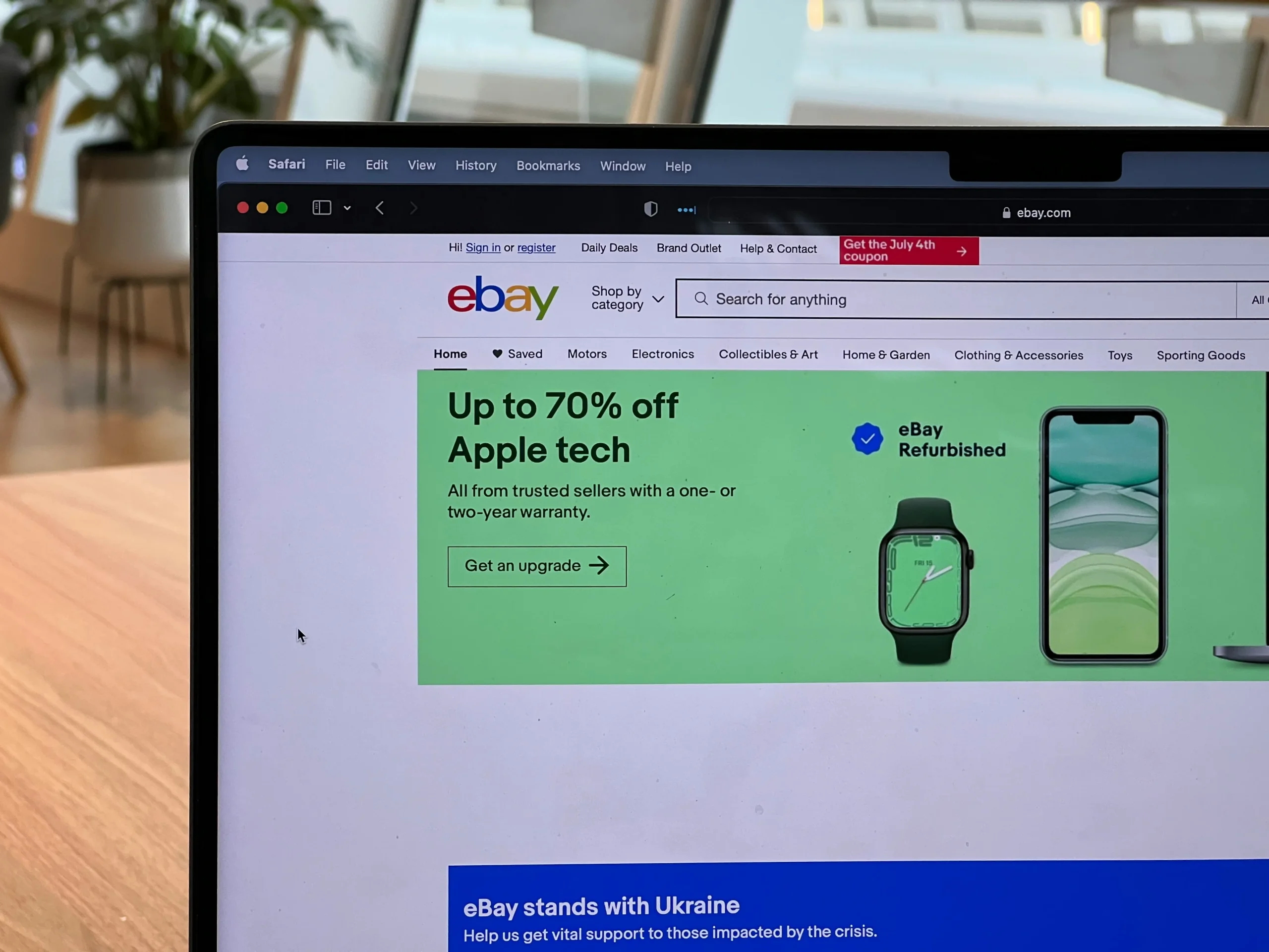
Despite being one of the pioneers in online marketplaces, eBay exhibits several significant UX flaws that can negatively impact user satisfaction and overall experience. Here are key points illustrating why eBay’s UX is subpar:
Inconsistent with E-commerce Site Standards
Misleading Button Actions:
- The “List item” button on the sale listing page, instead of immediately posting the listing, directs users to payment methods. This deviation from the expected flow frustrates users who anticipate a straightforward listing process.
Problematic Dynamic Auto-Fill:
- The dynamic auto-fill feature for the Sell search bar leads users to a different page, disrupting their workflow and causing confusion. Users expect auto-fill to assist their current task, not redirect them.
Lengthy Information
Irrelevant Content for Sellers:
- The Sell home page is cluttered with irrelevant content, making it difficult for sellers to find essential tools and information. Over half of user task participants struggled when directed to this page, highlighting a significant usability issue.
Disorganized Help Articles and FAQs:
- Help articles and FAQs are filled with endless text and multiple external links, with no clear organization. This makes finding specific information tedious and time-consuming for users.
Inconsistent Visual Design
Lack of Cohesive Design:
- eBay lacks a consistent visual theme, with inefficient use of color, unusually large text, and poor utilization of negative space. This inconsistency creates a disjointed and unprofessional appearance.
Cluttered Product Pages:
- Different item descriptions from various sellers result in messy and cluttered product pages. This lack of standardization makes it difficult for users to compare items and detracts from the overall shopping experience.
Inefficient Display of Features
Repetitive Help Links:
- Multiple help links redirect users to the same page, adding unnecessary redundancy and clutter to the interface.
Poor Visibility of Key Features:
- The “Sell” link on the homepage is small and easily overlooked despite being a critical component of eBay. This poor prioritization of features can hinder user engagement and participation in selling activities.
Lack of Feature Descriptions:
- eBay fails to explain clearly the differences between Auction and Buy It Now features, causing confusion among users. In user tests, two-thirds of participants were uncertain about these options.
In summary, eBay’s UX is hindered by inconsistent standards, disorganized content, poor visual design, and inefficient feature display. These issues lead to user frustration, confusion, and a preference for competitors like Amazon. Addressing these UX flaws is essential for eBay to improve user satisfaction and remain competitive in the e-commerce market.
Apps With Bad UX: Hulu’s 2017 App Design

While Hulu’s 2017 app design may be visually appealing, it suffers significantly from poor navigation, which compromises the overall user experience. Here are the key navigation issues:
Overemphasis on Aesthetics
Aesthetics Over Functionality:
- The design prioritizes aesthetics, resulting in a visually pleasing app at the expense of accessibility, simplicity, and intuitiveness. This focus on appearance overlooks the importance of making the app easy to use for all users.
Accessibility Issues
Poor Accessibility:
- The app fails to support accessibility features effectively. For instance, the contrast of text over colored backgrounds is insufficient, and thin fonts are difficult to read. The app also struggles with basic navigation for users with accessibility needs.
Navigation Complexity
Default View Limitations:
- When opening the app, users only see one show at a time, making it difficult to browse through content efficiently. Unlike other media apps that display multiple options at once, Hulu’s design forces users to scroll extensively.
Confusing Navigation Hierarchy:
- The top-level navigation fades off the screen, making it unclear if users should navigate through the top options or use the bottom app navigation. This confusion disrupts the user’s ability to find and access content quickly.
My Stuff View Issues:
- The “My Stuff” view, intended to provide easy access to saved content, also shows only one title before requiring users to scroll. This layout fails to maximize screen space and user convenience.
Intuitiveness
Learning Curve:
- The app deviates from familiar media app interfaces, making it harder for users to learn and use. Hulu’s design forces users to adapt to a new, less intuitive interface by not leveraging established user behaviors from other media apps.
Consistency
Inconsistent with Other Systems:
- While the app maintains internal consistency, it does not align well with other media apps. This inconsistency disrupts user expectations and learned behaviors from similar platforms.
Despite its attractive design, Hulu’s app falls short in providing a user-friendly experience. Key UX principles like accessibility, simplicity, and intuitiveness are compromised, making the app frustrating to use. To improve, Hulu should balance aesthetics with functionality, ensuring the app is both beautiful and easy to navigate.
Tips to Avoid Bad UX Design

- Understand User Needs:
- Conduct thorough user research to understand the needs, behaviors, and pain points of your target audience.
- Prioritize Accessibility:
- Ensure your design is accessible to all users, including those with disabilities. Use high-contrast colors, readable fonts, and provide alternative text for images.
- Keep it Simple:
- Simplify navigation and interface elements. Users should easily find what they need without unnecessary complexity.
- Consistent Design:
- Maintain consistency in design elements like colors, fonts, and button styles throughout the app or website.
- User Testing:
- Regularly test your design with real users and iterate based on their feedback.
- Clear Feedback:
- Provide clear feedback for user actions, such as loading indicators and confirmation messages.
- Responsive Design:
- Ensure your design works well on various devices and screen sizes.
- Intuitive Navigation:
- Design intuitive and straightforward navigation structures that users can easily understand and follow.
By focusing on these principles, you can create a user-friendly and effective UX design.
Conclusion: Bad UX: Top Examples of What to Avoid
In conclusion, bad UX design can significantly hinder the success of digital products by frustrating users, damaging brand reputation, and reducing engagement and revenue. As seen with examples like eBay and Hulu, issues such as poor navigation, inconsistent design, and accessibility problems can drive users away and give competitors an edge. Prioritizing user needs, simplicity, and accessibility is crucial for creating effective and enjoyable digital experiences.
If you want to ensure your project has the best custom-designed UX, contact Almax Design Agency today. Let us help you create a seamless and user-friendly experience that delights your users.
