


According to Forrester Research, a well-designed user interface can increase conversion rates by up to 200%. At Almax Design Agency, we understand the critical role that UX design plays in today’s digital landscape. One key element in enhancing UX is the use of good dashboard widgets. These compact, versatile components can dramatically improve the functionality and aesthetic appeal of your dashboard, making data visualization more effective and user interaction more seamless. In this blog post, we will delve into the importance of good dashboard widgets, the characteristics that make them effective, and best practices for their implementation.
Understanding the Importance of Having the Best Dashboard Design
What are Dashboard Widgets?
Dashboard widgets are small, modular components that display specific pieces of information or functionality within a dashboard interface. They can take various forms, such as:
- Charts and Graphs: Visualize data trends over time.
- Tables: Present detailed data in a structured format.
- Maps: Show geographical data points and distributions.
- KPI Indicators: Highlight key performance metrics at a glance.
- Interactive Elements: Such as buttons or sliders for user input.
These widgets make it easier for users to interpret and interact with data quickly and efficiently, providing immediate insights without the need to analyze extensive datasets.
A Brief History of Dashboard Widgets
The evolution of dashboard widgets began in the early days of personal computing with static reports that were hard to interpret. In the 1990s, interactive dashboards started to emerge with business intelligence (BI) tools, incorporating basic charts and graphs into desktop applications.
The 2000s brought significant advancements in web technologies, leading to dynamic, real-time dashboards powered by AJAX (Asynchronous JavaScript and XML). This era also saw the rise of SaaS platforms, making powerful dashboard tools more accessible. Today, advanced data visualization libraries like D3.js and Tableau enable highly customizable and interactive widgets, essential for modern UI/UX design.
The Importance of Good Dashboard Widgets
Having good dashboard widgets is crucial for several reasons:
- Enhanced User Experience: Good widgets are intuitive and user-friendly, making it easier for users to navigate and interact with the dashboard.
- Efficient Data Interpretation: Well-designed widgets present data in a clear, concise manner, allowing users to quickly grasp key insights.
- Real-Time Updates: Interactive widgets provide real-time data, enabling users to make informed decisions promptly.
- Customization and Flexibility: Good widgets can be customized to meet specific user needs, enhancing the overall usability of the dashboard.
For example, a sales dashboard might use a combination of bar charts to show monthly sales trends, pie charts to represent market share, and tables to list detailed sales data by region. These widgets work together to give a comprehensive view of sales performance, helping managers make data-driven decisions effectively.
Why Dashboard Widgets Matter for User Experience
Dashboard widgets play a crucial role in shaping the user experience. They allow users to interact with data intuitively and efficiently. Good dashboard widgets help users quickly interpret information, identify trends, and make data-driven decisions. Without effective widgets, even the most visually appealing dashboard can fall short in usability.
Effective dashboard widgets should be both functional and user-friendly. They need to display information clearly and concisely while allowing for interaction that feels intuitive. At Almax, we focus on designing widgets that offer high usability, ensuring they are easy to understand and interact with, regardless of the user’s technical expertise.
Key Characteristics of Good Dashboard Widgets
What Makes a Widget Effective and User-Friendly?
An effective widget should be both functional and user-friendly. It needs to display information clearly and concisely while allowing for interaction that feels intuitive. At Almax, we focus on designing widgets that offer high usability, ensuring they are easy to understand and interact with, regardless of the user’s technical expertise.
Top Dashboard Widgets for Enhanced User Interaction
To create a seamless user experience, it’s essential to incorporate a variety of widgets that cater to different data visualization needs. Each widget type serves a unique purpose, and selecting the right mix is crucial for comprehensive data representation.
Dashboard Chart Widgets
Charts are essential for visualizing data trends over time. They can include line charts, bar charts, pie charts, and more, each serving a unique purpose in data representation.
Progress Bars
Progress bars are excellent for showing task completion status or project progress. They give users a clear visual cue of how much work has been done and how much is left.
Sliders
Sliders allow users to adjust values dynamically, making them perfect for setting adjustments, filtering data ranges, and more.
Text Editor
A text editor widget is crucial for dashboards that require user input, such as comments, notes, or data entries.
Table Widget
Tables present detailed data in a structured format, making it easy for users to read and analyze large datasets.
Pricing Widget
A pricing widget is ideal for e-commerce or subscription-based services, displaying different pricing plans and options in an organized manner.
Design Principles for Good Dashboard Widgets
Font
Choosing the right font is crucial for readability. It should be clear, legible, and consistent across the dashboard to ensure users can easily interpret the information presented.
Color
Color plays a significant role in design, affecting both aesthetics and usability. It plays a vital role in helping users understand the function of buttons or dashboard elements by providing visual cues. Different colors can indicate various states or actions, such as green for success or go, red for error or stop, and blue for information or links. This use of color coding makes it easier for users to interpret functionality at a glance, enhancing usability and reducing the likelihood of errors. Consistent color usage across an interface also helps users quickly recognize and understand the purpose of different elements, improving overall navigation and efficiency.
Iconography
Iconography is crucial in UX design. It enhances usability by conveying complex information quickly through simple, recognizable symbols. Icons save space, aid in recognition, improve aesthetics, and transcend language barriers, making interfaces more intuitive and visually appealing while supporting quick decision-making and efficient navigation.
Customizing Widgets to Fit User Needs
Personalization and Flexibility in Widget Design
Personalization is key to creating a user-centric dashboard. Good dashboard widgets should be customizable to fit individual user preferences and requirements. This flexibility can lead to increased user satisfaction and engagement.
Integrating Data and Visualizations
How Good Widgets Make Data Accessible and Understandable
The primary goal of dashboard widgets is to make data accessible and understandable. Good widgets translate complex data sets into easy-to-digest visualizations, helping users to quickly grasp key insights and trends.
Best Practices for Implementing Dashboard Widgets
Seamless integration of widgets into your dashboard is crucial for optimal performance. This involves ensuring that widgets are well-aligned, load quickly, and function as intended. At Almax, we follow best practices to achieve this, such as optimizing widget performance and conducting thorough testing.
Dashboard Mockup
Creating a dashboard mockup is a vital step in the design process. It allows for testing and refining widgets before full implementation. Mockups help identify potential usability issues and provide a visual representation of the final product.
Case Studies: Successful Use of Dashboard Widgets
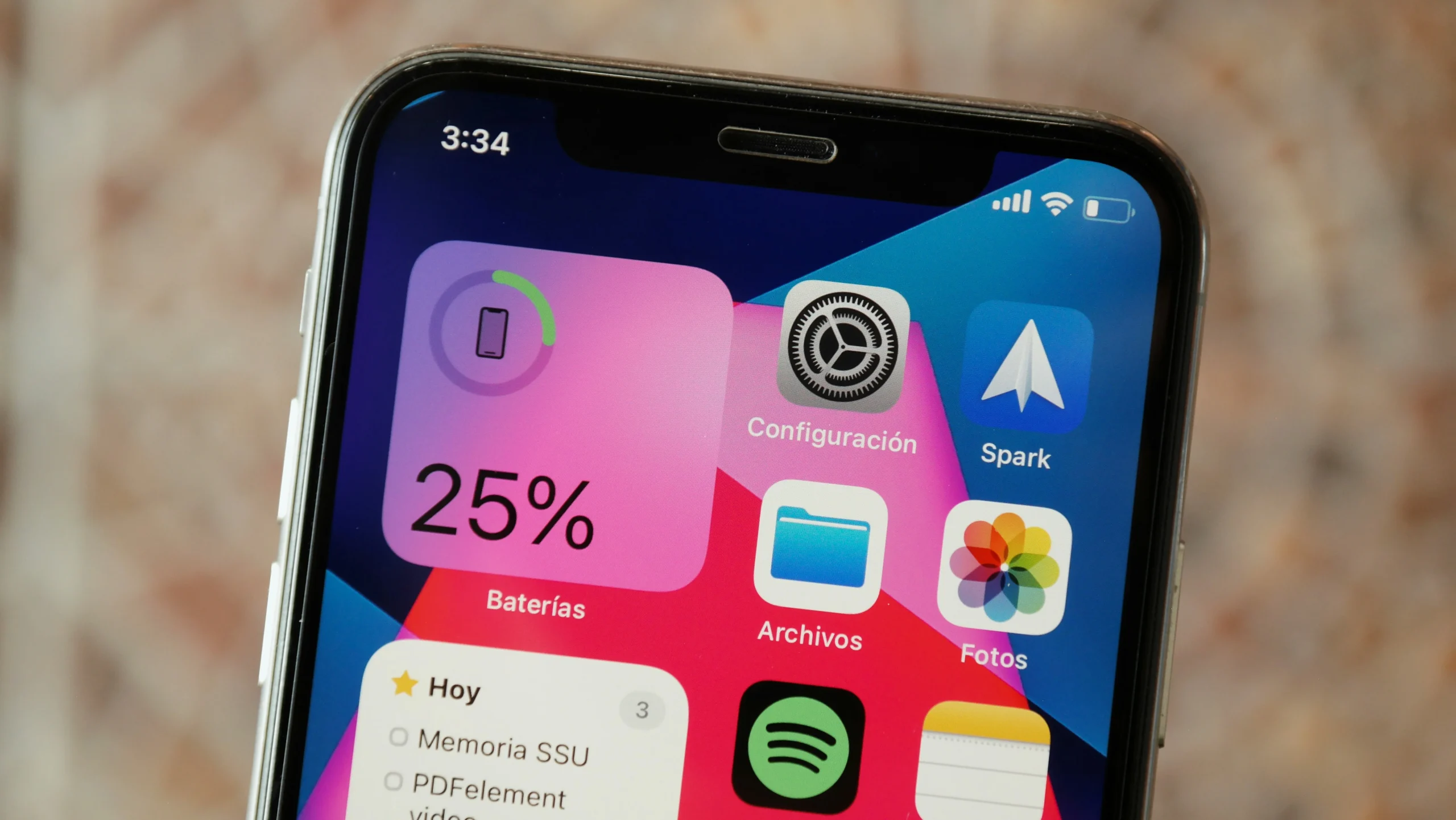
iOS Control Panel: A Prime Example of Effective Dashboard Widgets
The iOS Control Panel is a quintessential example of how great dashboard widgets can significantly enhance user experience on mobile apps. Apple’s design philosophy emphasizes simplicity, intuitiveness, and efficiency, all of which are embodied in the Control Panel’s widgets. Here’s a detailed look at how the iOS Control Panel effectively uses widgets to boost UX:
Seamless Access and Navigation
The iOS Control Panel provides users with quick and seamless access to essential functions and settings. By simply swiping down from the top right corner of the screen, users can instantly access the Control Panel, which is a dashboard composed of various widgets. This ease of access reduces the need to navigate through multiple menus, making it incredibly user-friendly.
Intuitive Widget Design
Each widget in the iOS Control Panel is designed with intuitiveness in mind. The icons are clear and recognizable, ensuring that users can quickly identify and use them. For example:
- Flashlight Widget: A simple tap turns the flashlight on or off, with the icon clearly indicating its state.
- Wi-Fi and Bluetooth Widgets: Users can easily toggle these settings, with icons changing to show the current status.
Customizability
The iOS Control Panel allows users to customize which widgets are displayed, tailoring the experience to individual preferences. Users can add, remove, or rearrange widgets, ensuring that the most frequently used functions are always at their fingertips. This level of personalization enhances user satisfaction and efficiency.
Real-Time Feedback
The widgets provide real-time feedback, keeping users informed about the status of various settings. For instance, the brightness and volume sliders show immediate changes as they are adjusted, and the battery widget displays the current charge level. This instant feedback helps users make quick and informed decisions.
Efficiency and Speed
The Control Panel’s widgets are designed to perform tasks swiftly, without lag or delay. Whether adjusting the screen brightness, turning on Do Not Disturb mode, or accessing the calculator, the widgets respond promptly, contributing to a smooth and efficient user experience.
Consistency in Design
Apple ensures that the design of the widgets is consistent with the overall iOS aesthetic. This uniformity helps users feel familiar and comfortable when interacting with the Control Panel, as it aligns with the broader design language of the iPhone’s interface.
Comprehensive Functionality
The Control Panel integrates a wide range of functionalities through its widgets, from connectivity options (Wi-Fi, Bluetooth) and media controls (play, pause, volume) to utility tools (flashlight, calculator) and system settings (airplane mode, Do Not Disturb). This comprehensive suite of tools available through intuitive widgets ensures that users have quick access to all necessary functions, enhancing the overall usability of the iPhone.
In summary, the iOS Control Panel exemplifies how well-designed dashboard widgets can create a highly effective and user-friendly interface. By combining seamless access, intuitive design, customizability, real-time feedback, efficiency, consistency, and comprehensive functionality, the Control Panel significantly boosts the user experience on the iPhone.
Conclusion: Good Dashboard Widgets
In conclusion, the power of good dashboard widgets cannot be overstated. They enhance the user experience by providing intuitive, user-friendly interfaces that allow for efficient data interpretation and real-time updates. Good widgets are essential for creating dashboards that are not only functional but also visually appealing and customizable to meet specific user needs. At Almax Design Agency, we prioritize the design of effective widgets that integrate seamlessly into your dashboard, optimizing performance and user engagement.
Our detailed exploration of the key characteristics of good dashboard widgets, the importance of design principles, and real-world examples like the iOS Control Panel highlight how these elements can dramatically improve your dashboard’s usability. By focusing on high usability, customization, and clear data visualization, we ensure that your dashboard delivers a superior user experience.
If you’re looking for design agency washington services to enhance your dashboard with top-notch widgets and improve your overall UX design, contact Almax today to see how we can use our UX expertise to help your business.
