


The Psychology of Light vs Dark Modes in UX Design
Did you know that over 80% of users now prefer dark mode on their digital devices? This statistic highlights a significant shift in user preferences and has made the light vs dark mode debate a central topic in UI/UX design. At Almax Design Agency, we understand that the choice between light and dark modes goes far beyond just aesthetics—it’s about crafting user interfaces that truly connect with users. In this article, we’ll dive into the psychology behind light vs dark modes, exploring how these design choices impact user experience, accessibility, and overall satisfaction.
Understanding the Basics: What Are Light and Dark Modes?
Light and dark modes refer to the two primary themes used in user interfaces. Light mode typically features dark text on a light background, providing a clean and traditional look. Dark mode, on the other hand, inverts this scheme, displaying light text on a dark background, which has gained popularity for its modern aesthetic and perceived eye comfort.
These modes are not just aesthetic choices but are deeply rooted in how users interact with digital environments. The selection between light vs dark modes can significantly impact a user’s experience, influencing everything from readability to emotional responses.
Is Dark Mode Better for Your Eyes?
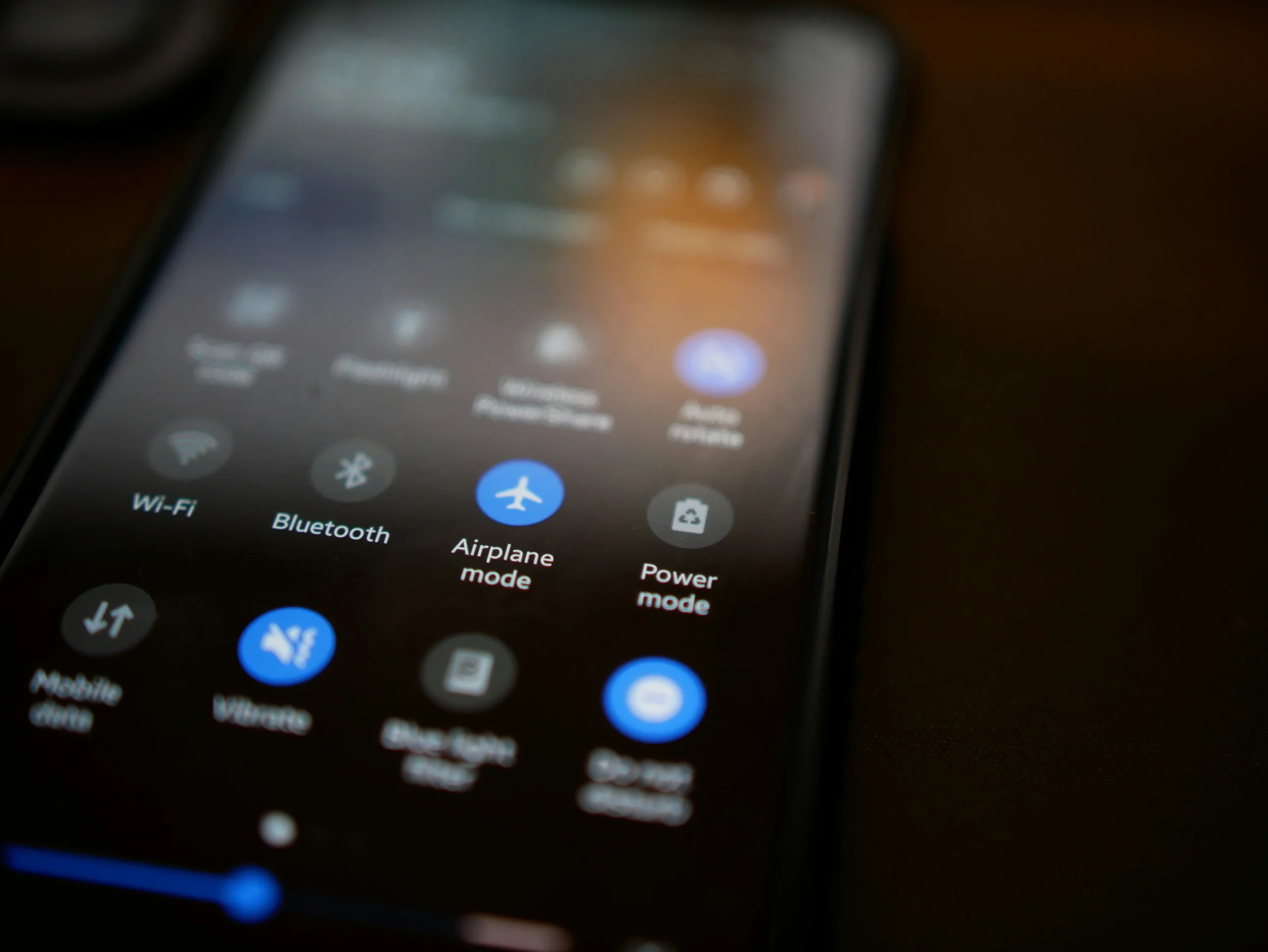
A common question that arises in the light vs dark mode debate is whether dark mode is better for eye health. The answer is nuanced. Dark mode is often praised for reducing eye strain, particularly in low-light environments. The lower luminance reduces glare and makes it easier for users to focus on the content without experiencing discomfort. However, the benefits are context-dependent.
In well-lit conditions, light mode may be preferable as it mimics natural lighting, making it easier for the eyes to adjust. Ultimately, the choice between light vs dark modes should be guided by the specific use case and environment in which the interface will be used.
The Science Behind Light vs Dark Color Perception in User Interfaces
Color perception plays a crucial role in the effectiveness of light vs dark modes. Human eyes are naturally adapted to perceive light better than darkness, which is why light mode often feels more natural and less fatiguing during daytime use. The contrast between text and background in light mode is generally higher, making content more legible in bright environments.
Conversely, dark mode leverages the ability of the human eye to detect contrast in low-light conditions. This makes dark mode particularly effective at night or in dimly lit environments, where bright screens can be jarring.

Psychological Impacts of Light Mode on Users
Light mode is often associated with positive psychological effects. It is perceived as more open, clean, and inviting, which can foster a sense of trust and transparency. This mode is ideal for interfaces that aim to convey professionalism, reliability, and clarity.
However, excessive use of light mode, particularly in dark environments, can lead to eye strain and discomfort, making it essential to provide users with an option to switch to dark mode when needed.
Exploring the Benefits of Dark Mode: Comfort and Focus
Dark mode offers several psychological benefits, particularly in terms of comfort and focus. The reduced luminance is less likely to cause eye strain in low-light settings, allowing users to work for extended periods without discomfort. Additionally, the high contrast of light text on a dark background can help to direct attention and reduce distractions, making dark mode an excellent choice for tasks that require deep focus.
Dark mode also evokes a sense of modernity and sophistication, making it a popular choice for apps and websites that want to appear cutting-edge and user-centric.
When to Use Light Mode vs. Dark Mode in Your Design
Deciding when to use light vs dark modes in your design should be guided by the context in which the interface will be used. Light mode is generally more suitable for daytime use and in well-lit environments, where it enhances readability and fosters a positive user experience. It’s ideal for professional settings, such as business websites and educational platforms.
Dark mode, on the other hand, excels in low-light environments and is particularly beneficial for apps and websites used during the evening or night. It is also a great option for creative and tech-oriented platforms that want to convey a modern, sleek aesthetic.
Accessibility Considerations: Inclusivity in Light vs Dark Modes
Accessibility is a critical aspect of UX design, and the choice between light vs dark modes should consider the diverse needs of users. For individuals with visual impairments, high contrast is essential, and both light and dark modes can be optimized to meet these needs.
Light mode can be adjusted with larger text and higher contrast ratios to aid readability. Dark mode should also ensure sufficient contrast between text and background to avoid readability issues. Providing users with the option to choose their preferred mode enhances inclusivity and ensures a better overall user experience.
User Preferences: The Role of Personalization in Mode Selection
User preferences play a significant role in the light vs dark mode debate. Some users have a strong preference for one mode over the other, often based on their environment or personal comfort. Offering both modes and allowing users to switch between them empowers users and enhances their experience.

How Many People Use Dark Mode?
Dark mode has really taken off in recent years, becoming the go-to choice for many people when it comes to how they view their screens. As of 2024, about 81.9% of smartphone users have switched to dark mode, and 82.7% of desktop and laptop users prefer it too. This isn’t just a random trend—people find dark mode easier on the eyes, especially in low-light environments, and it can even help save battery life on devices with OLED screens.
Interestingly, developers are some of the biggest fans of dark mode, with around 70% of them saying it makes coding easier on their eyes during those long sessions. This surge in popularity has made dark mode a standard option in most apps and devices today.
If you want to see how Almax can help you apply light and dark modes to your digital project, check out our mobile apps and e-commerce services.
The Evolution of Light and Dark Modes in UX Design
The concept of light vs dark modes is not new, but its application in UX design has evolved significantly. Initially, dark mode was primarily used in coding environments and applications designed for extended use in low-light conditions. However, as user preferences and technology have advanced, dark mode has become a mainstream option in various digital interfaces, from mobile apps to websites.
The evolution of these modes reflects a broader trend towards personalization and user-centric design, where the focus is on providing options that cater to individual needs and preferences.
Case Studies: Successful Implementation of Light and Dark Modes
Twitter and Slack have successfully implemented dark mode as part of their UX design strategy, setting a standard for how this feature can enhance user experience across different platforms.
Twitter’s Dark Mode Success

Twitter introduced dark mode in 2016, well ahead of many other platforms. This early adoption positioned Twitter as a pioneer in accommodating user preferences for lower-light environments. The success of dark mode on Twitter can be attributed to several factors:
- User Comfort: Twitter’s dark mode significantly reduces eye strain, especially for users who browse during nighttime or in dimly lit environments. By offering a more comfortable viewing experience, Twitter has increased user engagement and satisfaction.
- Customizability: Twitter offers users the ability to toggle between light and dark modes easily, and even provides options like “Dim” and “Lights Out,” catering to different user preferences. This flexibility in customization allows users to select the mode that best suits their needs, enhancing the overall user experience.
- Visual Appeal: Dark mode on Twitter accentuates multimedia content such as photos and videos, making them stand out more against the darker background. This visual enhancement is particularly beneficial for a platform where sharing and viewing media is a core activity.
Slack’s Dark Mode Success
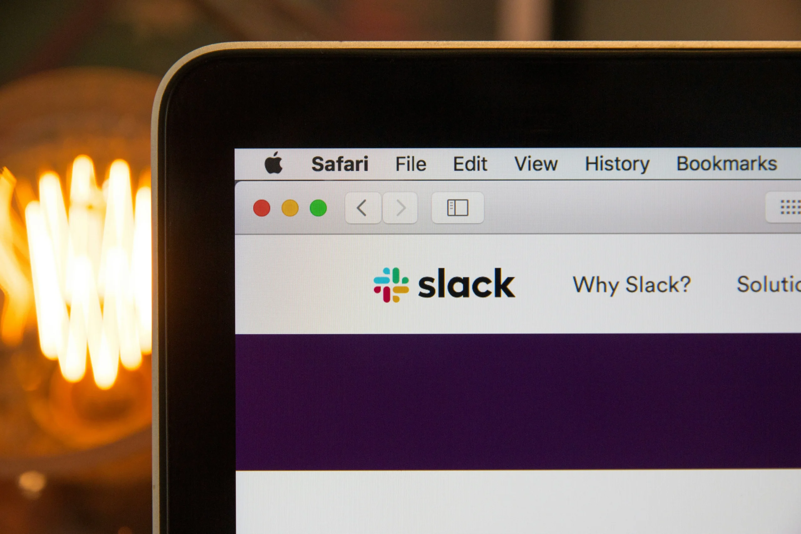
Slack, a widely used communication tool for teams, rolled out dark mode in 2019, responding to growing user demand. Slack’s successful implementation of dark mode is rooted in its focus on enhancing productivity and user comfort:
- Focus on Productivity: Slack’s dark mode helps reduce glare and eye fatigue, which is especially important for users who spend long hours communicating and collaborating on the platform. By minimizing eye strain, Slack enables users to work more comfortably and efficiently.
- Consistency Across Platforms: Slack ensured that dark mode was available across all its platforms—desktop, mobile, and web—providing a consistent user experience regardless of the device being used. This consistency helps maintain a seamless workflow, which is crucial for professional environments.
- User-Centric Design: Slack’s decision to implement dark mode was driven by user feedback. By listening to its community and delivering a feature that enhances usability, Slack reinforced its reputation as a user-focused platform.
Both Twitter and Slack illustrate how dark mode, when implemented thoughtfully, can improve user comfort, increase engagement, and cater to user preferences, making it a valuable feature in modern UX design.
Conclusion: The Psychology of Light vs Dark Modes in UX Design
In conclusion, the choice between light vs dark modes in UX design is far more than a matter of aesthetics—it’s about optimizing user comfort, enhancing accessibility, and ultimately delivering a user experience that meets diverse needs. As we’ve explored, light mode tends to be more effective in bright environments, offering clarity and readability, while dark mode excels in low-light conditions, reducing eye strain and focusing attention. Platforms like Twitter and Slack have demonstrated how a thoughtful implementation of dark mode can significantly enhance user satisfaction and engagement, setting a benchmark for others in the industry.
At Almax Design Agency, we understand that every detail in UX design, including the choice between light and dark modes, plays a crucial role in connecting with your audience. If you are looking for the best design agency Washington services to help you, contact Almax today!
