


Colors surround us everywhere—from the sleeve of your favorite coffee cup to the logo of the app you tap open every morning. They grab attention and set the vibe long before anyone reads a single word. For a brand, the right palette isn’t just eye candy; it’s a strategy that builds recognition and trust. Nail the shades, and even a minimalist identity suddenly works overtime.
Why Colors Can Make or Break a Brand
Think about the icons: Facebook’s blue, McDonald’s yellow, Coca-Cola’s red. One glance at the color and you know the brand. That’s not magic—it’s careful planning. Hues shape mood, hint at values, and even drive sales. Designers spend weeks hunting for the perfect tone for a reason.
A well-chosen palette sticks in people’s minds for years. It also gives you a leg up in SEO, since striking visuals attract more clicks and keep visitors around longer.
How Color Psychology Works on Us
Every shade sparks emotions and associations. Blue feels trustworthy, green whispers freshness and calm, while bright red nudges action. No wonder banks lean on cool tones and adventure brands go for warm, energetic ones.
This effect runs on autopilot. Even if someone isn’t thinking about it, their brain is reacting to those tones. It’s a bit like Micro-UX for the eyes—a subtle visual experience that quietly shapes decisions.
What Color Says About a Company’s Personality
A single hue can tell more about a business than a homepage paragraph. Soft pastels radiate friendliness and comfort, while metallics signal tech and seriousness. It’s the company’s personality in a swatch.
But the same color plays differently depending on the field. Black screams luxury for fashion houses, yet feels too heavy for a kids’ brand.
Color Mistakes That Turn Customers Away
One common misstep? Overload. Too many shades make a site look chaotic and tiring. Another blunder is copying someone else’s palette without considering your own audience.
A clashing combo can tank conversions even if your Scroll 2.0 layout is flawless. Visitors simply won’t stay on a page where colors fight each other.
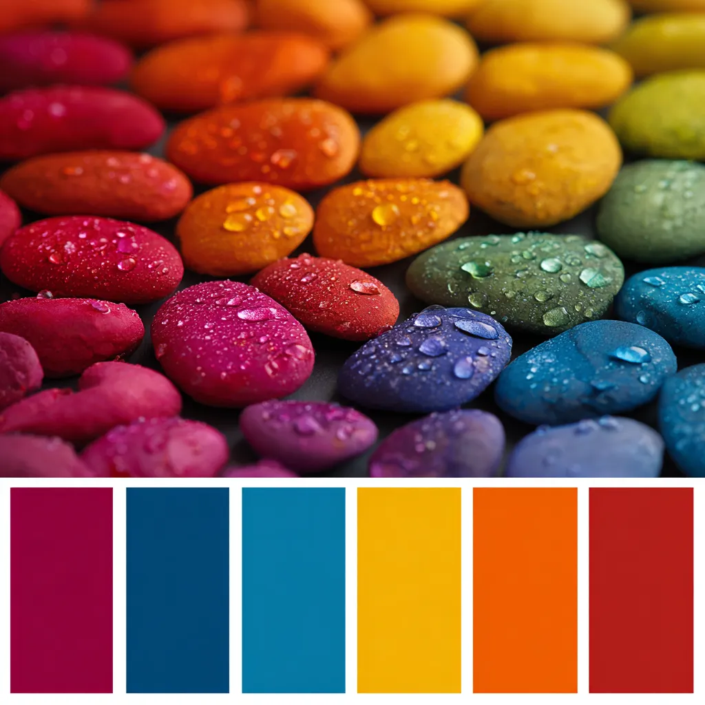
Secrets of a Harmonious Palette
A great color scheme is like music: different notes blending beautifully. Many designers follow the 60-30-10 rule—main color, secondary color, and an accent. It keeps everything balanced and easy on the eyes.
Always test on multiple screens and in different lighting. A slight shift can turn a warm hue chilly or vice versa.
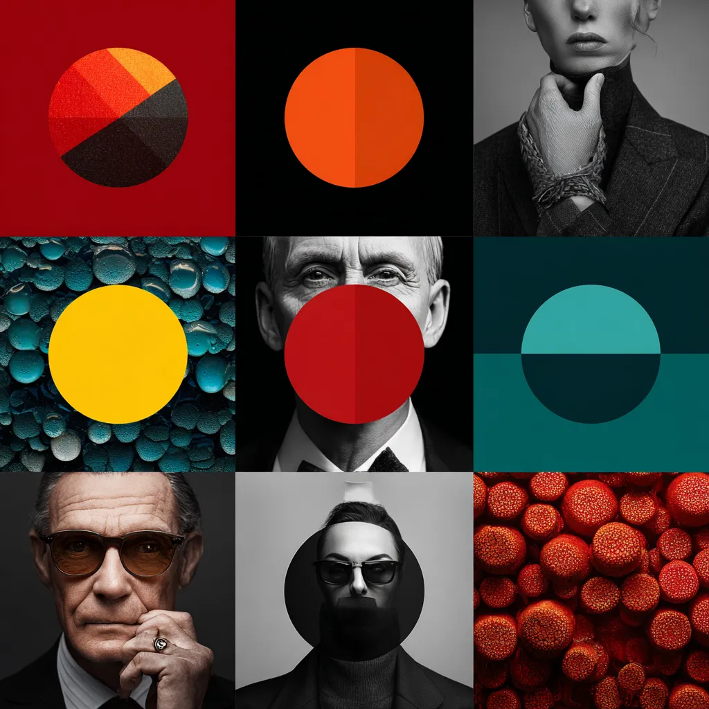
Using Contrast to Highlight the Essentials
Contrast is your attention magnet. It makes the “Buy Now” button or key headline pop instantly. The trick is to keep it tasteful so the viewer’s eyes don’t get tired.
Try these quick moves to boost contrast:
- Pair dark text with a very light background.
- Drop in bright accents only where you need focus.
That way users know exactly where to click without extra hints.
Color and Fonts: Making Text Stand Out and Stay Readable
Fonts and colors work hand in hand. The trendiest typeface loses charm if the text color is too faint. Dark gray on a soft cream background reads more smoothly than harsh black on white, and fresh Font Trends can inspire unexpected combos.
Match weight and size to your brand vibe. Easy-to-read copy keeps visitors scrolling instead of bouncing.
Culture and Context in Color Choices
The same shade can mean totally different things around the globe. White feels pure in much of Europe but is linked to mourning in parts of Asia. Global brands factor in cultural context before locking a palette.
Current events matter too. A color that’s stylish today could carry negative baggage tomorrow if it’s tied to a controversial story.
Handy Online Tools for Perfect Palettes
You don’t need to be an artist to craft a gorgeous scheme. Plenty of tools let you experiment and preview ideas in real time, saving hours and avoiding bad picks.
Favorites include:
- Adobe Color – great for pros.
- Coolors – a fast combo generator.
- Paletton – perfect for testing contrast.
Standout Brands with Brilliant Color Strategies
Apple sticks to clean neutrals for a premium, uncluttered look. Spotify rocks vivid green that jumps out from competitors and shines on any screen.
And then there’s Tiffany & Co. Their signature blue became so iconic it’s a registered color. That’s how a shade transforms into legend and turns into a brand asset all by itself.
