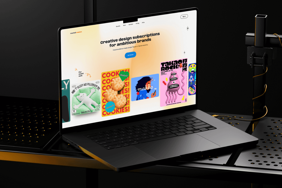
BioVital
BioVital is a wellness brand offering science-backed supplements for modern health.

BioVital
Brand
United states, Oregon
Location
BioVital
Client
Fitness, Food, Health & Wellness, Healthcare, Retail
Industry
2024
Release
(01) Challenge
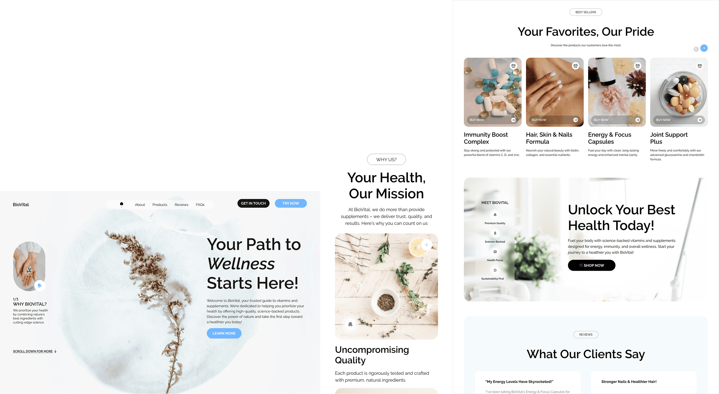
BioVital approached us to create a premium wellness e-commerce platform that inspires trust, supports conversion, and communicates product quality. We had to design a smooth shopping experience that clearly explains benefits, builds credibility, and feels clean and comforting across touchpoints.
(02) Approach
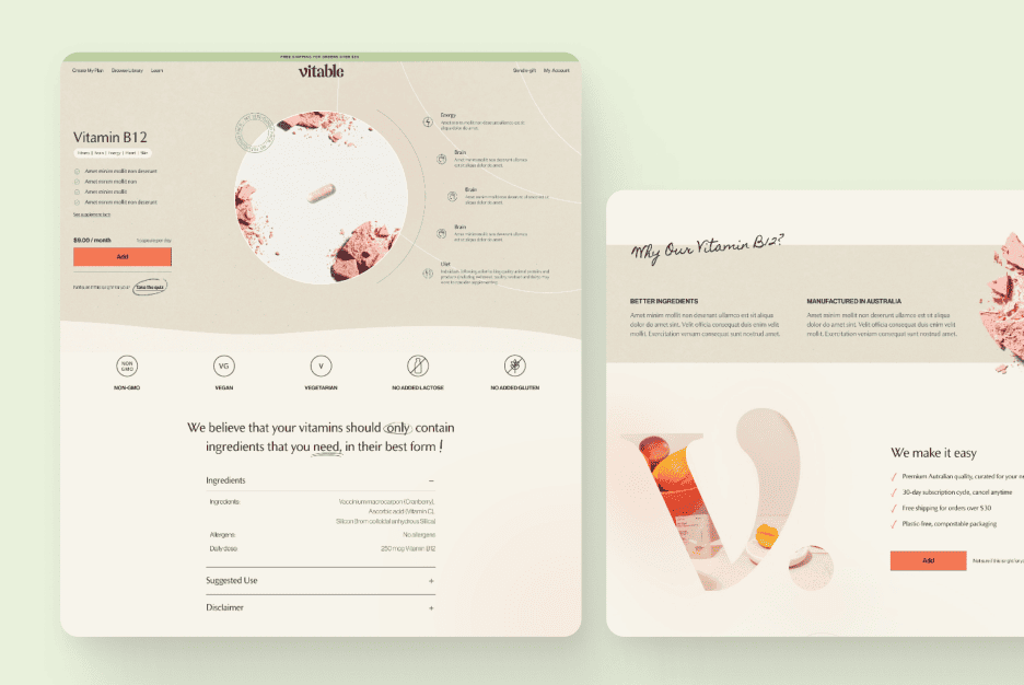
We designed a light, breathable interface with clear hierarchy and high legibility. Product pages focus on key outcomes, ingredients, and usage. We emphasized transparency, visual calmness, and personalization — supporting quick purchases without overwhelming the wellness-focused audience.
(03) Value delivered
The new platform helped BioVital boost both first-time conversions and returning customer rates. Users praised the intuitive navigation, trust signals, and calm branding. The layout positioned BioVital as a credible, professional, and consumer-first brand in the crowded supplement space.
Design Strategy
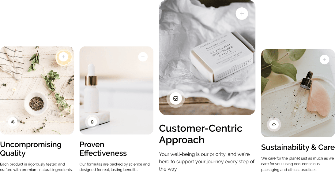
We combined visual purity with clinical credibility. A white-based color palette, soft edges, and subtle motion made the interface feel clear and safe. Icons, testimonials, and labels reinforced the science-backed message while supporting ease of navigation and shoppable simplicity.


Design, Development, and Testing
We adhered to a traditional project timeline, known for its effectiveness and successful application in past projects. Priority was given to crucial aspects of the website’s design, including information architecture, prototyping, and user flow mapping. Next, the project moved on to the interface design phase, focusing on style elements, responsiveness.
UX design 01
Phase 1
UI design 02
Development 03
Testing 04
Phase 2
Interactive Design
We introduced light-touch interactivity — from product highlights on hover to carousel-based reviews and CTA feedback. Microinteractions supported shopper clarity while keeping the experience distraction-free. The interface responds gently, guiding users toward confident decision-making.
Production Details
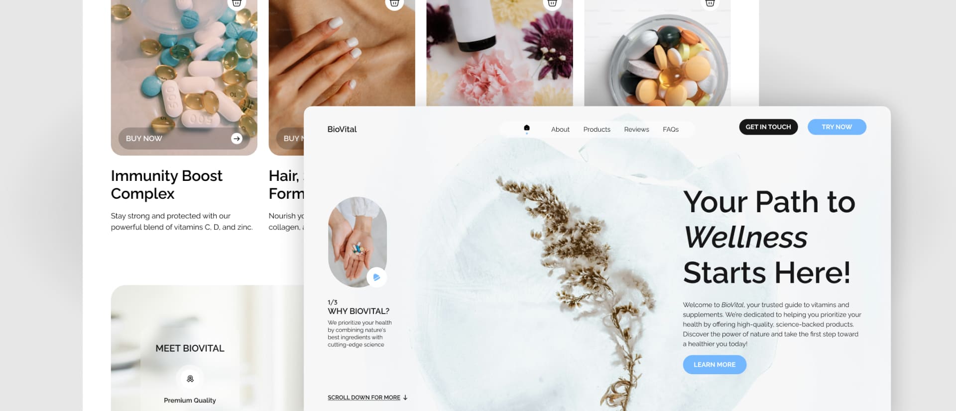
The site was developed as a component-based system. Each product card, bundle block, and review module is reusable across pages and promotions. We built mobile-first with optimized assets and ensured full accessibility. CMS structure supports scaling new lines, bundles, and campaigns.

We designed and implemented a structure that supports personalized journeys. Customers can explore by benefit, ingredient, or goal. Special focus was given to user education — highlighting efficacy and safety with badges, summaries, and curated discovery paths across the store.
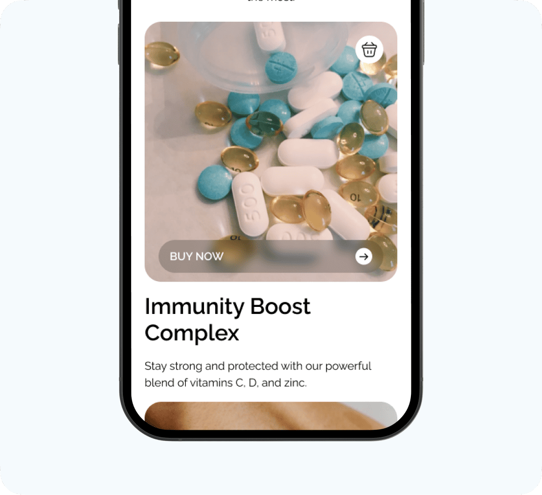
Each section was A/B tested for clarity and conversion, including homepage CTAs, product arrangement, and review placements. We prioritized simplicity and empathy — ensuring the site felt welcoming, authoritative, and aligned with the audience’s trust and wellness goals.


setting the tone
We developed a tone of voice that’s confident, warm, and science-led. The copy speaks with calm authority — avoiding buzzwords, focusing on clarity, and showing care. Product names, headlines, and messages were written to guide users without pressure, helping them feel supported.
#FFFFFF
#D9D9D9
#000000
#F5FAFD
#72B6FF
A
Raleway
A
Regular
A
SemiBold
A
Bold
Award-winning work!
BioVital’s clean and elegant wellness storefront received multiple awards for usability, health-sector branding, and conversion design. The platform was recognized for helping users feel empowered and informed — showing how digital design can elevate trust in wellness e-commerce.
Available to start the same day you first text us!
🤝
Thank you
for your message!
It has been successfully sent.
We'll contact you within an hour.

