Keak
Supercharge conversions with automatic content variations and seamless A/B testing.


Keak
Brand
New York, USA
Location
Keak
Client
Information Technology, SaaS, Technology
Industry
2023
Release
Live
(01) Challenge
Keak, a key player in content optimization, needed to upgrade their digital platform to better reflect their innovative market position. The goal was to create a website that highlights their cutting-edge solutions, showcases their success stories, and provides a seamless user experience. Approach
(02) Approach
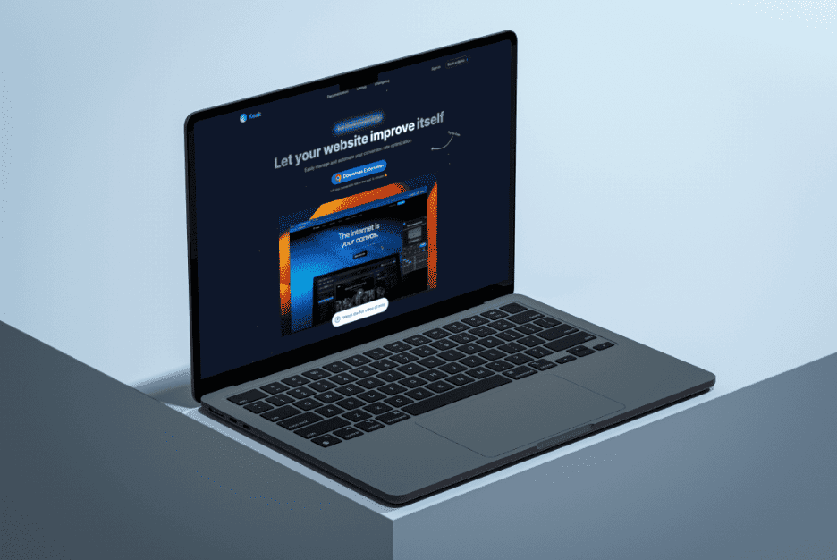
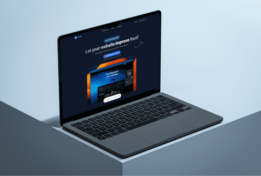
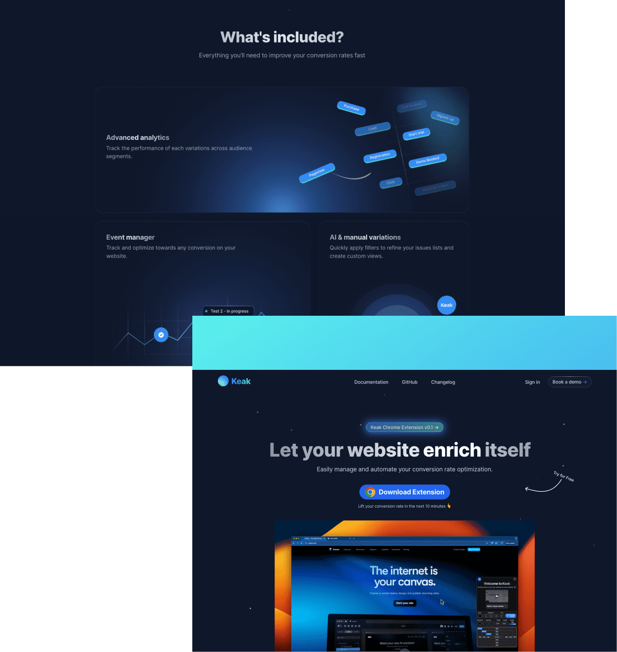
Our team conducted an in-depth audit to understand Keak’s requirements and market dynamics. We then designed and developed a sleek, modern website with enhanced mobile functionality and intuitive layouts for product pages. This redesign focused on improving usability and effectively communicating Keak’s value proposition.
(03) Value delivered
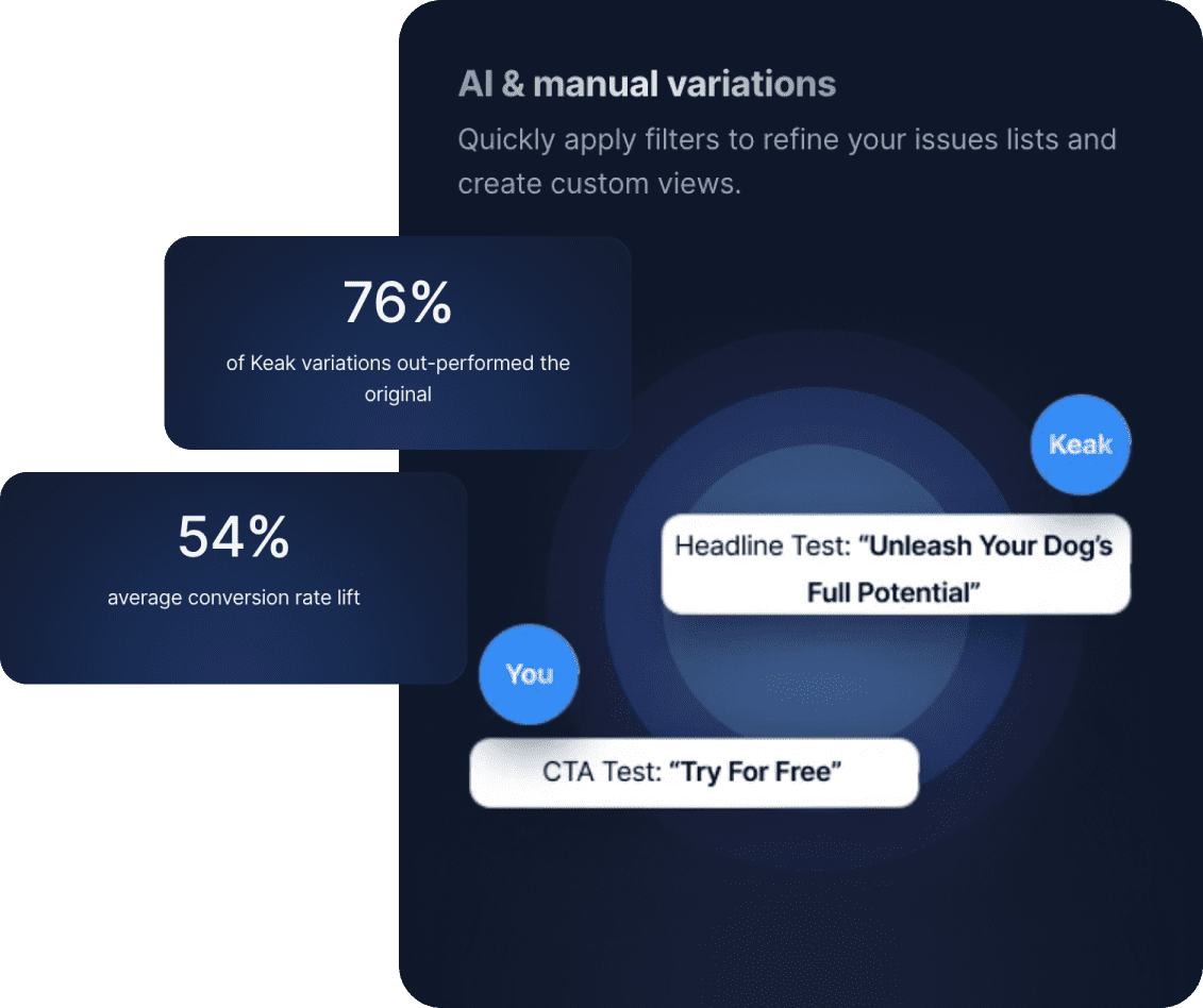
The new website successfully captured Keak’s commitment to innovation and quality. In the first month post-launch, Keak saw a substantial increase in conversion rates, more than doubling previous figures. This significant improvement in performance met the project’s primary objectives and elevated Keak’s digital presence.
Design Strategy
We prioritized a user-centered design approach to ensure the new website provides an exceptional user experience. This involved conducting user research, creating personas, and mapping out user journeys to understand the needs and behaviors of Keak’s target audience. Our goal was to make the website intuitive and engaging, driving higher user satisfaction and conversions.
Design, development, and testing
To reflect Keak’s innovative and professional market position, we incorporated a sleek and modern aesthetic into the design. This included using a clean and minimalistic layout, contemporary typography, and a cohesive color scheme aligned with Keak’s branding. Visual elements were designed to be both attractive and functional, enhancing the overall user experience.
UX design 01
Phase 1
UI design 02
Development 03
Testing 04
Phase 2
interactive design
To enhance user engagement, we incorporated interactive elements such as animated graphics, hover effects, and dynamic content. These elements were carefully designed to not only captivate users but also to provide additional information and context without overwhelming them.

setting the tone
To ensure users could easily find the information they need, we designed a simple and intuitive navigation system. This included a well-structured menu, clear call-to-action buttons, and a comprehensive search function. Accessibility features were also integrated to make the website usable for individuals with disabilities, complying with the latest web accessibility standards.
We implemented an enhanced visual hierarchy to guide users through the website effectively. Key information, such as Keak’s cutting-edge solutions and success stories, was strategically placed to capture attention and encourage exploration. Clear headings, concise copy, and compelling visuals were used to improve readability and engagement.
#F5F5F5
#D9F3FE
#54CBCF
#338DF2
#01256E
#0F172A
A
Inter
A
Black
A
Extra-Bold
A
Bold
A
Regular
A
Light
A
Thin
Award-winning work!
Our collaboration with Keak has been recognized for its excellence, earning accolades in the industry for its innovative design and outstanding performance. The revamped website not only achieved Keak’s goals but also set a new benchmark in content optimization.
Available to start the same day you first text us!
🤝
Thank you
for your message!
It has been successfully sent.
We'll contact you within an hour.

