Puzzle
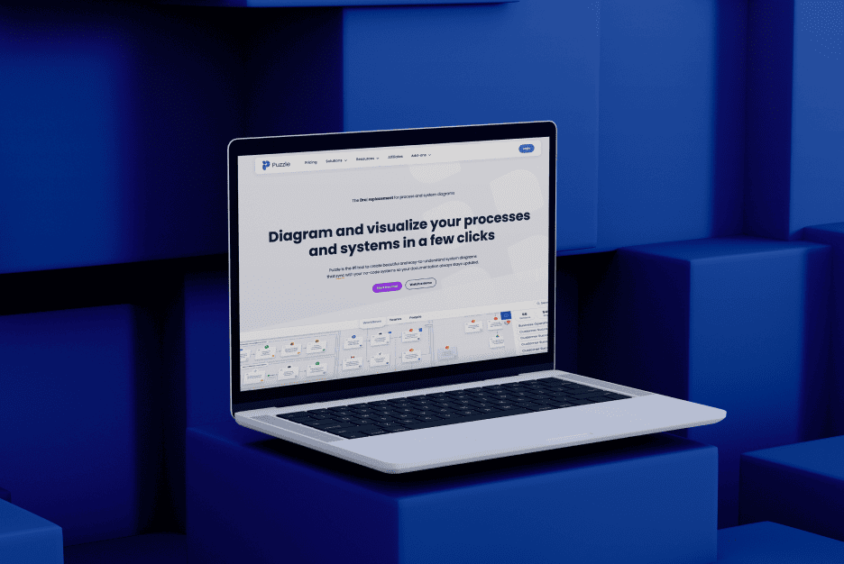
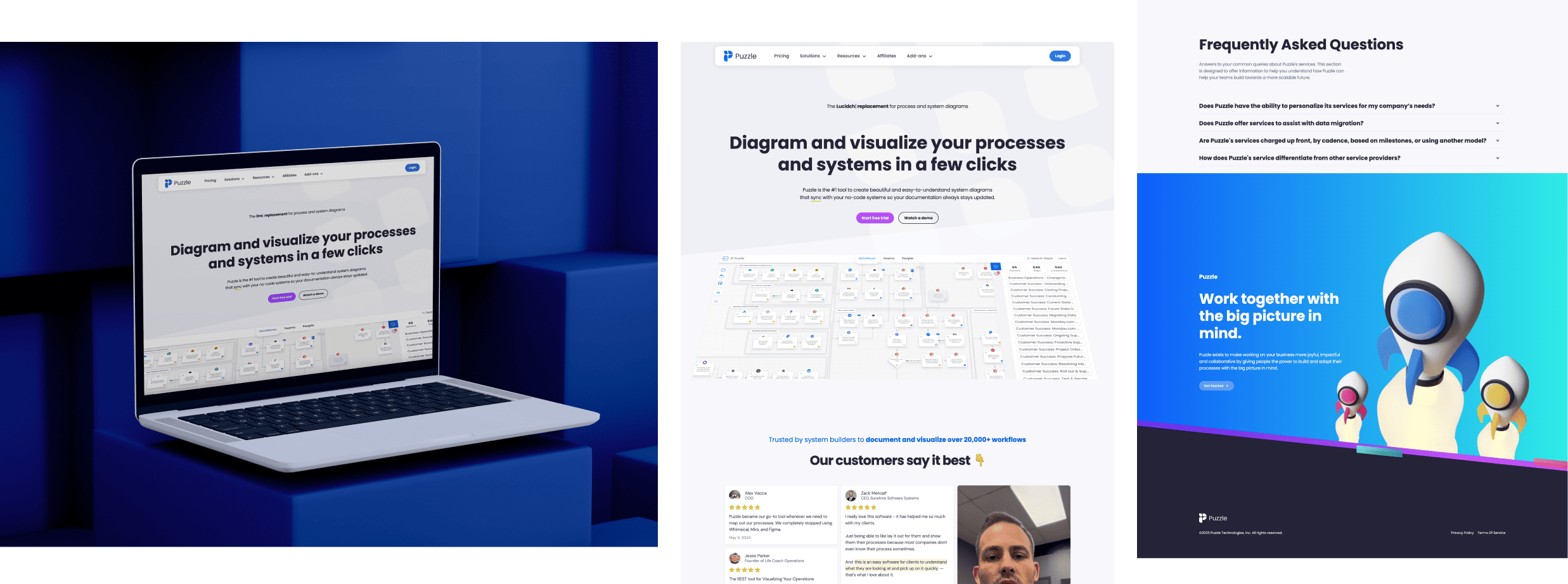
Puzzle is the #1 tool to create beautiful and easy-to-understand system diagrams

Puzzle
Brand
New York, USA
Location
Puzzle
Client
Information Technology, SaaS, Technology
Industry
2023
Release
Live
(01) Challenge
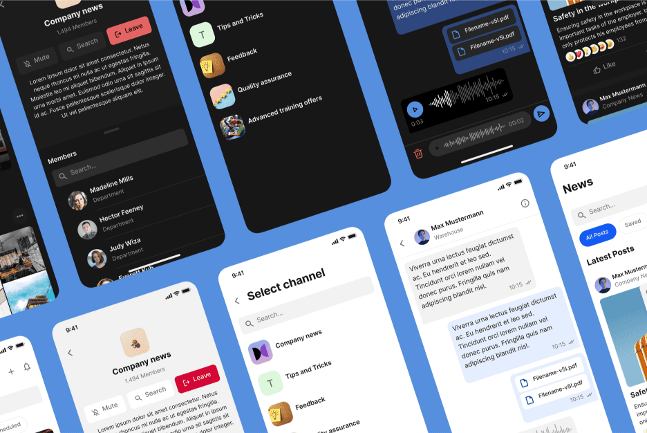
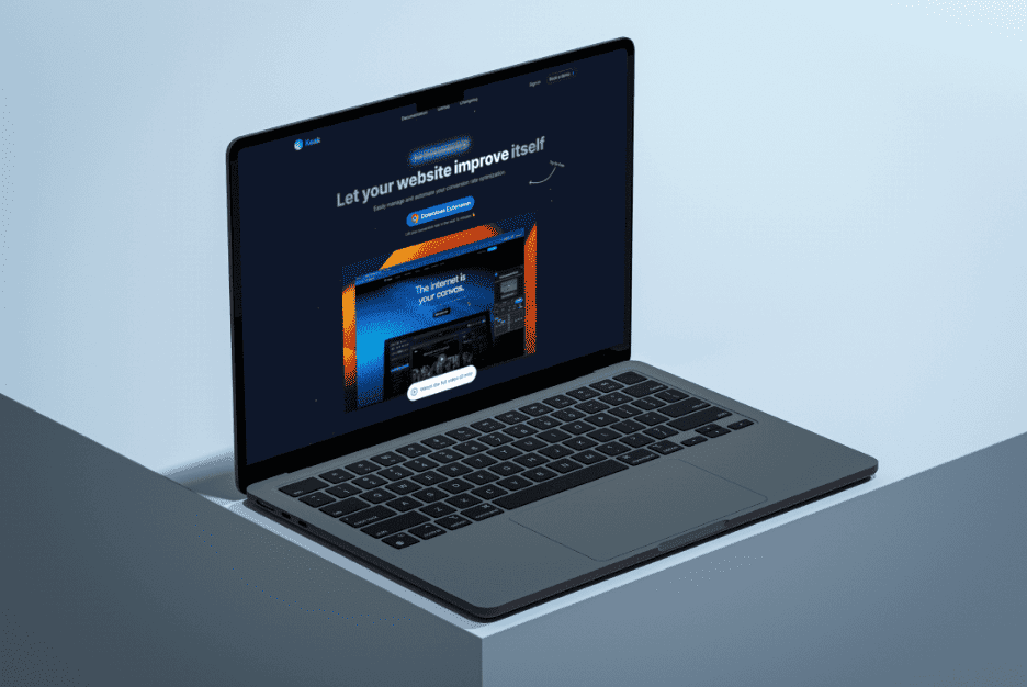
Puzzle, a collaborative workspace application, needed to enhance its digital platform to better serve its growing user base of remote teams and professionals. The challenge was to create a website that effectively communicated Puzzle’s unique value proposition while providing a seamless and engaging user experience. The existing platform needed to be more intuitive and visually appealing to attract and retain users in a highly competitive market.
(02) Approach
Our approach began with a comprehensive analysis of Puzzle’s current platform and an in-depth understanding of their target audience. We focused on designing a user-friendly interface that emphasized simplicity and ease of use, crucial for busy professionals seeking efficient collaboration tools. The design process involved creating a clean, modern aesthetic with clear navigation paths and intuitive layouts. We also integrated interactive elements to showcase Puzzle’s features dynamically, making it easier for users to understand and engage with the platform. Additionally, we ensured the design was fully responsive, offering a consistent experience across all devices.
(03) Value delivered
The redesigned platform significantly improved user engagement and satisfaction, leading to an increase in user retention and sign-ups. The new design effectively communicated Puzzle’s unique strengths, helping to differentiate it in the competitive market for collaborative tools. The intuitive interface and modern aesthetic not only enhanced the user experience but also positioned Puzzle as a leader in the collaborative workspace industry, ready for future growth and expansion.
Design Strategy
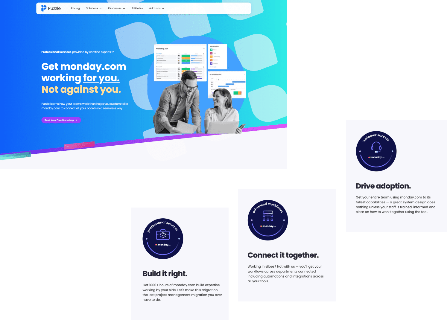
Our design strategy for Puzzle centered around creating a user-centric platform that enhances collaboration while being visually appealing and easy to navigate. We aimed to develop an interface that was not only functional but also intuitive, making it effortless for users to access the tools and features they need. To achieve this, we focused on simplicity, clarity, and responsiveness, ensuring that the design would cater to the needs of remote teams and professionals who rely on efficient, user-friendly digital workspaces.

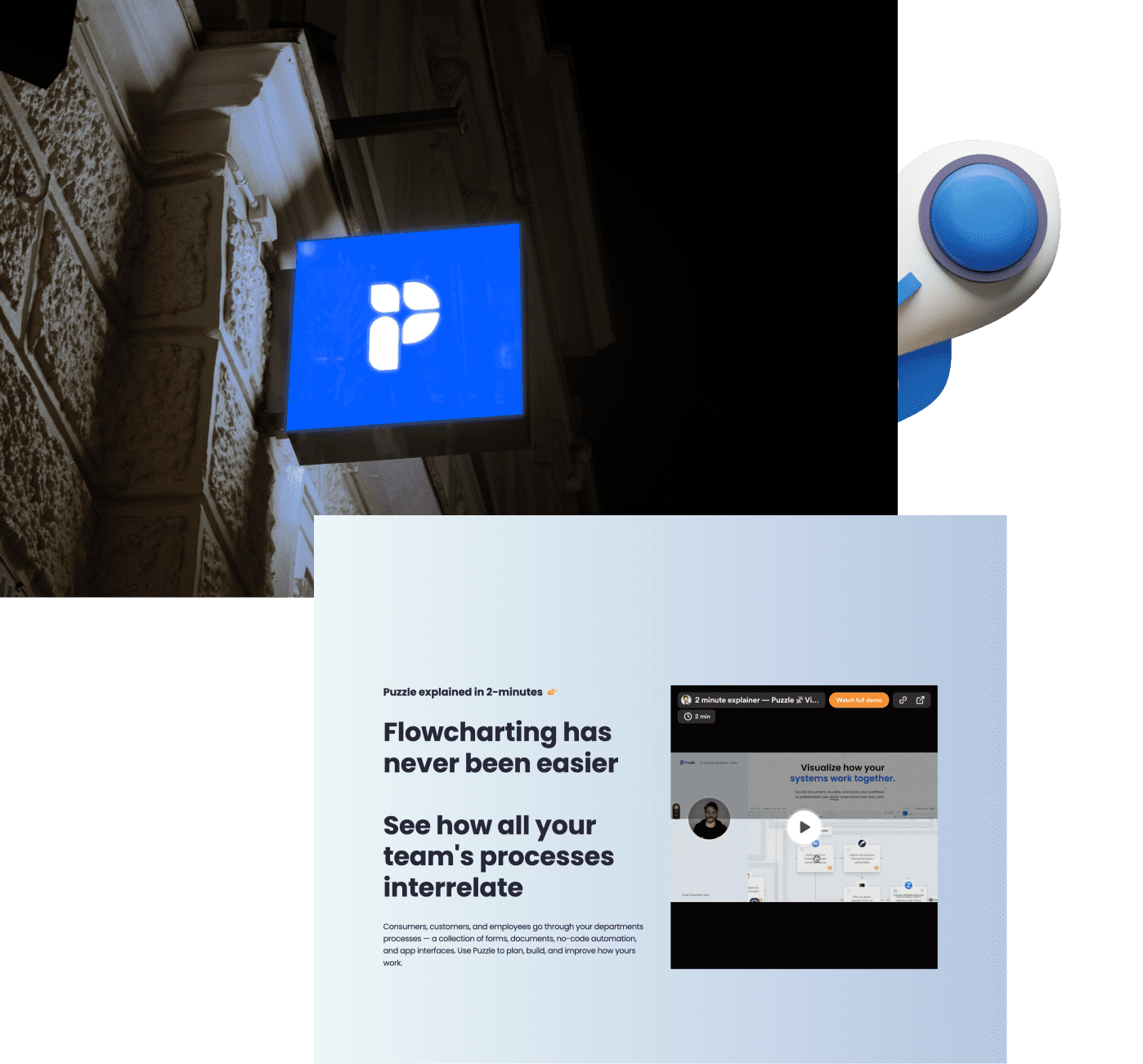
Design, development, and testing
The design, development, and testing phases were tightly integrated to ensure a cohesive and robust final product. We adopted an agile development approach, allowing for continuous iterations based on user feedback and testing outcomes. This iterative process ensured that both the design and functionality were fine-tuned to meet the highest standards. Rigorous testing was conducted at each stage to identify and address any issues related to usability, performance, and security, ensuring that the platform would perform flawlessly under real-world conditions.
UX design 01
Phase 1
UI design 02
Development 03
Testing 04
Phase 2
interactive design
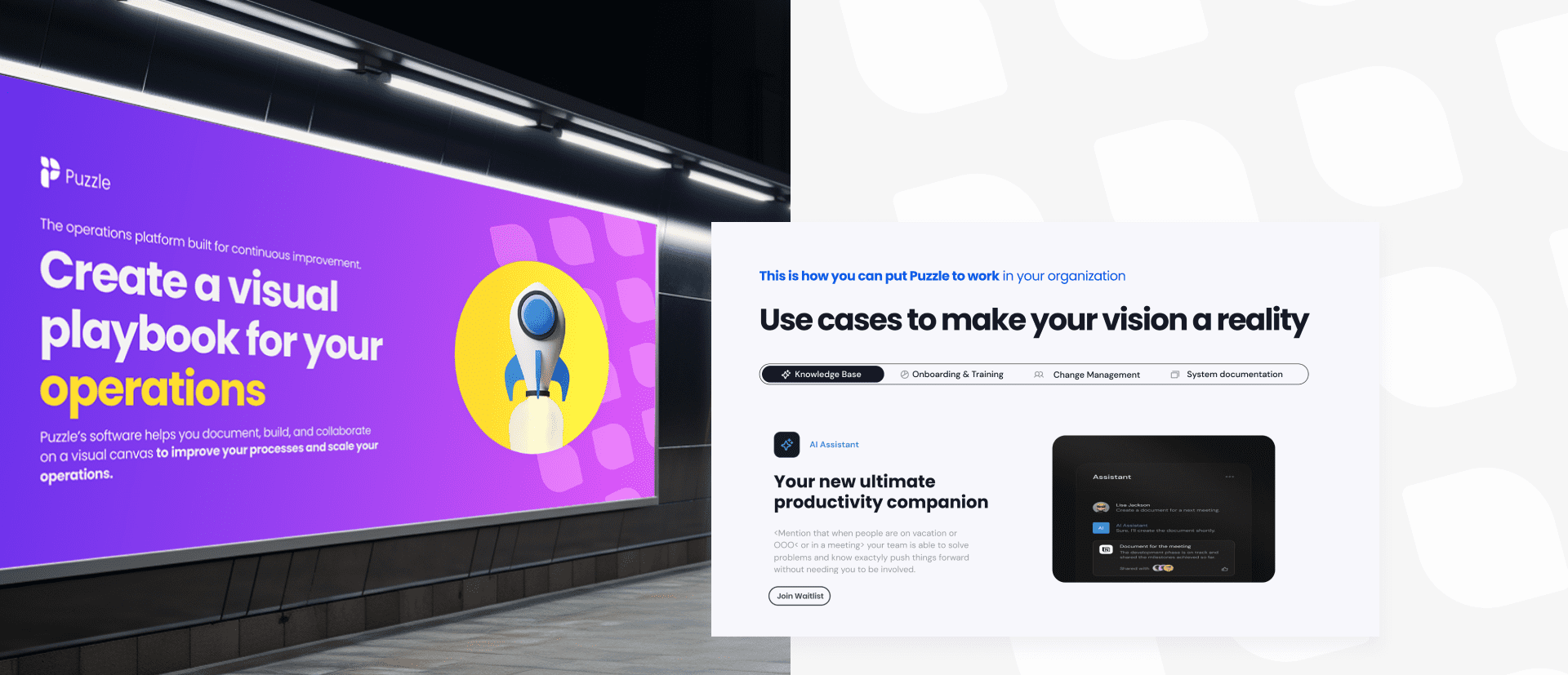
To make the Puzzle platform more engaging, we incorporated interactive design elements that brought the user experience to life. Features such as animated transitions, hover effects, and dynamic content were used to create a more immersive experience. These interactive elements were carefully designed to enhance the overall usability without overwhelming the user, helping to communicate the platform’s features in a more engaging and understandable way.
production details
The production process was meticulously planned to ensure that the project was completed on time and within budget.
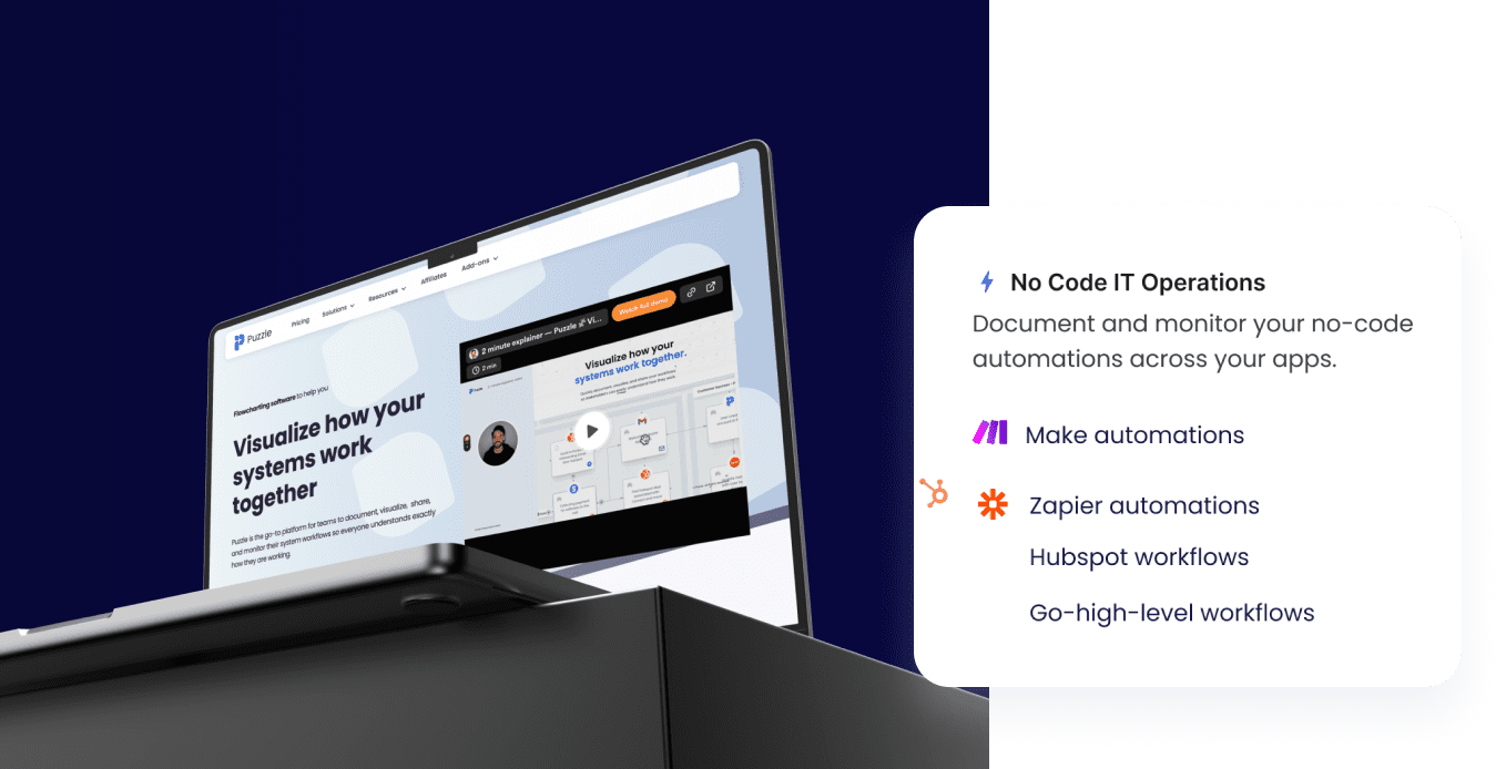
We used cutting-edge web technologies to build a platform that is both scalable and reliable, capable of handling the demands of an expanding user base.
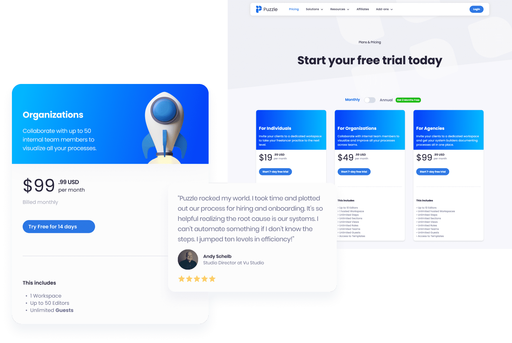
Throughout the production phase, we maintained a strong focus on quality control, ensuring that every aspect of the platform—from the backend architecture to the frontend design—was executed to the highest standards.
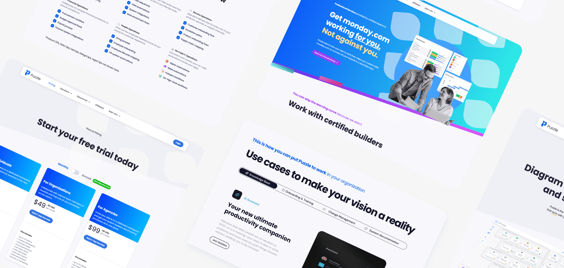
setting the tone
Setting the tone for the Puzzle platform was crucial in creating a brand identity that resonated with its users. We chose a modern, minimalistic design language that conveyed professionalism and efficiency, aligned with the needs of remote teams and professionals. The color palette was carefully selected to create a calm and focused environment, while the typography was chosen for its clarity and readability. The overall tone of the platform was designed to be welcoming and user-friendly, reflecting Puzzle’s commitment to simplifying collaboration.
A
Poppins
A
Black
A
Extra-Bold
A
Bold
A
Regular
A
Light
A
Thin
Award-winning work!
The work we delivered for Puzzle has been recognized for its excellence in design and functionality, earning accolades within the industry. The platform’s innovative approach to user experience and its seamless integration of interactive elements set a new standard in the collaborative workspace market. The project’s success has been celebrated as an example of how thoughtful design and meticulous execution can lead to an award-winning digital product that not only meets but exceeds user expectations.
Available to start the same day you first text us!
🤝
Thank you
for your message!
It has been successfully sent.
We'll contact you within an hour.

