


ShipEase
ShipEase is a smart logistics dashboard that streamlines delivery insights in real time.
ShipEase
Brand
Belgium
Location
ShipEase
Client
B2B, SaaS, Technology
Industry
2024
Release
Live
(01) Challenge
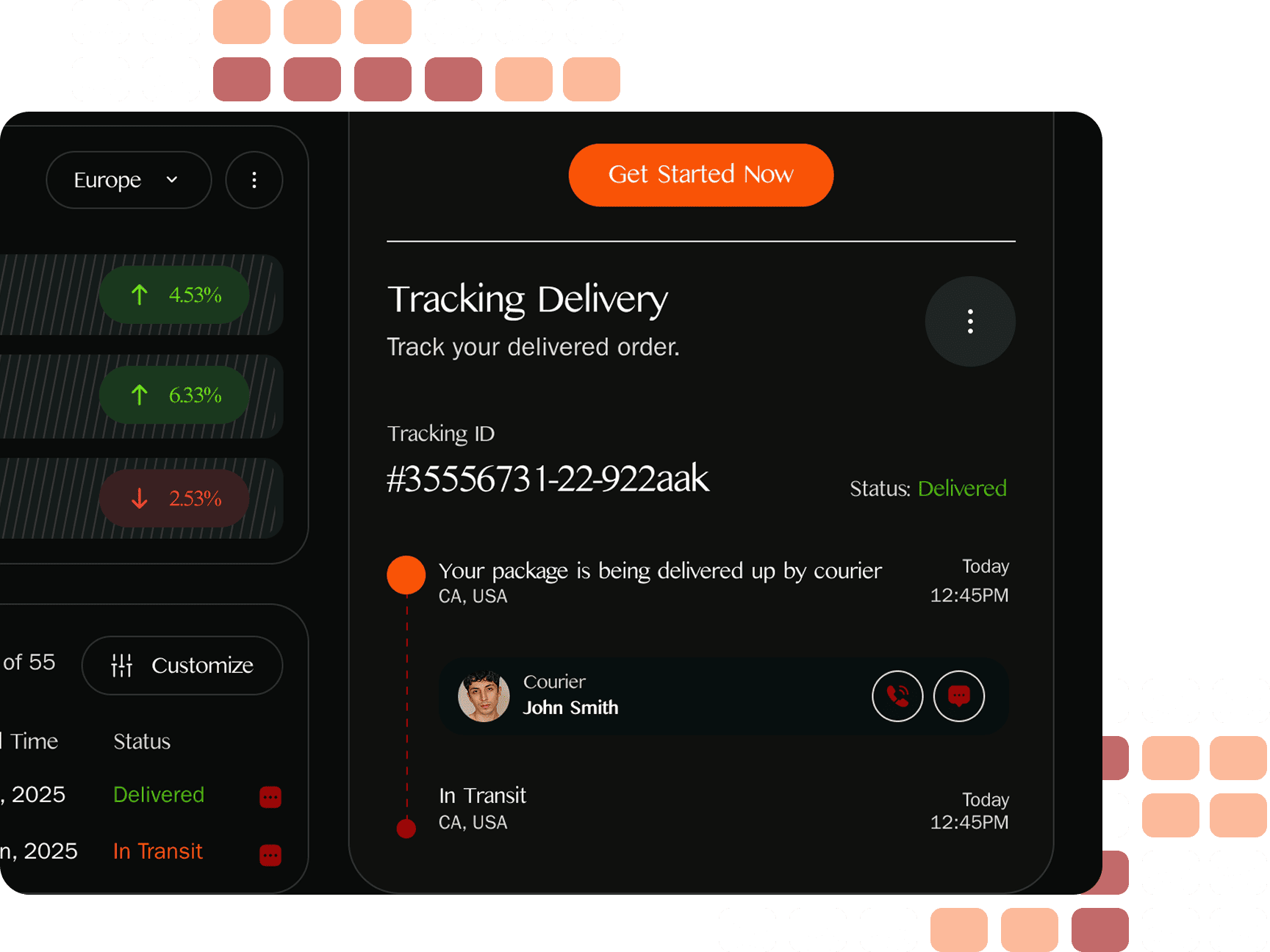
ShipEase asked us to rethink the logistics dashboard experience. They needed a unified platform to track shipments, monitor carrier performance, and manage delivery metrics. The challenge was to simplify vast data into an intuitive layout while keeping the UX clear, fast, and visually modern.
(02) Approach
We created a dashboard UI system focused on clarity, contrast, and control. Cards and modules were color-coded by category. Every data point was paired with intuitive icons and comparisons to help users understand shipment trends instantly — whether viewed daily, weekly, or monthly.
(03) Value delivered
With the new dashboard, ShipEase empowered teams to manage delivery KPIs faster. Real-time metrics, cleaner graphs, and modular components led to improved decision-making. The tool now offers a smoother way to control logistics operations and increase customer satisfaction at scale.
Design Strategy
We designed around a dark UI optimized for focus and clarity. The strategy was to visualize logistics data in a way that feels actionable. From income charts to delivery tracking, each screen balances performance insights with usability for managers, couriers, and support staff alike.
Design, Development, and Testing
We adhered to a traditional project timeline, known for its effectiveness and successful application in past projects. Priority was given to crucial aspects of the website’s design, including information architecture, prototyping, and user flow mapping. Next, the project moved on to the interface design phase, focusing on style elements, responsiveness.
UX design 01
Phase 1
UI design 02
Development 03
Testing 04
Phase 2
Interactive Design
Motion was kept subtle but purposeful. Microinteractions highlight new shipments or delivery status changes. Hover states, tooltips, and animated data charts made the platform feel intelligent and alive — while avoiding noise or distraction in high-focus enterprise environments.
Production Details
We delivered a fully responsive and scalable dashboard system. Components were built in a grid layout and integrated into a flexible design library. All elements were tested for dark mode clarity, dashboard density, and future support for API-based data sources and alerts.
Each section was designed for future extensibility — from new analytics widgets to third-party logistics integrations. Iconography and color coding were built into a flexible framework, making the dashboard modular and easy to evolve with ShipEase’s product roadmap.
Every UI component was performance-optimized. From loading states to filtering animations, we ensured the experience remains fluid across screen sizes and connection speeds. Charts were built to handle dynamic data, and fonts were selected for sharp readability in enterprise use.
setting the tone
The tone of voice was professional, supportive, and efficient. We kept the microcopy clear and actionable — with a focus on what matters now. Labels, alerts, and tooltips were written to empower teams to act quickly, reduce confusion, and trust what they see in the dashboard.
#F85306
#990707
#262A2A
#FFFFFF
A
Kannada MN
A
Regular
A
Bold
Award-winning work!
ShipEase’s smart logistics dashboard received recognition for its data clarity and visual system. The project was awarded by platforms focused on enterprise UX and B2B innovation — setting a new benchmark for usable logistics dashboards and delivery control tools in the industry.
Available to start the same day you first text us!
🤝
Thank you
for your message!
It has been successfully sent.
We'll contact you within an hour.
