


Good Body Text Fonts for Modern Apps
Did you know that using the right font can increase site engagement by almost 40%? At Almax Design Agency, we understand that selecting the appropriate body text fonts is crucial for your app’s success. The right font enhances readability, ensures a smooth user experience, and contributes to a visually appealing design. In this blog, we will explore good body text fonts for modern apps, focusing on easy-to-read fonts and how they can improve your app’s overall performance.
Introduction to Body Text Fonts
Body text fonts are the primary fonts used for the main content in your app. They form the backbone of your content, ensuring that users can read and comprehend the information presented. Choosing the right font for body copy can significantly impact user engagement and satisfaction. The right body text font not only enhances readability but also contributes to the overall aesthetic and usability of the app.

Why Easy to Read Fonts Matter in App Design
Easy to read fonts are essential for app design because they enhance the user experience by making content accessible and comfortable to read. When users can effortlessly read your content, they are more likely to engage with your app and find value in it. Additionally, easy to read fonts reduce eye strain, particularly in apps that involve long reading sessions. This is crucial in retaining user attention and ensuring they spend more time on your app.
Easy to read fonts also contribute to accessibility, making your app usable for people with visual impairments or reading difficulties. By prioritizing readability, you demonstrate a commitment to inclusivity and user-centric design.
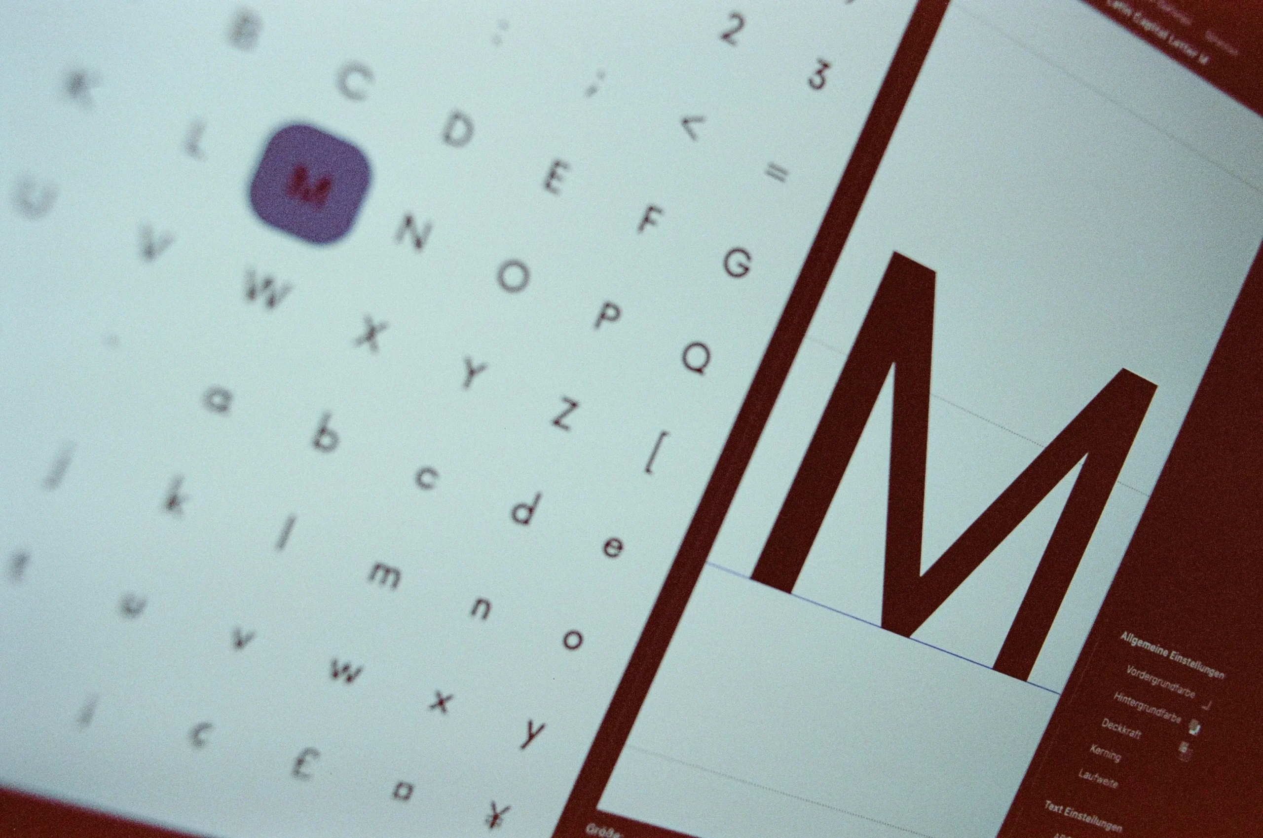
Key Characteristics of Good Body Text Fonts
- Legibility:
- Clarity: The font should be easily readable without straining the eyes. This means avoiding overly decorative fonts for body text and ensuring the design of each character is straightforward and not overly complex.
- Distinct Characters: Each character must be easily distinguishable to prevent confusion. For instance, the lowercase ‘l’ should not look like an uppercase ‘I’ or the number ‘1’. This is crucial for avoiding misinterpretation, especially in apps where precise information is key.
- Readability:
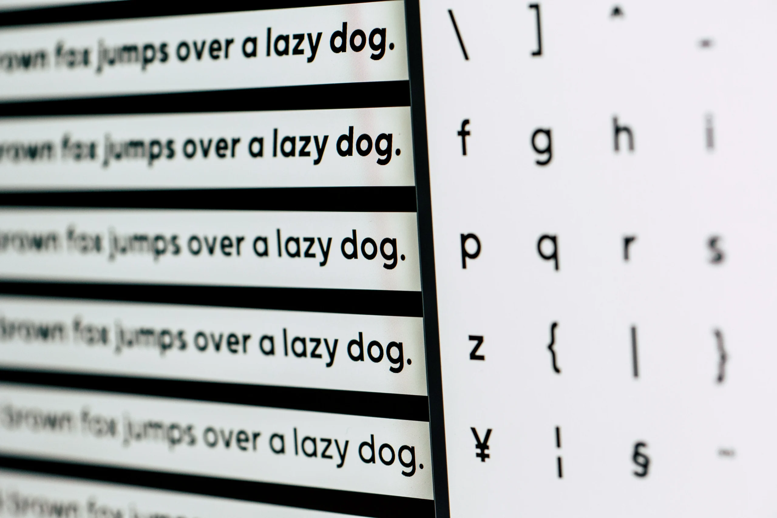
- Comfortable Reading Flow: A good body text font should support a comfortable reading experience, allowing users to read long blocks of text without fatigue. This involves a balance between character spacing (kerning), word spacing, and line length.
- Proper Line Spacing: Adequate line height (leading) is essential to avoid crowding and enhance readability. A general rule is to have the line height 1.2 to 1.5 times the font size, ensuring each line of text has enough breathing room.
- Scalability:
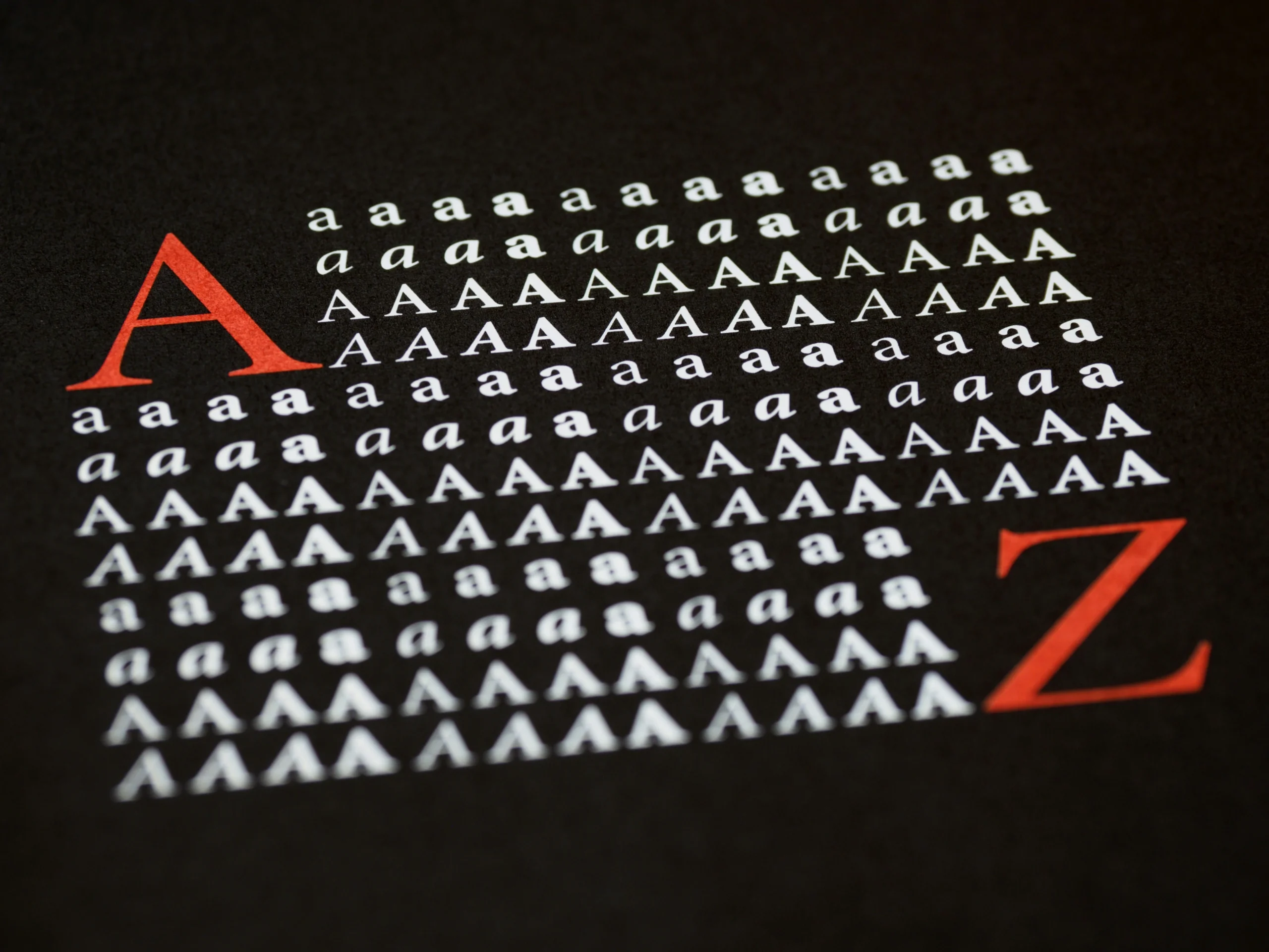
- Versatility Across Sizes: The font should remain legible and visually appealing in various sizes, from small captions to larger text blocks. This ensures consistency in the user experience, whether on a small mobile screen or a larger tablet display.
- Consistency:
- Uniform Stroke Width: The thickness of strokes within characters should be consistent, contributing to a balanced and harmonious appearance. Inconsistent stroke widths can make a font look uneven and disrupt the visual flow.
- Proportional Widths: Characters should have proportional widths to ensure even spacing between letters and words. This prevents the text from looking cramped or overly spaced, enhancing readability.
- Style:
- Appropriate Aesthetics: The font should align with the app’s overall design style and aesthetic. For instance, a modern app might use clean, sans-serif fonts, while an educational app might opt for a more traditional serif font.
- Neutrality: A neutral font does not distract from the content but rather complements it. Overly stylized fonts can draw attention away from the message and make the text harder to read.
- Support for Multiple Languages:
- Extended Character Set: The font should include a comprehensive set of characters to support multiple languages, especially if the app has an international audience. This includes diacritics, special characters, and symbols.
- Accessibility:
- High Contrast: Ensure there is a high contrast between text and background to enhance readability for all users, including those with visual impairments. This involves choosing font colors that stand out against the background color.
- Adjustability: The font should allow for adjustments in size and weight without losing readability or style. This is crucial for accessibility, enabling users to customize the text according to their needs.
- Performance:
- Optimized for Digital Use: The font should be optimized for screen use, ensuring fast loading times and minimal impact on app performance. Web fonts that are lightweight and well-hinted for screen rendering are ideal for maintaining a smooth user experience.
By focusing on these detailed characteristics, you can ensure the selected body text fonts enhance user experience, maintain readability, and align seamlessly with the overall design of your modern app.
Good Body Text Fonts for Readability and User Experience
To achieve a high level of readability and user experience, select fonts that offer clarity and comfort. Fonts like Roboto, Open Sans, and Lato are excellent examples of easy to read fonts that enhance the readability of your app’s body copy. These fonts are designed to be clear and legible at various sizes, ensuring that users can comfortably read long passages of text without straining their eyes.
Roboto: Developed by Google, Roboto is a sans-serif font that offers a modern, clean look with excellent readability. It is widely used in Android apps and provides a professional appearance without compromising on legibility.
Open Sans: Another popular choice from Google, Open Sans is a versatile sans-serif font known for its clarity and friendly appearance. It performs well in both small and large sizes, making it suitable for various types of content.
Lato: Lato is a sans-serif font that combines a sleek, modern design with high readability. It has a slightly rounded feel, giving it a warm and approachable look that works well for body text in many app designs.
Sans-Serif vs. Serif: Which is Better for Your App?
When choosing between sans-serif and serif fonts for body text, consider the context of your app. Sans-serif fonts like Arial and Helvetica are often preferred for digital content due to their clean and modern appearance. They lack the small strokes at the ends of letters (serifs), which can make them look simpler and more streamlined on screens.
Serif fonts like Times New Roman and Georgia can be suitable for apps that require a more traditional or formal look. Serif fonts have small strokes or lines attached to the ends of their letters, which can create a sense of elegance and sophistication. However, they can sometimes be harder to read on smaller screens, so they are often used in larger sizes or for headings.
Consider the overall aesthetic and purpose of your app when choosing between these two styles. For most modern apps, sans-serif fonts tend to be the better choice due to their simplicity and readability on digital devices. However, serif fonts can be effective for certain types of content or apps that aim to convey a sense of tradition or formality.
Google Fonts: Free and Reliable Choices
Google Fonts is an extensive library of free, open-source fonts that designers and developers can use to enhance the visual appeal and readability of websites. Launched by Google in 2010, this service offers a wide variety of font families, including serif, sans-serif, display, handwriting, and monospace fonts. Here’s an overview of what makes Google Fonts an invaluable tool for web design:
1. Wide Selection of Fonts
Google Fonts offers over 1,000 font families, providing designers with a vast array of options to choose from. This includes popular serif fonts like Merriweather, Playfair Display, and Crimson Text, as well as many contemporary serif fonts that can give your website a professional and elegant look.
2. Ease of Use
Integrating Google Fonts into a website is straightforward. Designers can browse the library, select the fonts they like, and embed them into their website using a simple line of code. The service also allows for easy customization, including adjusting the weight, style, and subset of each font.
3. Performance Optimization
Fonts from Google Fonts are optimized for fast loading times, which is crucial for maintaining good website performance. The service uses a global content delivery network (CDN) to ensure that fonts load quickly and efficiently, no matter where the user is located.
4. Cross-Browser Compatibility
Google Fonts are designed to work seamlessly across all major browsers and devices. This ensures that your website’s typography looks consistent and professional, whether viewed on a desktop, tablet, or smartphone.

5. Customization and Flexibility
Google Fonts provides numerous options for customization. Designers can choose from various font weights, styles, and character sets, allowing for a high degree of flexibility in creating unique and visually appealing typography.
6. Open Source and Free
One of the most significant advantages of Google Fonts is that they are open-source and completely free to use. This makes high-quality typography accessible to everyone, from individual bloggers to large corporations, without worrying about licensing fees.
7. Typography Trends and Insights
Google Fonts also provides valuable insights into typography trends. Designers can see which fonts are popular and widely used, helping them make informed decisions about which fonts might work best for their projects.
Google Fonts is an essential resource for anyone involved in web design and development. Its vast library of free, high-quality fonts, combined with ease of use, performance optimization, and cross-browser compatibility, makes it an ideal choice for enhancing the typography of any website. Whether you’re looking for contemporary serif fonts, bold serif fonts, or any other style, Google Fonts has something to meet your needs.
Best Practices for Implementing Easy to Read Fonts in Your App
To implement easy to read fonts in your app, follow these best practices:
- Test Fonts at Various Sizes: Ensure readability across different screen sizes. Test the font in both small and large sizes to ensure it remains legible and visually appealing.
- Maintain High Contrast: Use high-contrast colors for text and background. This enhances readability and makes your content accessible to users with visual impairments.
- Optimize for Performance: Choose fonts that are lightweight and load quickly. This ensures that your app runs smoothly and provides a positive user experience.
- Provide Font Adjustability: Allow users to adjust font size and weight for better accessibility. This ensures that your app can cater to users with specific needs and preferences.
- Consistent Use: Maintain consistency in font usage throughout your app. Use the same fonts for similar types of content to create a cohesive and professional design.
By following these best practices, you can ensure that your app’s fonts enhance readability, accessibility, and overall user experience.
Conclusion: Choosing Good Body Text Fonts for Modern Apps
In conclusion, selecting the right body text fonts is essential for creating a user-friendly and visually appealing app. Focusing on easy-to-read fonts and considering key characteristics such as legibility, readability, and scalability will enhance your app’s design and user experience. The right font can make a significant difference in how users engage with your content, ensuring that your app stands out in a competitive market.
By understanding the importance of font choice and implementing best practices, you can create an app that not only looks great but also provides a comfortable and enjoyable reading experience for your users. At Almax Design Agency, we are committed to helping you choose the best fonts for your modern app, ensuring your content is accessible, engaging, and visually harmonious.
Contact Almax today to see how we can help you with your design challenges!
