
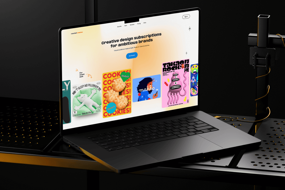
Back in the day, UI design revolved around smartphones and laptops. Now things have flipped upside down: we’ve got tiny smartwatches, giant car dashboards, even foldable screens that open like a book. Designers and developers can’t just recycle old tricks anymore — every new device format demands fresh solutions. And let’s be honest, people expect the interface to look slick and work flawlessly no matter the screen.
Why adaptability goes way beyond smartphones
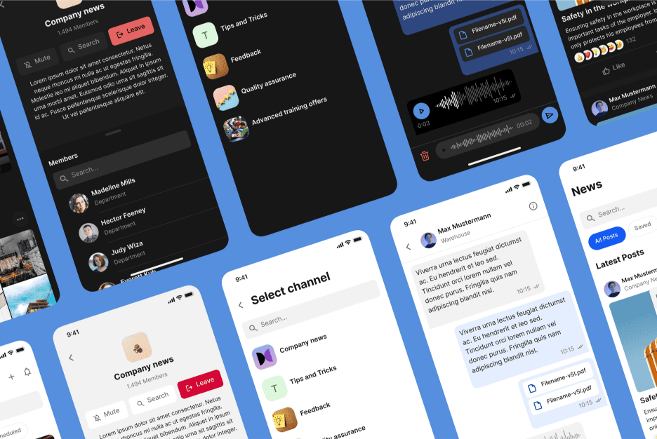
These days, people interact with tech through way more than just phones. Someone’s checking notifications on their smartwatch, another person is scrolling through recipes on a fridge, and someone else is changing songs on a car display. Each of these situations needs a UI that doesn’t make the user suffer.
User Behavior shifts dramatically depending on the device. What feels intuitive on a phone can be totally awkward on a watch or TV. That’s where adaptive design comes in — the ability to shape-shift for any screen size or format.
How tiny smartwatch screens flip the usual rules
Smartwatches are a universe of their own. You can’t just shrink down a normal app and call it a day. Space is ridiculously limited, so designers have to focus on icons, gestures, and micro animations that carry the message instantly.
This is where Micro-UX really shines. Every little vibration, swipe, or tap has to feel precise. Users don’t have time to puzzle over controls — they want quick, frictionless actions.
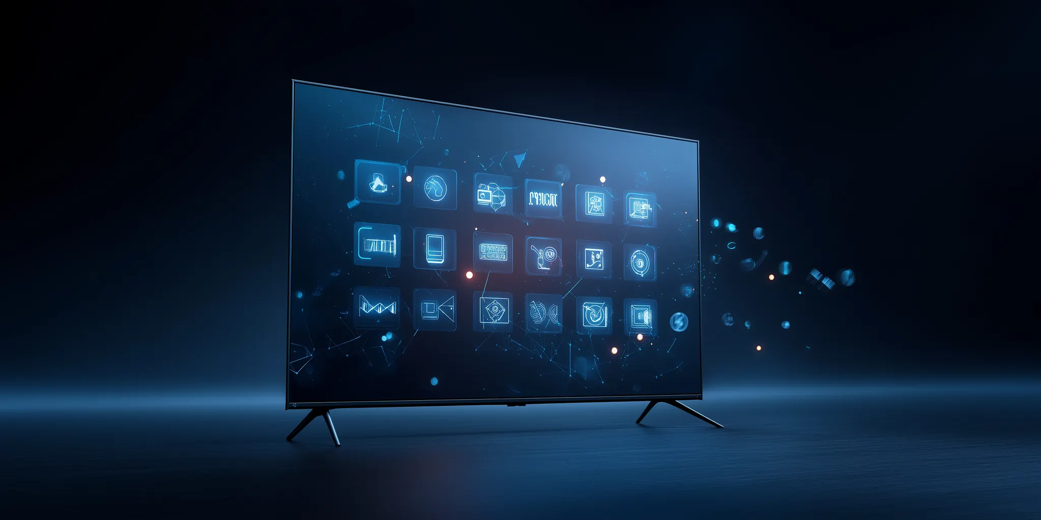
The challenges of car and home panels
Car dashboards and kitchen displays bring their own quirks. Here, clarity and safety are non-negotiable. A driver can’t spend three seconds hunting for a button — everything must be obvious at first glance.
Lighting is another headache. Bright sun or pitch-dark night? The UI must still be readable. That’s why carefully chosen Color Schemes are critical for these environments.
Why foldables demand brand-new patterns
Foldable gadgets are rule-breakers. Your app has to look good both in compact mode and stretched wide open. This means navigation and content layouts need to morph seamlessly on the fly.
Developers are already inventing new design patterns for these devices. Menus that “jump” to a different screen section, or content that rearranges like the pages of a book — it’s all part of making foldables feel natural.
Keeping navigation smooth with almost no screen space
Tiny displays call for stripped-down navigation. Classic tabs and long lists just don’t work. Instead, gestures, swipes, and contextual actions take the spotlight.
A few tricks help keep things usable:
- Group features by priority;
- Hide secondary options in extra menus;
- Use dynamic buttons that adapt depending on the task.
Which UI elements you can cut without killing usability
The hardest part? Deciding what to leave out. On a watch, text labels can often be replaced by icons. On a car display, advanced settings are better buried in menus instead of cluttering the main screen.
Eco-Friendly Design also matters here. Fewer distractions mean lower energy usage and less cognitive load for the user. Clean and simple wins the race.
Gestures and other ways of interacting
Gestures are becoming the universal language of devices. Swiping, pinching, double-tapping — they can replace a ton of buttons when done right. The key is consistency across platforms so users don’t get confused.
But gestures aren’t the only trick in the book. Voice commands, eye tracking, even hand motion sensors are slowly making their way into everyday gadgets.
How to keep visuals consistent on ultra-wide displays
Monitors the size of a desk or full-width car panels test every designer’s patience. How do you keep things from looking stretched and messy?
The modular approach saves the day. Breaking down the interface into blocks makes it possible to rearrange layouts for different devices while still keeping a sense of balance and cohesion.
Testing designs when you don’t have the device
Obvious question: what if you don’t own all these gadgets? Luckily, simulators and emulators let you preview how your UI behaves on different screens.
Remote testing services are another lifesaver. Real people can try your prototypes on their own devices and give feedback. That way, you’ll catch hidden issues before your app goes live.
The future of interfaces in the age of unusual screens
What’s next? Transparent displays, holographic panels, interfaces built into clothing or furniture — these aren’t sci-fi dreams anymore, they’re prototypes already in development.
That’s why flexibility is the superpower every designer needs now. Interfaces can’t be built “once and done” anymore. They have to evolve with the tech, or they’ll be left behind.
