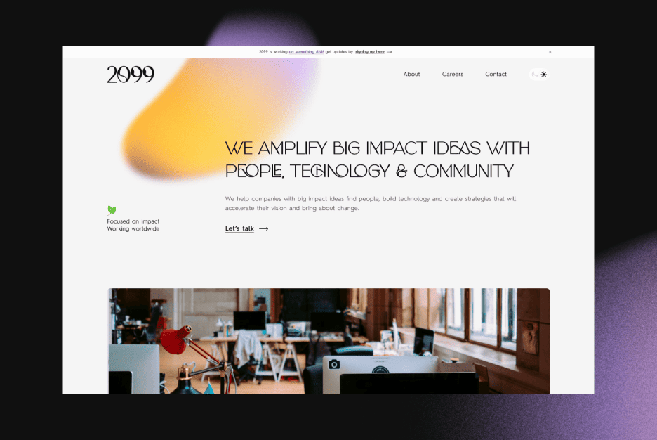

Designers dream in pixels. Developers live in logic. Somewhere between those two worlds, beautiful ideas often get lost in translation. The result? What looked perfect in Figma ends up broken, uneven, or — let’s be honest — slightly embarrassing in production.
Bridging the gap between design and code isn’t about pointing fingers; it’s about communication, structure, and mutual respect. Great products are born when both sides speak the same language — not when they argue over padding values or button sizes.
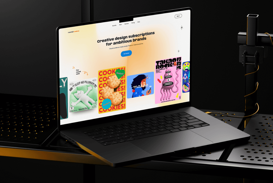
Why the perfect Figma design falls apart in development
That breathtaking layout you crafted in Figma? Yeah, it doesn’t always survive the trip to the browser. And the reason isn’t magic — it’s misalignment between design vision and implementation reality.
Design tools like Figma let you build anything, but development adds rules — frameworks, screen sizes, and real-world constraints. Fonts behave differently in code, animations lag, and your Visual Hierarchy can crumble if the grid isn’t respected.
Developers don’t “ruin” designs; they interpret them. The problem starts when the brief lacks context or clarity. What you saw in Figma is a picture — what they build is a system.
The main reasons for miscommunication between designers and developers
The number one reason projects break down? Assumptions. Designers assume devs will “get it.” Developers assume the mockup is “final.” Spoiler: both are wrong.
Each discipline has its own mindset — designers think in aesthetics and flow, while developers think in logic and structure. That’s why it’s crucial to align early. Walk through the flow together, discuss edge cases, and clarify priorities.
Think of the process like directing Movies and Video Games — you wouldn’t hand an actor a vague script and say “figure it out.” Collaboration is the only way to bring the story to life.
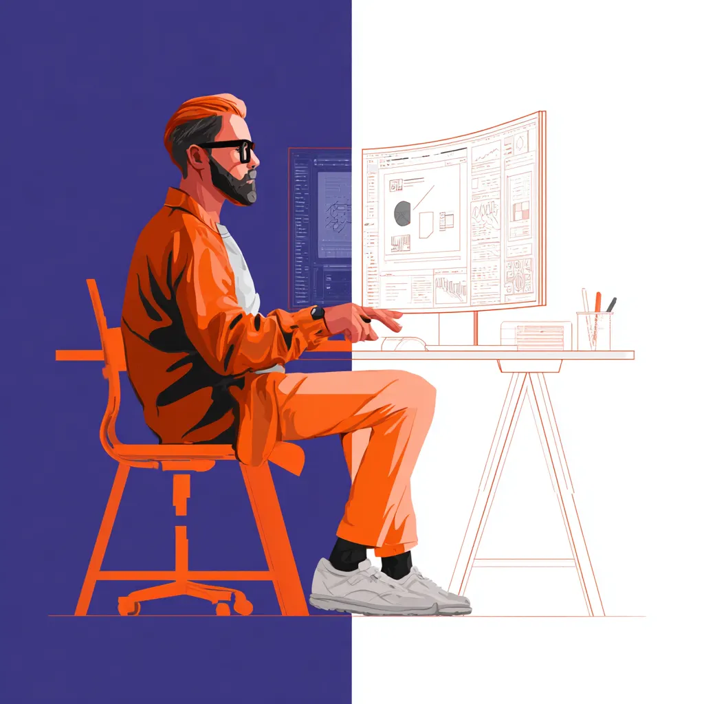
What designers need to know about technical constraints
Designers don’t have to code, but they do need to understand how code works. Knowing the basics of responsiveness, performance, and accessibility saves everyone from painful surprises later.
Here’s what helps every designer work smarter with developers:
- Understand how components behave in different screen sizes.
- Avoid pixel-perfect layouts that ignore real-world limitations.
- Test your work on actual devices, not just Figma frames.
- Learn how spacing and grids impact scalability.
A little technical empathy goes a long way. It’s not about giving up creativity — it’s about designing smarter within constraints, not against them.
How to document interface logic properly
A Figma file alone isn’t documentation — it’s a visual reference. Without context, developers can only guess what you intended. That’s how you end up with inconsistent spacing or animations that look “off.”
Good documentation explains not just what things look like, but how they behave. What happens when a button is clicked? How should an error message appear? What’s the hover state on mobile?
The best teams pair visuals with notes and short explanations. Add annotations, use component descriptions, and link relevant Movies and Video Games references if needed (yes, really — sometimes visual analogies help clarify flow and pacing).
The importance of grids, spacing, and consistent components
Consistency isn’t sexy, but it’s everything. Grids, spacing systems, and shared components are what keep your Visual Hierarchy stable from concept to code.
When spacing is off or elements shift unpredictably, users subconsciously lose trust. Even a single misaligned button can make an interface feel sloppy. Consistent spacing and typography, on the other hand, create harmony — a quiet design Silence that makes everything feel intentional.
If you want developers to match your design pixel for pixel, define your spacing tokens and component library clearly. Treat your design like a system, not a collage.
Style and token mistakes that ruin development
Design tokens are supposed to be the bridge between Figma and front-end — but only if they’re used right. Random font sizes, inconsistent color values, and duplicated elements are a developer’s worst nightmare.
When a designer manually adjusts every headline instead of using global styles, they create chaos. The result? Developers spend hours hunting down inconsistencies instead of building.
Keep your naming conventions logical, your color variables consistent, and your typography rules centralized. Every small detail adds up — especially when your project scales.
Why a prototype isn’t an instruction manual
Prototypes show flow, not function. They help visualize how users move, but they don’t explain how it’s built. Developers can’t guess transitions, timings, or hidden logic just by clicking through your mockup.
Treat prototypes as conversations, not commandments. Walk your team through them, explain intentions, and point out what matters most for Conversion or usability. When context is missing, assumptions take over — and assumptions cost time.
How communication saves a project from chaos
Most design-to-dev nightmares could be avoided with one thing: talking. The earlier, the better. Weekly check-ins, design reviews, and shared workspaces keep everyone aligned.
Good communication also means knowing when to pause. Like Silence in film, quiet reflection moments — “Wait, does this make sense?” — can prevent massive problems later. It’s not just about sharing files; it’s about sharing understanding.
Create feedback loops. Ask questions. Be humble. The smoother your communication, the fewer surprises at launch.
The role of design systems in accurate handoff
A solid design system is like a shared dictionary between teams. It defines components, behaviors, and spacing so both sides can work independently — and still stay consistent.
Design systems aren’t about rigidity; they’re about predictability. When you have one, Figma and code stop being two different worlds. It’s like having subtitles that everyone understands.
The best systems evolve — designers improve visuals, developers refine implementation, and everyone contributes. That’s where creativity and structure meet in perfect balance.
How to test and find discrepancies after launch
No handoff is flawless. Once the design is live, things will look slightly different — that’s normal. What matters is catching and fixing issues early.
Use tools that allow side-by-side comparison between design and production. Zoom in, test across devices, and document every inconsistency. Encourage developers to flag unclear specs instead of guessing.
Testing isn’t about blaming — it’s about alignment. The closer design and development collaborate, the fewer post-launch headaches you’ll face.
Tools that make collaboration easier
Thankfully, we live in a golden age of design-developer tools. Platforms like Zeplin, Avocode, and Figma’s built-in Dev Mode make asset handoff almost effortless.
These tools translate design language into developer-friendly specs, removing ambiguity. But remember: tools don’t replace communication — they support it. Technology can simplify workflows, but it can’t replace human clarity and Trust.
The gap between design and development isn’t a wall — it’s a bridge waiting to be built. When designers respect technical reality and developers appreciate creative vision, the end result feels cohesive and intentional.
It’s not about “perfect handoff” — it’s about shared purpose. The kind of collaboration that turns pixels into real products people love
