


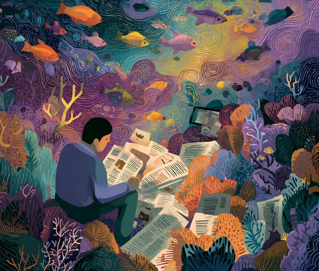
There’s a moment we’ve all experienced: you open a website or app, expecting clarity, and instead you’re hit by more text, buttons, colors, and sections than your brain signed up for. Suddenly your eyes start darting around like you’re decoding a secret map. Modern life throws endless streams of information at us — and somehow, design is the only thing standing between us and total overload. When it works, you barely notice it. When it doesn’t… well, you probably close the tab. Let’s talk about why thoughtful structure, smart visuals, and even the tiniest Fonts Shape decisions literally help your brain breathe.
Why Information Chaos Has Become the New Normal
We live in an age where every platform is competing for attention, which means more content, more features, more everything. It’s not that the world suddenly got messier — it’s that humans developed tools like AI that produce information faster than we can process it. The irony? The more “smart” systems we build, the harder it becomes to stay oriented.
This chaos doesn’t look dramatic. It’s quietly draining. Your brain isn’t designed to evaluate dozens of stimuli per second. It’s designed for patterns. When there are none, you feel mentally tired for reasons you can’t quite explain. That’s where design steps in — not to decorate, but to organize the noise.
How Design Turns a Flood of Data Into a Clear Map
When done well, design acts like a guide holding a lantern in a dark cave. It highlights what matters, dims what doesn’t, and gives every piece of content a place to stand. This isn’t magic — it’s structure. We interpret visuals long before words, so good designers use that instinct to create a sense of direction.
Think about metro maps. They simplify reality just enough to be useful. They don’t show buildings, elevations, or every tiny street. Only the essentials. Digital products work the same way: without that reduction, you’re not navigating — you’re surviving.
Why Visual Structure Matters More Than the Amount of Content
You can give a user ten paragraphs or a hundred — if the structure is intuitive, they’ll manage. If it’s not, even a short page feels overwhelming. Visual structure is the skeleton of comprehension. People want pathways, not piles.
That’s why products with heavy content often feel surprisingly simple: the visual organization does the cognitive heavy lifting. It’s the difference between a messy closet and one where everything has a shelf. Same objects, totally different emotional reaction.
How Hierarchy Helps the Brain Find What Matters Fast
Hierarchy is one of those invisible forces you only notice when it’s missing. It tells your eyes where to look first, second, and third. If everything screams, nothing speaks. That’s when people bounce.
Hierarchy also taps into our instinctive reading patterns. We naturally process big shapes before small ones, bold before light, bright before muted. Designers build on these tendencies to create a visual rhythm that quietly guides you — almost like a trail of breadcrumbs.
Why Minimalism Makes Complex Systems Feel More Human
Minimalism isn’t about empty spaces and fancy aesthetics. It’s about reducing friction. The fewer decisions a person has to make, the smoother their experience becomes. Suddenly a complicated tool feels friendly — approachable even.
Of course, minimalism can be taken too far. Good minimalism isn’t about removing features. It’s about removing confusion. It’s a negotiation between clarity and function, not a purity contest.
How Typography Directs the Eye and Reduces Cognitive Load
People underestimate how much Fonts Shape their experience. Typography is not decoration — it’s architecture. The right type choices create spacing, rhythm, and emphasis that help the brain digest content without strain.
And with Font Trends shifting toward more humanistic, readable forms, we’re seeing a cultural move away from hyper-polished aesthetics toward clarity and warmth. Your eyes know the difference even if you don’t consciously notice.
Before a user reads the message, they feel the typography. That emotional pre-reading is powerful — and often the key to reducing overload.
Why Color Helps Classify Information Better Than Words
Color coding is one of the oldest cognitive tools we have. Our brains recognize hues faster than meaning, which makes color a perfect assistant for grouping, separating, and highlighting information.
Imagine a calendar with no colors — pure text. You’d immediately feel lost. Color turns data into something scannable. It’s not about making things pretty; it’s about making them understandable in milliseconds.
Why People Understand Visual Metaphors Faster Than Text
Humans have always communicated through symbols. A folder icon means storage. A heart means love or saving. A trash bin means delete. You don’t need instructions — your brain fills the meaning automatically.
Visual metaphors compress knowledge into a single glance. That’s efficiency at its finest. And in an environment with too much content, metaphors become shortcuts your mind gratefully accepts.
Why Users Get Lost When Visual Flow is Broken
A design without flow feels like a conversation where someone keeps interrupting you. You lose the thread. Your attention scatters. You become frustrated.
Flow is built on spacing, alignment, micro-transitions, and predictable movement. When any of these elements is off, the mental friction spikes. Users don’t articulate it — they just abandon the experience.
Mistakes That Turn an Interface Into a Maze
Before the list, let’s acknowledge something: no one sets out to design a maze. It usually happens when features outpace clarity or when visual consistency slowly erodes.
Here are the most common pitfalls:
- Too many competing focal points
- Missing or inconsistent hierarchy
- Overly decorative elements that distract from meaning
- Colors used emotionally instead of functionally
- Typography mismatched with content density
Each mistake adds a tiny bit of friction — and friction adds up fast.
Companies That Won Thanks to Clear Information Architecture
Some of the world’s strongest digital products didn’t win by being the most beautiful — they won by being the clearest. Think about platforms like Airbnb, Notion, or Apple’s ecosystem. They take massive amounts of data and serve it in a way that feels almost… calm.
What these companies share is a devotion to structure. They treat information design as seriously as visual aesthetics. The result is trust, loyalty, and experiences people return to without hesitation.
Good information architecture is invisible, but its absence is loud.
