


Sometimes a brand feels expensive, trustworthy, friendly, or absolutely chaotic before you even read a single word. That “gut feeling” isn’t magic — it’s typography doing heavy lifting behind the scenes. Fonts build atmosphere, personality, and expectations faster than the logo, layout, or color palette. And somehow, against all odds, Comic Sans refuses to die. Let’s break down why.
Why Typography Affects Emotions More Than We Expect
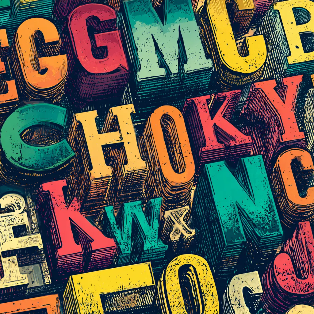
Fonts are basically the emotional soundtrack of design. You can show two identical phrases in two different typefaces, and people will read them with totally different feelings — excitement, warmth, discomfort, or even suspicion. It’s wild how a slight curve or subtle weight change can shift the viewer’s whole interpretation.
There’s psychology behind this. Our brains subconsciously associate shapes with emotional cues. Rounded letters feel friendlier, sharp angles feel more intense, and geometric styles often communicate structure. Even Voice Search interfaces rely on recognizable visual cues to avoid cognitive overload. Typography shapes the tone long before the rest of the interface has a chance to speak.
How a Typeface Creates a Brand’s First Impression
Before a visitor interacts with anything — buttons, menus, content — the typeface sets the tone. That first flash of text is a silent handshake. A brand that uses refined typography instantly feels more credible, while something sloppy can make people bounce before they explore.
Good typography becomes part of User Experience, not decoration. Brands that understand this don’t treat fonts as background noise. They treat them as active participants in guiding emotion and expectation. If the vibe feels wrong, users sense it immediately, even if they can’t explain why.
Why Some Fonts Inspire Trust While Others Trigger Annoyance
Trust is a fragile thing, and type can either strengthen it or destroy it. Serif fonts often signal expertise or heritage, which is why so many financial or academic institutions still use them. Meanwhile, super-modern sans serifs feel clean and efficient.
But then there are fonts that trigger immediate irritation — often because they look cheap, childish, or overly decorative. Bad type choices become silent Mistakes that damage credibility. A fancy script might look “pretty,” but if users struggle to read it, trust plummets. Emotional friction beats visual charm every time.
How Font Style Shapes the Tone of Communication
Fonts act like voice actors. They determine if your message sounds serious, playful, sarcastic, elegant, or rebellious. That tone needs to match the brand’s core personality — otherwise the whole experience feels disjointed.
Every curve, weight, and proportion affects mood. A narrow, tall font feels formal and tense. A wide one feels laid-back. A chunky bold headline screams, while a thin delicate one whispers. This relationship between style and tone matters even more when brands want consistency across generations of users with different expectations.
The Role of Contrast, Rhythm, and Proportions in Shaping Emotion
Typography isn’t just about choosing a single font. It’s about how that font behaves in the entire system. Good rhythm and hierarchy guide the user’s eye, creating harmony. Poor spacing, mismatched weights, or weird proportions generate subtle discomfort.
Before long, users experience emotional fatigue without knowing why. And when that happens, they don’t blame themselves. They blame the brand. Contrast and rhythm help people absorb information effortlessly, reducing friction and boosting satisfaction.
Why Brands Use Custom Typefaces to Strengthen Identity
Custom fonts are like bespoke suits — expensive, but they fit perfectly. Companies invest in them because typography is a long-term asset that increases recognizability.
A custom typeface elevates consistency across platforms, including places where logos aren’t present. Think packaging, apps, billboards, or Voice Search previews. The typeface becomes a signature. When people recognize a brand’s font instantly, you know the design team is doing something right.
The Strange Phenomenon of Comic Sans and Why It Still Survives
Ah, Comic Sans — the font everyone loves to hate. Designers have tried to bury it for decades, yet it keeps resurfacing like a stubborn cultural relic. The reason is painfully simple: people find it approachable.
Comic Sans feels casual, harmless, almost human. Its round shapes appeal to younger audiences and non-designers who don’t care about refined taste. Psychology works differently outside the design bubble — many users want warmth more than sophistication.
Is it “good” typography? Usually not. But is it effective in the right context? Absolutely.
How the Wrong Typeface Can Destroy a Brand’s Image
Nothing ruins branding faster than a font that contradicts the intended mood. A luxury brand with a childish typeface looks ridiculous. A serious company with overly decorative lettering feels unprofessional. A tech startup using heavy Gothic type suddenly looks like a metal band.
Here are common typography disasters:
- Using fonts that clash with the brand’s personality
- Choosing styles that hurt readability
- Mixing too many contrasting typefaces without logic
These aren’t tiny issues. These are silent Mistakes that push users away without them even understanding why.
Why Truly Universal Fonts Don’t Exist
Some designers dream of “perfect fonts” that work everywhere. Unfortunately, that’s a myth. Every font communicates something — calmness, authority, playfulness, tension — and no single typeface can cover all emotional territories.
Different audiences, markets, and generations interpret shapes differently. What feels trustworthy to one group may feel boring to another. That’s why font choice must be intentional, not automatic.
How to Test Typography With Real Users
Choosing a font isn’t guesswork — it’s an experiment. Real users should “feel” the type in natural contexts, not in perfect Figma screens. Designers often assume readability equals effectiveness, but emotional resonance matters just as much.
Before finalizing typography, test:
- Emotional reaction
- Comfort during longer reading
- Clarity in small sizes
- Behavior on different screens
User testing saves brands from costly redesigns and teaches teams how typography influences mood in real scenarios.
Why Typographic Trends Keep Returning
Typography trends are cyclical because human emotion is cyclical. What feels “fresh” eventually becomes saturated. Then designers crave contrast — something nostalgic, experimental, or raw. Trends return not because they’re fashionable but because they fill emotional gaps the market creates.
We saw it with brutalism, retro typefaces, bold serifs, handwritten styles — and yes, even Comic Sans making ironic comebacks.
Brands That Built Their Personality Around Typography
Many iconic brands didn’t just choose fonts — they built identities around them. Think of Vogue’s iconic serif, Airbnb’s approachable rounded sans serif, or Spotify’s energetic geometric style. Each one communicates far more than words ever could.
Some brands update their typefaces across generations to keep emotional relevance, while others embrace timeless direction. Typography becomes the foundation of their storytelling long before visuals or slogans enter the picture.
