


You can have the flashiest colors, slickest animations, and the boldest Font Trends—but if users can’t figure out where to click, your beautiful masterpiece might as well be a maze. Great websites don’t start with beauty; they start with brains. The logic behind every button, label, and page structure shapes how people feel, stay, and act on your site. Let’s dig into why information architecture is the real hero behind online success.
Why Pretty Wrapping Doesn’t Save a Messy Structure
Imagine walking into a fancy restaurant where the décor screams luxury—but there’s no menu, no signs, and the staff just points vaguely toward the kitchen. That’s what a poorly structured website feels like. It doesn’t matter how stunning it looks if visitors feel lost after three clicks.
The truth? People don’t stay for beauty—they stay for clarity. A clean layout is useless when your users can’t find the “Buy” button. Beauty catches attention, but logic earns trust. Design without direction is like icing on an invisible cake—sweet but pointless.
Information Architecture as the Backbone of Digital Experience
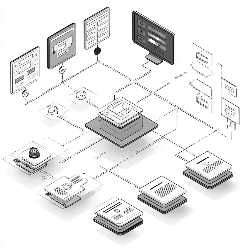
Think of information architecture as the skeleton of a website—it holds everything together. It’s about organizing content in a way that makes sense to both the brain and the heart. Good structure ensures users move smoothly from curiosity to conversion without friction.
Real-world example: Amazon’s early success wasn’t about being pretty—it was about being easy. Categories, filters, breadcrumbs—they turned chaos into comfort. Behind every seamless experience hides a brilliant plan. That’s the quiet power of information architecture.
How Visitors Think, Click, and Get Lost Online
Ever wondered why people rage-click the same button five times? It’s not impatience—it’s confusion. Users don’t read, they scan. Their brains look for patterns and cues, which means one misplaced label can send them spiraling into frustration.
Psychology plays a massive role here. Users subconsciously expect familiar paths—like “Cart” in the top-right corner or “Contact” at the bottom. Break those expectations, and they break up with your site. It’s not personal—it’s cognitive overload.
Logic vs Chaos — Why Simplicity Always Wins
Minimalism isn’t just a trend; it’s a survival strategy. The more mental energy users spend figuring out your layout, the less they enjoy your content. Logical structure means faster decisions and happier visitors.
Let’s be real—chaotic websites look like they were built during a caffeine rush. Simple ones feel peaceful. In design, peace equals conversion. Because when everything just makes sense, people stick around.
The Sitemap as a Mental Map for Users
A sitemap isn’t just a technical diagram—it’s a psychological roadmap. It helps you visualize how users move through your space before they even arrive. If a visitor can predict where something should be, you’ve nailed it.
When planning a site, think like your users. Ask:
- What’s the first thing they want to do here?
- How many clicks will it take to get there?
- Where might they hesitate or backtrack?
These questions turn a vague layout into an intuitive flow. Remember, people love predictability—it gives them confidence.
The Power of Content Hierarchy and Priorities
Hierarchy isn’t about who’s boss—it’s about what matters first. Your website should whisper: “Start here.” Good hierarchy guides the eye naturally from headline to button to result.
To master it, try this: squint at your homepage. Can you still tell what’s important? If not, your hierarchy needs a workout. Even color, spacing, and Font Trends help guide focus when used smartly. Subtle cues can lead users straight to where you want them—without shouting.
Why Navigation Is the Language of a Website
Navigation isn’t decoration—it’s conversation. It’s how your site talks to its visitors. Every link, menu, and breadcrumb tells a story about how much you respect their time.
Bad navigation feels like bad directions—confusing, frustrating, and rude. Great navigation feels invisible because it just works. The goal is not to make users think, but to make them feel smart for using your site. That’s the magic of intuitive communication.
Mistakes That Destroy Architecture Even for Big Brands
Even giants stumble. Ever landed on a major retailer’s site and thought, “Where’s that product again?” It happens when companies focus too much on trends and forget logic.
Common mistakes include:
- Overstuffed menus with too many options
- Inconsistent labels that confuse instead of clarify
- Ignoring mobile flow while obsessing over desktop design
A bit of Gamification can make exploring fun, but it can’t fix chaos. If your site’s structure feels like a puzzle, you’ve already lost half your visitors before they even start playing.
How Logic Makes Beauty Even Stronger
Here’s the twist—logic doesn’t kill creativity. It supercharges it. When your site structure is clear, your visuals shine brighter. Every color, photo, and animation suddenly feels intentional.
A designer’s best friend is a well-organized plan. Logic provides the boundaries where creativity thrives. It’s like jazz—you can improvise, but only if you know the rhythm. That’s how the smartest teams make beauty feel effortless.
Why Every Great Website Starts with Understanding, Not Button Colors
At the end of the day, users remember how your site made them feel—not what font you used. A logical flow gives them comfort; beauty just seals the deal. Start with empathy, test often, and never stop refining.
Because when your structure makes sense, everything else—design, storytelling, even Gamification—starts to click naturally. Great websites aren’t built to impress; they’re built to connect. Logic first, always. Beauty will follow.
