


Luxury in design used to scream. Now it whispers — and somehow that whisper feels more expensive than any glossy gradient or overloaded interface from the 2010s. The new premium aesthetic is calm, airy, emotionally warm, and surprisingly human. Users are tired of digital noise, overloaded layouts, and “premium but cold” visuals. They want interfaces that breathe. They want space. They want meaning. And they want brands that feel alive, not polished to the point of sterility. Let’s dive into why modern luxury design looks completely different — and why this shift isn’t just a trend but a reflection of how people connect with brands now.
Why the Meaning of Luxury in Design Changes Faster Than Trends
Luxury used to be about excess — intricate details, heavy graphics, intense visual density. Today, that approach feels outdated because digital environments have become overstimulating. People interact with dozens of apps every day, and their brains crave simplicity. Modern premium brands understand that attention is a scarce resource, so they use minimal visual clutter and thoughtful spacing to create a calm emotional rhythm.
Another reason this transformation happens so quickly is the cultural shift toward authenticity. “Perfect and polished” once symbolized professionalism. Now it feels artificial. Contemporary luxury aligns with honesty, emotional resonance, and subtle cues that say, “We respect your time and mental energy.” This is why soft textures, natural colors, and thoughtful micro-details define today’s top-tier aesthetic.
How Minimalism Became Warm Instead of Cold
Minimalism used to look sterile — white backgrounds, rigid grids, soulless geometry. But designers finally understood that removing noise doesn’t mean removing humanity. By adding warmth through thoughtful color shapes, gentle shadows, textured surfaces, or soft illustrations, minimalism transformed into something comforting.
This warm minimalism communicates maturity. When brands remove unnecessary elements, they show confidence. They don’t need to shout to be heard. They create emotional clarity, not cold emptiness. It’s a shift from “empty” to “breathable,” and users feel that difference instantly.
Why Air in the Interface Is Now More Valuable Than Ornamentation
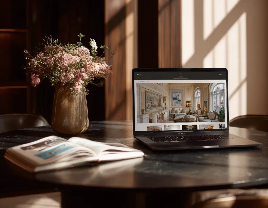
White space (or “air”) is not a lack of design — it is design. Modern luxury uses air like a material: deliberately, strategically, and respectfully. When a layout gives content room to breathe, it feels elevated. Air signals sophistication because only confident brands allow themselves to focus on what truly matters.
Air also improves onboarding, increases clarity, and reduces friction in interactions. Users no longer perceive space as “wasted,” but as a sign that the brand respects their cognitive capacity. Space guides the eye more effectively than any decorative detail.
The Role of Human Details in Creating a Premium Modern Style
Human-centered luxury doesn’t rely on flashy visual tricks. Instead, it uses micro-gestures of empathy: a friendly tone of voice, small illustrations that feel handcrafted, or subtle animations that respond to the user’s presence. These human elements turn an interface from “expensive-looking” into “emotionally intelligent.”
Brands are rediscovering the value of storytelling through facial expressions, soft textures, and relatable content. In an era where AI generates everything, authenticity — even in tiny details — becomes the new premium currency.
How Emotional Warmth Replaces Expensive Visual Effects
Previously, expensive meant dramatic lighting, glossy gradients, and complex transitions. Now it’s all about how the user feels. Emotional warmth is created through the combination of soft tones, calm pacing, and microinteractions that feel natural. When an interface removes pressure, welcomes the user gently, and avoids overwhelming them, it becomes luxurious in a completely new way.
Instead of intense visual fireworks, brands use mood. Calm animations. Slow transitions. Gentle micro-feedback. This creates a sense of presence and care that no glowing effect can replicate.
Why Brands Move from “Glossy” to Quiet Sincerity
The glossy digital aesthetic feels outdated because it promises perfection nobody believes in anymore. Transparency, sincerity, and timeless visuals resonate deeper than flashy special effects. The new luxury is emotional stability — the feeling that a brand is grounded, thoughtful, and emotionally intelligent.
As users move away from loud marketing and high-pressure messaging, they appreciate brands that look calm, confident, and honest. Quiet sincerity communicates long-term value.
The New Aesthetic of Slow Interfaces and Why Users Love It
Slow interfaces don’t mean slow performance. They mean slow experience: gentle animations, soft transitions, subtle delays that make actions feel intentional. These slow moments replicate the feeling of walking into a boutique rather than scrolling through a hyperactive feed.
This “digital mindfulness” provides a premium emotional journey. It contrasts beautifully with the speed and chaos of everything else online.
Why Visual Silence Has Become a Symbol of Brand Confidence
Visual silence — the deliberate absence of noise — is the new status symbol. Brands that embrace it show certainty in their message. They don’t need glowing animations, oversized typography, or screaming colors. They let stillness express maturity.
Visual silence also increases clarity, strengthens message delivery, and reduces cognitive overload. It’s premium because it feels intentional — not lazy. And users intuitively sense that.
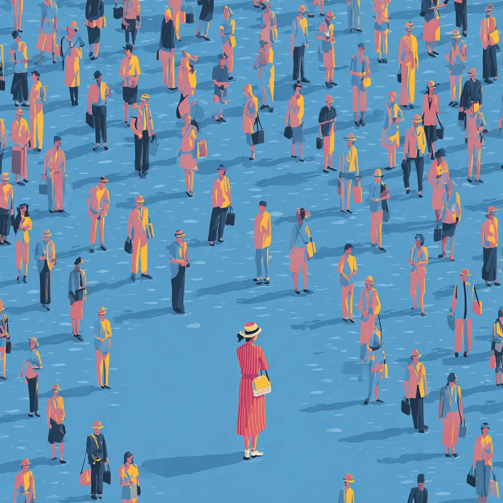
How Personalization Turns Simplicity Into Exclusivity
Minimalist interfaces run the risk of looking similar — unless personalization enters the equation. When an interface adapts to the user’s context, habits, or environment, simplicity becomes bespoke. Personalized microcopy, adaptive layouts, changing tones, and custom visuals turn a calm interface into a unique and intimate experience.
Here are a few ways personalization creates luxury:
- Adapting layout pacing to user behavior
- Adjusting tones or themes to mood or context
- Using microcopy that feels handcrafted
- Highlighting elements based on subtle habits
This level of attention makes users feel seen, not marketed to.
Common Mistakes That Prevent Design From Looking Premium
Before we dive into examples, here are frequent mistakes that instantly kill the feeling of modern luxury:
- Overusing decorative accents instead of meaningful spacing
- Mixing too many fonts or inconsistent styles
- Adding animations just because “it looks cool”
- Using harsh tones instead of refined gradients
- Overcompressing layouts to fit “more information”
These errors don’t just harm aesthetics — they break emotional resonance and downgrade the brand’s perceived value.
Brands That Successfully Shifted to the Modern Luxury Aesthetic
Many companies have already embraced this subtle luxury movement. From boutique hotels to fintech apps, they all share one approach: confidence through clarity. A few standout examples include brands that emphasize air, mindfulness, and human-centered storytelling rather than heavy gloss.
These companies didn’t just redesign visuals; they redesigned emotions. They built trust, presence, and warmth by removing everything unnecessary and keeping only what strengthens the relationship with the user.
