


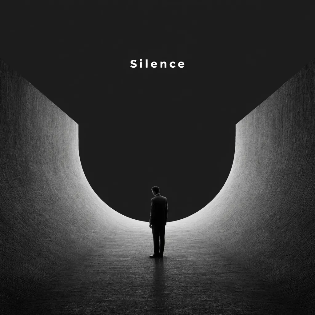
You know that moment when you open an app or website, and everything just feels right? Nothing screams for your attention, yet somehow, every detail stands exactly where it should. That’s not magic — that’s the power of silence in design. The space between elements, the breathing room, the pauses — they all work together to make your eyes relax and your mind say, “Yeah, this feels good.”
Let’s dive into why silence can be louder than chaos and how calm layouts can hit harder than flashy visuals.
Why Silence in Design Speaks Louder Than Words
Ever noticed how some interfaces just make you breathe? They don’t bombard you with pop-ups, banners, or a million buttons. Instead, they whisper. They give you room to think, to explore, to feel. Silence in visual design isn’t about doing nothing — it’s about doing less but doing it intentionally.
Think of it like music. The pause between notes creates rhythm, emotion, and drama. Without silence, even the best melody turns into noise. The same goes for digital design — without visual rest, users drown in information.
Pauses, Emptiness, and the Breathing of an Interface
Whitespace is the lungs of design. Without it, everything suffocates. When you let your layout breathe, users can focus on what truly matters — not just what looks shiny. Empty space guides attention better than arrows or animations ever could.
The best interfaces feel like a well-paced conversation. They have pauses, emphasis, and rhythm. They breathe. When you scroll through something that feels effortless, that’s not luck — it’s careful planning and a lot of Brainstorming behind the scenes.
Balance Between Content and Space as the Foundation of Perception
Balance is what keeps your design from collapsing under its own weight. Too much content — and it feels cluttered. Too much space — and it feels empty. The trick is finding that sweet spot where every pixel has a purpose.
Imagine reading a book with no paragraphs or margins. Nightmare, right? The same logic applies here. Space helps information flow naturally, allowing the eye to move smoothly and the mind to process faster.
The Psychology of Emptiness and How the Brain Reacts to Visual Pauses
Here’s a fun fact from Psychology — our brains love order and patterns. When something is too noisy or visually heavy, our cognitive load increases, and we tune out. But when there’s balance and rest, the mind feels safe, comfortable, and open to engage.
Empty space isn’t “nothing.” It’s mental oxygen. It gives your audience’s brains a chance to process, breathe, and connect emotionally. That’s why clean, calm designs often feel more premium and trustworthy — they let users think clearly without stress.
White Space as a Tool for Emphasis and Meaning
White space is not wasted space — it’s a secret weapon. Designers use it to highlight key elements, add rhythm, and direct attention naturally. Apple’s website, for example, is practically a masterclass in using space to sell luxury and focus attention.
When everything screams for notice, nothing stands out. But when you give your message room to shine, it hits ten times harder. Silence, in this case, amplifies meaning.
When Design Stops Shouting and Starts Convincing
We live in a world of loud visuals — bright colors, motion, endless notifications. But real persuasion doesn’t come from shouting. It comes from confidence. Minimal, calm designs feel self-assured, like someone who doesn’t need to yell to be heard.
When a product “speaks softly,” it feels more genuine. It earns trust. It’s the same reason a calm speaker often holds the crowd better than the loudest one in the room.
Mistakes with Empty Space That Kill Good Ideas
Let’s face it — whitespace is easy to mess up. Too much, and your layout looks unfinished. Too little, and it becomes visual chaos. Many beginners either fear space or overuse it.
Here are the most common blunders to avoid:
- Cramming every pixel with content “just to fill space.”
- Ignoring alignment and rhythm — space needs structure, not randomness.
- Treating whitespace as an afterthought instead of a core design element.
Empty space isn’t decoration — it’s part of the message.
Using Rhythm and Pauses in Typography and Grids
Typography isn’t just about picking fonts — it’s about tempo. The rhythm between lines, the spacing of paragraphs, and the grid structure all create a visual heartbeat.
Good rhythm keeps users moving naturally through content. It’s like guiding them through a story, one breath at a time. When designers plan spacing carefully, they’re basically composing a visual melody. And like any melody, it’s all about the pauses.
How “Silence” Strengthens Branding and Builds Trust
Silence doesn’t just make design beautiful — it shapes Branding. Brands that embrace calm, spacious layouts often appear more elegant and confident. Think of high-end fashion labels or tech companies that rely on visual restraint to communicate sophistication.
People subconsciously associate space with quality. When a brand isn’t trying too hard to grab attention, it feels established, reliable, and timeless. That’s the power of minimalism — it lets your message speak without shouting.
Why the Future of Interfaces Belongs to Thoughtful Minimalism
Digital noise is exhausting. As screens get smaller and attention spans shorter, minimalism is becoming less of a trend and more of a necessity. The future belongs to interfaces that respect the user’s focus.
Designers are already moving toward clarity, calm colors, and human-centered flow. The next generation of digital experiences won’t try to overwhelm — they’ll invite, guide, and gently persuade. Silence isn’t the absence of design; it’s the highest form of it.
