

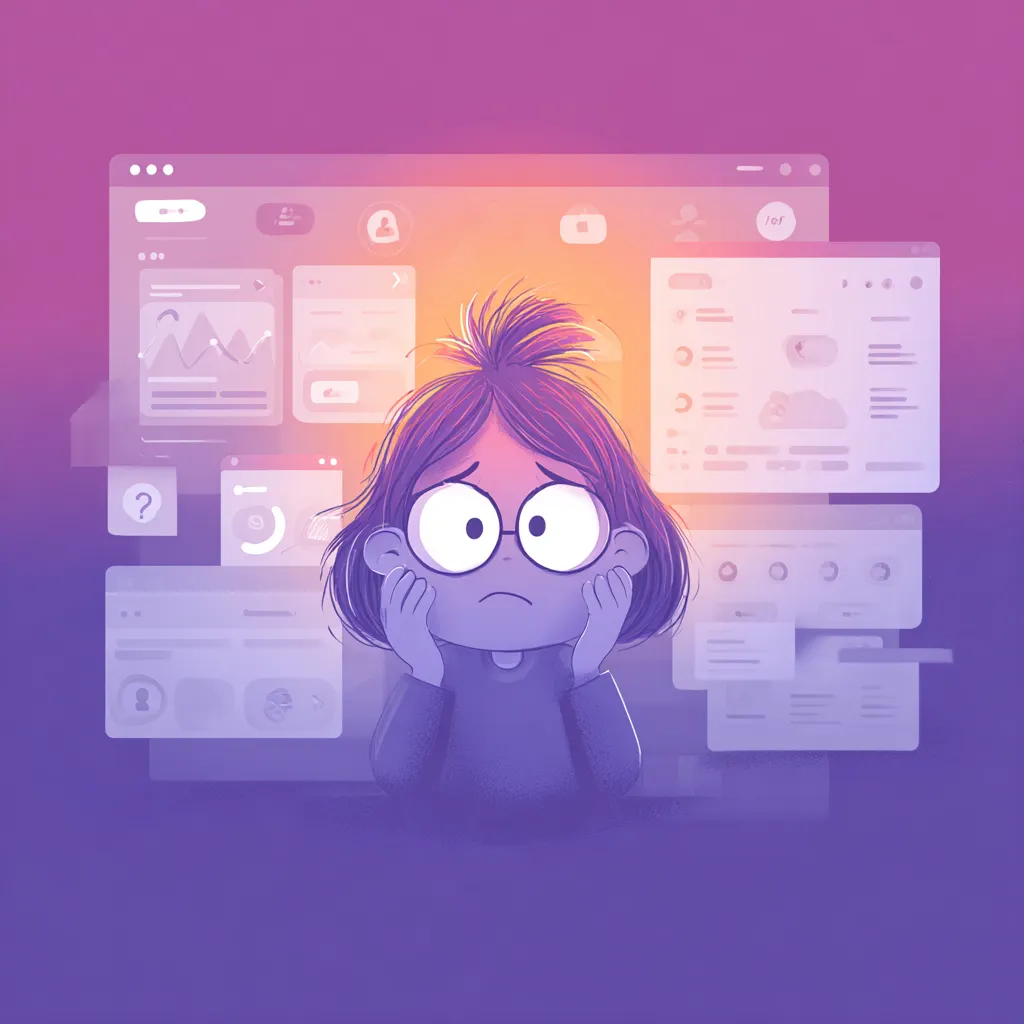
If you’ve ever clicked on a button that didn’t respond, squinted at low-contrast text, or tried to navigate a site that felt like a maze designed by a sleep-deprived raccoon — congratulations, you’ve experienced bad UI. And here’s the kicker: many of those issues come from designers who genuinely didn’t see the problem. Not because they’re careless, but because the human brain has a fun tendency to “autocorrect” visual flaws when you stare at the same screens for too long.
The truth is, users judge harshly and instantly. Designers don’t get the luxury of explaining their decisions — the interface either works or it irritates. This article digs into those subtle UI Mistakes that quietly destroy user patience, conversions, and trust, all while remaining practically invisible to the person who created the design.
Why designers stop noticing their own errors
When a designer spends weeks staring at the same interface, something strange happens: the brain starts filling gaps automatically. Buttons feel clickable even when they’re not. Gaps seem aligned even if they’re slightly off. It’s like design tunnel vision — everything begins to look “normal.”
This over-familiarity makes it easy to miss broken flows or confusing elements that a new user would instantly notice. The designer sees intention; the user sees friction. The only way out of this trap is to keep stepping back — literally and mentally — and look at the product with fresh eyes. Or someone else’s eyes. Preferably someone who has no emotional attachment to your beautiful Color Schemes.
How visual fatigue hides the obvious
Visual fatigue creeps in quietly. After dozens of iterations, your once-sharp attention softens, and small flaws disappear into the background. It’s the design equivalent of walking past a crooked painting every day and eventually not noticing it’s crooked.
This is why designers often miss inconsistent paddings, misaligned icons, and text styles that don’t match the Brand Guide. Users spot these instantly because they don’t have the same mental “autocorrect” running in the background. Their first impression is fresh; the designer’s is long gone.
One simple trick that works wonders: leave the design for a day and return with rested eyes. Suddenly the “perfect” section spacing looks like a tragic accident. Magic.
Micro-elements that ruin the whole interface
It’s not always the big things — sometimes the smallest grains of sand ruin the entire machine. Micro-elements might look harmless, but they shape how the whole UI feels. A sloppy tooltip, a slow hover effect, or a pixel-off icon can make the product seem clumsy.
Users love smoothness. They love when a button reacts instantly and a card expands exactly as expected. When these tiny responses fail, the interface feels rigid or lifeless. And if an app feels lifeless, it also feels outdated. Even an Eco-Friendly product won’t convert if the interface behaves like it’s stuck in 2013.
Before launch, create a checklist of micro-interactions. Look for changes in state, cursor feedback, press behavior, and transitions. It’s shocking how many products skip this step — and pay the price.
When too much creativity becomes a problem
Designers adore experimenting. That energy creates innovation, but it also creates UI chaos when creativity becomes the priority instead of usability. Users don’t want to “discover” how to use the product. They want clarity, familiarity, and flow.
A wildly inventive menu or reinvented scroll interaction might win a design award but lose 30% of users in real life. Aesthetic bravery is great — but not at the cost of brains.
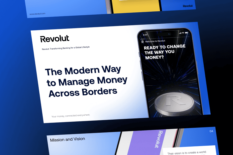
The most effective digital products follow a simple rule: surprise the user emotionally, not functionally. Creativity should enhance understanding, not replace it. Even the most dramatic Color Schemes should support navigation, not overshadow it.
Navigation flaws that make users feel lost
Bad navigation is the UI equivalent of being dropped into a foreign city without street signs. Users shouldn’t have to guess where the next step is or which path takes them back.
Some common issues include:
- Menus that move, disappear, or morph too aggressively
- Unclear hierarchy between sections
- Labels that try too hard to be “creative” and end up cryptic
- Icons with ambiguous meaning
The navigation structure should always mirror the user’s mental model, not the designer’s. When users get lost, they don’t explore — they exit.
Poor contrast and readability as a hidden source of frustration
Designers love subtlety. Users love reading. These two goals often conflict. Low contrast text might look sleek on a Dribbble shot, but it becomes torture on a real device in real lighting.
Accessibility rules exist for a reason. Text needs to be readable for everyone, including people with imperfect eyesight, old screens, or terrible sun glare. When users struggle to read, they blame the product — not the environment.
A good rule: if a stranger needs to lean in to read a button, your interface is already losing the Conversion.
When animations slow the interface down
Animation is powerful — until it becomes annoying. Slow transitions feel like the UI is dragging its feet. Excessive movement becomes noisy. And if everything moves, then nothing is meaningful.
A common problem is designers testing animations on powerful computers. Users with older devices experience lag, stutters, or broken sequences. Suddenly elegant micro-motion becomes a bug.
Use animation for guidance, emotion, and clarity. If it doesn’t serve the experience, cut it. Motion should feel like breathing — natural, quick, and unobtrusive.
Ignoring mobile UX and its painful consequences
Designers still often treat mobile as a smaller version of desktop — which is a huge mistake. Mobile is its own ecosystem, with its own expectations and constraints.
Thumb reach matters. Tap targets matter. Latency matters. A web page with perfect desktop spacing can become an Anti-UX nightmare on mobile when elements shrink and stack awkwardly.
Test on real devices, not just emulators. The difference is gigantic. Your design might feel beautiful on your widescreen monitor and completely collapse once squeezed into a 6-inch rectangle.
Lack of feedback on user actions
One of the most frustrating UI experiences is pressing something and getting… nothing. No movement. No sound. No response. Users instantly assume something is broken.
Feedback is acknowledgment. It tells people, “Yes, the system heard you.” Even tiny hints — a ripple effect, a loading shimmer, a subtle vibration — create confidence. Without feedback, users hesitate, repeat actions, or abandon tasks.
This is especially critical in e-commerce flows, where every second of uncertainty kills the Conversion.
How testing helps designers see through user eyes
Testing isn’t about proving you’re right — it’s about discovering where you’re wrong. And you will be wrong. Everyone is. Users behave unpredictably because they don’t think like designers, don’t care about aesthetics, and don’t follow your logic.
Even simple guerilla testing reveals huge gaps in flows and expectations. Watching real people interact with your design is humbling — and liberating. Suddenly, obvious improvements appear everywhere.
Testing turns invisible Mistakes into actionable insights.
Brand examples that fixed UI problems and boosted engagement
Many companies transformed their products simply by correcting hidden UI flaws.
Spotify cleaned up its cluttered layout, streamlined controls, and introduced clearer visual patterns. The result? Higher retention and simpler onboarding.
Airbnb focused heavily on micro-interactions and readability. They tightened spacing, optimized Color Schemes, and improved feedback cues, making the interface more human and trustworthy.
These brands didn’t reinvent themselves — they improved the experience by removing friction. Sometimes refinement beats reinvention.
