


Let’s be honest — everyone loves to throw around the word intuitive. “We need the design to feel intuitive.” “Make it intuitive like Apple.” But here’s the secret: there’s no magic spell that makes an interface instantly easy to use. What feels “natural” to one person can feel like rocket science to another.
An intuitive interface isn’t born — it’s engineered. It’s the result of careful observation, smart Information Architecture, and deep empathy for the user. The irony? When it’s done right, it doesn’t look like hard work. It just feels… obvious.
Why an “intuitive” interface isn’t an accident
The best digital experiences don’t happen by chance — they happen because someone obsessed over every pixel and click. When a product “just works,” it’s usually the result of endless iterations, User Journeys mapping, and testing sessions where designers learn exactly what confuses users.
Calling an interface intuitive is really a compliment to the designer’s ability to anticipate needs. They’ve already asked — and answered — all the questions a user might have. It’s not psychic ability; it’s preparation disguised as simplicity.
How the human brain processes interaction
Humans are lazy thinkers — and that’s not an insult, it’s science. Our brains look for shortcuts and familiar patterns to make decisions faster. Every tap, scroll, or swipe should follow a rhythm the brain already recognizes.
That’s why consistent layouts, clear feedback, and a logical Visual Hierarchy are so powerful. They reduce cognitive load — the mental effort it takes to figure out what to do next. If your users have to think about how to use your site, you’ve already lost them.
An intuitive interface speaks the brain’s native language: clarity, repetition, and flow.
The role of habits and patterns in creating understanding
Every app you use trains you. Whether it’s tapping a heart icon for “like” or swiping left to delete, we rely on patterns we’ve seen a hundred times before. The smartest designers build on those habits instead of reinventing the wheel.
People expect certain things — menus at the top, buttons at the bottom, forms that behave predictably. Breaking those expectations can feel clever for a moment… until users start rage-clicking.
Good design isn’t about being different; it’s about being familiar in the right way. You can innovate on visuals, motion, or tone — but when it comes to usability, stick close to what people already know.
Why visual hierarchy matters more than animations
Motion is great for storytelling, but clarity wins the game. The best interfaces rely on Visual Hierarchy — a clear sense of what matters most on the screen. Bold headlines, smart spacing, and contrast guide the eye far better than any fancy animation.
Animations are like seasoning — sprinkle them, don’t drown the dish. A smooth transition can make users feel oriented, but when overused, it turns into noise. Users shouldn’t be watching your interface; they should be using it.
If everything moves, nothing stands out. Simplicity commands attention.
How microinteractions make interfaces feel natural
It’s the little things that make users fall in love with a product — the subtle vibration after clicking “send,” the color change when a task is completed, the satisfying “tick” of progress. These microinteractions turn mechanical actions into emotional ones.
They work because they mimic real-world feedback. When you flip a physical switch, it clicks. When you unlock your phone, it glows. These moments create a dialogue between human and machine — a quiet confirmation that says, “I got you.”
Done well, microinteractions are invisible. Done poorly, they become distractions.
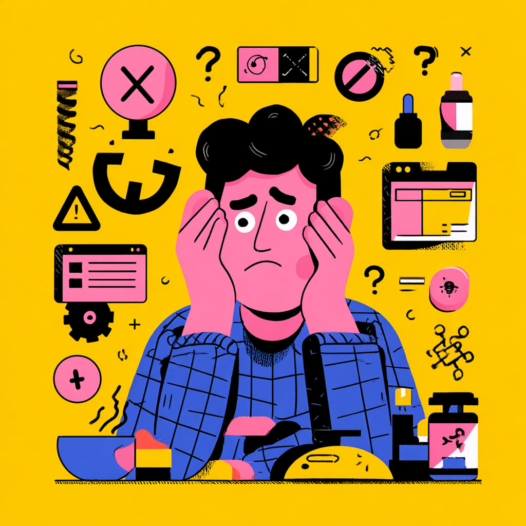
Mistakes that make interfaces feel anything but intuitive
Even good designs can lose their way. Sometimes, in the pursuit of being unique or “innovative,” teams forget that users don’t read design rationales — they just react.
Here are the usual suspects behind confusing interfaces:
- Hidden navigation that looks clever but feels frustrating.
- Inconsistent language or iconography.
- Ignoring accessibility and device variations.
- Overloading screens with too many choices.
A product stops feeling intuitive the moment users have to stop and ask, “Wait… what do I do now?” That moment is death by confusion.
Why designers should think like users, not authors
Designers are storytellers, but users aren’t reading your story — they’re trying to reach their goal. The challenge is to make their User Journeys feel effortless while still staying visually engaging.
Thinking like a user means killing your darlings. That color you love? It might ruin readability. That clever icon? It might mean nothing to anyone else. Empathy is the best design tool you’ll ever use — better than any plug-in or prototype trick.
Your job isn’t to impress; it’s to make people feel smart while they use your product.
How UX research helps predict behavior
Design intuition only gets you so far. Real insight comes from UX Research — watching people use your product and learning what they actually do versus what you thought they’d do.
The data never lies. Heatmaps, session replays, A/B testing — these are the designer’s truth serum. They expose blind spots and validate instincts. Most importantly, they remind teams that design isn’t about opinions; it’s about evidence.
When you study how people move through your Information Architecture, you stop guessing and start designing with purpose.
Balancing creativity and familiarity
It’s tempting to reinvent everything — especially when you’re trying to stand out. But here’s the hard truth: users don’t want surprises; they want flow. The trick is finding balance.
Keep your creative energy focused on emotion and style, not on rewriting the rules of navigation. You can have a bold look without breaking usability. A solid Visual Hierarchy lets creativity shine without chaos.
Think of it like jazz — innovation only works when there’s structure underneath.
Examples where simplicity came from complexity
The cleanest designs usually have the messiest backstories. Take Google, for example — that one search bar hides layers of data science and interface testing. Or Dropbox, whose effortless drag-and-drop took years of iteration.
True simplicity isn’t laziness; it’s refinement. Behind every “obvious” interface is a team that’s spent countless hours studying behavior, testing flows, and improving Information Architecture until it feels invisible.
The smoother it feels, the harder it was to build.
The future of intuitive design and the role of technology
Artificial intelligence and adaptive interfaces are redefining what “intuitive” means. Soon, systems won’t just react — they’ll anticipate needs. Think personalized layouts, predictive actions, and User Journeys that evolve based on behavior.
But even with smarter tech, the human factor stays the same. The goal will always be empathy — designing experiences that feel right, not just look right.
The future isn’t magic. It’s data-driven intuition, powered by understanding.
An intuitive interface isn’t a lucky accident — it’s a carefully crafted illusion. It’s logic dressed as instinct, empathy disguised as ease. And when it works, it feels like magic — not because it is, but because it’s invisible.
