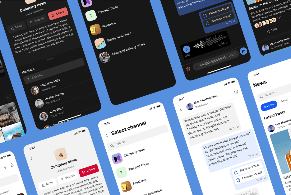
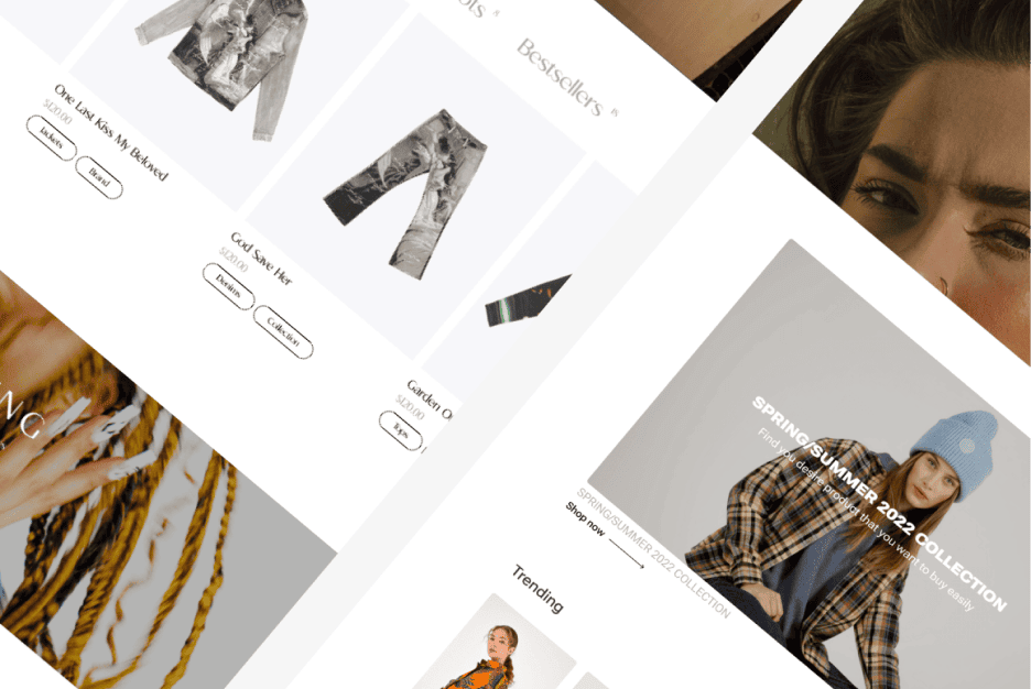
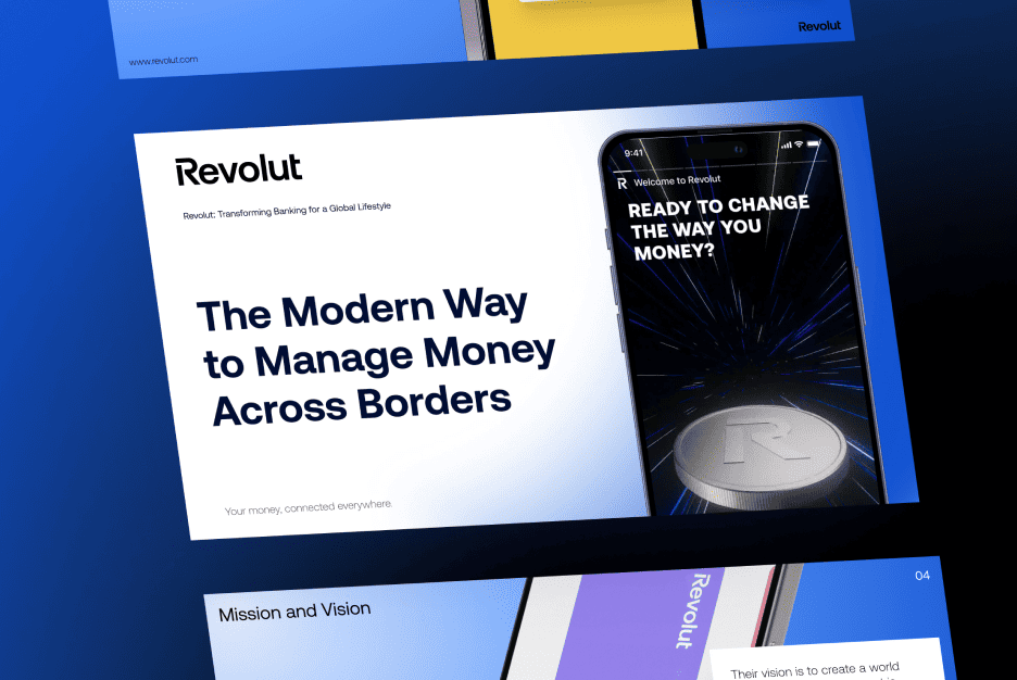
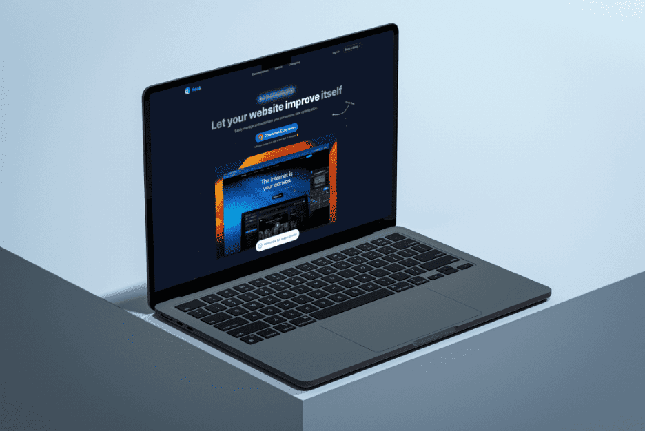
At some point, almost everyone has the same thought. You open a bank’s website, then a payment service, then another financial platform — and everything feels strangely familiar. Calm colors, strict layouts, zero visual drama. It may seem uninspiring at first, almost lifeless. But here’s the secret: that so-called boredom is not a flaw. It’s a carefully engineered feature that quietly does its job while you’re busy checking balances and not panicking.
Why bank websites almost always look the same
Banks didn’t secretly meet in a dark room to agree on one universal layout. Similarity is the result of shared reality. The risks are alike, the rules are strict, and user expectations are nearly identical. When real money is involved, creativity suddenly becomes a high-risk sport.
People don’t visit financial platforms for entertainment. They arrive with a clear goal and a slight sense of anxiety. Familiar layouts shorten the thinking process. When everything behaves as expected, the brain relaxes faster, and that feeling of recognition matters more than originality.
Familiar patterns feel safer than fresh experiments
The human brain trusts what it already knows. A predictable structure quietly whispers “nothing strange will happen here,” and in the financial world, that message is gold.
What actually hides behind the feeling of boring design
What many people label as dull is often intentional restraint. Every visual choice is filtered through risk assessment. Bright ideas don’t disappear because designers lack imagination — they get removed because clarity wins over excitement.
There’s also the issue of mental overload. Financial tasks already demand concentration. Extra visual noise would only increase fatigue. Calm screens help users focus on decisions, not decorations.
Visual simplicity reduces cognitive pressure
Less stimulation means fewer mistakes. And mistakes with money are the worst kind.
Why emotions are dangerous in financial services
Strong emotions lead to impulsive actions. That’s great for online shopping, terrible for transferring savings. When emotions rise, rational thinking drops, and banks are painfully aware of this.
Behavioral economics shows that people make poorer financial decisions under emotional stress. Neutral presentation keeps users grounded. No rush, no pressure, no dramatic choices that lead to regret.
Emotional neutrality works like a safety belt
You don’t feel it, but it protects you at the exact moment you need it.
How trust became more important than the wow effect
Trust is fragile. One playful animation or overly friendly message can raise suspicion. “Are these people serious?” is not a question a financial brand wants to provoke.
Over time, consistency proved more valuable than surprise. Repeating familiar patterns builds confidence. When nothing feels unexpected, reliability quietly grows in the background.
Stability looks professional and expensive
That’s why luxury brands love silence and space. Banks use the same logic — just without champagne.
Why predictable interfaces reduce anxiety
Money already makes people nervous. Add unpredictable navigation, and stress levels spike instantly. Predictable flows calm users before they even realize it.
There’s a psychological reason behind this. When actions feel controllable, anxiety drops. Clicking buttons that behave exactly as expected creates a sense of control during complex processes.
Control beats creativity in stressful moments
In finance, comfort often matters more than originality.
How user fear shapes visual strictness
Design reflects emotions, and fear plays a huge role here. Fear of mistakes, fear of fraud, fear of losing money — all of it influences visual decisions.
That’s why strict layouts, generous spacing, and conservative Fonts dominate financial interfaces. They silently communicate discipline, seriousness, and order.
Visual restraint mirrors emotional caution
The interface becomes a calm guide, not an entertainer.
Why minimalism in banking is a necessity, not a trend
Minimalism here isn’t about fashion or taste. It’s about survival. Every extra element is a distraction. Every decorative choice increases the chance of confusion.
Clear hierarchy is critical. Carefully managed Contrast helps users instantly spot what matters without scanning the screen like they’re defusing a bomb.
Fewer elements mean fewer errors
When actions are obvious, costly mistakes become rare — and that’s priceless.
How regulations and security kill creativity and save money
Behind every calm interface stands an army of regulations. Compliance teams, security checks, accessibility standards — creativity must survive all of them.
Two-step verification, confirmations, warnings, encryption — none of this is fun. But all of it prevents disaster. Even advanced personalization powered by AI has to operate inside strict boundaries.
Safety first, applause never
No one praises a system for stopping fraud, but everyone remembers when it fails.
Why a boring website often feels more trustworthy
People subconsciously associate seriousness with restraint. Loud visuals feel cheap. Quiet screens feel solid and expensive. It’s a mental shortcut we all use.
Multiple studies show that conservative interfaces inspire more trust when money is involved. Visual modesty translates into perceived stability, even if the technology underneath is cutting-edge.
Boring often equals reliable
In finance, that’s the highest praise.
The difference between boring and calm design
Boring lacks intention. Calm is deliberate. The difference lives in details: spacing, rhythm, wording, balance.
A peaceful interface guides without shouting. It respects attention and doesn’t compete for focus. That’s not dullness — that’s maturity.
Silence can be a design skill
Not every product needs to entertain. Some need to reassure.
Why the best compliment for a bank website is not noticing it
If users don’t remember the interface but everything worked smoothly, the design did its job perfectly. Absence of frustration is the real success metric.
People don’t want to admire banking platforms. They want results without stress. When the interface disappears, trust quietly takes its place.
Before closing, here’s what truly defines good financial design. These qualities rarely get applause, but they carry the entire experience:
- predictability instead of novelty
- clarity over decoration
- calm neutrality rather than excitement
In the end, boring isn’t lazy. It’s careful. And when one click can move real money, careful is not just good — it’s beautiful.
