


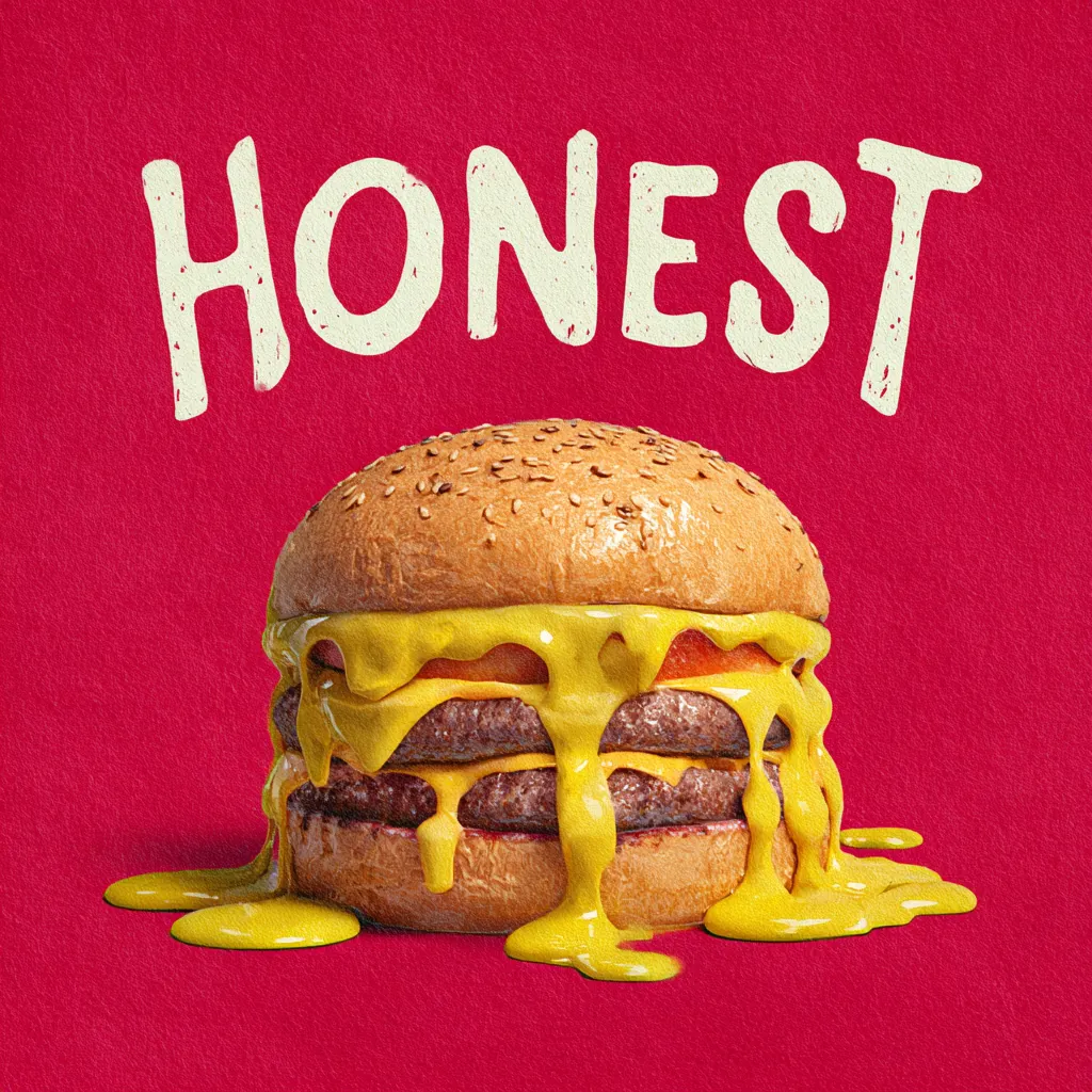
Somewhere along the way, digital design became a beauty contest. Glassy gradients, surgically polished layouts, impossibly symmetrical visuals — every brand tried to out-pretty the next one. But users didn’t clap. They didn’t feel anything. And now the pendulum is swinging in the opposite direction: authenticity beats perfection, humanity beats polish, and brands that dare to show their raw edges suddenly look more… real. And real is what people actually connect with.
Why Perfect Design Stopped Working in Today’s Digital World
Perfection used to be a differentiator. Now it’s wallpaper. When every interface looks like a mood board from the same “modern clean design” Pinterest folder, nothing stands out. The sameness makes interactions feel robotic, especially when AI tools generate flawless visuals in seconds. Users don’t crave immaculate surfaces — they crave personality.
Another problem with overly polished layouts is emotional flatness. Perfect things feel distant. Like those hotel rooms where everything is placed “just so,” and you’re afraid to touch anything. Digital spaces borrowed that vibe, and people subconsciously backed away. With too much emphasis on symmetry, ultra-tight Color Schemes, and premium shine, brands accidentally erased all warmth.
How Honest Visuals Build Trust Faster Than Any Fancy Aesthetic
Honest design feels like a real conversation, not a staged photoshoot. When a brand dares to show imperfection — human touches, natural textures, unfiltered moments — trust grows quicker. There’s something disarming in visuals that don’t try too hard. They communicate: we’re real, not pretending.
Authenticity also removes the emotional friction that keeps users skeptical. Nobody trusts something that looks “too perfect” anymore. We’ve all seen enough filters, generative magic, and corporate gloss to sense when we’re being sold an illusion. Rough edges, on the other hand, make brands feel grounded and approachable.
Why Users Are Tired of Over-Polished Interfaces
People are drowning in perfectly rounded buttons, 90% opacity shadows, and layouts cleaner than an operating room. This visual sterilization exhausts the brain because it feels artificially engineered. It’s not that users dislike beautiful design — they dislike artificiality.
The fatigue also comes from emotional monotony. When every site follows the same safe patterns, the experience becomes predictable. It’s the equivalent of eating plain oatmeal every morning: technically fine, but joyless. Honest expression snaps users out of this déjà vu and creates a sense of presence.
How Realness Becomes the New Standard of Attractiveness
Raw, unfiltered visuals feel alive. They show texture, flaws, and spontaneity — things our brains evolved to trust. That’s why natural materials, imperfect lines, and subtle asymmetry feel refreshing in digital spaces. They are a relief from the polished plasticity that dominated the last decade.
And no, this isn’t about making things sloppy. Realness doesn’t mean chaos. It means letting the design breathe without forcing every pixel into a mathematically sculpted grid. It’s the difference between a staged stock photo and a candid moment — one looks manufactured, the other feels human.
Why Imperfections Make Brands Feel More Human
Little quirks — slightly uneven strokes, handwritten details, tiny inconsistencies — remind people there are humans behind the screen. These imperfections act as emotional cues. They’re micro-signals that say: a person crafted this, not a machine.
And yes, sometimes imperfections lead to Mistakes, but those flaws often make the communication more relatable. Users forgive imperfection far easier than coldness.
How Honest Design Reduces Anxiety and Visual Noise
Minimal pressure on perfection helps users feel more at ease. Instead of bombarding them with visual drama, honest design delivers space, simplicity, and calm energy. The absence of visual noise works like a digital exhale — especially in a world already overloaded with stimulation.
This softer approach also gives the eyes a break. When interfaces aren’t screaming for attention, users naturally stay longer and engage more. Calmness becomes a competitive advantage.
Why Emotional Sincerity Beats Creative Flawlessness
Creativity without emotion is decoration. Emotion without creativity is connection. Brands finally figured out the difference. That’s why so many are shifting toward sincerity — because it resonates, sticks, and spreads without force.
A flawless layout might impress, but an emotionally honest visual touches something deeper. That emotional spark is what users remember long after they close the tab.
Why Honest Visual Language Deepens Customer Loyalty
Users don’t want perfect brands. They want believable ones. When a brand communicates with sincerity — through its tone, visuals, and behavior — people feel closer to it. Honest design functions like a long-term relationship strategy: consistent, warm, and grounded.
This connection builds loyalty because the brand’s identity feels stable and trustworthy. In chaotic times, “realness” becomes an anchor.
Why Perfect Design Creates Distance, and Honest Design Feels Close
Polished visuals often feel corporate and detached. They create a psychological gap, like a glass wall between the screen and the viewer. Honest design breaks that wall. It invites users in instead of performing for them.
That closeness becomes especially powerful when paired with less rigid structures and more character-driven details. Slight asymmetry, textured backgrounds, and real-life imagery create comfort and familiarity.
Why Minimalistic Approaches Look More Expensive Than Overloaded Layouts
Luxury today is not defined by glitter — it’s defined by restraint. Clean structures, generous spacing, soft tones, and intentional simplicity signal confidence. The brand looks like it doesn’t need to shout.
Minimal layouts also allow details to shine. A subtle highlight, a carefully chosen typeface, a smart layout decision — all become more noticeable when the canvas isn’t screaming.
Brands That Won by Choosing Honest Aesthetics
Some of the world’s most influential companies built their modern presence around authenticity. Patagonia’s unpolished photography, Glossier’s natural-skin visuals, Oatly’s messy handwritten labels, Airbnb’s humanistic approach — all demonstrate the power of honest aesthetics.
Other brands lean into natural Color Schemes, unscripted imagery, and candid storytelling. The results? Stronger loyalty, deeper emotional connections, and a sense of relatability that hyper-perfect competitors simply cannot fake.
