


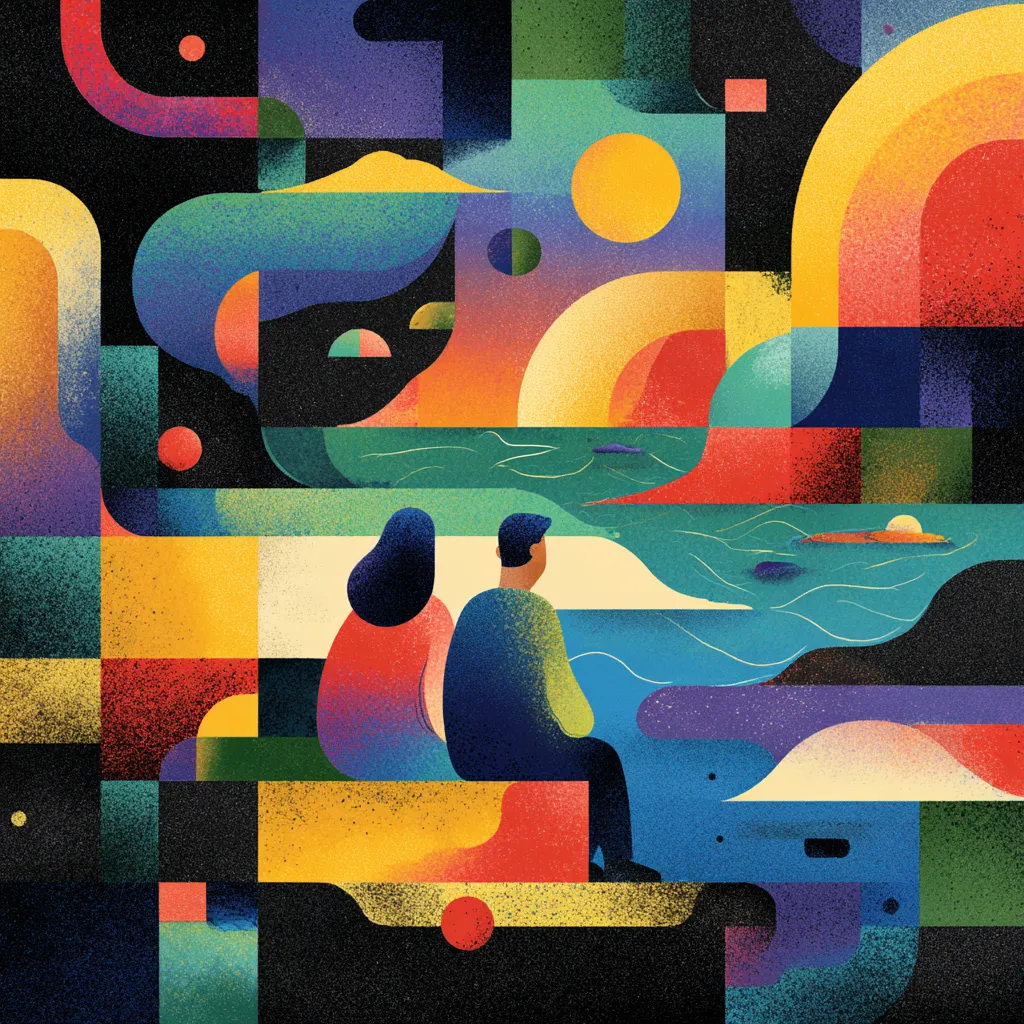
People don’t browse the internet with a calculator in their hands — they browse with their feelings. Even when they pretend to be logical creatures, their decisions are heavily shaped by instinct, mood, and micro-reactions they can’t fully explain. That’s why design today is shifting from strict grids and polished geometry to atmosphere, warmth, and sensory storytelling. Brands are finally embracing what psychologists have been screaming for decades: emotion wins faster than logic every single time.
Why Rational Design Stopped Influencing User Behavior
For years, we believed clean layouts and structured thinking could magically lead users to conversion. But the digital world doesn’t work like a classroom. People scroll at lightning speed, skip anything that smells like effort, and rely on gut impulses. So purely rational design often feels boring, predictable, and—worst of all—forgettable.
On top of that, algorithms reward engagement, not correctness. Even SEO benefits when people actually interact with a page instead of glancing and bouncing. Emotional cues keep visitors hooked longer, which helps visibility and creates stronger connection points. Attention today is emotional—not technical.
How Emotions Became the Main Filter for Digital Choices
Users make decisions in milliseconds. Neuroscientists estimate around 95% of choices happen subconsciously before the rational mind even wakes up. That’s why feelings have become the primary filter customers use to judge everything — from apps to online shops.
Brands that tap into sentiment outperform those that rely on functionality alone. Whether it’s warmth, mystery, confidence, or playfulness, these emotional signals help people interpret what they see faster than any explanation or instruction. This shift is so large that even AI-powered interfaces are now built with emotional cues at the core, not as decoration.
Why the Visual Language of Feelings Works Faster Than Logic
Humans recognize mood before they interpret meaning. Colors, shapes, depth, movement — all these elements form impressions instantly. Logical organization, on the other hand, requires processing. And processing takes time, which users don’t have.
Emotional visuals also work cross-culture and cross-language, which matters when audiences come from different backgrounds. Rational messages often fail to translate smoothly. Emotions, however, are universal. Designers who understand this create experiences that skip cognitive friction.
How Emotional Design Creates Instant Trust
Trust forms through signals, not slogans. Subtle lighting, gentle motion, calm gradients — these cues help interfaces feel alive and welcoming. When users sense intention rather than perfection, they relax. They’re more willing to explore. They even forgive small mistakes because the overall experience makes them feel understood.
This is exactly why emotional design feels so human: it communicates empathy without using words. A brand that greets users with warmth is far more trustworthy than one hiding behind sterile precision and robotic efficiency.
Why Brands With a Sensory Style Stick in Memory
Emotionally driven design naturally becomes more memorable because it activates multiple parts of the brain simultaneously. A rational layout may be “correct,” but emotional cues spark sensory reactions—color triggers association, depth creates immersion, movement adds rhythm.
Memory loves patterns infused with meaning. Pure structure rarely carries meaning. That’s why brands that rely on atmospheric visuals linger in people’s minds long after they close the tab.
The Role of Atmosphere and Mood in Perception
Mood shapes context. You can show the same message in two different atmospheres, and users will read it completely differently. A calm aesthetic creates comfort. A bold environment energizes. A dark mood feels mysterious. A bright tone feels friendly.
Crafting atmosphere is no longer an afterthought—it’s a primary design tool. Modern interfaces behave more like cinematic scenes than static pages. They shape emotional tempo before users read a single line.
How Emotional Triggers Strengthen Site Interaction
Before a person decides what to click, they instinctively react to how something feels. Designers use emotional triggers to guide this reaction. Think of them as micro-nudges that tune the user’s state of mind, making the entire journey smoother.
Here are some examples of emotional signals that influence interaction:
- Depth that creates subtle immersion
- Tactile textures that feel “touchable”
- Motion that mimics physical behavior
- Color accents that spark curiosity
These cues replace dry instructions. They help people navigate without thinking. And when the experience feels intuitive instead of difficult, engagement skyrockets.
Why Users Get Tired of “Perfect” Interfaces
Perfect can be exhausting. Too clean, too symmetrical, too polished — it starts feeling artificial. Humans crave personality, quirks, softness. Over-optimized layouts often trigger emotional fatigue because they lack warmth. They feel engineered instead of designed.
In a world full of uniform templates, users gravitate toward authenticity. That might mean slightly irregular elements, organic textures, or a touch of unpredictability. Digital Silence and sterile precision feel outdated, not premium.
How Visual Storytelling Replaces Complex UX Explanations
People don’t want to read manuals. They want to sense what they should do next. Storytelling helps achieve that. Every visual detail — rhythm, contrast, atmosphere, motion — creates narrative flow. Users understand the interface not because it’s rational, but because it feels guided.
This is why visual storytelling has become a powerful alternative to traditional UX structure. It removes friction and reduces cognitive overload. It also makes interfaces far more enjoyable.
Company Mistakes When They Try to Stay Rational in an Emotional Era
Many teams cling to outdated principles, thinking logic equals clarity. But that mindset leads to common misfires:
- Over-engineering layouts instead of designing experiences
- Prioritizing features instead of feelings
- Using rigid structures that limit expression
- Treating emotion as decoration rather than strategy
- Ignoring the fact that AI surfaces emotional content more often
These mistakes disconnect brands from actual human behavior. People don’t choose what’s correct—they choose what resonates.
How to Balance Functionality and Emotional Impact
A great interface isn’t pure emotion or pure logic — it’s a blend. Function should stay incredibly clear, but feeling should lead the path. The best designers create systems that behave rationally but communicate emotionally.
To achieve balance, teams often use two design modes:
- Functional mode for structure, flows, accessibility
- Emotional mode for mood, depth, atmosphere
When these modes support each other instead of competing, the result feels effortless.
Brands That Won by Choosing Emotional Visuals
Modern leaders prove this shift is real. Luxury companies, lifestyle platforms, wellness apps, boutique e-commerce stores — they all lean heavily into emotional aesthetic over strict mechanics. They tell stories with tone, atmosphere, and nuance.
These brands don’t follow design manuals. They create worlds. And people return to worlds, not layouts.
