


Back in the day, people argued over jeans — flared or skinny? Fast forward to today, and the real battles are happening in the world of fonts. Designers, marketers, and brands debate which typeface wins, while most readers don’t even realize how much those tiny letters affect mood and perception. Fonts aren’t just shapes on a screen — they’re a secret language of emotions and associations.
And in 2025, this “silent hero” finally takes center stage. Text is no longer limited to newspapers and websites; it’s alive in AR, VR, and smart devices. Picking a typeface is no longer “just throw in Times New Roman and move on.” Now it’s directly tied to trust, brand image, and even user engagement.
Why Fonts Are Back in the Spotlight in 2025
Here’s the deal: the world is drowning in visuals. Photos, videos, memes, ads — our eyes are overloaded. But fonts manage to stand out quietly. They don’t scream like banners; instead, they set the mood in a subtle way. Studies show that the right typeface can boost trust in written content by up to 20%. Not bad for a bunch of letters.
This is where Psychology comes in. People react to fonts the same way they react to music or facial expressions. Sharp serifs can feel aggressive, while round shapes come across as friendly. That’s why brands in 2025 are putting as much effort into typography as they once did into choosing logo colors.
Minimalism and Clean Forms as the Designers’ Top Choice
Remember when everything had to be loud and flashy? Well, that’s over. Minimalism is ruling again. The simpler the typeface, the easier it is to read. People are tired of noisy screens, and clean fonts give them a breath of fresh air.
But don’t confuse simplicity with boring. Minimalist typefaces in 2025 are carefully polished — think balanced shapes, subtle details, and precise strokes. They also play perfectly with Micro-UX. When buttons and menus are instantly readable, users click more, and designers celebrate with quiet high-fives.
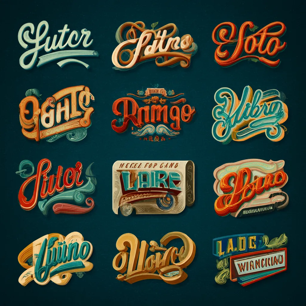
Retro and Vintage Fonts Making a Comeback
Nostalgia is a powerful drug. Fonts inspired by old magazines, neon signs, and 70s posters are everywhere again. But it’s not about copying the past — it’s about giving it a modern twist.
What’s really interesting is how these fonts sneak into Branding. They trigger warm feelings, trust, and familiarity. Imagine a coffee shop’s website styled like a retro newspaper — suddenly, you’re ready to pay double for a latte just for the vibe.
Playing with Variable Fonts and Living Typography
Tech has given us a whole new playground. Variable fonts let you tweak weight, width, and even motion in real time. It’s basically font tuning, but for designers instead of car geeks.
This shines in digital products. Headlines can “breathe” and react to user actions. Hover over a word, and it smoothly expands or shifts. That tiny touch of Gamification keeps people engaged and makes the interface feel alive.
Sustainability and Ethics as New Typeface Standards
Yep, fonts have gone green too. Designers are paying attention to file size and load speed because it actualy affects energy use on a global scale. Sounds silly, but across millions of websites, it adds up.
There’s also the rise of “ethical fonts.” Some creators refuse to use typefaces from companies with shady reputations. It’s just like fashion — if a brand makes clothes under poor labor conditions, people boycott. The same principle applies here.
Fonts for AI and Augmented Reality
Text in 2025 is no longer stuck on flat screens. AR glasses, VR headsets, and smart gadgets need typefaces that stay legible from every angle, in any light.
On top of that, developers are thinking about how fonts work with voice assistants. Sounds weird, but even the typeface shown on a smart speaker screen influences how users perceive the brand and how smooth the interaction feels.
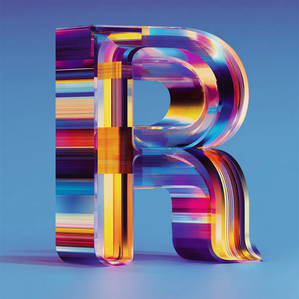
How Colorful and Gradient Fonts Became Part of Branding
Gone are the days when fonts were just black and white. Designers now boldly play with gradients and rich tones. Colorful typefaces aren’t just a gimmick anymore — they’re a serious design weapon.
They fit seamlessly into Branding, helping texts pop on social feeds and stand out from the competition. A bold gradient headline can instantly become part of a company’s visual identity. Just don’t go overboard — no one wants a neon migraine.
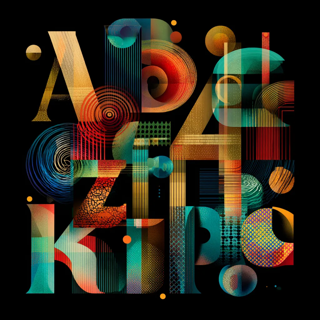
Super Display Fonts and the Power of Dramatic Headlines
Big, loud, dramatic — display fonts are hotter than ever. You don’t use them for paragraphs; you use them to make a statement.
A well-chosen display font works like a billboard: it stops you in your tracks. Magazines, ad campaigns, and creative studios love them because they deliver instant impact.
Typography Mistakes You Really Should Avoid
Talking about trends without mentioning fails would be unfair. So here are some common sins:
- Mixing too many fonts in one project
- Forgetting about mobile readability
- Overusing decorative typefaces in places where clarity is key
One classic mistake is picking a font just because it looks “cool.” A pretty typeface is useless if it kills readability. Sometimes the boring option is actually the smart one.
Wrapping Up 2025 and What’s Next for Typography
This year proves one thing: fonts are no longer the sidekick. They’re the star of the show, shaping how brands talk to people. Designers are pushing boundaries, and tech is making wild ideas possible.
Looking ahead, we’ll see even deeper ties between fonts, AR, and AI, plus more personalization. Don’t be surprised if one day you pick your own “personal font,” the same way you choose wallpapers on your phone. Sounds futuristic, but it’s already on the horizon.
