


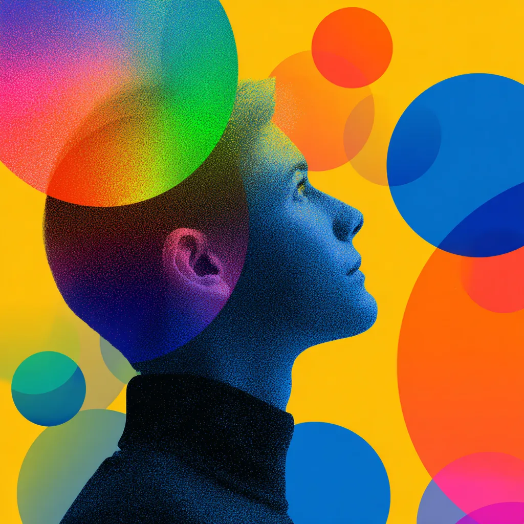
We live in an era where time and focus are the most valuable currency. Our brains process thousands of signals every day, and designers are fighting for fractions of a second to capture attention. Nobody reads every little detail on a screen — people scan, get distracted, and come back. That’s exactly when UX psychology steps in: color and motion become the secret weapons that either make a brand stand out or get lost in a sea of competitors.
The fun part? These visual tricks aren’t just “for decoration.” They actively influence how people decide, act, and even spend. When a designer understands this, an interface stops being just pixels and turns into a magnet for eyes — and wallets.
Why User Attention Became the New Digital Currency
Think about it: how many apps and websites have you opened today? Probably more than you can recall. That’s why people’s focus is compared to Bitcoin — it’s scarce, everyone’s chasing it, and the one who holds it wins.
Brands pour millions into strategies just to keep someone’s eyes on their screen a little longer. Marketing reports now brag not only about clicks but about “time on screen.” In a world where competition multiplies every second, the ability to grab attention has become the ultimate superpower.
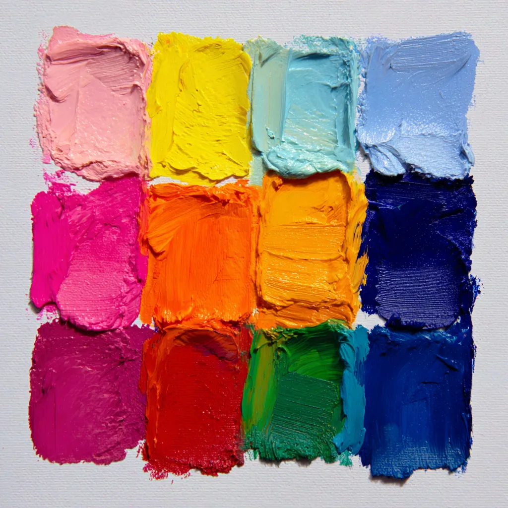
How Color Shapes Emotions and Decisions
Colors trigger emotional reactions faster than text ever could. Red screams urgency or discount, blue feels like trust and stability, green signals calmness and balance. This isn’t sorcery — it’s biology mixed with cultural conditioning.
A study by the University of Winnipeg found that color increases brand recognition by up to 80%. No wonder companies spend so much time fine-tuning their palettes. In the universe of Branding, color isn’t background — it’s the star of the show
The Power of Contrast and Accent Shades in Interfaces
Now imagine a website with no contrast — just a beige-grey blur. Your eyes don’t know where to land, and your brain gives up fast. Contrast works like a road sign: it tells you where to click and what matters most.
That’s why you’ll often see bright call-to-action buttons placed on neutral backgrounds. It’s an old trick, but it works because the human brain loves clarity. And contrast isn’t just about color — it’s about size, font weight, and shape too. In UX, contrast is like a megaphone shouting: “Hey, over here!”
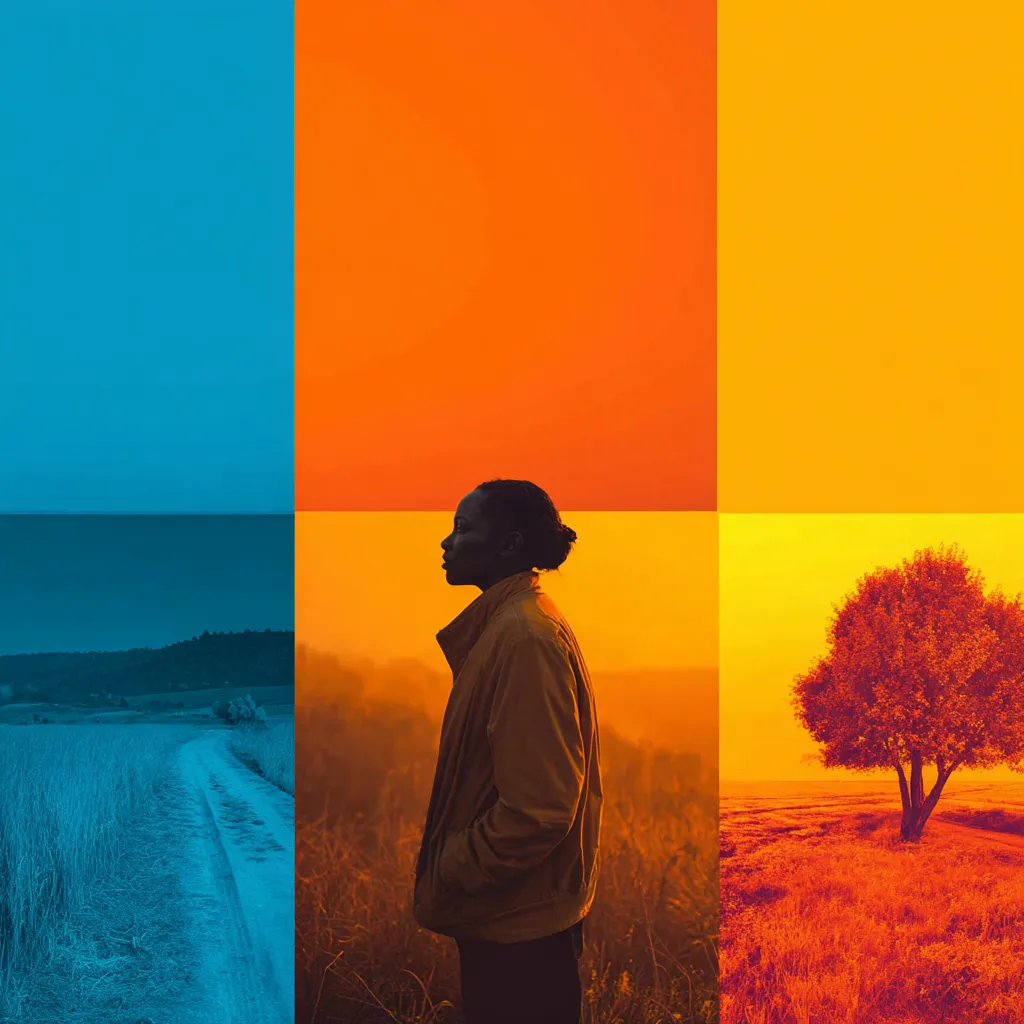
The Psychology of Warm and Cool Colors in User Experience
Warm shades — red, orange, yellow — spark energy, urgency, even hunger. That’s why fast-food giants paint their brands with them. Cool tones — blue, green, purple — create feelings of trust and calmness, which is why banks and healthcare companies love them.
But perception also depends on culture. In Western countries, white usually means purity, while in Japan it can symbolize mourning. That’s why global players test their palettes across different regions to avoid cultural misfires.
How Micro-Motion Guides the Eye and Holds Attention
Our brains are wired to notice movement. Even the tiniest animation on a button can grab more attention than a giant static banner. That’s why micro-motion has become a staple in modern design.
When an element wiggles, glows, or shifts slightly, it acts like a lighthouse. You could be scrolling endlessly, but a subtle animation will pull your eyes back. And it works across every format — from a Mobile App to a complex platform.
The Difference Between Helpful and Distracting Animation
Here’s the thing: animation can either help or annoy. Helpful animation gives users orientation — showing that a process is loading or that an action is completed. Distracting animation just wastes time and frustrates people with flashy, over-the-top effects.
A quick test: if the design feels confusing without animation, it’s useful. But if the interface already works perfectly fine and someone adds bouncing characters “just for fun,” chances are it’s doing more harm than good.
Micro-Interactions as Emotional Anchors in Interfaces
You know that little spark when you hit “like” on social media and a heart pops up? That’s a micro-interaction. It’s not just a visual effect — it’s an emotional hook that bonds users with a product.
These details act like tiny rewards: people come back not just for the functionality, but for the satisfaction. This is where Gamification shines — small achievements, badges, and playful touches turn an ordinary task into an engaging ritual.
How Color and Motion Work Together to Boost Engagement
When color and motion join forces, the effect multiplies. Picture a button that lights up when you hover and gives a subtle vibration when you tap. It feels alive, like you’re not just clicking but interacting.
This combo builds trust and nudges people to act. Users love when an interface “responds” to them. In the Web2 world, these interactions have become standard — and without them, products instantly feel outdated.
Common Mistakes with Animation and Bright Accents
Not every designer knows when to stop. Too many effects can turn an interface into a chaotic disco ball. Instead of helping, it overwhelms users — and they simply leave.
Some of the most common mistakes include:
- loading animations that drag on forever
- blinking elements that scream for attention non-stop
- too many bright highlights fighting on the same screen
These errors steal focus instead of guiding it, and they usually drive people away instead of pulling them in.
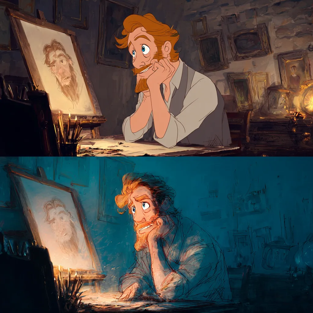
Real-World Cases Where Psychology of Color and Motion Boosted Conversions
Amazon once tested a small color tweak on its “Buy Now” button and saw conversion rates jump by several percent. Considering millions of daily users, that’s huge. Airbnb introduced smoother transitions in their Mobile App, and their retention numbers climbed noticeably.
Another classic case is Duolingo. Their animations and micro-interactions have become iconic — the little owl makes learning addictive. That’s Branding in action: people remember not just the functionality but the emotions tied to the experience.
