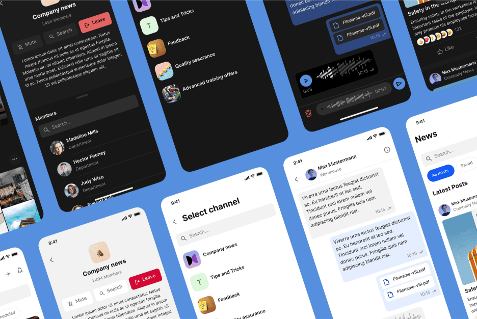
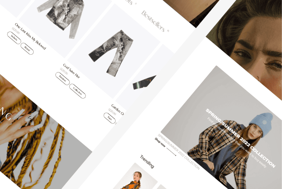
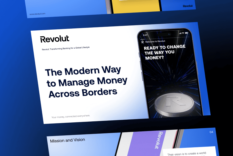
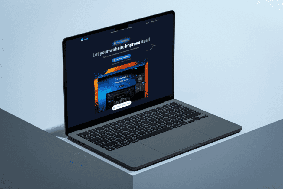
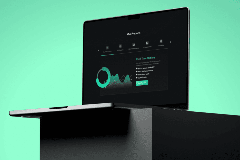
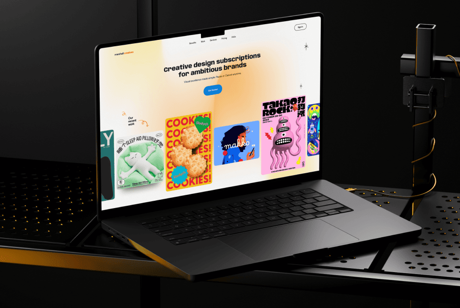
In a world full of endless digital choices, these good user interface design examples prove that the right design can be the difference between a forgettable app and a user’s favorite tool.
At Almax, we know that creating an exceptional user interface (UI) isn’t just about making things look good—it’s about designing seamless experiences that keep users engaged and coming back for more. Whether it’s crafting the layout for a mobile app, enhancing the functionality of a website, or designing an intuitive platform, good UI design is essential in turning digital interactions into meaningful connections. In this blog post, we’ll take a look at 9 good UI design examples that showcase the power of thoughtful, user-centered design across different industries. From calming wellness apps to engaging e-commerce platforms, these examples reveal the strategies behind successful UIs and how they drive real results for the brands that use them.
Why Good UI Design Examples Matter for Exceptional User Experiences
User interface (UI) design does more than just provide a good-looking digital experience—it creates lasting impressions that influence how users feel about a brand. Here’s why it’s essential:
- Retention and Satisfaction: Users are more likely to return to a site that feels natural and enjoyable to use. A well-thought-out UI ensures users can accomplish their goals easily, fostering satisfaction and repeat engagement.
- Competitive Differentiation: With countless options available, a unique UI can be the reason users choose your platform over others. In a crowded market, a brand with a clear, intuitive interface will stand out.
- Impact on Usability and Engagement: When UI is intuitive, users engage more deeply, navigate with ease, and feel more positive about their experience. Better usability often translates into lower bounce rates and higher conversion rates.
Example 1 – Headspace: Calming Colors and Guided Interactions for Meditation

Headspace is a meditation and mindfulness app with over 70 million downloads globally. Known for helping millions manage stress and improve sleep, Headspace’s engaging and calming UI contributes to its reputation as a leader in the wellness space.
Encouraging User Well-Being Through Good UI Design
Headspace’s UI is a standout among good user interface design examples, carefully crafted to promote relaxation and mindfulness in line with the app’s purpose.
- Soft Colors and Friendly Animations: The palette of pastel blues, greens, and pinks, coupled with gentle animations, creates a calming atmosphere that immediately puts users at ease. Animations, such as breathing guides and simple transitions, support the meditative experience, making it a UI that enhances the product’s core purpose.
- Guided Onboarding for First-Time Users: Headspace provides an introductory journey for new users, explaining features in a low-pressure, easy-to-digest way. This guided onboarding includes clear calls to action, icons, and simple language, helping users familiarize themselves with the app without feeling overwhelmed.
- Minimalist Approach: Headspace’s minimalist and calming approach makes it one of the most effective UI design samples in wellness apps, allowing users to focus on relaxation and mindfulness—a practice especially valuable in Delete Dialog UX Design, where minimalism is key.
Example 2 – Airbnb: Personalized Browsing for Travel Experiences

Airbnb has redefined travel by connecting over 150 million users with unique experiences worldwide, with more than 1.4 billion bookings to date. Its UI strategy has been instrumental in making the booking process simple and visually engaging for users.
Enabling Seamless Exploration with User-Centric UI Design Web Design
Airbnb’s UI delivers a customized, exploratory experience that helps users feel connected to their travel goals and inspired by new possibilities.
- Personalized Suggestions Based on User Behavior: Airbnb tailors its recommendations according to the user’s browsing history, presenting them with properties and experiences that reflect their unique tastes. This personalization is apparent on the homepage, where users see listings similar to their previous searches, helping them quickly find desirable options.
- Map-Based Search for Visualizing Locations: The map-based interface is a standout feature, showing property locations in real-time as users zoom in and out or adjust their search area. This interactivity provides users with geographical context, making it easier to understand proximity to landmarks, transit options, and other preferences.
- Immersive Visual Experience: Airbnb’s UI showcases vibrant, high-resolution images of each listing, paired with informative descriptions and visual markers for key amenities. Dynamic visuals and scrolling effects give users an immersive browsing experience that feels like a “virtual tour,” enhancing the sense of connection to each property.
Example 3 – Trello: Visual Task Management with Color and Labels
Trello has more than 50 million registered users and is widely adopted across industries for project management. Its visual, kanban-style approach to task organization has made it a go-to tool for teams worldwide.
Streamlining Team Collaboration with Clear UI Design Samples
Trello’s UI makes project management intuitive and accessible, turning task organization into a visually organized experience.
- Drag-and-Drop Functionality: Trello uses a kanban-style layout where users can move tasks between columns, mimicking the experience of a physical bulletin board. This layout appeals to visual thinkers and enables team members to track project progress at a glance, increasing overall productivity.
- Color-Coded Labels and Tags: Colors and labels are integral to Trello’s design, helping users quickly categorize tasks based on priority, status, or team member assignment. This simple color-coding system provides visual cues that make project updates and task prioritization clear at a glance, boosting collaborative efficiency.
- Customizable Power-Ups: Trello’s “power-ups” allow users to enhance functionality based on project needs, from calendar views to voting capabilities. This flexibility means teams can adapt the platform to their workflows, ensuring the UI feels intuitive and effective no matter the project type.
Example 4 – Calm: UX Design that Reinforces App Purpose for Relaxation
Calm, known as the “#1 app for sleep, meditation, and relaxation,” has achieved over 100 million downloads globally, with millions of active users relying on its serene UI to de-stress and focus on well-being.
Crafting a Relaxing Experience Through UI Design Samples
Calm’s UI takes a unique approach to encourage relaxation, blending design elements that align with its mission to help users unwind.
- Gentle Onboarding and Interactive Tutorials: Calm’s onboarding flow is slow-paced and deliberate, guiding new users through each feature step-by-step. It avoids information overload, presenting only the essentials for getting started with meditation or sleep features.
- Ambient Animations for Visual Relaxation: Calm’s immersive design is a powerful addition to the world’s good user interface design examples, using visuals like flowing water and gently moving clouds to create a soothing experience.
- Simple and Intentional Design: The interface design prioritizes only necessary elements, keeping it free from distracting features that could detract from its purpose. With few calls-to-action and limited text, Calm’s design helps users focus on their well-being rather than complex navigation.
Example 5 – Robinhood: Financial Accessibility Through Simple UI Design
Robinhood disrupted the financial industry by democratizing access to stock trading, amassing millions of users and bringing in more than $89 billion in managed assets.
Designing for Clarity and Accessibility in Finance
Robinhood’s user interface is designed with financial newcomers in mind, demystifying investing with a clean, straightforward approach.
- Visualizing Data with Simplified Graphs and Charts: The UI breaks down complex financial data into simple, easy-to-read visuals that help users understand stock performance and trends at a glance. By showing line graphs of stock prices, for example, Robinhood enables users to make informed decisions without feeling overwhelmed.
- Clear Navigation for Financial Information: Robinhood’s menu structure and navigation are intuitive, guiding users to popular actions like buying or selling stocks. Users can quickly access account summaries, notifications, and their portfolio without navigating through confusing layers of information.
- Color and Micro-Interactions for Decision-Making: Subtle micro-interactions, like changes in color when stocks rise or fall, offer immediate feedback, enhancing user confidence. This interactivity helps users track gains or losses with ease, making the experience more engaging and actionable.
Example 6 – Adobe Lightroom Mobile: Streamlined Editing Tools for All Skill Levels
Adobe Lightroom Mobile, part of Adobe’s suite of professional-grade tools, has helped millions of users—photographers, designers, and enthusiasts—enhance and organize their photos with ease.
Bridging Complexity with Intuitive Good UI Design Examples
Adobe Lightroom Mobile caters to both beginners and experienced photographers, offering a responsive UI that simplifies complex editing.
- Layered Tool Design for Ease of Access: Lightroom organizes its editing tools into layers, where basic adjustments are upfront and more advanced settings are tucked away. This structure makes the app accessible for beginners, while professionals can dig deeper into the tools they need.
- Adaptive Toolbars for User Customization: The app’s toolbar can be personalized to feature commonly used tools, allowing users to customize their editing environment based on their workflow. This adaptability means that every user, regardless of experience level, feels comfortable with the layout.
- Responsive Feedback for Precision Editing: Adobe’s UI provides real-time feedback with each adjustment, showing users how each tool impacts the image instantly. This responsiveness is key for fine-tuning edits and ensures that users feel in control of their creative process.
Example 7 – Todoist: Goal-Oriented Design for Personal Productivity

Todoist has grown to over 30 million users globally by helping people simplify task management with its intuitive design and cross-platform functionality.
Encouraging Productivity with Simple UI Design Samples
Todoist’s UI is built for efficiency, helping users stay on top of their goals without getting bogged down in features.
- Intuitive Checklist and Priority Tagging: Todoist organizes tasks in a checklist format with priority labels, giving users a clear visual hierarchy of their to-do items. This structure ensures that the most important tasks stand out, helping users manage their time effectively.
- Minimalist, Focused Interface: The UI is streamlined and free from clutter, keeping users’ attention on their tasks. With an emphasis on simplicity, Todoist makes it easy to stay organized without unnecessary distractions.
- Progress Visuals for Motivation: Todoist incorporates progress indicators, such as “streaks” that track daily completion rates, motivating users to stay productive. This gamification element reinforces a sense of accomplishment, boosting engagement.
Example 8 – Asos: Visual Shopping with Style Recommendations
Asos is one of the most successful fashion retailers online, attracting over 59 million visits per month and catering to shoppers worldwide with its vast range of fashion and beauty products.
Enhancing E-commerce with Visual Shopping UI Design Web Design
Asos elevates online shopping with a visually driven, user-friendly interface that makes exploring products enjoyable.
- Integrated “Shop the Look” Feature: This feature enables users to purchase complete outfits, which improves the shopping experience by allowing them to envision full styles. Users can click on different pieces within a look, creating a seamless browsing-to-purchase journey.
- “Find Similar” Tool for Product Exploration: The UI includes a tool that shows visually similar items, helping users discover additional options that fit their style. This function mimics the experience of a physical store, where users can see variations in color and style.
- High-Quality Visuals and Filter Options: Asos combines clear, high-resolution images with detailed filter options, enabling users to narrow down choices efficiently. This visual-first approach keeps users engaged and encourages exploration, increasing the likelihood of purchase.
Example 9 – Waze: Real-Time Navigation Designed Around User Needs
Waze, a navigation app owned by Google, has become a go-to choice for 140 million drivers globally who rely on its community-based approach to real-time traffic updates and navigation.
Prioritizing User Safety and Convenience with Good UI Design
Waze’s UI is optimized for real-time, on-the-go navigation, providing a safe and user-focused driving experience.
- Live Traffic and Hazard Updates: Waze offers real-time updates about traffic, road hazards, and speed limits, which are communicated visually and audibly. These features keep drivers informed without requiring excessive screen interaction.
- Color-Coded Routes and Voice Commands: Waze uses color-coded routes to differentiate traffic conditions, making route choices clearer at a glance. Voice commands and directions further enhance safety by keeping drivers’ eyes on the road.
- Customizable User Settings: Drivers can customize Waze settings, such as preferred route types or notifications for specific hazards. This flexibility makes it easier for users to tailor their navigation experience, ensuring comfort and convenience.
Key Takeaways: Elements of Successful Good UI Design Examples
Great UI design combines aesthetic appeal with a deeply functional experience. Successful UI should be simple, personal, and aligned with users’ needs, creating a strong connection between users and the product. Responsiveness and real-time feedback are essential, ensuring that users can enjoy a smooth experience across various devices. When a UI reflects both the needs of its target audience and the brand’s unique personality, it fosters trust, engagement, and loyalty.
If you’re ready to elevate your digital interface, reach out to Almax. Let’s work together to create a user-centered, engaging UI that drives real results for your brand.
