


When you open a new app or website, that first impression hits in seconds. Sometimes you can’t even explain why you feel like staying and exploring further. Often, it’s not the big flashy features but the little touches that make the experience enjoyable and the interface feel thoughtful. That’s the magic of micro-UX. It’s not loud functionality, but those subtle details that keep people hooked and coming back.
What is micro UX and why everyone is talking about it
Micro-UX is all about those tiny moments in a digital experience that make the interaction smoother, more human, and more delightful. Think of the checkmark animation that pops up after you’ve finished filling a form. It doesn’t solve world problems, but it makes you feel accomplished. That’s micro-UX at work.
These subtle moments often go unnoticed, but they shape the atmosphere of the whole product. And the reason everyone’s buzzing about micro-UX is simple: competition is brutal. The winner is the one who makes users feel something extra.
Small details that change the way we see an interface
Ever landed on a site where you had to endlessly Scroll down just to find something useful? Annoying, right? Now picture an app that guides you naturally step by step, almost like reading a well-written book. That difference comes down to small, carefully crafted touches.
The shape of a button, a soft vibration when you tap, even letting people switch between Light or Dark Theme — these may look like afterthoughts, but together they define the vibe of a product. You might forget the navigation logic, but you won’t forget how smooth and effortless it felt.

How micro UX impacts user emotions
Emotions are the real currency of attention. When people get little sparks of positive reinforcement during interactions, they start associating your product with good vibes. That’s Psychology applied directly to interface design.
Even tiny visual moves or sound cues can shift mood. Remember when Instagram introduced the heart-burst animation on likes? It quickly became addictive. That micro detail turned a simple tap into an emotional habit.
Why micro UX increases engagement by 30 percent
Studies from Nielsen Norman Group show that smart micro-interactions can raise engagement by nearly a third. Why? Because they hold attention longer and reduce friction.
When a product doesn’t just “work” but actually feels easy and rewarding, people want to use it again. Instead of a boring task, users get a series of small “wins” that keep them motivated to continue.
Real-world micro UX examples that work
You don’t need to look far. Duolingo makes its goofy characters cheer you on after each lesson, turning learning into a little celebration. Netflix autoplays trailers on the homepage to hook you instantly without any clicks.
And here’s a classic: the bright red Call-to-Action button on YouTube that screams “Subscribe.” It’s just a button, but that tiny design choice has pulled millions into hitting it.
Animations transitions and micro-interactions that make interfaces feel alive
Without animations, digital products would feel stiff and mechanical. Animations guide attention, explain what’s happening, and make everything feel more intuitive. A smooth window fade-in, for example, feels calmer than a jarring pop-up.
Micro-interactions are like having a casual conversation with the app. A loading bar can just be a boring line, or — like in Slack — a playful character keeping you entertained. Guess which one makes you smile and forget you’re waiting.
The power of text and micro UX in microcopy
Words matter more than we think. A button that says “Submit” feels completely different from one that says “Let’s Go!” That’s microcopy shaping the user’s mood.
Strong microcopy also reinforces Branding, giving the product its own recognizable voice. Dropbox is a good example — their friendly, human style makes cloud storage feel way less robotic.
How micro UX helps build user habits
Habits form through repetition and positive reinforcement. Micro UX plays a big role here, creating rituals that keep people coming back. Click, reward, repeat — and suddenly it’s second nature.
Apps like Duolingo or Headspace thrive on this. Notifications, streaks, mini-achievements — they’re all powered by micro-UX design choices. Before you know it, they’ve woven themselves into your daily routine.

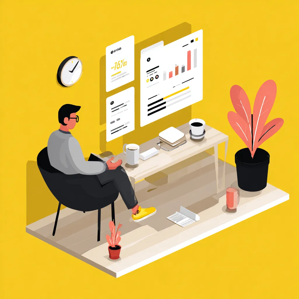
How to test and measure micro UX effectiveness
Pretty details are nice, but they have to deliver. To see if micro UX works, you’ve got to measure it: A/B testing, click maps, surveys, and good old behavior tracking.
A useful approach is to focus on metrics like:
- Time spent on the page
- Interaction rates with specific elements
- Return visits
If activity goes up and people hit their goals faster, you’ve nailed it.
The future of micro UX and trends you can’t ignore
The next wave of micro-UX is all about personalization. Products are adapting to users in real time, from predictive text to automatic switches between Light or Dark Theme based on the time of day.
AI is also stepping in. Imagine an interface that learns your patterns and predicts your next move. Sounds futuristic, but big players are already experimenting with it.
