


Gone are the days when a website was just a digital business card. Now it’s your most loyal salesperson — one that works 24/7, never asks for a raise, and greets thousands of visitors every day. But like any salesperson, it needs charisma, clarity, and strategy. A site that sells isn’t about flashy visuals or buzzwords; it’s about design that connects, guides, and converts. Let’s break down what makes modern web design the true engine of business growth.
Why the website became the brand’s best salesperson
Think about it: before anyone talks to your team, reads your brochure, or even opens your social media — they visit your website. It’s your front door, handshake, and elevator pitch rolled into one. If that experience fails, your brand’s reputation takes a hit instantly.
In a world where attention spans rival goldfish, a site’s performance and clarity matter more than ever. Your design, content, and flow create the first emotional connection. Get it right, and users stay. Miss the mark, and you’re met with digital Silence — no clicks, no conversions, just exits.
How visual design influences the desire to buy
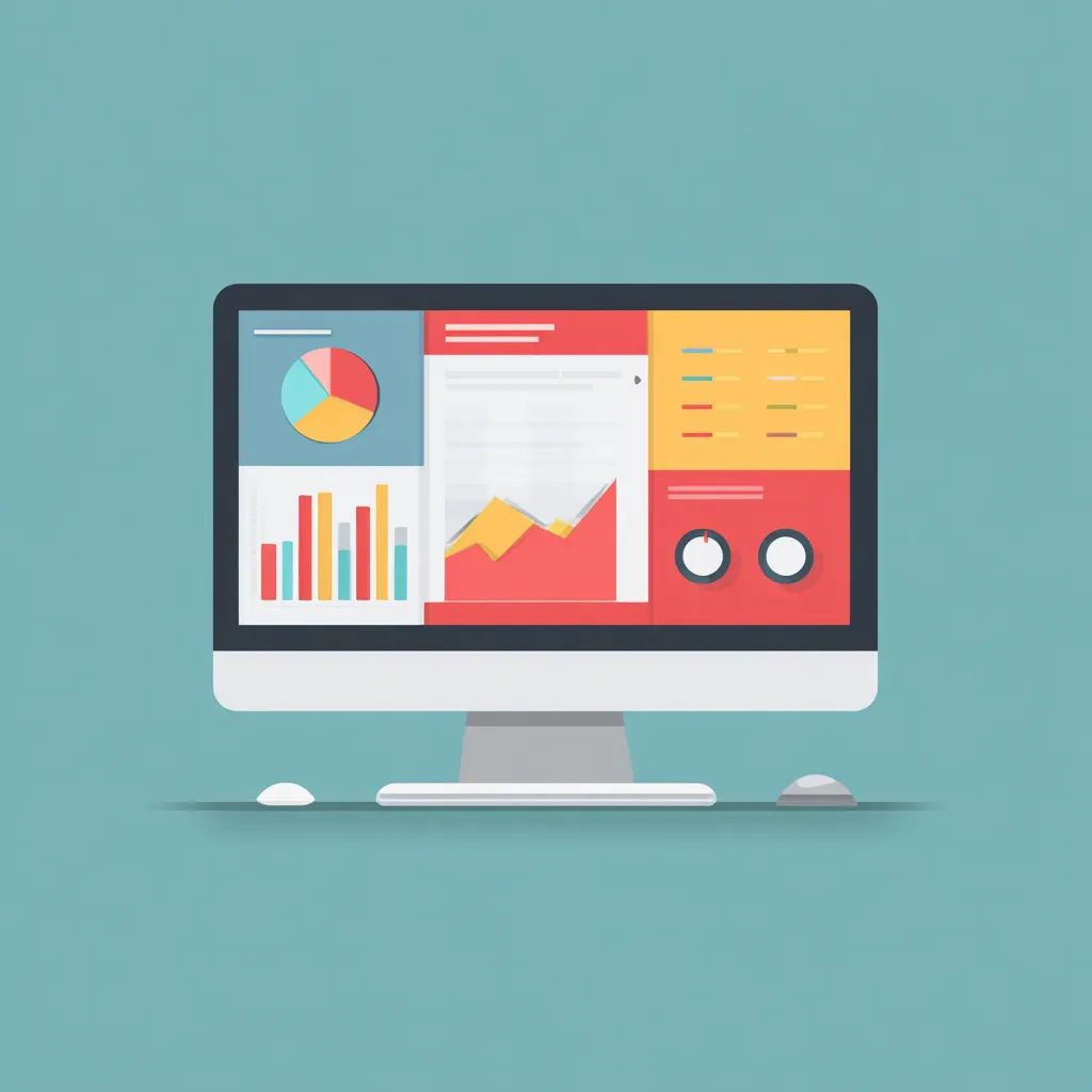
People don’t “read” websites — they feel them. Within seconds, users decide if a brand looks credible, appealing, and worth their time. That’s why great Visual Hierarchy is everything. It helps users process information effortlessly, guiding their eyes toward what truly matters: trust signals, product benefits, and irresistible calls to action.
Good visuals create mood and motivation. From consistent typography to smart spacing, every detail should whisper, “You’re in good hands.” When the layout is messy or confusing, users subconsciously sense risk — and trust is gone. Remember: design doesn’t just decorate; it persuades.
First impression and trust at the interface level
Ever land on a site and feel instantly relaxed — like you know it’s legit? That’s the magic of a strong first impression. People judge credibility based on design faster than they judge words. Even color balance, alignment, or button shape affect perceived professionalism.
This is where your Visual Hierarchy comes alive. Clean lines, consistent grids, and intuitive buttons signal reliability. Meanwhile, clutter, poor contrast, or outdated visuals trigger doubt. Online trust is fragile, and your design either builds it — or breaks it — in under three seconds.
The psychology of color and layouts that drive action
Color isn’t decoration; it’s persuasion. Red can energize and create urgency; blue builds calm and authority; green whispers safety and progress. Big brands know this — Coca-Cola, Facebook, and Spotify all use color psychology strategically to evoke emotion before words even appear.
But color is just part of the puzzle. Composition matters too. Balanced spacing, focal points, and rhythm in layout guide users’ emotions. Without this harmony, your design falls into Silence — visually loud but emotionally empty. The best designs don’t shout; they lead.
What makes a page layout truly persuasive
A selling page feels effortless. Every block, every element has a purpose. The layout must gently take users from curiosity to trust to action. That flow doesn’t happen by accident — it’s crafted with empathy and logic.
Here’s what high-converting layouts have in common:
- Clear structure — one message per section.
- Scannable text and short paragraphs.
- Logical sequence — benefits first, proof second, CTA last.
- Zero Anti-UX moments like cluttered pop-ups or broken alignment.
When the journey feels natural, users don’t think — they buy.
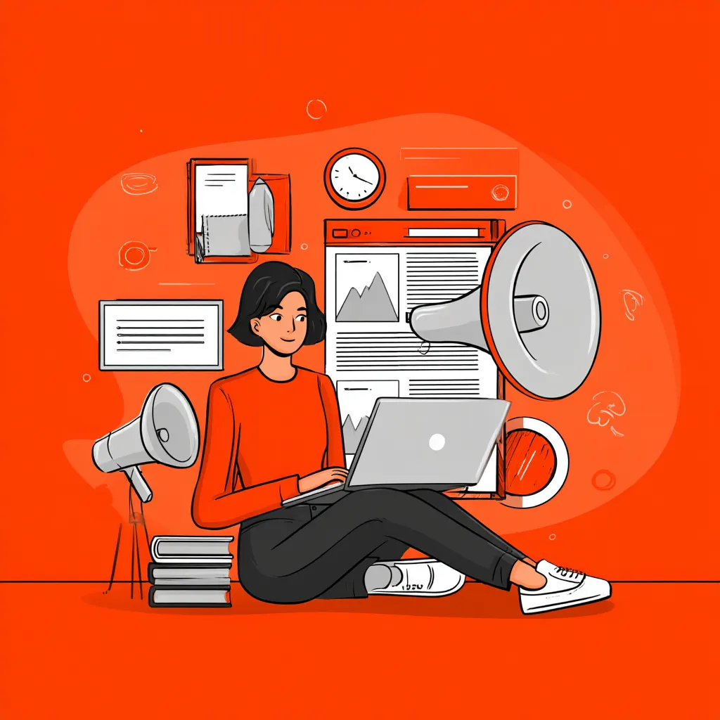
Content that works better than a salesperson
Copywriting is the voice of your brand — and no, it’s not about stuffing keywords. It’s about empathy. Great UX writing predicts questions before users ask them. Every headline, CTA, or microtext should reduce hesitation and build confidence.
Strong content mimics a great conversation: engaging, friendly, and useful. Even in Voice Search results, simple, conversational phrasing wins. If your message sounds human, people listen. Robotic text? That’s instant bounce.
UX design that leads users to purchase
UX isn’t decoration; it’s strategy. The best websites anticipate every move users might make and make those moves feel easy. Smart UX doesn’t just guide — it removes friction entirely.
Navigation should feel like instinct, not effort. Smooth transitions, clean typography, and accessible elements all work together to maintain momentum. Each click should feel rewarding, not like solving a puzzle. When experience flows, trust grows — and so do sales.
Mistakes that turn websites into anti-sales machines
Some sites don’t just fail to sell — they actually push customers away. Cluttered visuals, outdated stock photos, or confusing CTAs scream “unreliable.” If your checkout process has five unnecessary steps, congratulations — you’ve just invented Anti-UX.
Avoid these deal-breaking errors:
- Overloading users with too much info at once.
- Ignoring mobile responsiveness.
- Using pop-ups that interrupt rather than assist.
- Forgetting emotional appeal in pursuit of “professionalism.”
The secret to selling online isn’t complexity — it’s clarity.
The role of speed and adaptability in purchase decisions
Fast websites don’t just perform better; they feel more trustworthy. A one-second delay in loading time can drop conversions by 7%. People don’t blame their internet — they blame your brand.
Adaptability matters too. Responsive layouts show that your site was designed for them, not for your convenience. Whether it’s desktop, tablet, or smartphone, every screen should deliver consistency and ease. When technology disappears behind smooth performance, users stay focused on buying — not waiting.
Mobile experience as the new sales standard
Let’s face it — your customers are shopping while waiting in line, watching TV, or commuting. If your mobile site doesn’t work flawlessly, you’re leaving money on the table.
Mobile-first design isn’t a trend; it’s survival. Clean buttons, thumb-friendly spacing, and intuitive gestures make a massive difference. Combine that with Voice Search optimization, and you’re speaking your users’ language — literally.
Brand case studies that grew revenue through redesign
When Airbnb revamped its interface with cleaner visuals and more emotional imagery, bookings skyrocketed. Nike’s Redesign focused on minimalism and mobile-first storytelling, leading to a 20% increase in conversions. Even small businesses that simplified their structure and visuals saw significant trust boosts.
Real-world proof matters. These brands understood that modern web design isn’t art for art’s sake — it’s a tool for connection, persuasion, and sales.
A great website doesn’t shout “buy now” — it whispers “you’re in the right place.” Every pixel, every word, every interaction should quietly reinforce confidence. When your design listens instead of screams, Silence becomes powerful — and that’s when your website truly starts to sell.
