


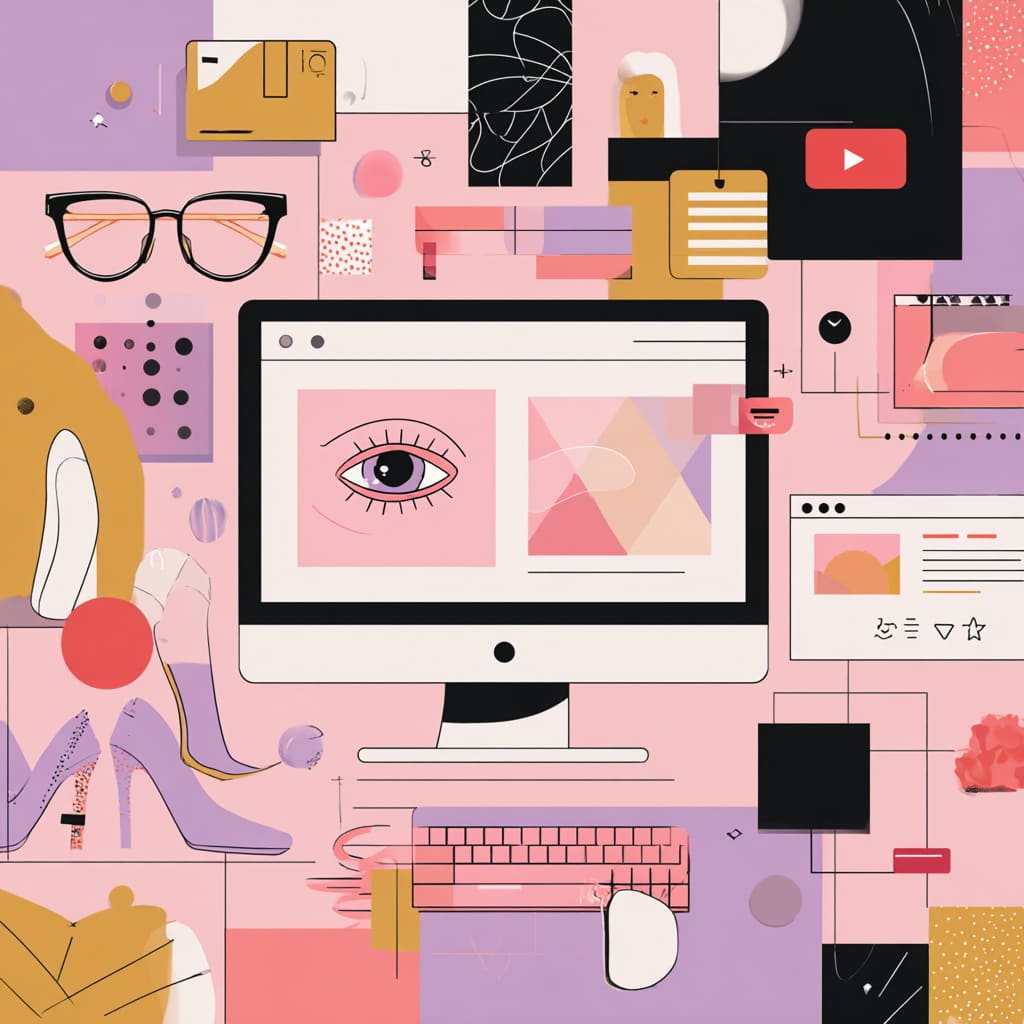
Let’s be honest — we’re all a little shallow online. We judge brands not by their values, mission, or service quality (at least not right away), but by how they look. The design hits first, logic follows later. A single glance at a homepage or an Instagram grid can tell us whether a brand feels premium, cheap, trustworthy, or fake. That’s the magic — and the danger — of visual style.
A brand’s visual identity isn’t just about “looking nice.” It’s a language that shapes how people feel, think, and behave toward a business. The right combination of color, typography, imagery, and rhythm can turn casual scrollers into loyal fans. Let’s break down how that happens.
Why Visual Style Rules the Online World
Online, attention is a currency — and it’s painfully scarce. You have about 50 milliseconds (yep, less than a blink) to make an impression before users decide whether to stay or bounce. In that tiny moment, visual style becomes your only spokesperson.
Your website or social feed doesn’t just show your brand; it tells a story through tone, balance, and emotion. Think of it as silent persuasion — an orchestra of colors, fonts, and space that whispers (or screams) your values before a single word is read.
When done right, the visuals don’t compete with Information Architecture — they dance with it. Together, they guide the viewer through content effortlessly, creating a sense of natural flow and clarity that feels almost invisible. That’s how good design works: it’s noticed when it’s gone.
First Impressions Online – How Design Builds Trust
Here’s the truth: trust online is as fragile as a soap bubble. One off-color layout, one sloppy logo, and “poof” — credibility vanishes. According to research by Stanford, 75% of users judge a company’s credibility based on its website design. That’s not opinion; that’s science.
Great design creates what psychologists call cognitive ease. Your eyes glide naturally, nothing feels overwhelming, and the Silence between elements feels intentional. It’s visual breathing room that makes users comfortable enough to stick around. When the design feels calm, the brand feels confident.
Trust is a visual emotion. It’s built not through slogans, but through consistent, thoughtful design decisions — like spacing, contrast, and a well-balanced Hierarchy of information that respects the reader’s focus.
Colors That Speak for the Brand
Color psychology isn’t just marketing voodoo — it’s backed by decades of behavioral research. Blue inspires calm and reliability (hello, Facebook and LinkedIn). Red evokes passion, energy, and appetite (Coca-Cola, Netflix, YouTube — notice a trend?).
Colors are emotional triggers. They bypass logic and tap straight into instinct. The shade of your CTA button or the background tone of your hero image can literally influence conversion rates.
When choosing your palette, remember this: it’s not about picking your favorite color — it’s about selecting what your audience feels comfortable with. The key is consistency. A well-maintained color scheme across touchpoints reinforces recognition and trust subconsciously, building a strong visual echo that makes people remember you.
Typography as the Voice of a Company’s Personality
If color sets the mood, typography sets the tone of voice. A sleek sans-serif font might whisper modern efficiency, while a hand-drawn script screams creativity and warmth. The magic lies in alignment — your typography should sound like your brand, even when muted.
Good typography isn’t about decoration. It’s about readability, rhythm, and emotion. It’s the structure that gives your words personality. Think of it like a soundtrack — unnoticed by many, but crucial for setting the mood.
Pro tip: avoid mixing too many fonts. Two, at most three, that complement each other will do. And remember the Hierarchy — titles lead, subtitles support, and body text carries the story. When type is in tune with your message, users don’t read; they feel it.
Images, Photos, and Illustrations That Spark Emotion
Let’s face it — our brains are visual junkies. They process images 60,000 times faster than text. That’s why one powerful photo can do more for your brand than an entire paragraph of copy.
Stock photos are fine… if your goal is to look generic. But brands that stand out use visuals with a heartbeat — real people, real moments, real stories. Authenticity beats polish every time.
And don’t forget the storytelling element. The right image doesn’t just fill space — it amplifies emotion, creates connection, and supports your message. Treat visuals as part of your narrative, not as decoration.
Silence plays a role here, too. Don’t clutter every inch of your layout. Give your visuals breathing room — that’s where emotion has space to live.
Visual Consistency and the Power of Recognition
Consistency might sound boring, but it’s the secret sauce of memorability. Imagine if Apple used a different shade of gray every product launch, or Nike changed its “Just Do It” font weekly — chaos, right?
Consistency builds recognition, and recognition builds trust. It’s what makes your brand click in the user’s mind after just a glimpse. Visual cohesion across platforms also reinforces your Information Architecture — people know where to look and what to expect, which feels effortlessly intuitive.
Here are a few things to keep in check:
- Keep your color palette tight and repeated across channels
- Use the same tone and typography online and offline
- Maintain logo placement and proportions
When all parts of your design sing the same tune, your brand becomes instantly recognizable, even in a crowded digital feed.
Why a Unified Style Boosts Conversion and Retention
Ever wonder why some sites just feel trustworthy enough to buy from? It’s because every visual element — from layout to imagery — whispers “you’re in good hands.” That’s the power of coherence.
A unified visual identity reduces friction. It removes tiny bits of mental effort that users spend figuring things out. Less friction = more action. And guess what? That smooth experience often translates directly into higher conversion rates.
Retention works the same way. When users recognize your visual cues instantly, it’s like seeing an old friend online — familiar, safe, and reassuring. They come back, again and again, not just for your product, but for how your brand feels.
Mistakes That Destroy Brand Perception Online
Let’s talk about the dark side — the design blunders that send users running faster than you can say “bounce rate.”
Here are the usual suspects:
- Inconsistent branding – mixing colors, fonts, and styles like a confused DJ.
- Poor readability – fancy fonts that look cool but murder the eyes.
- Cluttered layouts – too much going on, no space for Silence.
- Stock photo overload – everyone’s seen that same smiling call-center lady.
The cure? Clarity. Simplicity. And respect for Hierarchy — every element should have a purpose and a rank. When you respect the viewer’s time, they reward you with attention.

Brands That Won With Strong Visual Style
Ever noticed how some brands don’t need a logo to be recognized? You just know it’s them. That’s visual mastery.
Take Airbnb, for instance. Their visuals radiate warmth and belonging — not just through the logo, but through friendly colors, soft shapes, and genuine photography. Apple nails minimalism like nobody else, proving that restraint can be louder than chaos. And Coca-Cola? That red isn’t just color anymore — it’s a feeling.
Each of these brands built visual ecosystems that reinforce emotion, values, and familiarity. They’re not selling products; they’re selling experiences through design.
How to Create a Visual Style That Actually Works
Creating a killer visual style isn’t about throwing trendy colors and fonts together. It’s strategy wrapped in creativity. Here’s a roadmap to get started:
- Define your brand’s core personality – playful, luxurious, bold, or minimalist?
- Pick colors that evoke your values – test how they look across devices.
- Establish your Hierarchy early – decide what grabs attention first, and what follows.
- Build a brand style guide – document fonts, tones, imagery, and Silence rules for spacing.
- Test, tweak, repeat – design evolves with your audience, not against it.
Creating your visual identity isn’t a one-time project; it’s an ongoing conversation between you and your audience. Keep refining it as your brand grows.
Final Thoughts
Your visual style is more than design — it’s your digital handshake, your first impression, your silent salesperson. Online, where attention is fleeting and competition fierce, the way you look defines how you’re remembered.
When you craft your design with intention — balancing emotion, Information Architecture, and brand personality — you don’t just attract customers; you build fans. And fans don’t scroll away. They stay.
