


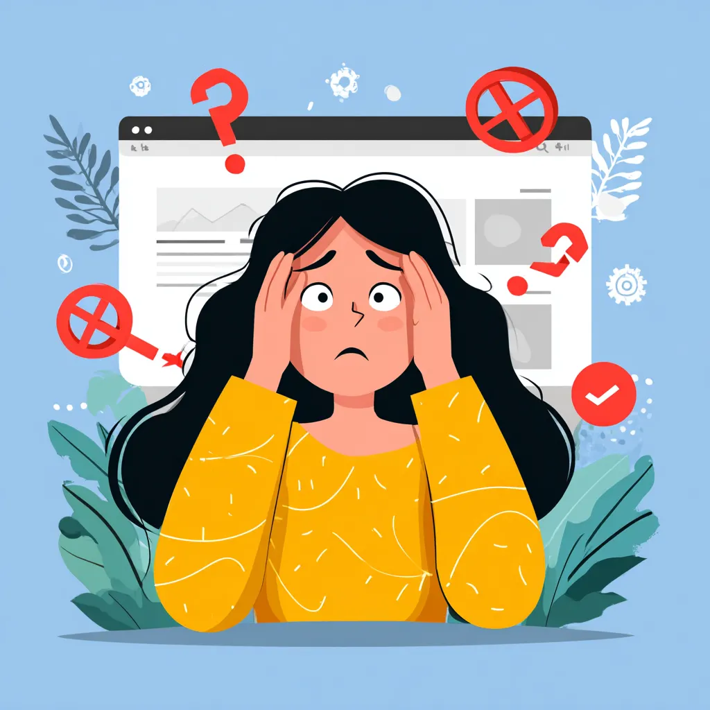
You don’t open a website and think, “Ah yes, today I will evaluate my social rank.” And yet… that’s exactly what happens. Some pages make you feel confident, valued, almost powerful. Others quietly push you into the background like you should be grateful just to be there. None of this is random. Digital products are emotional machines, carefully tuned to influence how important you feel. Let’s talk about how they pull it off.
Why We Feel Different on Different Websites
Emotion Hits Before Logic
Your brain doesn’t wait for facts. It reacts instantly. Colors, spacing, rhythm, visual calm — all of that lands before you read a single word. A balanced interface feels self-assured. A noisy one feels insecure. And those emotions immediately affect how you see yourself as a visitor.
Fast loading pages also play a role here. Speed creates confidence. When a site responds instantly, it feels like it respects your time. Slow reactions do the opposite and quietly lower your perceived importance.
Context Shapes Self-Perception
Two platforms can offer the same service, yet one feels premium while the other feels disposable. That difference often comes from atmosphere, not content. Thoughtful Contrast directs attention and subtly signals what matters. And if something matters, so do you.
The Illusion of Exclusivity as a Core Status Tool
People Love Being “Not Everyone”
We’re wired to want inner circles. The moment a platform hints that access is limited, interest explodes. “Members only” sounds irresistible even when membership is basically automatic. Logic steps aside. Ego takes the wheel.
Private areas, early access programs, invitation systems — all of them manufacture prestige out of thin air. You stop feeling like a random user and start feeling chosen.
Exclusivity Doesn’t Have to Be Real
Here’s the trick: it only needs to feel exclusive. A label like “available to selected users” can include millions, and your brain will still treat it as special. Status lives in perception, not statistics.
How Design Makes Users Feel Powerful or Powerless
Control Equals Authority
The more control a site gives you, the more respected you feel. Custom settings, flexible filters, adjustable dashboards — these aren’t just features. They’re signals. They say the system adapts to you.
Remove that control, and the tone changes. You’re no longer steering. You’re complying. Strong User Experience design reinforces autonomy, and autonomy feels like power.
Visual Hierarchy Sets the Mood
Small text, tight spacing, endless pop-ups shrink the user. Large elements, confident typography, and clear structure elevate them. The screen quietly decides who’s in charge.
How Interface Language Builds a Sense of Superiority
Words Can Empower or Undermine
Buttons and labels carry emotional weight. “Proceed” feels different from “Let’s go.” One commands. The other invites. Friendly, confident wording boosts the user’s self-image without trying too hard.
Nobody enjoys being talked down to by software. Tone matters more than most teams admit.
Speaking Directly Changes Everything
Using “you” turns instructions into conversation. The interface stops barking orders and starts collaborating. That simple shift increases comfort and perceived importance instantly.
Limited Access as the Strongest Status Marker
What’s Locked Becomes Valuable
Blurred content, disabled options, hidden sections — they all whisper the same thing: this isn’t for everyone. Even if you didn’t want it before, now you’re curious.
Subscription platforms and SaaS tools lean heavily on this tactic because it works. The wall itself creates desire.
Waiting Builds Emotional Investment
Waiting lists aren’t about logistics. They’re about psychology. The longer the wait, the higher the perceived value. Time spent waiting turns mild interest into attachment.
Personalization That Flatters and Manipulates at the Same Time
Recognition Feels Good
Seeing your name, preferences, or history feels personal. Like being remembered. That recognition boosts confidence and creates emotional warmth toward the platform.
When done poorly, it feels invasive. When done right, it feels like respect.
The Feeling of a Unique Journey
Even when algorithms group you with millions, the experience feels custom-made. Smart defaults, adaptive layouts, tailored suggestions — all of it suggests the system revolves around you.
To make this clearer, here are a few common personalization patterns people rarely notice:
- Content recommendations based on past behavior
- Interfaces that evolve as usage grows
- Messages triggered by actions, not schedules
Social Proof and the Hidden User Hierarchy
We Always Compare Ourselves
Badges, follower counts, visible achievements — they quietly rank everyone. You instantly know who carries weight and who doesn’t. And you automatically place yourself somewhere on that ladder.
Even subtle labels like “top contributor” or “verified” do heavy psychological lifting.
Status Is Contagious
Seeing respected people use a product elevates the space itself. That’s why logos, testimonials, and endorsements are everywhere. If important people are here, being here must mean something.
Micro-Rewards and the Feeling of Moving Up
Small Wins Fuel Motivation
Progress indicators, streaks, gentle celebrations — they feed the brain tiny doses of satisfaction. Each action feels like advancement. Movement creates meaning.
Gamification doesn’t need fireworks. Subtle feedback is often more effective.
Advancement Without Real Rewards
Often there’s no tangible prize at all. Just symbols of growth. Levels, milestones, numbers going up. And somehow, that’s enough to make progress feel real.
Premium Without Words Through Visual Signals
Appearance Speaks Louder Than Text
Luxury doesn’t shout. It’s quiet. Restrained color palettes, minimal layouts, generous spacing — these choices radiate confidence without explanation.
Typography plays a huge role here. Thoughtfully chosen Fonts instantly raise perceived quality, even when nothing else changes.
Details Create Authority
Smooth animations, subtle shadows, refined icons — these details don’t beg for attention. They earn trust. High status design comes from restraint, not excess.
When the Website Makes the User the Main Character
You’re the Center of the Experience
Great platforms frame the user as the hero. Dashboards reflect personal goals. Interfaces respond instantly. Everything reinforces the idea that this space exists for you.
This is storytelling without words. Interaction becomes narrative.
The Journey Matters More Than the Outcome
Clear paths, visible progress, meaningful checkpoints — they create momentum. You’re not clicking aimlessly. You’re moving through a story where your actions matter.
The Ethical Line Between Status and Psychological Pressure
Influence Can Turn Into Exploitation
What starts as motivation can slip into manipulation. Artificial urgency, fear of missing out, aggressive upselling — these tactics push the same emotional buttons but with less respect.
Design always influences behavior. The question is how responsibly.
Respect Is the Highest Status Signal
The strongest platforms don’t pressure users. They trust them. Clear choices, honest limits, transparency — these create loyalty that no trick can match.
In the end, real digital status isn’t about exclusivity or polish. It’s about feeling valued without being played.
