


Design Principles: Drawing Emphasis Using Contrast
Did you know that 90% of information transmitted to the brain is visual, and people process visuals 60,000 times faster than text? At Almax, we understand the power of effective design in engaging viewers, and one of the most powerful tools at our disposal is contrast. By using contrast effectively, our designers can guide the viewer’s eye, highlight important elements, and create a visual hierarchy that enhances the overall user experience. In this blog post, we will explore the importance of drawing emphasis, how contrast can be used to achieve it, and practical techniques for implementing these principles in your designs.
Why Drawing Emphasis Is Important
Drawing emphasis is crucial because it helps communicate the most important information to the viewer quickly and clearly. In art and design, emphasis and subordination are key principles that ensure some elements stand out while others recede into the background. This hierarchy allows the designer to control the viewer’s focus, making the design more effective and engaging.
Emphasis and Subordination in Art
Emphasis
Emphasis in art refers to the technique used by artists to draw attention to a particular area or element within an artwork. This is often achieved by manipulating various elements such as color, size, shape, texture, or placement to make a specific part stand out. Emphasis helps to create a focal point, guiding the viewer’s eye to the most important part of the composition.
Subordination
Subordination is the counterpart to emphasis, where certain elements are made less noticeable to support the focal point. This technique ensures that the emphasized part of the artwork stands out more prominently by reducing the visual impact of other components. Subordination helps maintain a balanced composition and prevents the artwork from becoming too chaotic or overwhelming.
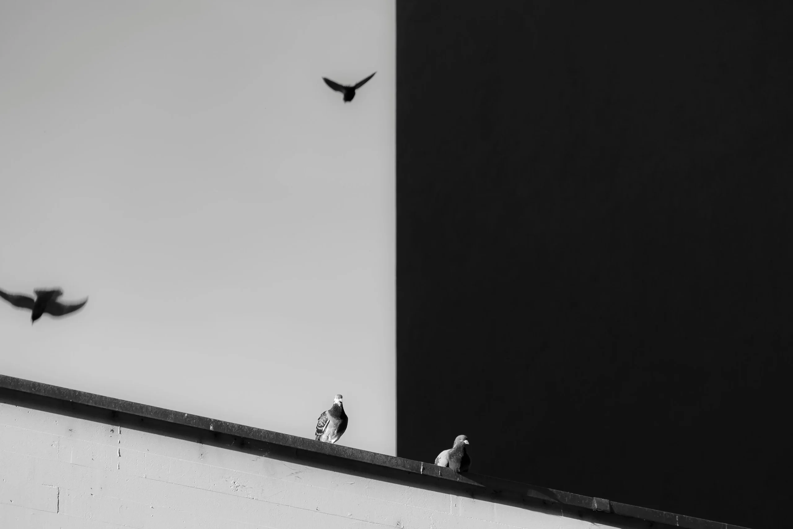
Understanding How Contrast Can Draw Emphasis
Contrast is one of the most powerful tools for drawing emphasis. By placing different elements in opposition to each other, such as light against dark or large against small, designers can create visual interest and direct attention where it’s needed most.
Ways to Draw Emphasis: Types of Contrast
Color Emphasis and Contrast: Making Elements Stand Out
Color contrast is a highly effective way to draw emphasis. By using contrasting colors, designers can make certain elements pop, ensuring they capture the viewer’s attention. For example, a bright red button on a neutral background immediately stands out, making it clear that it is an important call to action.
Contrast in Typography: Emphasis Lines
Typography contrast, such as using bold or italicized text, can also draw emphasis. Emphasis lines, created by varying font weights or styles, help important text stand out from surrounding content, guiding the reader’s eye through the design.
Size and Scale: Creating Visual Hierarchy
Using size and scale to create contrast is another effective technique. Larger elements naturally draw more attention than smaller ones, establishing a clear visual hierarchy. This technique is particularly useful for headlines, images, and key content.
Texture and Pattern: Adding Depth and Interest
Contrasting textures and patterns can add depth and interest to a design. By juxtaposing smooth and rough textures or simple and complex patterns, designers can create areas of emphasis that stand out from the rest of the composition.
Emphasis by Isolation
Isolating an element from the rest of the design can also draw emphasis. By surrounding an important element with whitespace or a different background, it becomes the focal point, ensuring that the viewer’s attention is directed to it.
How to Draw Emphasis in Your Website Designs
Using Contrast to Guide the Viewer’s Eye
In web design, using contrast to guide the viewer’s eye is essential for effective navigation. By strategically placing contrasting elements, designers can lead users through the site in a logical and intuitive way.
Enhancing Readability with Contrast
Enhancing readability with contrast involves ensuring that text is easily distinguishable from the background. This can be achieved by using high-contrast color combinations and sufficient font sizes to make reading comfortable and effortless.
Creating Focal Points through Contrast
Creating focal points through contrast helps highlight the most important parts of a webpage. This can be done using techniques such as color contrast, size contrast, and isolation to ensure key elements like calls to action and important information stand out.
Drawing Emphasis: Tips and Techniques
Balancing Contrast for Harmony
While contrast is important, it’s crucial to balance it to maintain harmony in the design. Too much contrast can be overwhelming, while too little can make the design dull. Finding the right balance ensures a cohesive and aesthetically pleasing result.
Avoiding Common Contrast Mistakes
Avoiding common contrast mistakes is vital for effective design. Common errors include using too many contrasting elements, which can create visual chaos, or not enough contrast, leading to a lack of emphasis. Ensuring that contrast is used purposefully and sparingly is key.
Tools and Resources for Effective Contrast
Various tools and resources can help designers use contrast effectively. Color contrast checkers, typography tools, and design software with contrast features can assist in creating designs that draw emphasis appropriately.
Case Studies and Examples
Analyzing Successful Designs: On the Grid Website
The On the Grid website provides excellent examples of using contrast to draw emphasis and improve user experience. Here are some screenshots and explanations of how the site uses contrast effectively:
In this screenshot, the main call to action, “Choose a City,” is emphasized using a high-contrast button that stands out against the background image. The text “Explore the world” is in bold, large font, drawing immediate attention and guiding the viewer’s eye to the primary message.
The website also uses color contrast to help indicate to the user what city they are selecting. The highlighted city, Amsterdam, uses a lighter background, drawing emphasis compared to the darker background of other cities. This not only makes it stand out but also guides the user’s focus, improving navigation and user experience.
You might also like to see Bad UX: Top Examples of What to Avoid
Emphasis Examples in Art
“The Last Supper” by Leonardo da Vinci
In “The Last Supper,” Leonardo da Vinci uses several techniques to draw emphasis to the figure of Jesus at the center of the composition:
- Central Placement: Jesus is placed at the exact center of the table, making him the focal point.
- Converging Lines: The architectural lines of the ceiling and walls converge towards Jesus, directing the viewer’s eye.
- Contrast in Lighting: Jesus is highlighted with a brighter background, creating a stark contrast with the darker surroundings.
“Starry Night” by Vincent van Gogh
Vincent van Gogh’s “Starry Night” uses color and movement to draw emphasis to the swirling night sky:
- Color Contrast: The vibrant, swirling blues and yellows of the sky contrast with the darker, more muted colors of the village below.
- Dynamic Lines: The swirling, dynamic lines of the sky create a sense of movement and energy, drawing the viewer’s eye across the canvas.
“The Creation of Adam” by Michelangelo
Michelangelo’s fresco “The Creation of Adam” in the Sistine Chapel emphasizes the moment of creation:
- Isolation and Placement: The nearly touching hands of God and Adam are centrally placed and isolated against a relatively plain background, drawing immediate focus.
- Use of Light: The figures of God and Adam are highlighted against the darker background, emphasizing their importance.
Conclusion: Drawing Emphasis
In conclusion, mastering the use of contrast to draw emphasis in design can significantly enhance the effectiveness and visual appeal of your projects. By understanding and applying principles of emphasis and subordination, you can create clear visual hierarchies that guide the viewer’s eye and highlight key elements. From color contrast to typography, size, texture, and isolation, each technique offers unique ways to make your designs more engaging and impactful.
At Almax, our team of skilled designers is adept at leveraging these techniques to create stunning and effective designs. Contact us today to see how we can help you elevate your designs with expert use of contrast and emphasis.
