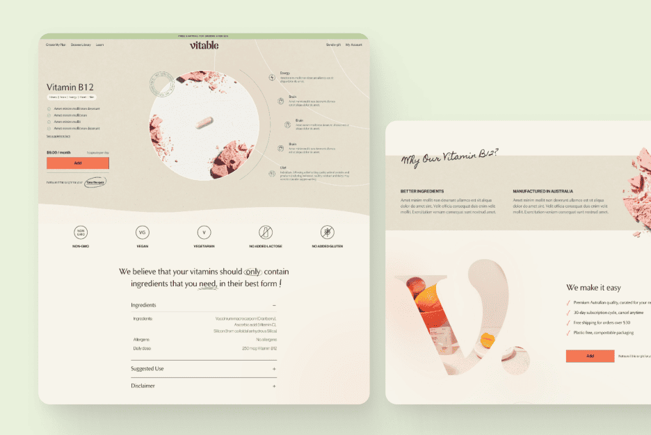
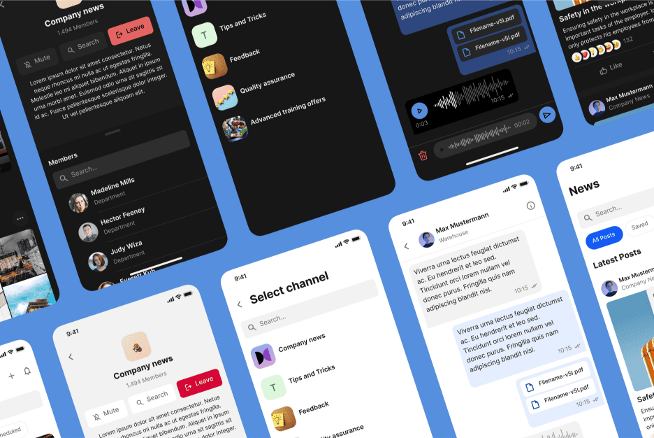
When it comes to improving user experience, many design teams believe that large-scale redesigns are the only way to solve user issues. However, the reality is that small, strategic tweaks to UI components can often yield more impactful results than a full overhaul.
Changing the text on a button, repositioning key UI elements, or refining spacing can make or break user interactions. These micro-adjustments, when driven by data, don’t just improve user satisfaction—they can increase engagement and boost conversions without disrupting your development pipeline.
In this guide, we’ll explore the art of smart UX testing and how minimal design changes can have a maximum impact on your product’s success.
Check out some of our recent UX optimization projects on Behance for real-world examples of how small changes made a big difference.
Why Small Changes Matter in UX Testing
The misconception that only major updates create real change leads many design teams to overlook the potential of small adjustments. But some of the most successful UX transformations come from tiny tweaks.
Real-World Examples of Game-Changing Tweaks:
- Button Copy Change: A fintech platform switched the CTA “Get a Quote” to “See Your Savings” and saw a 12% increase in clicks.
- Form Simplification: A travel booking site reduced its form fields from six to three and increased completion rates by 18%.
- Contrast Adjustment: An online education platform enhanced the contrast of its “Next Lesson” button and boosted course completion by 25%.
Why Small Changes Work:
- Reduced Cognitive Load: Users can navigate more intuitively when they face fewer visual distractions.
- Faster Testing and Iteration: Small updates can be tested and refined within days, not weeks.
- Granular Insights: Isolating one change at a time allows teams to identify exactly what drives user behavior.
Related Reading: For a deeper dive into UX optimization strategies, read our article Why Every Design Launch Needs a Detailed UX Plan.
External Resource: For more insights on micro UX design, check out Nielsen Norman Group’s guide on UX.
Pro Tip: Start by identifying “micro-friction points”—small moments where users hesitate or experience confusion. Testing even subtle improvements in these areas can lead to major UX wins.

Key UI Elements to Focus On During UX Testing
A complete UI overhaul isn’t necessary to see a significant impact. Instead, focus on specific high-impact elements that users interact with most frequently.
High-Impact UI Elements to Test:
- Buttons: Placement, color, and microcopy can drastically affect user actions.
- Forms: Reducing the number of input fields or rearranging their order can improve form completion rates.
- Navigation Menus: Small changes like labeling or rearranging menu items can improve discoverability.
- Callouts and Modals: Testing subtle changes in the phrasing of pop-ups and tooltips can prevent users from abandoning the page.
Example:
A popular SaaS platform experimented with changing the text of their primary call-to-action from “Start Free Trial” to “Get Started in 60 Seconds.” The change resulted in a 10% increase in new user sign-ups.
Pro Tip: Color psychology also plays a significant role in UI testing. To learn more about the psychology of color, check out our guide why color choices matter in design.
External Resource: Read HubSpot’s article on boosting UX with CTA optimization.

UX Testing Methods That Drive Results
Choosing the right UX testing method can make all the difference when refining your interface. While there are many ways to gather insights, some approaches stand out for their effectiveness.
Popular UX Testing Methods:
- A/B Testing: Shows users two variations of the same element or page to determine which performs better.
- Heatmaps: Visualize user interactions, highlighting where users click, scroll, or hover the most.
- Usability Testing: Real users perform tasks while observers gather qualitative feedback on their experience.
- Session Recordings: Track and review user sessions to understand patterns and uncover common roadblocks.
Pro Insight: Many teams default to A/B testing without a clear hypothesis, leading to irrelevant or inconclusive data. Instead of testing random variations, form a hypothesis based on user feedback or behavior patterns. For example, if heatmaps show users skipping a key CTA, you can hypothesize that the color or position isn’t prominent enough and test adjustments accordingly.
Further Reading: Want to know how to get actionable data from your UX tests? Check out Smashing Magazine’s article on A/B testing.
Common UX Testing Mistakes and How to Avoid Them
Even the best UX testing efforts can fail if certain pitfalls aren’t avoided.
Common UX Testing Mistakes:
- Testing Too Many Elements at Once: Simultaneously changing multiple elements makes it difficult to determine which adjustment led to the observed result.
- Small Sample Sizes: Testing with too few users can produce skewed or unreliable data.
- Ignoring Qualitative Feedback: Quantitative metrics (clicks, conversions) are essential, but qualitative insights (user comments, frustrations) add valuable context.
Pro Tip: Balance qualitative and quantitative testing by combining A/B testing with usability testing. This dual approach provides both hard data and user sentiment, giving you a fuller picture of your interface’s performance.
External Resource: Learn more about usability testing from Maze’s comprehensive UX testing guide.
Case Study: In one of our projects for an e-commerce client, we ran usability tests alongside A/B tests to refine their checkout process. This combination of data led to a 20% improvement in conversion rates.

The Importance of Continuous Iteration in UX Testing
UX optimization isn’t a one-and-done process—it’s a continuous cycle of testing, learning, and improving.
Building a Sustainable Iterative Process:
- Plan: Identify areas of improvement and set clear goals for your tests.
- Test: Run experiments on small UI elements to validate or disprove your hypotheses.
- Analyze: Use both quantitative data (e.g., click-through rates) and qualitative feedback (user comments) to draw conclusions.
- Refine and Repeat: Implement the best-performing changes, then test again to validate results.
Real-World Example:
A financial services app improved its onboarding flow by iteratively testing changes to welcome screen copy, button labels, and progress indicators. These small improvements increased account activations by 22% without requiring a full redesign.
Learn more about UX from our articla – The Ultimate Guide to Delete Dialog UX Design
Conclusion: The Power of Micro-Changes in UX Design
Small design changes can have a massive impact when guided by smart UX testing. By focusing on high-impact UI elements, running data-driven experiments, and embracing an iterative process, you can enhance your product’s user experience without resorting to costly redesigns.
At Almax Agency, we specialize in helping businesses unlock the full potential of their digital products through strategic UX testing and minimal but effective updates. Want to see how small tweaks can make a big difference for your project? Let’s Talk.
For more insights and success stories, visit our Behance page and discover how small improvements lead to significant transformations.


