


Ever tried to design a product without knowing what your user actually wants? Feels like throwing spaghetti at a wall and hoping something sticks. That’s where user journeys come to the rescue. They aren’t just fancy diagrams you hang on the wall—they’re your secret weapon to understanding the human behind the clicks, taps, and swipes. Buckle up, because we’re diving deep into what makes user journeys essential, how to build them, and how they can actually save your sanity (and your product) in the long run.
What a User Journey Really Is and Why You Can’t Ignore It
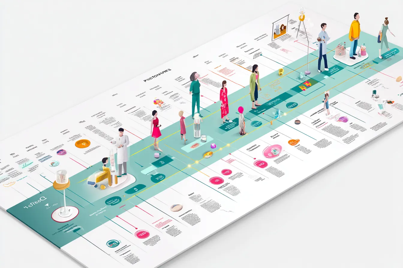
A user journey is basically a map of how someone interacts with your product or service. Think of it as a storyline where your customer is the hero, and every touchpoint—website, app, customer support—acts like a plot twist. The better you understand the journey, the fewer plot holes your product has.
Skipping this step is like trying to throw a party without knowing if your guests like cake or chips. You might get lucky, but most likely you’ll end up with a sad punch bowl and an empty dance floor. User journeys give you clarity, help identify pain points, and spotlight opportunities that might otherwise go unnoticed.
Another reason they’re indispensable: they turn abstract data into a story you can actually act on. Numbers are fine, but a real-life narrative? That sticks. And it’s much easier to persuade stakeholders with a story than a spreadsheet.
How User Journeys Help You See the Real User Experience
Ever stared at analytics for hours and still didn’t know why your bounce rate was through the roof? That’s because data can only tell you what happens, not why it happens. User journeys bridge that gap. They reveal motivations, frustrations, and tiny moments of delight that analytics simply can’t capture.
When you map a journey, you start seeing patterns. Maybe users are getting lost on the checkout page, or perhaps they abandon your onboarding because your Color Palette makes everything feel overwhelming. Suddenly, these “small annoyances” become actionable insights. And guess what? Fixing these pain points often leads to noticeable spikes in engagement and retention.
Small Wins Matter
Even tiny improvements in a user journey can have huge effects. A simpler login process, a clearer CTA, or even adjusting your Color Schemes for better contrast can make your users feel like you actually get them.
The Classic Mistake Most People Make When Designing Interfaces
Let me spill the tea: tons of designers skip the journey phase and jump straight to screens. They think flashy buttons, cool animations, or the newest Design System Architecture will make users happy. Spoiler: it rarely works that way.
Without a journey map, you’re essentially designing in the dark. Users end up frustrated, support tickets pile up, and you wonder why your product isn’t “as intuitive as you thought.” Remember, interfaces aren’t just about looking pretty—they’re about guiding humans through a meaningful experience.
Preparing to Craft a User Journey and Gathering the Right Data
Before you grab a Miro board or Figma file, preparation is key. You need the right info to tell the story convincingly.
Start by collecting:
- User interviews: Direct feedback is pure gold. Ask open-ended questions like “What frustrates you most about X?”
- Behavioral data: Analytics tell you where users drop off or linger.
- Support tickets and reviews: Sometimes the best insights are complaints or kudos left by real humans.
Extra Tip
Document everything. Even seemingly minor details—like users getting confused by your Color Palette choices or inconsistencies in your Design System Architecture—can be the difference between a smooth journey and a bumpy ride.
The Main Stages of Building a User Journey
Once you’ve gathered data, it’s time to structure it. A solid user journey usually includes:
- Awareness – How users first discover your product.
- Consideration – Why they stick around and what questions they ask.
- Decision – What makes them finally take action.
- Retention – How you keep them engaged.
- Advocacy – What encourages them to spread the word.
Treat each stage as a mini-story. Add touchpoints, emotions, and actions. The more vivid, the better—it helps everyone in your team empathize with the user
Choosing a Persona and Defining Motivation
Every good user journey needs a hero. Pick a persona—a semi-fictional representation of your user—and flesh out their motivations, fears, and goals. This is where your journey stops being abstract and starts feeling real.
Ask yourself:
- What keeps this persona awake at night?
- What do they hope to achieve with my product?
- Which parts of their life will I make easier?
Once you answer these, you can design flows that actually solve problems instead of adding friction.
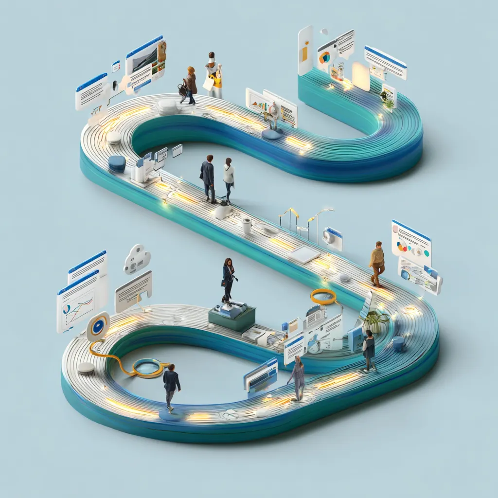
Visualizing Journeys and Making Them Team-Friendly
A journey map is useless if no one understands it. Keep it clear and approachable. Use visuals, sticky notes, or even rough sketches. Highlight key touchpoints, frustrations, and moments of delight.
Some handy tips:
- Use color coding for stages or emotions.
- Include a simple timeline so it’s easy to follow.
- Keep it collaborative—invite teammates to contribute ideas.
A well-visualized journey helps designers, developers, and marketers get on the same page. It’s your secret weapon for smoother teamwork.
Typical Mistakes When Creating User Journeys and How to Avoid Them
Even seasoned pros mess this up. Common pitfalls include:
- Focusing on features instead of the user’s feelings.
- Skipping research and making assumptions.
- Overcomplicating the map with unnecessary details.
To avoid these, always validate your assumptions with real users, keep your journey concise, and remember: simplicity often wins over complexity.
Real Company Cases That Thrived Thanks to User Journeys
Some of the most successful products swear by journey mapping. Spotify, for instance, didn’t just randomly create playlists—they observed how users discover music, then built flows around those habits. The result? Millions of engaged users who feel understood.
Another fun example is Airbnb. Early on, they noticed users were confused during booking. Mapping the journey revealed pain points, which they fixed with clearer messaging and a more intuitive interface. That small change led to huge growth and customer satisfaction.
Why It Works
When you walk in a user’s shoes, you notice patterns that data alone can’t reveal. Tiny tweaks informed by journeys often compound into massive wins over time.
The Key Takeaways on Crafting User Journeys
If you remember only three things, make it these:
- Empathize first – know your users’ desires and frustrations.
- Visualize clearly – make journeys intuitive for everyone on the team.
- Iterate constantly – update your maps as your product evolves.
Also, don’t forget small details like Color Schemes or the consistency of your Design System Architecture. They might seem minor, but they influence the overall experience more than you think.
In short, user journeys aren’t optional—they’re the blueprint for understanding, improving, and delighting your audience. Nail them, and your product won’t just function; it will resonate.
