


We live in a world that never shuts up. Screens blink, notifications scream, feeds scroll forever. In that constant noise, contrast is the quiet superpower that helps us make sense of things without thinking too hard. We don’t consciously ask for it, but our brain desperately needs differences to survive the Sea of Information we swim in every day. Without contrast, everything blurs into a boring, exhausting mess.
Good contrast doesn’t shout. It guides. It gently tells us where to look, what matters, and what can wait. And once you start noticing it, you’ll realize how deeply it affects everything—from websites and apps to Landing Pages and even how we read a simple paragraph of text.
Why contrast is the foundation of perception, not a decorative trick
Contrast isn’t about making things “look cool.” It’s a survival mechanism. Our brains evolved to notice differences fast: light versus shadow, large versus small, still versus moving. That instinct didn’t disappear when we opened our first website.
When designers treat contrast like decoration, the result usually looks pretty but feels confusing. When contrast is treated as structure, everything suddenly makes sense. You don’t need explanations. You just know where to go next.
How the brain uses differences to understand the world faster
Your brain hates effort. It’s lazy in the most efficient way possible. The moment it sees clear differences, it relaxes. “Ah, got it,” it says, and moves on.
This is why strong contrasts speed up comprehension. Big elements signal importance. Dark areas feel heavier. Light zones feel safe and open. The brain processes these signals faster than any written instruction could ever hope to.
Why design without contrast becomes invisible
When everything looks the same, nothing stands out. Equal sizes, similar tones, uniform spacing—it all melts into visual fog. Users don’t get angry right away. They just leave.
Invisible design isn’t boring because it lacks beauty. It’s boring because it lacks decisions. If nothing is emphasized, users don’t know what to care about. And when people don’t know what matters, they stop paying attention.
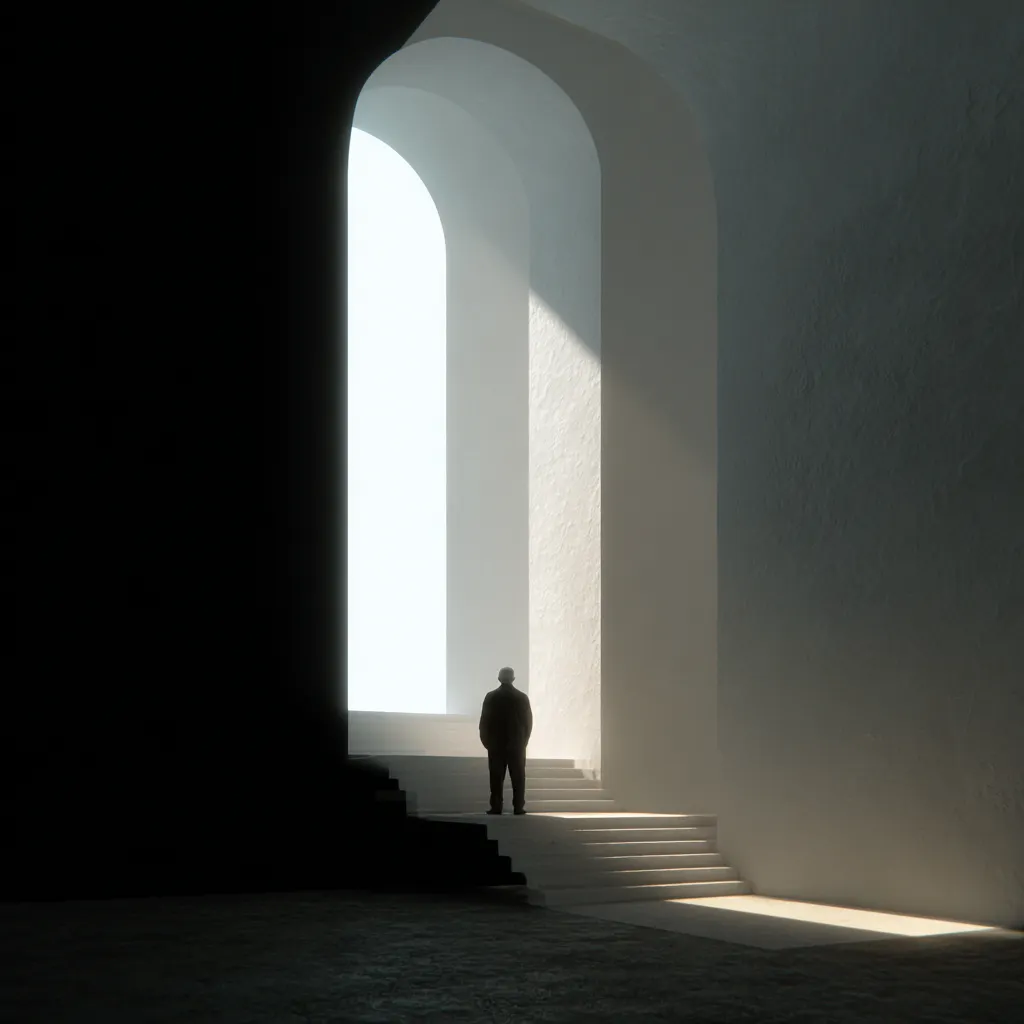
Light and dark as tools for controlling attention
Light areas invite. Dark areas anchor. Together, they create rhythm and direction. Used intentionally, they guide the eye without arrows, hints, or pop-ups begging for clicks.
This is why dark sections often hold key messages, while lighter zones feel easier to explore. It’s not a trend—it’s perception psychology doing its thing, quietly and effectively.
Why big always speaks louder than small
Size is the most primitive form of contrast. Bigger means more important. Smaller means supportive. We don’t question it—we accept it instantly.
When everything is large, nothing feels important. When everything is tiny, users feel lost. Strong design uses size like volume control, turning emphasis up or down exactly when needed.
How contrast helps set priorities without words
Great interfaces rarely explain themselves. They don’t need to. Contrast does the heavy lifting.
Before diving deeper, it helps to remember what contrast quietly answers for the user:
- What should I look at first
- What matters most right now
- What can I safely ignore
When these answers are clear, interaction feels effortless. When they aren’t, users feel tension without knowing why.
Why uniform design is more tiring than chaos
Chaos at least gives your brain something to grab onto. Uniformity doesn’t. When everything looks equally important, your mind works overtime trying to decode meaning.
This mental strain builds fast. Users may not articulate it, but they feel tired, impatient, and overwhelmed. Ironically, adding contrast often reduces stress, even if the layout looks bolder.

How scale and differences create a sense of structure and order
Structure isn’t about grids alone. It’s about relationships. Contrast creates those relationships instantly.
Large elements frame the story. Medium ones guide the flow. Small details add clarity. Together, they form a visual hierarchy that feels stable and predictable—even in complex systems.
Why contrast is about usability, not just aesthetics
Pretty without contrast is useless. Functional with contrast feels intuitive.
Usability lives in differences: readable text against backgrounds, clickable elements that look clickable, sections that feel distinct. A thoughtful Color Palette plays a huge role here—not by being trendy, but by creating clear separation and meaning.
How lack of differences breaks navigation and meaning
When buttons look like text, text looks like decoration, and sections blend together, navigation collapses. Users hesitate. They misclick. They second-guess themselves.
Every missing contrast adds friction. Enough friction, and trust evaporates. People don’t blame the design—they just assume the product isn’t for them.
Why strong design is always built on opposites
Light needs dark. Large needs small. Quiet needs loud. Without opposites, there is no clarity—only noise.
Strong design isn’t afraid of differences. It leans into them. Because contrast isn’t conflict. It’s conversation. And when used with intention, it turns confusion into confidence, chaos into flow, and complexity into something that finally feels human.
