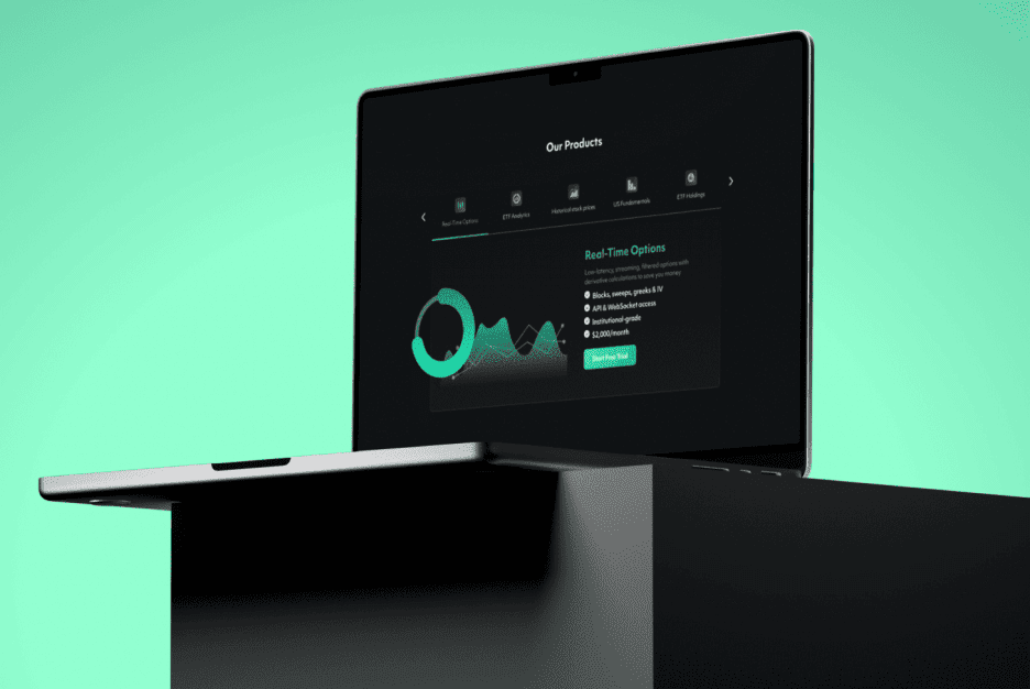
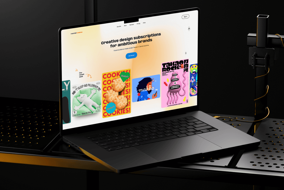
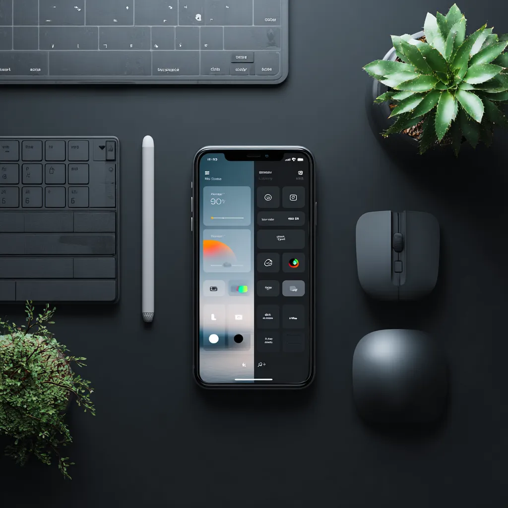
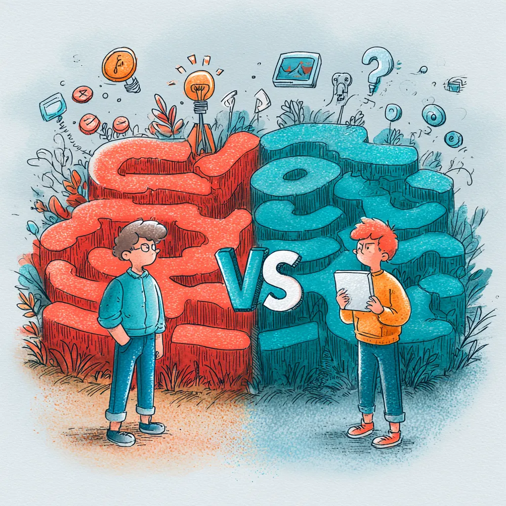
Ever notice how people fight over light mode versus dark mode like it’s a pizza topping debate? Some folks swear by the crisp, bright look of a white screen, while others treat dark mode like eye therapy. The truth is, both have their perks, their flaws, and a few hidden traps. Let’s break it down in a way that actually makes sense — no technical jargon, just straight talk about how people feel when they use different styles.
Why choosing between light and dark themes matters for your product
Think of a theme as the outfit your product wears. Just like you wouldn’t show up to a wedding in pajamas, your app or website shouldn’t feel out of place in your users’ hands. The look instantly affects whether people trust it, enjoy it, or ditch it quicker than you can say “delete.”
When companies plan a Design Launch, this choice isn’t just about looks. It’s tied to Value, first impressions, and whether users will recommend it to friends. It may seem small, but pick the wrong theme and your product might be remembered for all the wrong reasons.
What users actually feel in dark mode
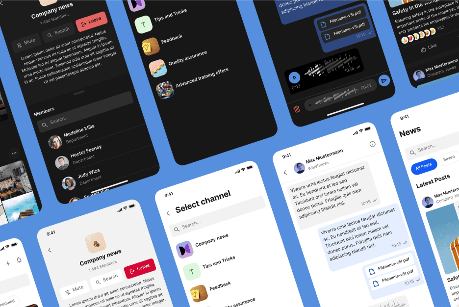
Dark backgrounds aren’t only about being “trendy.” They cut glare, create a modern vibe, and often feel more comfortable at night. That’s why gamers and developers who stare at screens for hours usually stick with darker layouts. It feels like dimming the lights in a cozy room.
But here’s the catch: too much darkness can get overwhelming or even depressing if the Color Palette isn’t chosen carefully. Instead of stylish, the whole product can feel heavy. People are emotional creatures, not machines — and design taps straight into those emotions.
When light mode works best
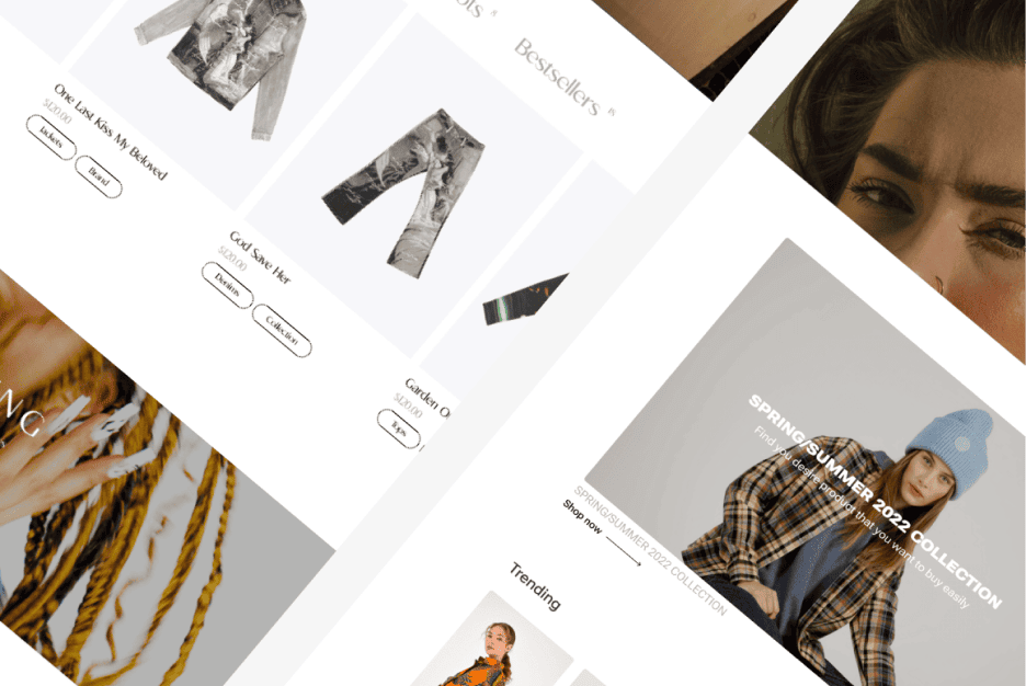
Bright themes feel open, clean, and trustworthy. It’s no accident that banking platforms, government portals, and most productivity tools go for lighter looks. They give off that “nothing to hide” energy, which builds trust instantly.
Light mode also shines when there’s a ton of text. Picture reading an article in dark mode under the blazing sun — you’d be squinting in seconds. Sometimes, straightforward and simple wins big.
When dark mode takes the spotlight
Dark mode rules in low-light spaces. Night readers, late-night designers, and anyone who wants less strain on their eyes will naturally gravitate toward it. On OLED screens, it even saves battery life, which is a lifesaver for Mobile App fans.
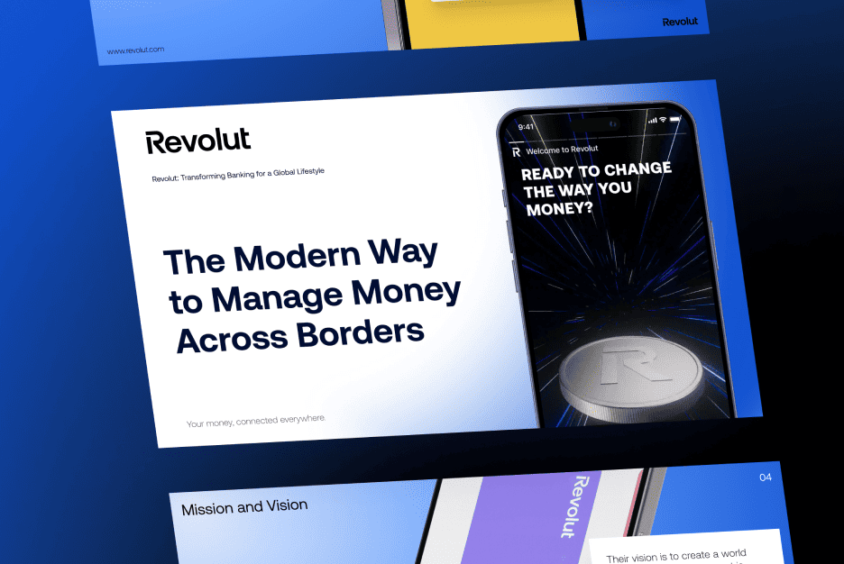
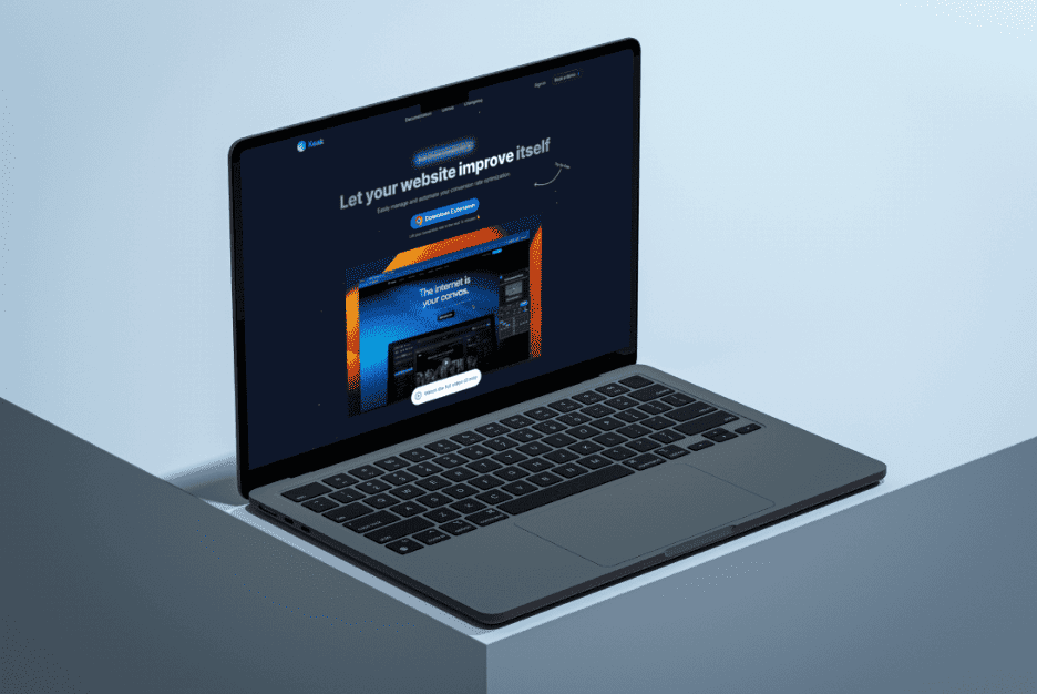
And let’s be real: it just looks slick. Dark themes feel futuristic, stylish, even premium. Many brands embrace them to look bold and stand apart from the crowd.
How habits and context shape perception
Your surroundings completely change your preference. Someone scrolling at midnight probably prefers the comfort of dark visuals, while the same person in a sunlit office would switch to light mode in a heartbeat. Context flips the script all the time.
That’s why the smartest products adapt. If your Development Software offers both choices, you’re handing users the power to make themselves comfortable instead of locking them into one default

What research says about comfort and eye strain
Studies don’t all agree. Some suggest dark layouts cut glare and help at night, while others show that reading long chunks of text is still easier in light mode. Basically: there’s no universal winner here.
Here’s a fun one — Microsoft found that people wrote more accurately in a bright editor but lasted longer without fatigue in a dark one. Each mode has its sweet spot depending on what you’re doing.
Why color perception ties to emotions and trust
Colors influence feelings more than most people realize. Light themes usually feel clean, transparent, and reliable. Dark visuals spark mystery, sophistication, and even intensity. Neither is “better” — it all depends on what your brand wants to say.
Think about a meditation app in neon green on black. Not exactly calming, right? The Color Palette needs to match the product’s vibe, or users will feel confused instead of connected
The risks of betting on just one theme
Here’s the danger: going all-in on a single theme is like serving only one meal at a restaurant. Some people will eat it up, but others won’t even sit down.
Ignore flexibility and you risk pushing away half your users. At worst, your product feels dated or stubborn. Giving options is a safer path than forcing everyone into the same box.
What users value when given the choice
People love having control. Offering both themes instantly makes users feel like the product cares about them. And when people feel good, they stick around.
Here’s what usually matters most:
- Eye comfort depending on time of day
- The impression the theme gives about your brand
- Whether the experience feels smooth inside the product they already use
Providing these options increases the perceived Value of your product without adding huge complexity
How to figure out which theme fits your audience
Don’t guess — test it. Surveys, polls, and A/B experiments reveal what users actually want. Sometimes the results are surprising, like younger audiences leaning toward dark while older folks prefer light.
The right decision isn’t just about data points, though. It’s about aligning your brand’s voice, your target audience, and the emotional journey you want to create every time someone opens your app. The sweet spot is found in a mix of feedback and intuition
