Let’s be honest — the internet is full of designs that either make you go “wow, that’s smooth” or “wait, where am I supposed to click?” Some websites feel like a well-organized desk, others like a teenager’s room after a weekend gaming marathon. That’s the magic (or disaster) of visual hierarchy — the thing that decides whether your eyes feel comfortable or completely lost.
Good design doesn’t happen by accident. Behind every clean layout and intuitive interface stands a designer who knows how to guide your attention without you even realizing it. That’s what separates Digital Product Design that builds trust from something that just looks… “fine.”
Why Some Interfaces Make Sense Instantly While Others Cause Chaos
Have you ever landed on a site that made you panic for a second because you couldn’t find the “buy” button or even the menu? Yeah, that’s poor hierarchy at work. Our brains love order. They crave patterns and structure — it’s part of how we survive in this noisy digital jungle.
When a layout is messy, people don’t think, “Oh, this designer messed up their Color Palette.” They just feel confused and click away. But when it’s done right, you don’t even notice the design — you just flow through it naturally. That’s Designing Trust in action, without saying a word.
What Visual Hierarchy Really Means in Simple Terms
Visual hierarchy is basically a fancy term for “what you notice first, second, and third.” It’s how designers use size, spacing, color, and contrast to tell your eyes where to go. You might not realize it, but every time you glance at a poster, website, or app, someone made deliberate decisions about what grabs you first.
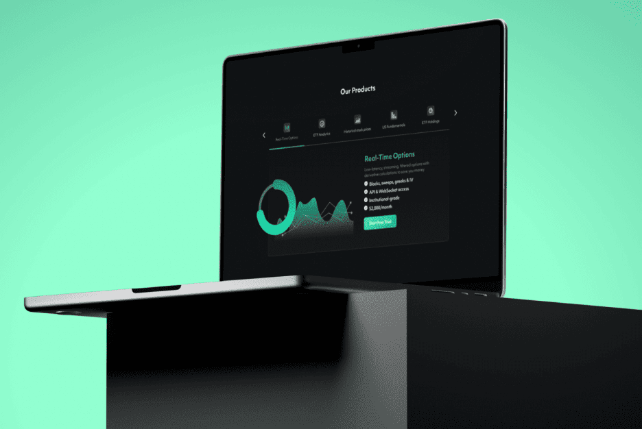
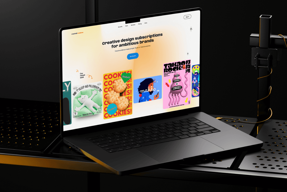
In Digital Product Design, hierarchy is like storytelling. You start with the big headline (the hook), guide the reader to the key message, and then nudge them toward a button or action. Without this, even the most beautiful design becomes visual noise.
How the Brain Processes Information on the Screen
Our brains are lazy — in a good way. They look for shortcuts to understand what’s going on. When faced with a bunch of visual elements, your mind instantly starts sorting them by importance. It’s instinct. Big = important. Bright = urgent. Grouped = related.
Studies in cognitive psychology show that users form an impression of a website in less than 50 milliseconds. That’s faster than a blink. If your hierarchy isn’t clear from the first glance, users bounce faster than you can say “usability testing.”
Contrast and Color That Guide the User’s Eyes
Contrast is the rockstar of hierarchy. It’s what makes text readable, buttons pop, and sections stand apart. Without contrast, your design is like a whisper in a noisy room — easily ignored.
Color plays a huge role here too. Warm colors like red and orange grab attention, while blues and greens calm the user down. The trick is using your Color Palette wisely — not every shade has to scream. Good contrast doesn’t mean neon chaos; it’s about smart balance.
Spacing and Grouping That Connect Visual Meaning
Ever tried reading a wall of text with no paragraphs? Feels awful, right? That’s because spacing creates rhythm. It lets your eyes breathe. Designers use white space not as “empty space,” but as a structural tool to organize meaning.
Grouping related elements together helps the brain understand that they belong. Think of it as visual teamwork — things that are close together feel like they’re part of the same story. Without it, even the most colorful layout feels like digital spaghetti.
Typography and Fonts That Define Reading Flow
Typography isn’t just about picking a pretty font. It’s how text feels and flows. A bold headline shouts, while smaller text whispers the details. Fonts have personalities — some feel confident and modern, others feel traditional or playful.
In well-thought-out Digital Product Design, typography is the rhythm of communication. The size, weight, and spacing of letters decide how comfortably someone reads. A mismatched font combo can ruin an otherwise perfect layout faster than a pop-up ad.
Real-Life Examples of Effective Visual Hierarchy
Let’s look at brands that nailed it. Apple? Their designs breathe simplicity — one glance, and you know where to look. Airbnb? Their use of imagery and typography instantly tells a story. Even Spotify uses hierarchy like a pro: bold headlines, clear sections, and focused CTAs.
Here’s what these examples have in common:
- They guide users effortlessly through information.
- Every design element has a job — nothing extra, nothing random.
- The layout feels intuitive, not forced.
That’s how you create interfaces that users trust and love.
Common Mistakes That Break Hierarchy and Confuse Users
Designing without a clear plan is like cooking without a recipe — you might get lucky, but it’ll probably be a mess. One big mistake is using too many competing focal points. If everything screams for attention, nothing gets noticed.
Another issue is inconsistent spacing and poor alignment. When buttons and text boxes float around with no structure, the whole design feels unbalanced. It’s not about following rigid rules — it’s about creating visual logic that keeps the user comfortable.
How to Test Your Visual Hierarchy for Clarity
You don’t need a fancy lab to check if your hierarchy works. Try the “squint test” — literally squint your eyes and see what pops out first. If the wrong element grabs your attention, you’ve got work to do.
You can also ask people to look at your design for five seconds and describe what they saw first. Their answer reveals what your hierarchy is actually communicating. A quick A/B test or heatmap tool can also show you where users focus — and where they don’t.
Why Visual Hierarchy Boosts Conversions and Keeps Users Engaged
A strong hierarchy does more than look good — it drives results. Clear structure helps users find what they need faster, reducing frustration and drop-offs. It’s not just about beauty; it’s about Designing Trust through consistent visual cues.
When people feel comfortable navigating your interface, they’re more likely to stay, explore, and buy. Great design makes users feel smart, not lost. That emotional connection is what transforms casual visitors into loyal fans.
