Key Features Every B2B Website Company Dashboard Needs

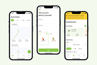
At Almax, we understand the importance of a well-designed B2B website company dashboard in helping businesses stay competitive. A dashboard serves as the central hub of your operations, bringing together data from multiple sources and presenting it in an easy-to-digest format. Whether you’re managing a fast-growing startup or a large enterprise rolling out new digital products, your dashboard should provide clear, actionable insights.


Whether you’re a startup or a large corporation, we understand how crucial it is to have a well-designed, user-friendly dashboard to optimize your digital products. Our services range from UI/UX design to mobile apps and custom-built websites.


In this post, we’ll break down the key features every B2B company dashboard should have and how these elements can streamline your processes and help you make better decisions.

The Basics: What Is a B2B Dashboard?

What is a B2B Dashboard?

A B2B dashboard is a centralized hub where b2b companies can monitor their performance metrics and track business processes in real time. Think of it as the control panel for your business, pulling in data from sources like CRMs, marketing platforms, and analytics tools to give you a comprehensive overview. For example, a B2B company might use its dashboard to track sales pipelines, measure B2B website traffic, and monitor customer support performance.


Let’s say you’re a SaaS company. You need to track monthly recurring revenue (MRR), churn rates, and the effectiveness of your onboarding process. A B2B dashboard allows you to visualize these metrics on one screen, enabling you to spot trends and act on insights immediately. Another example could be a logistics company using a dashboard to track deliveries, monitor fleet performance, and assess customer satisfaction ratings—all in real-time.


Dashboards simplify the way businesses handle data, ensuring that decision-makers and teams have the information they need without wading through complex spreadsheets or manual reports.

Intuitive User Interface (UI): Simplify Complex Processes

The Need for an Easy-to-Navigate Design

Imagine opening a dashboard that’s cluttered with data, tiny fonts, and too many widgets. It’s overwhelming, and you’re likely to miss the critical information you need. That’s why an intuitive user interface (UI) is essential. A well-designed dashboard uses a clean layout, logical grouping of data, and clear visual cues so that users can easily find the information they’re looking for.


For instance, a marketing manager might want to track the performance of specific ad campaigns. With a clean, intuitive UI, they can filter data quickly to see real-time campaign metrics without having to sift through unrelated information. A messy UI, on the other hand, could lead to missed opportunities or errors when interpreting the data.

Customizable Layouts to Fit Different Roles

Not everyone in your company will need access to the same data. A customer support team might focus on response times and satisfaction scores, while the sales department will want to track leads, opportunities, and conversions. A good dashboard should allow users to customize their layout based on their role, so each person can focus on the metrics most relevant to them.


For example, Salesforce dashboards allow users to create personalized views that display the most important KPIs for their specific role. A B2B dashboard that offers customizable views not only boosts productivity but also helps ensure that employees aren’t distracted by irrelevant data.

Reducing the Learning Curve for New Users

A dashboard should be easy enough for a new hire to navigate with minimal training. By incorporating good dashboard widgets—like collapsible menus, drag-and-drop functionality, and simple filters—companies can reduce the learning curve and make the onboarding process smoother. Avoiding bad UX reduces the time it takes for new users to become proficient and allows them to start contributing immediately.

Real-Time Data and Analytics: Empower Decision-Making

Real-Time Updates on KPIs and Metrics

In today’s fast-paced business environment, real-time data is crucial. Let’s say you run an e-commerce platform. Knowing exactly how many customers are browsing your site, which products they’re viewing, and how long they’re staying on your page can inform immediate changes to your marketing strategy. With real-time data, you can adjust your B2B website metrics on the fly, optimizing campaigns as they unfold.


For example, Netflix uses real-time data to analyze user behavior and adjust content recommendations almost instantly. Having this capability in your dashboard means you can react quickly, whether it’s adjusting pricing strategies, launching promotions, or identifying potential bottlenecks in your operations.

Custom Reporting Tools for Business Needs

Custom reporting is another must-have. Depending on your business, you’ll want to track specific data that may not be covered by a default dashboard setup. A good dashboard allows you to create custom reports based on your business’s unique metrics.


Imagine you’re running a B2B software company and want to track the performance of a new product feature. Custom reports can show you detailed engagement metrics, user adoption rates, and feature-specific revenue—all of which help inform future product development.

Customizable Permissions and Roles: Enhanced Security

Role-Based Access for Targeted Data Viewing

Not everyone in your company should have access to all the data. Sensitive financial information, for instance, should only be visible to a select group of employees. Customizable permissions allow admins to control who can view or modify specific sections of the dashboard.


Consider a company like Shopify, where different teams—from customer service to engineering—use the same dashboard but have access to different types of data. Role-based access ensures that employees only see what’s relevant to their work, preventing data breaches and reducing unnecessary distractions.

Granular Permission Settings for Security

Granular permission settings take it a step further by allowing businesses to control exactly which parts of the dashboard different users can interact with. For example, a marketing team may need access to B2B website traffic data but not to financial reports. This level of control improves both usability and security.

Seamless Integration with Third-Party Tools: Centralize Operations

Integrating with CRMs, ERPs, and Marketing Platforms

A powerful B2B website company dashboard integrates seamlessly with other tools like CRM systems, ERP platforms, and marketing automation software. When all your tools work together, your team can access a full range of data without having to switch between multiple platforms.


For example, HubSpot integrates with Google Analytics, Salesforce, and social media platforms, giving marketing teams a comprehensive view of their efforts from lead generation to conversion. Integrating third-party tools into your dashboard helps your team manage operations efficiently and makes it easier to make data-driven decisions.


If you’re looking for a trusted partner to build or enhance your B2B dashboard, platforms like GoodFirms can help you find top-rated, verified companies with proven expertise in delivering data-driven, customized solutions.

Single Sign-On for Convenience

Single sign-on (SSO) is another feature that enhances convenience by allowing users to log in once and access multiple platforms through a unified dashboard. This not only improves security but also reduces the time employees spend managing passwords.

Collaboration Features: Foster Team Communication

Built-In Messaging and Project Management Tools

Effective collaboration is key in any B2B setting. A b2b website company dashboard that includes built-in communication tools—such as messaging, file sharing, or even project management features—can significantly improve teamwork. For example, if your dashboard integrates with tools like Slack or Asana, team members can share reports, assign tasks, and track progress, all without leaving the dashboard.


Google’s G Suite is a great example of this integration in action, where collaboration tools like Google Docs and Sheets can be accessed directly within the same platform.

Real-Time Collaboration to Boost Efficiency

When teams can collaborate in real time, they make decisions faster and avoid delays. Let’s say your product development team is spread across different locations. A real-time collaboration feature allows them to make updates to product specs, see feedback instantly, and adjust timelines—all within the dashboard.

Mobile Optimization: Access Anytime, Anywhere

Responsive Design for Seamless Mobile Use

Mobile optimization isn’t just a nice-to-have anymore—it’s a necessity. If your team is working remotely or frequently on the move, having access to a mobile app or mobile-optimized dashboard allows them to stay connected to key metrics at all times.


For instance, Salesforce’s mobile app gives sales teams access to customer data, sales pipelines, and metrics directly from their smartphones, ensuring they’re always in the loop no matter where they are.

Enhancing Engagement with Mobile-First Designs

By adopting a mobile-first design, your dashboard will be accessible across devices without sacrificing functionality. Whether it’s tracking B2B website traffic or monitoring customer satisfaction scores, a mobile-optimized dashboard helps teams stay engaged and responsive.

User Support and Onboarding: Minimize Downtime

Tutorials, FAQs, and Live Support

A well-designed b2b website company dashboard should also include features that make onboarding new users easier. Tools like FAQs, video tutorials, and live support ensure that users can quickly get up to speed without relying on extensive training sessions.


For example, platforms like Zendesk offer in-depth tutorials and knowledge bases, allowing users to troubleshoot issues independently. This reduces downtime and increases productivity across your team.

Scalability and Flexibility: Future-Proof Your Platform

Evolving with Company Growth

As your company grows, so will your data needs. A good b2b website company dashboard should be scalable, allowing you to add new features, metrics, and integrations as your business evolves. For example, if you start as a small startup, your dashboard might initially track basic KPIs. But as you scale, you may need to monitor global operations, multiple product lines, or new revenue streams.


A dashboard with a creative design solution is essential for accommodating these growing demands without requiring a complete overhaul.

Adaptability and Custom Workflows

Custom workflows allow companies to adapt their dashboards to new processes or business goals. For instance, a growing company might want to automate certain repetitive tasks, like sending reports or alerts. A flexible dashboard that evolves with your business ensures that you stay efficient and productive as you scale.


Conclusion: B2B Website Company Dashboard

A well-designed B2B website company dashboard is more than just a data management tool—it’s a critical part of your company’s success. From intuitive user interfaces and real-time analytics to seamless integration with third-party tools, the right dashboard can significantly boost efficiency, security, and collaboration across your organization. Additionally, scalability and mobile optimization ensure that your dashboard grows alongside your business and remains functional across devices.

At Almax, we specialize in creating dashboards that are tailored to your company’s unique needs. Whether you’re tracking B2B website traffic, managing sales pipelines, or monitoring key business metrics, our solutions are designed to help you stay competitive. Contact Almax today to learn how we can elevate your B2B dashboard experience.

How to Create an Intuitive Menu App Mockup UX

Getting Started on a Menu App Mockup UX

Creating an intuitive user experience (UX) is key to the success of any app. Whether you’re launching a new mobile app for a startup or redesigning a platform for a large company, getting the menu app mockup UX right ensures users can easily navigate through your app.


At Almax, we specialize in designing intuitive, user-friendly interfaces for a range of digital products, whether you’re building a new mobile app, website, or platform. Our team excels at creating seamless menu app mockup UX that enhances the overall user experience, which is critical for any successful product. From startups developing their first mobile apps to large enterprises launching new digital projects, we understand how to craft designs that meet your unique needs. With expertise in UI/UX design, websites, and mobile apps, our goal is to provide high-quality, tailored solutions that align with your business objectives.


In this guide, we’ll share insights into creating an intuitive menu that users will love, starting with understanding your audience and progressing through each step of the design process.

Understanding Your Target Audience: The First Step to a Successful Menu App Mockup UX

Before diving into design, it’s crucial to understand who your audience is. Knowing your users allows you to create a menu app mockup UX that meets their specific needs.

Define the User’s Persona: Demographics, Behavior, and Goals

Your audience’s demographics—such as age, technical proficiency, and goals—should drive your design decisions. For example, a younger, tech-savvy audience might appreciate advanced gestures and sleek transitions, while a broader audience may prefer a more straightforward, accessible interface. Tailoring the menu app mockup UX to fit different personas is key to ensuring usability.


To make your UX accessible to a wide audience, including users with disabilities, it’s essential to follow digital accessibility standards. Creating an app with inclusive design features can improve your app’s usability for all. For example, considering color contrast, text size, and voice navigation options can drastically enhance the experience. Learn more about making your UX accessible in our Digital Accessibility and Inclusion Standard SF guide.

Identify Pain Points and How Your App Menu Will Solve Them

To build a successful menu app mockup, start by identifying your users’ frustrations. Are they struggling with slow navigation or complex menus in other apps? By addressing these issues, you can create an intuitive UX that solves common problems. You can also optimize your design by encouraging brainstorming sessions that bring out new perspectives. Here’s how to get the best brainstorming results for your UX.

Tailoring UX for Startups and Large Enterprises

Startups typically require flexibility and scalability, while larger companies may prioritize stability and long-term usability. Both can benefit from a menu app mockup UX that’s easy to navigate and designed with the end-user in mind, ensuring that users, regardless of app complexity, can easily find what they need. Many interactive UX design agencies focus on creating dynamic, engaging experiences that align with these varied business needs, helping to craft interfaces that cater to different user expectations.

Structuring the Information Architecture for Easy Phone Menu Navigation

How you structure your menu is just as important as its appearance. Good information architecture ensures a phone menu is easy to navigate and intuitive for users.

The Importance of Logical Hierarchies in a Phone Menu

Users expect to find certain information in certain places. For example, a “Settings” menu should always be easily accessible. Logical hierarchies, where the most important elements are prioritized, help users navigate your app without frustration.

Creating Categories Based on User Expectations

Users have mental models of how a phone menu should be structured, often based on their experiences with other apps. For instance, features like “Home,” “Profile,” or “Cart” should be organized into familiar categories. This keeps your app intuitive and ensures users don’t waste time searching for key features.

Avoid Overwhelming Users with Too Many Choices in Mobile Menu Design

While it’s tempting to provide users with every option at once, too many choices can be overwhelming. A clean, minimal mobile menu design with logical categories allows users to navigate smoothly without being paralyzed by too many options.

Choosing the Right Design Patterns for a Seamless Mobile Menu Design

Designing an intuitive mobile menu involves selecting patterns that fit the needs of your app and its users.

Compare Various Menu Styles: Hamburger, Bottom Navigation, or Side Panels

  • Hamburger menus: Great for saving space but may hide important features.
  • Bottom navigation bars: Best for providing easy access to core features, especially when you have three to five key areas.
  • Side panels: These are useful for secondary features, keeping the main screen uncluttered.

Pros and Cons for Different Projects

Hamburger Menus

Great for saving space but may hide important features.

  • Best for apps with a lot of features: Apps like social networks (e.g., Facebook) or productivity tools (e.g., Trello) often benefit from hamburger menus because they have many features, but users only need a few at a time. The hamburger menu keeps the interface clean, allowing users to reveal more options as needed.
  • Projects with limited screen space: If you’re designing for mobile devices where screen real estate is at a premium, a hamburger menu can save space for the content itself.
  • Minimalistic design-focused apps: For projects like lifestyle or meditation apps where the focus is on simplicity and aesthetics, hiding less frequently used options in a hamburger menu can maintain a clean look.

2. Bottom Navigation Bars

Best for providing easy access to core features, especially when you have three to five key areas.

  • Best for apps with 3-5 primary functions: Think of apps like Instagram or Spotify. These apps have a few core features (e.g., home, search, profile) that users need constant access to, so a bottom navigation bar ensures they can switch between them easily.
  • Ideal for mobile apps where accessibility is key: For apps that rely on frequent navigation between key sections, such as banking apps or shopping apps, a bottom navigation bar puts the most important options right at the user’s fingertips, making it easier to navigate with one hand.
  • User-focused apps: If your project involves apps where quick access is critical—like a health-tracking app, where users need to switch between tracking, reports, and settings—a bottom navigation bar works best.

3. Side Panels

Useful for secondary features, keeping the main screen uncluttered.

  • Best for apps with a main feature but additional tools: Productivity apps like Gmail or Slack often use side panels to display secondary features (e.g., settings, account info, or filters) while the main focus remains on the primary task, such as sending emails or chatting.

  • Ideal for dashboards or admin panels: For more complex projects like management systems or reporting dashboards, a side panel helps organize various tools and options without overwhelming users on the main screen. It allows for quick navigation while keeping secondary actions out of the way.
  • Suitable for tablet or desktop applications: Side panels are great for apps on larger screens where space isn’t as limited. For instance, design tools like Adobe Photoshop or video editing software often use side panels for layers, settings, or tools that users access frequently but don’t need on the main workspace.

Intuitive Mobile Menu Design Increases Engagement

When a mobile menu design is intuitive, users stay engaged. A smooth, easy-to-use menu keeps users from abandoning the app, ensuring higher retention rates. The design choices you make—including whether you go with a light or dark mode—can significantly impact engagement, as detailed in our guide on the psychology of light vs dark modes in UX design.

Wireframing Your Menu App Mockup: The Foundation of Flawless UX

Wireframing is where your ideas begin to take shape. It’s crucial to get this step right before moving on to high-fidelity designs.

What is a Wireframe?

A wireframe is a simple visual guide that represents the skeletal framework of a digital product, such as a website or mobile app. It outlines the basic structure and layout of elements like menus, buttons, and content areas without focusing on detailed design or visuals. Wireframes help communicate how the interface will function and allow teams to plan user flow and navigation before moving on to more detailed design phases.

The Wireframing Process: From Low to High Fidelity

Wireframes help you visualize the user journey and pinpoint potential issues early on. Start with low-fidelity sketches to outline the structure, and gradually move toward high-fidelity wireframes as you add detail. This process helps ensure that your menu app mockup flows logically and efficiently.

Examples of Efficient Wireframes Focusing on User Flow

A well-crafted wireframe should emphasize the ease with which users can navigate through the app. For instance, if you’re designing an e-commerce app, ensure the path from product selection to checkout is as short as possible.

Aligning Clients’ Needs with Budget Flexibility

Wireframing can help you balance user experience with project costs. For example, some clients might need an extensive, feature-rich menu app mockup, while others might need a more streamlined version. At Almax, we ensure that our wireframing process remains flexible, meeting the needs of both startups and large enterprises.

Implementing User-Centered Interaction Design Principles for a Phone Menu

Great design goes beyond just how things look—it’s about how they work.

Accessibility and Simplicity in Phone Menu Interactions

A phone menu should be accessible to all users, regardless of their physical abilities. Button sizes, for example, should be designed with the average user’s finger in mind. According to an MIT study, the average human fingertip is between 45-57 pixels wide. Keeping this in mind ensures users can interact comfortably with your app.

Touchpoints, Responsiveness, and Visual Feedback

Every interaction—whether it’s tapping a button or swiping a menu—should provide responsive feedback. Visual cues like color changes or haptic feedback reassure users that their actions have been registered, improving the overall user experience.

Scalable Interaction Design Benefits All Projects

Whether designing for a small startup app or a large corporate platform, scalable designs ensure your app remains intuitive as new features are added.

User Testing and Iteration: Refining Your Menu App Mockup UX for Maximum Usability

No matter how perfect your menu app mockup UX looks on paper, user testing is essential to ensure it works in practice.

The Importance of Prototyping and Gathering Feedback

Testing a prototype allows you to gather crucial user feedback on navigation, ease of use, and overall design. This feedback ensures your menu app mockup meets user needs and expectations before launch.

Implementing Changes During Iterative Phases

At Almax, we believe in an iterative design process. This means continuously refining the menu app mockup UX based on user testing, ensuring the final product is user-centered and meets client goals.

How Almax’s Flexible Approach Meets Client Expectations

Whether you’re a startup with budget constraints or a large corporation with more complex needs, our flexible design process at Almax ensures we can deliver a high-quality menu app mockup UX that aligns with your vision and business objectives.


Conclusion: How to Create an Intuitive Menu App Mockup UX

In conclusion, creating an intuitive menu app mockup UX requires a deep understanding of your users, a clear information architecture, thoughtful design patterns, and a rigorous testing process. Whether you’re developing a new mobile app or redesigning a website, ensuring that your mobile menu design is user-friendly and accessible will significantly improve engagement and overall user satisfaction. By focusing on scalability, accessibility, and seamless navigation, you can create a product that not only meets but exceeds user expectations.


Working with a professional design company can be crucial to achieving an effective menu app design. At Almax, we’re dedicated to helping you craft exceptional user experiences, whether it’s for mobile apps, websites, or any other digital platform. Contact Almax today to see how we can help optimize the UX for your project!

Onboarding Screens that Convert: Secrets Revealed

At Almax, we understand that the moment users first engage with your digital product is critical. Their experience should be seamless, intuitive, and rewarding, setting the stage for a long-term relationship. This is where onboarding screens come into play. Think of these screens as the initial handshake between your brand and its users—a handshake that defines their entire journey with your product. In this article, we’ll share our insights on designing onboarding web screens that truly convert, leveraging our expertise in UI/UX design, mobile app development, and user experience optimization to turn new users into engaged, loyal customers.

Understanding the Purpose of Onboarding Screens

What Are Onboarding Screens and Why Are They Critical to User Experience?

Onboarding screens are the introductory sequences that guide new users through a product’s interface, features, and functionalities. They are more than just welcome messages or tutorials; they are an essential part of the first user experience that aims to educate, engage, and retain users.

Different Types of Onboarding Experiences

There are various onboarding approaches, each tailored to different user needs and product types:

  • Feature Highlights: This method showcases key features through a series of informative screens. It’s ideal for products with complex functionalities, providing an overview without overwhelming the user.
  • Progressive Onboarding: Here, features are introduced gradually as the user explores the product. This approach reduces cognitive load and helps users discover functionalities at their own pace.
  • Tutorials: Step-by-step guides that walk users through specific tasks or actions. Tutorials are great for task-oriented apps, like design tools or project management software, where hands-on practice is essential for user success.

Each type of onboarding can be effective, but the best choice depends on your product, your target audience, and the experience you want to create.

What is Onboarding UI?

Definition and Purpose of Onboarding UI

Onboarding UI (User Interface) refers to the design elements—such as screens, pop-ups, and tooltips—that introduce users to a product’s core features and functionalities. Its primary purpose is to minimize user friction by offering a clear, guided path to understanding and engaging with the product.

Core Components of Effective Onboarding UI

To create a high-converting onboarding experience, consider incorporating the following components:

  • Welcome Messages: Warm, inviting messages that greet new users and set the tone for their journey.
  • Progress Indicators: Visual elements, like progress bars or step counters, that show users where they are in the onboarding process.
  • Interactive Guides: Elements like tooltips or contextual hints that provide real-time assistance and encourage exploration.

These components work together to create an onboarding experience that feels seamless, user-friendly, and aligned with your product goals.

Types of Onboarding UIs

Different types of onboarding UIs can cater to various product needs:

  • Progressive Onboarding: Offers step-by-step guidance, revealing features gradually as the user interacts with the product. For example, Slack uses progressive onboarding to introduce its key features—like creating channels or sending messages—one at a time.
  • Self-Select Onboarding: Allows users to choose their own onboarding journey based on their needs or goals. For instance, Netflix asks users to select their viewing preferences to provide a personalized onboarding experience.
  • Gamified Onboarding: Uses game-like elements such as points, badges, or progress rewards to make the onboarding process more engaging. Duolingo is a prime example, using gamification to keep users motivated and learning.

By selecting the right type of onboarding UI, you can create a more personalized and effective experience for your users.

What Makes a Good Onboarding Experience?

Clear Value Proposition

A good onboarding experience starts with clearly communicating your product’s core benefits. Within the first few screens, users should know exactly what your product does and why it’s valuable to them. According to research, users make a judgment about a product’s usefulness in just 50 milliseconds. That’s why your onboarding screens need to convey what sets your product apart quickly.

Simplicity and Focus

Avoid overwhelming users with too much information or too many steps. A clean, focused design with minimal text and clear visuals helps users understand the essentials without feeling bombarded.

Personalized Experience

Tailoring the onboarding process to individual users can significantly improve engagement. Personalization can be as simple as using the user’s name in welcome messages or as complex as suggesting content based on their preferences. German fashion online retailer Zalando found that by implementing personalization experiences through custom outfit recommendations, they could increase their conversion rates by two times.

Interactive and Engaging Design

Engagement is key to a successful onboarding experience. Incorporate interactive elements such as swipes, taps, or animations to keep users engaged. Canva, for example, uses an interactive, gamified onboarding process that encourages users to create their first design within minutes, increasing user retention significantly.

Seamless Integration

The best onboarding experiences are those that integrate seamlessly into the product. Users should feel like they are learning by doing, rather than going through a separate onboarding process. For example, TikTok integrates onboarding into its content feed, allowing users to explore the app’s features while they scroll.

Continuous Optimization

Onboarding is not a one-time task; it requires ongoing optimization. Regularly test your onboarding screens using A/B testing and gather user feedback to make data-driven improvements. According to a study by Forrester, companies implementing A/B testing can see an increase of 400% in user conversion.

Key Elements of High-Converting Onboarding Screens

To create onboarding screens that convert users effectively, focus on these critical elements:

  • Clear Value Propositions: Convey the unique benefits of your product right from the start.
  • Concise Messaging: Use short, impactful text that communicates your message clearly.
  • Intuitive Design: Create an interface that is easy to navigate and visually appealing.
  • Seamless User Flow: Ensure the user journey is smooth, with no unnecessary friction or confusion.

These elements can make a significant difference in user engagement and retention rates.

Crafting a Compelling Onboarding Narrative

The Power of Storytelling in Onboarding

Humans are wired for stories. A compelling onboarding narrative can make your product more relatable and engaging. Instead of just listing features, frame them as solutions to the user’s problems. For example, Headspace uses storytelling to position its meditation app as a guide for mental wellness, turning new users into loyal subscribers.

Tips for Creating Relatable Scenarios

Use scenarios that mirror your users’ real-life challenges. For instance, a fitness app might show how its features help users achieve their fitness goals step by step. This approach helps users visualize how the product fits into their lives, increasing their likelihood of continued use.

Connecting Emotionally with Users

Emotion drives decision-making. Use visuals and copy that resonate emotionally with your audience. For example, visually appealing graphics, warm colors, and empathetic language can help establish a positive connection from the get-go.

Design Principles for an Effective Onboarding UI

Using Color Psychology and Typography

Colors evoke emotions, and typography impacts readability. Use colors that align with your brand’s identity and encourage positive emotions. For example, blue often conveys trust and stability, while green symbolizes growth. Choose fonts that are easy to read and match your brand’s tone.

Leveraging Animations and Transitions

Animations and transitions can help guide users through the onboarding process smoothly. Subtle animations can draw attention to important actions or guide users on what to do next. Dropbox uses animations in its onboarding UI to explain its features clearly and engagingly.

Ensuring Mobile-Responsive and Cross-Device Compatibility

Your onboarding UI should be mobile-responsive and work seamlessly across all devices. Throughout 2023, mobile devices accounted for at least 53% of global web traffic. Ensuring that your onboarding screens are optimized for all screen sizes will help you reach and retain more users.

Best Practices for Testing and Optimizing Onboarding Screens

A/B Testing Different Approaches

A/B testing allows you to experiment with different onboarding approaches and identify what works best. For instance, test variations in copy, layout, or sequence to determine which version yields higher conversion rates.

Key Metrics to Track

Monitor essential metrics like completion rates, time spent on each screen, and user retention. High completion rates and user engagement indicate an effective onboarding process, while high drop-off rates signal areas for improvement.

Common Mistakes to Avoid When Designing Onboarding Screens

Avoid Information Overload

Presenting too much information at once can overwhelm users, leading to frustration and drop-offs. Instead, focus on bite-sized chunks of information that are easy to digest.

Ensure Clarity in Messaging

Ambiguous or unclear messaging can confuse users and hinder their progress. Use direct, straightforward language to convey your product’s value clearly.

Iterate Based on Feedback

Failing to iterate based on user feedback is a missed opportunity for improvement. Regularly collect feedback, analyze it, and make necessary adjustments to enhance the onboarding experience.

The Role of Personalization in Onboarding

Leveraging User Data

Use user data to tailor the onboarding experience to each individual. Personalization can range from customized welcome messages to suggesting relevant features or content based on user preferences.

Examples of Effective Personalization

Spotify uses personalized onboarding to suggest playlists and music genres based on the user’s initial selections, leading to higher user engagement and retention rates.

Benefits of Personalization

Personalized onboarding makes users feel valued and understood, increasing their likelihood of continued use. McKinsey reports that personalization can boost revenue by 10-15%.

How to Align Onboarding with Your Brand Identity

Aligning your onboarding experience with your brand identity is crucial for creating a strong, cohesive connection with new users. Your onboarding screens are often the first interaction users have with your brand, so they should reflect your unique style, values, and messaging. A well-aligned onboarding process not only makes a great first impression but also sets the stage for a meaningful and lasting user relationship.

Incorporating Brand Elements

Ensure your onboarding screens incorporate brand colors, fonts, and messaging to create a cohesive experience. This consistency helps build trust and recognition.

The Importance of Consistency

Consistent design and messaging are some of the basics of branding; they reinforce your brand identity, making your product more memorable and trustworthy. Brands like Apple and Airbnb maintain their identity throughout the onboarding process, contributing to their strong customer loyalty.

Final Thoughts: Elevating Your Onboarding Strategy

Onboarding is not just a functional process; it’s an opportunity to create a memorable first impression and build a lasting relationship with your users. By focusing on strategic design, clear messaging, personalization, and continuous optimization, you can create onboarding screens that truly convert.

At Almax, we specialize in creating onboarding experiences that resonate with users and drive results. Ready to elevate your onboarding strategy? Contact us, and let’s create something extraordinary together.

Top Strategies for Optimizing Your Error Searching UI

Imagine you’re browsing a new website or app, eagerly searching for information or products, only to be met with a “no results found” message. Frustrating, right? You’re not alone. According to PriceWaterhouseCoopers (PWC), 32% of customers would leave a brand they loved after just one bad experience. When it comes to digital experiences, the stakes are even higher—88% of online consumers report that they are less likely to return to a site after a negative interaction.


At Almax, we specialize in crafting user interfaces that keep your customers engaged, even when things don’t go as planned. Whether it’s designing a website from scratch, refining the user experience of a mobile app, or optimizing the interface of a complex platform, we know how crucial it is to get the error-handling right.


An optimized error searching UI can make all the difference in preventing these costly customer losses. Yet, many companies still fall into common traps, like using vague or overly technical error messages that leave users confused. Errors such as “no search results found” can be a huge turnoff if not handled correctly. So why should startups and large companies, particularly those launching new digital products, prioritize error handling in their design processes?


In this blog post, we’ll explore strategies to turn those frustrating “no results found” moments into opportunities for engagement. We’ll walk you through practical techniques to enhance your error searching UI, ensuring it guides users smoothly, keeps them informed, and ultimately, satisfied.

1. Understand the User’s Experience in Error Searching UI

To improve your error searching UI, you need to understand the situations where errors are most likely to occur. Consider common scenarios like:

  • Users mistyping search queries or using uncommon terms.
  • Searching for a product that is out of stock or discontinued.
  • Looking for content that has been moved or removed.

These are just a few examples of when users might encounter a “no search results found” message. But understanding the problem is only half the battle—you need to know when and where users need the most support.

Key Points to Focus On:

  • Map Out Common Scenarios: Identify moments in the user journey where errors occur most frequently. This could be when users type in a search term, apply filters, or navigate to certain parts of your site.
  • Recognize User Needs: When users face “no results” messages, consider what they might be feeling—confusion, frustration, or doubt. What support do they need at this moment?
  • Use User Personas: Different users have different needs. A new visitor might require more guidance, while a returning user might need a faster way to refine their search. Create user personas to predict reactions and tailor your approach accordingly.

By understanding these elements, you can anticipate errors and design your UI to help users navigate these situations with ease.

2. Make “No Results Found” Messages Clear and Actionable

A vague message like “404 Error” tells users nothing about what went wrong or what to do next. Instead, aim for clarity and guidance in your error messages. Here’s how:

  • Use Simple Language: Avoid technical jargon or error codes. For example, instead of saying “404 Error,” try “We couldn’t find what you were looking for.”
  • Be Specific: If a user’s search yields no results, explain why. For example:
    • “We couldn’t find any products matching ‘red sneakers.’ Try searching with different terms or check our latest arrivals.”
    • “It looks like the article you’re searching for has been moved. Here are some similar articles you might find helpful.”
  • Offer Solutions: Don’t leave users at a dead-end. Provide:
    • Alternative suggestions: “Did you mean…?”
    • Helpful links: “Explore similar items” or “Check our FAQs.”
    • Next steps: Offer buttons to refine their search or navigate to other areas of the site.

3. Leverage Real-time Feedback to Prevent “No Results” Errors

Real-time feedback is a game-changer for preventing “no results” errors. By catching mistakes before they happen, you keep the user experience smooth and frustration-free.

Strategies for Real-Time Feedback:

  • Inline Validation: While the user types, provide hints or suggestions to prevent common errors. For instance, if they type “appl” instead of “apple,” your UI could suggest “Did you mean ‘apple’?”
  • Dynamic Feedback: When users filter search results, instantly show how many results are available. This helps guide them away from paths that lead to “search results no results.”
  • Present One Error at a Time: Avoid overwhelming users with multiple error messages. Instead, prioritize the most relevant message to maintain clarity.

4. Prioritize Visual Hierarchy in Your Error Searching UI

Design isn’t just about making things look good—it’s about ensuring users notice important information. When a user encounters an error, the way you present that message can either clarify or confuse.

Best Practices for Visual Hierarchy:

  • Use Color Wisely: Bright colors like red can draw attention to critical errors. However, reserve red for genuine errors to prevent confusion. Use softer colors for less critical information.
  • Consistent Placement: Make sure that “no result found” messages appear in the same location across your platform. Consistency helps users know where to look when they need help.
  • Incorporate Icons and Typography: Icons (like a magnifying glass or an exclamation mark) paired with bold or highlighted text can make your “no search results found” messages more noticeable and easier to understand.

5. Enable Easy Correction for “No Results Found” Issues

If a user hits a “no results” message, make it easy for them to adjust their query and try again. Here’s how you can make corrections effortless:

  • Direct Links or Buttons: Provide buttons to refine searches immediately, like “Try a new search” or “Clear filters.”
  • Smart Suggestions: Offer recommendations based on common misspellings, synonyms, or related queries. For example, if a user searches for “sneekers,” suggest “Did you mean ‘sneakers’?”
  • Undo Options: Allow users to undo actions, such as removing filters, to quickly return to a broader search.

By enabling easy correction, you reduce friction and keep users engaged.

6. Track and Analyze “No Results” Patterns in Search Results UX

Optimizing your error searching UI is an ongoing process. Regularly monitor how users interact with your search function and identify areas where they often encounter “no results.”

Key Steps to Take:

  • Utilize Analytics Tools: Tools like Google Analytics or Hotjar can help you track “no result found” frequencies. Look for patterns in search queries, filter usage, and user behaviors.
  • Identify Problem Areas: Are certain search terms or pages more prone to “no results” errors? Use this data to adjust your content or improve your search algorithm.
  • Make Data-Driven Decisions: Refine your error-handling process based on insights. If you notice users often search for a term that returns no results, consider adding relevant content or products.

7. Test Your Error Searching UI with Real Users

No amount of design or analysis can replace feedback from actual users. Conduct usability tests to see how real users react when they face “no search results found” scenarios.

How to Approach Testing:

  • Focus on Common Scenarios: Test situations where “no search results” is likely to occur. Observe user behavior and gather feedback on the clarity of your messages.
  • Ask the Right Questions: Did users understand the error message? Did they know what to do next? Did they find the suggestions helpful?
  • Iterate and Improve: Use the insights from testing to refine your designs. Remember, even small changes can significantly enhance user satisfaction.

8. Integrate Error Handling with Customer Support for “No Results” Queries

Even the best-designed UI can’t always solve every issue. Sometimes, users will need direct support, especially when they hit “no results found.”

Ways to Connect UI with Support:

  • Chatbots and AI: Deploy chatbots to assist users in real time when they encounter “no results.” Chatbots can suggest alternative queries or escalate the issue to a human agent if needed.
  • Seamless Escalation: Make it easy for users to switch from self-service to customer support. Include clear links or buttons like “Contact Support” or “Chat with Us Now.”

9. Future-proof Your Error Searching UI Strategy

Digital trends change rapidly. To keep your error searching UI effective, you must stay ahead of these changes.

Actions to Take:

  • Stay Updated on UX Trends: Regularly review best practices and emerging trends to keep your UI current and effective.
  • Review and Refresh Content: Periodically update error messages and UI elements to ensure they align with user needs and expectations.
  • Educate Your Team: Ensure everyone involved in the design and development process understands the importance of optimizing error search functionalities.

Conclusion: Turn Errors into Opportunities

Your error searching UI can either be a barrier or a bridge for your users. By understanding the user experience, crafting clear and actionable messages, leveraging real-time feedback, and integrating with customer support, you can transform frustrating “no results found” moments into opportunities for engagement.

Errors don’t have to mean the end of a user’s journey. Instead, let them be the start of a more satisfying, supportive, and user-friendly experience.

Digital Accessibility and Inclusion Standard SF: A Quick Guide

In today’s digital age, accessibility isn’t just a buzzword—it’s a necessity. Every user who visits your website or app should have an equal opportunity to experience your product without barriers. For startups and large enterprises alike, embracing the Digital Accessibility and Inclusion Standard SF isn’t just about compliance; it’s about creating an inclusive, welcoming environment for everyone.

At Almax, we believe that great design is about more than just aesthetics—it’s about creating digital experiences that everyone can enjoy. Whether you’re a startup creating mobile apps or a large company rolling out a new platform, meeting the Digital Accessibility and Inclusion Standard SF is essential.

In this quick guide, we’ll walk you through the basics of the Digital Accessibility and Inclusion Standard SF and why it matters for your business. We’ll also provide practical tips and tools to help you incorporate accessibility into your design process, ensuring your product meets the highest standards and reaches the broadest possible audience. Whether you need a website, mobile app, or platform design, we’re here to help you make it accessible and inclusive from the ground up.

Understanding Digital Accessibility: What Is It and Why It Matters

So, what exactly is digital accessibility? At its core, digital accessibility ensures that all users, including those with disabilities, can navigate, understand, and interact with your website or app. The Digital Accessibility and Inclusion Standard SF is a guideline that helps companies achieve this by ensuring that digital platforms are user-friendly for everyone, regardless of their abilities.

Why does this matter? For starters, it’s good for business. Websites and apps that meet the Digital Accessibility and Inclusion Standard SF reach a broader audience, which can improve your brand’s reputation and boost engagement. Plus, there are legal and ethical considerations. Many countries have laws mandating digital accessibility, and failing to comply with standards like the Digital Accessibility and Inclusion Standard SF can lead to lawsuits, fines, and public backlash.

By creating an inclusive digital environment that aligns with the Digital Accessibility and Inclusion Standard SF, you’re not just avoiding legal trouble—you’re welcoming all users to experience your product. This can set you apart from competitors and foster customer loyalty.

Key Principles of Digital Accessibility: WCAG 2.1 Standards

The Digital Accessibility and Inclusion Standard SF is closely aligned with the Web Content Accessibility Guidelines (WCAG) 2.1, which provide a roadmap for making websites and apps accessible. WCAG is built around four key principles: Perceivable, Operable, Understandable, and Robust—often abbreviated as POUR.

Level A

Level A compliance under the Digital Accessibility and Inclusion Standard SF is the most basic level of accessibility. It ensures that your content is accessible to some users but not all. Think of it as the entry point to digital accessibility—covering essential elements like providing text alternatives for images (alt text), enabling keyboard navigation, and ensuring content is structured in a way that screen readers can understand.

Example of Good Practice: An image on your website has descriptive alt text that says, “A young man using a laptop in a coffee shop.” This aligns with the Digital Accessibility and Inclusion Standard SF by allowing screen readers to convey the image’s context to visually impaired users.

Example of Bad Practice: The same image has an alt text that simply says “image001.jpg,” providing no meaningful information to the user and failing the Digital Accessibility and Inclusion Standard SF.

Level AA

Level AA compliance is often the goal for most businesses under the Digital Accessibility and Inclusion Standard SF. It addresses the biggest barriers to accessibility for a broader range of users. To meet Level AA, you’ll need to consider things like color contrast (ensuring text is readable against its background), resizable text, and clear navigation.

Example of Good Practice: Your website uses a high-contrast color scheme with readable fonts, meeting the Digital Accessibility and Inclusion Standard SF and making it easier for users with visual impairments to read text.

Example of Bad Practice: A website where important information is displayed in low-contrast colors or relies on color alone to convey meaning (like using red text to signify “stop”) fails to meet the Digital Accessibility and Inclusion Standard SF.

Level AAA

Level AAA compliance is the highest and most comprehensive level outlined in the Digital Accessibility and Inclusion Standard SF, but it can be challenging to achieve. It requires meeting more stringent criteria, such as providing sign language interpretation for videos or offering multiple ways to navigate your website.

Example of Good Practice: A website includes a video with both captions and a sign language interpreter, meeting the Digital Accessibility and Inclusion Standard SF to cater to different types of hearing impairments.

Example of Bad Practice: A website has a video without captions or audio descriptions, leaving many users unable to access the content and falling short of the Digital Accessibility and Inclusion Standard SF.

Building Inclusive User Interfaces: Tips and Best Practices

Creating an inclusive user interface that aligns with the Digital Accessibility and Inclusion Standard SF doesn’t have to be daunting. Here are a few tips:

  • Design Clear Navigation: Make sure menus are straightforward, with logical sequences. Use familiar icons and consistent labels.
  • Optimize Color Contrast and Text Size: Ensure your text is readable. Tools like contrast checkers can help you select colors that meet the Digital Accessibility and Inclusion Standard SF.
  • Incorporate Keyboard Accessibility: Not everyone uses a mouse. Make sure users can navigate through your content using a keyboard alone, in line with the Digital Accessibility and Inclusion Standard SF.
  • Make Multimedia Accessible: Provide captions for videos, transcripts for audio, and ensure images have descriptive alt text, all essential aspects of the Digital Accessibility and Inclusion Standard SF.

Tools and Resources to Enhance Accessibility in Your Designs

Achieving compliance with the Digital Accessibility and Inclusion Standard SF is easier with the right tools. Tools like WAVE, Axe, and Lighthouse can help you identify accessibility issues and suggest improvements.

Plugins and software can streamline the design process, ensuring that accessibility is considered at every stage to meet the Digital Accessibility and Inclusion Standard SF. Staying updated with online communities and resources, like the Web Accessibility Initiative (WAI), can help you keep track of the latest developments.

Regular audits for compliance with the Digital Accessibility and Inclusion Standard SF and using feedback for continuous improvement are crucial.

A woman looking over paint chips to help brands better use design elements.

How Accessibility Drives Growth and Retention for Digital Products

Adhering to the Digital Accessibility and Inclusion Standard SF is more than just a compliance requirement—it’s a strategic advantage.

Case studies show that startups and enterprises focusing on accessibility see higher user engagement and retention. This is because accessible designs reduce frustration, cater to a wider audience, and often result in positive word-of-mouth marketing. Meeting the Digital Accessibility and Inclusion Standard SF can also open doors to new markets, including people with disabilities who may not otherwise be able to use your product.

Tip: Highlight your commitment to the Digital Accessibility and Inclusion Standard SF on your website to attract like-minded customers and partners.

Common Accessibility Mistakes to Avoid

Mistakes happen, but when aiming to comply with the Digital Accessibility and Inclusion Standard SF, some are easier to avoid with a bit of knowledge.

  • Non-descriptive Alt Text: Avoid using generic phrases like “image1” or “click here.” Provide meaningful descriptions that meet the Digital Accessibility and Inclusion Standard SF.
  • Inaccessible Forms: Make sure all form fields are labeled and provide clear instructions to align with the Digital Accessibility and Inclusion Standard SF.
  • Ignoring Color Contrast: Ensure that text is readable against its background, as required by the Digital Accessibility and Inclusion Standard SF.

Ignoring these aspects can lead to reputational damage, legal risks, and lost customers. Create a checklist to keep your designs on track from the start to comply with the Digital Accessibility and Inclusion Standard SF.

Future Trends in Digital Accessibility and Inclusion

The Digital Accessibility and Inclusion Standard SF continues to evolve with technology. AI, voice interfaces, and AR/VR are reshaping how we think about inclusive design. Accessibility is becoming increasingly crucial in mobile-first strategies, with users expecting seamless experiences across all devices.

Stay ahead by listening to user feedback and keeping up with regulatory changes and standards, such as the Digital Accessibility and Inclusion Standard SF.

Creating an Accessibility Roadmap for Your Project

To integrate the Digital Accessibility and Inclusion Standard SF effectively, start by planning from the project’s inception. Determine who will be responsible for various tasks and prioritize based on impact and effort. Use feedback to continuously improve and ensure compliance.

By creating a roadmap, you’re setting your project up for success and showing your commitment to the Digital Accessibility and Inclusion Standard SF.

Remember, the Digital Accessibility and Inclusion Standard SF is not just a legal requirement; it’s a chance to welcome all users to your digital space, enhancing both experience and growth. And that’s a win-win for everyone.

How to Level Up Your UX with Results Focused Web Design

How to Level Up Your UX with Results Focused Web Design

In today’s competitive digital landscape, simply having a beautiful website or app isn’t enough. Your users expect more. They want a seamless, intuitive experience that meets their needs and guides them effortlessly toward their goals. At Almax, we believe that great design isn’t just about looking good—it’s about delivering real, measurable results. This is where results-focused web design comes in.

In this article, we’re diving deep into the concept of results-focused web design—a strategic approach that goes beyond aesthetics to create experiences that drive growth and engagement. We’ll walk you through nine essential steps to implement this approach, from setting clear goals to optimizing your design for conversions. Whether you’re launching a new digital product or redesigning an existing platform, our growth-driven design strategies can help you create high-performing websites, mobile apps, and platforms that truly resonate with your audience.

At Almax, we specialize in creating user-centric designs that align with your business objectives. Our services range from custom website design and mobile app development to UI/UX design and platform redesign. Ready to elevate your digital presence? Let’s explore how results-focused web design can level up your UX and help you achieve your business goals.

Understanding Results Focused Web Design

Results-focused web design is about aligning every aspect of your website or app with measurable business goals. Unlike traditional design approaches that may prioritize aesthetics or subjective preferences, this method is all about creating a seamless experience that drives tangible outcomes. Whether it’s increasing user engagement, boosting conversion rates, or improving customer retention, results-focused design ensures that every design decision is purposeful.

What is Results Focused Web Design?

At its core, results-focused web design prioritizes function over form. This approach recognizes that while a visually appealing website is important, it’s not enough to drive results. Instead, the design should:

  • Guide users towards specific actions: Whether it’s filling out a form, making a purchase, or subscribing to a newsletter, every element of the design should contribute to these goals.
  • Be informed by data: Decisions are driven by analytics, user behavior, and testing, ensuring that the design is continually optimized for performance.
  • Focus on user needs: By understanding what users want and need, the design can deliver a better experience that leads to higher satisfaction and loyalty.

This approach isn’t just a theory—it’s backed by research. For instance, a study by Forrester found that a well-designed user interface could raise a website’s conversion rate by up to 200%, while a better UX design can yield conversion rates up to 400%.

The 9 Steps for Implementing Results-Focused Web Design

Implementing a results-focused web design isn’t a one-size-fits-all process. However, there are key steps you can follow to ensure your design is effective and aligned with your business goals.

Start with Clear, Quantifiable Goals

The first step in any results-focused design process is setting clear, measurable goals. Without specific objectives, it’s impossible to gauge the success of your design.

  • Set SMART goals: Your goals should be Specific, Measurable, Achievable, Relevant, and Time-bound. For example, instead of saying “improve user engagement,” aim for “increase average session duration by 15% within the next three months.”
  • Align with business objectives: Ensure your design goals are directly tied to broader business goals, such as revenue growth or customer acquisition.
  • Use historical data: If you have access to previous analytics, use them to set realistic benchmarks and goals.

Optimize Your User Journey from Day One

Mapping out and optimizing the user journey is crucial for ensuring users can achieve their goals on your site with minimal friction.

  • Map the user journey: Identify all the touchpoints a user interacts with from the moment they land on your site to the point of conversion. Use tools like customer journey maps to visualize these steps.
  • Identify friction points: Look for areas where users might get stuck or drop off. Common issues include confusing navigation, too many steps in a checkout process, or slow page load times.
  • Streamline navigation: Ensure that your site’s navigation is intuitive and that users can easily find the information they need. According to a study by HubSpot, 76% of consumers say the most important factor in a website’s design is that it “makes it easy for them to find what they want.”
  • Use testing methods: Employ A/B testing, heatmaps, and user testing to gather data on how users interact with your site. These insights can guide further optimization.

Leverage Data-Driven Design Decisions

Data should be at the heart of your design process, informing every decision you make.

  • Monitor key metrics: Keep an eye on important metrics such as session duration, bounce rates, click-through rates (CTR), and conversion rates. These can provide insights into how users are interacting with your site.
  • Use analytics tools: Tools like Google Analytics, Hotjar, and Crazy Egg can offer valuable insights into user behavior. For example, you might discover that users are frequently abandoning their carts on a particular page, indicating a problem that needs to be addressed.
  • Iterate based on data: Design isn’t static. Continuously use data to make informed changes and improvements. A report by McKinsey found that companies that use customer analytics extensively are more than twice as likely to generate above-average profits.

Implement User-Centric Design Principles

User-centric design puts the needs, behaviors, and goals of the user at the forefront of the design process.

  • Conduct user research: Start by understanding your users. Develop detailed personas that represent different segments of your audience, and use empathy mapping to gain insights into their needs and pain points.
  • Focus on accessibility: Ensure your design is inclusive and accessible to all users, regardless of their abilities. This includes considering factors like color contrast, text size, and navigational ease.
  • Create feedback loops: Once your site or app is live, continue to gather user feedback. This can be done through surveys, usability testing, or direct feedback channels on the site.

According to a study by the Nielsen Norman Group, user-centered design improves the usability of websites and apps, leading to increased satisfaction and higher conversion rates.

Maximize Engagement with Compelling Visuals and Content

Visual content plays a critical role in capturing attention and guiding users toward the actions you want them to take.

  • Use visual hierarchy: Organize your content so that the most important elements stand out. This can be achieved through size, color, contrast, and placement.
  • Incorporate multimedia: Use images, videos, infographics, and other visual elements to make your content more engaging. A survey by Wyzowl found that 89% of consumers want to see more video content from brands they support.
  • Align content with design: Your content strategy should complement your design. Ensure that every piece of content is purposeful and supports the user journey.

Boost Conversions Through Strategic Call-to-Actions

Calls-to-action (CTAs) are a crucial element of any results-focused design. They guide users toward the next step in their journey.

  • Experiment with placements: Test different locations for your CTAs to see which performs best. Common placements include above the fold, at the end of blog posts, and in pop-ups.
  • Craft compelling copy: Your CTA text should be clear, concise, and action-oriented. Avoid generic phrases like “Click Here” and opt for something more specific like “Get Your Free Quote” or “Start Your Free Trial.”
  • Test and refine: Continuously A/B test different elements of your CTAs, such as color, size, and text, to optimize for conversions.

Optimize for Mobile Users from the Ground Up

With more people accessing websites from mobile devices than ever before, a mobile-first approach is essential.

  • Prioritize mobile responsiveness: Ensure your site is fully responsive, meaning it adjusts seamlessly to different screen sizes.
  • Optimize for speed: Mobile users expect fast load times. Compress images, leverage browser caching, and minimize code to reduce load times.
  • Design for touch: Ensure that buttons and links are large enough to be easily tapped, and avoid using hover effects that don’t translate well to touchscreens.

Ensure Seamless Integration with SEO Best Practices

Good UX and SEO are closely intertwined. A results-focused design should not only look good but also perform well in search engine rankings.

  • Optimize for site speed: Fast-loading sites not only provide a better user experience but are also favored by Google’s ranking algorithms.
  • Use mobile-friendly design: Google’s mobile-first indexing means that the mobile version of your site is what gets indexed. Ensure your design is mobile-friendly to maintain or improve your search rankings.
  • Implement structured data: Use schema markup to provide search engines with additional information about your content. This can enhance how your site appears in search results, potentially leading to higher click-through rates.

Continuously Test, Measure, and Adapt Your Design

The final step in a results-focused design process is ongoing testing and iteration.

  • Use A/B testing: Regularly test different versions of your pages to see which performs better. This could involve testing different headlines, layouts, or CTA placements.
  • Monitor user behavior: Continue to use tools like heatmaps and user session recordings to understand how users interact with your site.
  • Adapt based on feedback: Be prepared to make changes based on user feedback and behavior. The best designs are those that evolve over time, constantly improving to meet the needs of your users.

Conclusion

Results-focused web design is about more than just aesthetics—it’s about creating an experience that delivers real, measurable outcomes. At Almax, we’re dedicated to helping startups and established companies alike harness the power of design to drive growth and success. If you’re ready to elevate your UX with a growth-driven design agency, contact Almax and explore how we can help you achieve your goals.

The Role of Branding Photography in Web Design

Welcome to the world of web design, where every detail counts—and none more so than the images you choose to represent your brand. At Almax, we know that your website is often the first stop for potential clients or customers. That’s why it’s crucial to make every second count.


In this article, we’ll explore how branding photography plays a pivotal role in web design. We’ll uncover how the right visuals can set the tone for your brand, build trust, boost engagement, and ultimately drive conversions. At Almax, we specialize in creating stunning, custom websites and mobile apps that not only look beautiful but are also strategically crafted to reflect your unique brand identity. Whether it’s designing a cohesive visual narrative, selecting the perfect imagery, or optimizing your site’s user experience, we’ve got you covered.


Let’s dive into why great photography matters and how it can elevate your website to new heights!

First Impressions Matter: Why Visuals Are Key

We’ve all heard the saying, “You never get a second chance to make a first impression.” In web design, this couldn’t be more accurate. Studies show that users form an opinion about a website in just 50 milliseconds. That’s less than a blink of an eye! And what drives that split-second decision? Visuals. High-quality, professional branding photography immediately sets the tone for your brand and communicates its value.

Good photography can convey trust, professionalism, and quality. On the other hand, poor imagery can make your website—and by extension, your brand—seem unreliable or untrustworthy. This is why investing in branding photography isn’t just about aesthetics; it’s about creating a strong first impression that keeps visitors engaged and interested.

Building Trust Through Consistent Imagery

Consistency in branding is more than just using the same logo or color palette. It extends to the photography you use across your website. High-quality branding photography that maintains a consistent style builds trust by creating a cohesive and recognizable brand image. When visitors see the same quality and style of photos across all web pages, it reinforces the idea that your brand is professional, reliable, and thoughtful.

In contrast, inconsistent or low-quality images can have the opposite effect. If the photos don’t match in style, color, or quality, it can confuse visitors and make the site feel disjointed or amateurish. The bottom line? Consistent branding photography helps create a seamless experience that builds trust from the moment someone lands on your site.

The Impact of Authentic Photography on User Engagement

Authenticity is key to user engagement. People connect with real, relatable images far more than they do with generic stock photos. When visitors see authentic photography—whether it’s a behind-the-scenes look at your team, real customers using your products, or a snapshot of your office environment—they’re more likely to engage with your content and stay longer on your site.

Real photos provide a sense of transparency and build an emotional connection with your audience. This connection can reduce bounce rates and encourage deeper interactions, like exploring more pages or signing up for a newsletter. At Almax, we’ve seen firsthand how authentic, relatable branding photography can transform a website’s performance.

How Branding Photos Communicate Your Brand’s Story

Every brand has a story to tell, and photos are one of the most powerful ways to tell it. Branding photography captures the essence of your brand—its values, culture, and personality—without saying a single word. It provides a visual narrative that complements your written content and gives depth to your brand’s identity.

Whether it’s a warm, welcoming photo of your team, a detailed close-up of your product, or an image that captures the spirit of your workspace, every picture tells part of your story. At Almax, we work with clients to create a visual narrative that resonates with their target audience, ensuring every image reflects the unique character of the brand.

Driving Conversions with Strategic Website Photography

Photography isn’t just about making your website look good; it’s also a strategic tool for driving conversions. Well-placed images can evoke emotions, highlight key product features, and guide visitors through the sales funnel. For instance, a captivating hero image on your homepage can draw visitors in, while a series of detailed product shots can help convert a browser into a buyer.

Strategic branding photography can subtly influence user behavior, making them feel more connected to your brand and more likely to take action. Whether your goal is to sell a product, book a service, or encourage a signup, the right photos can make all the difference.

Custom vs. Stock Photos: What’s Right for Your Brand?

You might be wondering whether to use custom or stock photos on your website. The truth is, each has its place. Stock photos can be a quick and cost-effective solution, but they often lack the unique touch that custom branding photography provides. Custom photos offer better results for branding purposes because they are tailored specifically to your brand’s needs and personality. They set your brand apart from competitors who may use the same generic stock images.

However, stock photos might still be appropriate in certain situations, such as for blog posts or when you need a quick solution. At Almax, we guide our clients in choosing the best approach, ensuring that the images always reflect their unique brand identity.

Best Practices for Integrating Photography into Web Design

Once you’ve invested in high-quality branding photography, integrating it effectively into your web design is crucial. Here are some best practices:

  • Image Placement: Use images strategically to guide the user’s eye and highlight important content.
  • Alignment with Brand Colors: Ensure photos complement your brand’s color palette.
  • Use of White Space: Allow images to breathe by surrounding them with white space, which enhances their impact.
  • Optimizing Image Sizes: Make sure images are optimized for fast loading without compromising quality.

At Almax, we take a thoughtful approach to integrating visuals, ensuring they work harmoniously with all other design elements for maximum impact.

The Psychology Behind Great Branding Photos

Did you know that certain images, colors, and compositions can evoke specific emotions or responses from viewers? This is the psychology behind great branding photography. For example, bright, warm colors can create feelings of excitement and energy, while cool, muted tones can convey calmness and professionalism.

Understanding these psychological principles allows you to influence user behavior on your website. At Almax, we use this knowledge to select and create photos that not only look great but also serve your brand’s strategic goals.

Enhancing UX with Thoughtful Visual Elements

Well-thought-out visual elements, including photography, are essential for enhancing the user experience (UX) on your website. High-quality images can make a website easier to navigate, more engaging, and visually appealing. The balance between aesthetics and functionality is key. A visually attractive site that’s also user-friendly keeps visitors happy and engaged.

Tips for Choosing the Perfect Photographer for Your Brand

Not all photographers are created equal, especially when it comes to branding. When choosing a photographer, consider their portfolio, experience, and ability to capture the essence of your brand. Look for someone who understands your brand’s personality and can translate it into visual storytelling.

At Almax, we partner with top photographers or manage the entire photoshoot process in-house, ensuring a seamless experience and consistent results that align with your brand’s vision.

Conclusion

High-quality branding photography is more than just a visual element—it’s a powerful tool that enhances your website’s design, builds trust, and drives conversions. If you’re ready to take your website to the next level, let’s talk. At Almax, we’re here to help you create a visually stunning and strategically sound website that truly represents your brand. Contact us today for a consultation!

How to Get the Best Brainstorming Results: the Secret to Great Design

Turning great ideas into great designs isn’t just about creativity. It’s about taking the brainstorming results and shaping them into something that truly works. At Almax, we know that every powerful design starts with a powerful idea. But how do you move from those initial brainstorming sessions to a fully realized design? Let’s break down the steps to leverage brainstorming results effectively in your design process.

Introduction to brainstorming in the creative process

What is Brainstorming?

Brainstorming is a creative thinking process where a team comes together to generate a wide range of ideas or solutions for a specific challenge or problem. It’s an open, judgment-free activity where all ideas—no matter how unconventional—are welcome. The primary goal is to create a space where creativity can flourish and team members feel encouraged to share their thoughts freely.

Why is Brainstorming Important in the Design Process?

Brainstorming is crucial in the design process because it sets the foundation for creativity and innovation. Here’s why:

  1. Encourages Diverse Thinking: In a brainstorming session, every team member has a voice. This diversity of perspectives often leads to unexpected and innovative ideas that wouldn’t have emerged otherwise. According to a study by Harvard Business Review, diverse teams are 45% more likely to report growth in market share and 70% more likely to capture a new market.
  2. Generates a Wealth of Ideas: The more ideas you generate, the higher the chance you’ll find that one groundbreaking concept.
  3. Promotes Team Collaboration: Brainstorming isn’t just about the ideas; it’s about the collaboration and communication that happens among team members. It brings people together, fosters a sense of ownership over the design, and builds a stronger team dynamic.
  4. Refines and Clarifies Objectives: Brainstorming helps to clarify the design goals and objectives early on. By openly discussing various approaches, teams can quickly identify what aligns best with the brand’s vision and user needs.
  5. Reduces Risk and Mistakes: By considering a wide range of ideas and potential solutions, teams can identify potential pitfalls early on. This proactive approach helps to reduce costly design mistakes and ensures the project stays aligned with its objectives from the start.

Why Every Design Team Should Use Brainstorming

Brainstorming is not just a creative exercise; it’s a strategic tool that every design team should utilize. Here’s why:

  • It Boosts Innovation: Every design team strives for innovative solutions that set their work apart. Brainstorming encourages thinking outside the box, which is critical for developing unique and compelling designs.
  • It Enhances Team Morale: Teams that feel involved in the creative process are generally more motivated and engaged. Brainstorming sessions build camaraderie and make every member feel valued and heard, which is essential for maintaining high morale and productivity.
  • It Streamlines the Design Process: By fostering open dialogue early, teams can address potential conflicts or misunderstandings before they escalate. This leads to smoother project execution and helps keep timelines on track.

The Bottom Line

Brainstorming is a fundamental part of the design process that every team should embrace. It’s a proven way to boost creativity, enhance collaboration, and ensure that your design is not only unique but also effective and aligned with your brand’s goals. So, if you’re looking to create truly innovative designs, make brainstorming a core part of your strategy.

How to Brainstorm Effectively

But let’s be honest. Brainstorming can sometimes feel like organized chaos. To make the most of your brainstorming results, you need a structured approach. Let’s dive into the steps that will help you brainstorm effectively and turn those sparks of inspiration into tangible design concepts.

Set Clear Objectives: Define the Problem or Goal

Before you even gather the team, make sure you’re crystal clear on what you’re trying to achieve. Define the problem you’re solving or the goal you’re aiming for. This sets the stage and gives everyone a shared understanding of what success looks like.

Without a clear objective, brainstorming sessions can quickly lose focus. Make sure everyone understands the challenge and knows what they are working towards. A well-defined objective helps guide the conversation and ensures that the brainstorming results are relevant and actionable.

Assemble a Diverse Team: Gather Different Perspectives

Your brainstorming session will only be as good as the people in the room. That’s why it’s essential to bring together a diverse team with different skills, backgrounds, and perspectives. Designers, developers, marketers, and even end-users can all offer unique insights that enrich the discussion.

Diversity fuels creativity. A study from the Harvard Business Review shows that teams with diverse perspectives are better at solving complex problems. So, gather a team that brings a mix of viewpoints to the table. This will lead to more innovative brainstorming results.

Create a Comfortable Environment: Encourage Open Participation

People need to feel comfortable sharing their ideas—especially the unconventional ones. Create an environment where everyone feels safe to speak up without fear of criticism or judgment. Encourage open participation by setting ground rules: no idea is too wild, and everyone’s voice matters.

When people feel heard, they’re more likely to contribute. And the more ideas you have, the better your chances of finding that game-changing solution.

Warm Up the Team: Start with Icebreakers or Simple Exercises

Jumping straight into problem-solving can be intimidating. Start with a warm-up exercise or an icebreaker to get the creative juices flowing. This can be as simple as a quick round of “What’s the weirdest product idea you’ve ever seen?” or a word association game.

These activities help loosen up the team, break down barriers, and set a playful, creative tone for the session. When people are relaxed, they’re more likely to contribute freely.

Generate Ideas Freely: Focus on Quantity Over Quality

During the initial brainstorming phase, aim for quantity, not quality. Encourage participants to generate as many ideas as possible, no matter how outlandish or impractical they may seem. The goal is to create a broad pool of ideas without filtering or judging them.

Remember, some of the best ideas come from the most unexpected places. This phase is about exploration. Let the ideas flow. You can always refine them later.

Record Every Idea: Use Tools to Capture Contributions

It’s easy for great ideas to get lost in the excitement of a brainstorming session. Make sure you capture every contribution by using digital tools like Miro, Trello, or a simple shared document. Alternatively, go old-school with sticky notes and a whiteboard.

The key is to ensure that no idea is forgotten. By documenting everything, you keep a record of all brainstorming results, making it easier to review and refine later.

Organize and Categorize: Group Similar Ideas Together

Once you have a healthy list of ideas, it’s time to bring some order to the chaos. Organize and categorize the ideas into themes or groups. Look for patterns, similarities, or connections between ideas.

This step helps make sense of the brainstorming results and reveals which concepts have the most potential. It also makes it easier to identify gaps or areas that need more exploration.

Evaluate and Prioritize: Filter Ideas Based on Feasibility and Impact

Now that you have a well-organized list, it’s time to evaluate and prioritize the ideas. Consider factors like feasibility, alignment with project goals, and potential impact. Tools like the MoSCoW method (Must-have, Should-have, Could-have, Won’t-have) or a simple pros and cons list can help with this step.

Focus on the ideas that are not only creative but also actionable. This filtering process ensures that your brainstorming results lead to solutions that can realistically be implemented.

Refine and Develop: Combine and Build on Promising Ideas

At this point, you should have a shortlist of ideas with the most potential. Now, it’s time to refine and develop these concepts further. Look for ways to combine different ideas, build on them, or enhance them to create stronger solutions.

This is where true innovation happens. By mixing and matching different elements, you can create unique solutions that stand out and deliver real value.

Review and Reflect: Analyze the Session and Plan Next Steps

Finally, take time to review and reflect on the session. What worked well? What could be improved next time? Analyzing the brainstorming results and process helps you learn and refine your approach for future sessions.

Outline the next steps based on the prioritized ideas. Assign tasks, set deadlines, and create a roadmap to move forward. Clear action points ensure that your brainstorming results are put to use, driving your project toward a successful outcome.

Conclusion: How to get the best Brainstorming Results, the secret to great design

In conclusion, effective brainstorming is the secret sauce behind every great design. By setting clear objectives, assembling a diverse team, and fostering an open, creative environment, you can transform a chaotic flood of ideas into a focused strategy that drives your design projects forward. Remember to capture every idea, organize and prioritize them thoughtfully, and refine your concepts until they shine.

At Almax, we believe that structured brainstorming sessions are more than just creative exercises—they are strategic tools that can unlock your team’s full potential. By embracing this process, you set the foundation for innovative, effective designs that resonate with your audience and achieve your business goals.

Ready to turn your brainstorming results into game-changing designs? Contact Almax today to get the best design solutions for your business!

Top 7 Flutter Alternatives for Cross-Platform Development

When it comes to developing cross-platform applications, Flutter has carved out a significant place for itself in the developer community. However, it’s not without its limitations, and for many projects, it might not be the optimal choice. At Almax, we’ve found that React Native consistently outperforms other options, offering a balance of efficiency, flexibility, and developer satisfaction that’s hard to beat. In this blog, we’ll explore the top 7 Flutter alternatives and discuss why React Native, in particular, might be the superior choice for your website design.

Why Consider Alternatives to Flutter?

Flutter is powerful, no doubt, but it’s not the only tool in the toolbox. Depending on the specific needs of your project—whether it’s performance, integration with existing technology stacks, or leveraging your team’s current expertise—considering Flutter alternatives can lead to better results. This exploration is not just about finding a framework that works, but about finding one that works best.

For instance, if your project demands rapid development cycles, a rich ecosystem of pre-built components, or seamless integration with web technologies, Flutter might not be the ideal solution. This is where React Native shines, offering not only speed and flexibility but also a development experience that’s second to none.

Top 7 Flutter Alternatives for Cross-Platform Development

React Native vs Flutter

Overview:

React Native, developed by Facebook, is arguably the most popular Flutter alternative and for good reason. It empowers developers to create mobile applications using React and JavaScript, two of the most widely adopted technologies in the world. With React Native, you’re not just building an app—you’re building it with a framework that provides native-like performance, a vast ecosystem, and a developer experience that’s hard to match.

Use Case Example: Consider a startup aiming to quickly develop a high-quality mobile app for both iOS and Android. With React Native, the development team can tap into a rich ecosystem of libraries and tools, significantly speeding up the development process without sacrificing quality. This approach ensures that the startup can launch its product faster and iterate more quickly, which is crucial in a competitive market.

Pros:

  • Single Codebase: React Native allows developers to write code once and deploy it across iOS and Android platforms. This not only reduces development time and costs but also ensures a consistent user experience across devices.
  • Rich Ecosystem: With access to a vast array of plugins, tools, and pre-built components, React Native enables developers to implement complex features quickly and efficiently. This ecosystem is continually growing, ensuring that developers have the resources they need to solve challenges without reinventing the wheel.
  • Large Community: React Native’s large and active community is a major advantage. This strong support network means developers can easily find tutorials, documentation, and third-party libraries, accelerating the development process and reducing the time spent troubleshooting.

Cons:

  • Performance: While React Native delivers excellent performance for most use cases, particularly complex applications may require additional optimization or the use of native modules to achieve the desired level of performance.
  • Third-Party Dependencies: React Native relies on third-party libraries for certain functionalities. While this allows for rapid development, it also means that the stability of these libraries is crucial to the overall reliability of the app.

Xamarin vs Flutter

Overview:

Xamarin, owned by Microsoft, stands as another robust Flutter alternative that allows developers to build native applications for Android, iOS, and Windows using C# and .NET. Xamarin is especially appealing to developers who are already embedded in the Microsoft ecosystem, offering deep integration with tools like Visual Studio and Azure.

Use Case Example: Imagine a large enterprise with an extensive .NET infrastructure looking to develop a mobile application to streamline internal operations. Xamarin would be an excellent choice, allowing the company to leverage existing code and integrate seamlessly with their current tools, all while maintaining the performance and reliability expected of a native app.

Pros:

  • Native API Access: Xamarin’s direct access to native APIs ensures that developers can fully leverage platform-specific features, leading to apps that perform comparably to those built with native tools.
  • Integration with Microsoft Tools: Xamarin’s seamless integration with Microsoft’s suite of tools makes it an ideal choice for teams already invested in the Microsoft ecosystem, reducing the learning curve and enhancing productivity.
  • Single Technology Stack: By using C# for both frontend and backend, Xamarin simplifies the development process, making the codebase more maintainable and easier to scale.

Cons:

  • Larger App Size: Applications built with Xamarin tend to be larger than those developed with Flutter or React Native, which could be a concern for projects where app size is critical.
  • Slower Updates: Xamarin updates may lag behind native platforms, potentially leading to delays in adopting new OS features or addressing platform-specific bugs.

Ionic vs Flutter

Overview:

Ionic is a versatile Flutter alternative that uses web technologies such as HTML, CSS, and JavaScript to build cross-platform mobile applications. By using Angular, React, or Vue.js for the frontend, Ionic allows developers to create apps that can run on multiple platforms, including iOS, Android, and the web.

Use Case Example: For a digital agency tasked with creating a cross-platform app that needs to be available on mobile and as a web application, Ionic provides an efficient solution. The ability to share code across platforms ensures consistency while saving time and resources—essential in a fast-paced development environment.

Pros:

  • Web Developer Friendly: Ionic’s use of familiar web technologies makes it a natural fit for teams with a background in web development. Developers can quickly transition from building web apps to mobile apps without the steep learning curve associated with other frameworks.
  • Extensive Plugin Library: Ionic’s integration with Cordova and Capacitor offers a wide range of plugins, enabling developers to easily add native functionality to their apps. This makes it simple to implement features like camera access, push notifications, and more.
  • Cross-Platform Deployment: Ionic’s ability to deploy apps across multiple platforms—including mobile, web, and desktop—offers true flexibility. This makes it an attractive option for projects that need to reach users on a variety of devices.

Cons:

  • Performance: While Ionic performs well for many applications, its reliance on web views can lead to slower performance compared to native frameworks like React Native. This can be a drawback for apps that require high responsiveness or heavy graphics processing.
  • Web-Based Feel: Despite efforts to make Ionic apps feel native, they may still exhibit characteristics of web applications, which can detract from the user experience. This is a crucial consideration for projects where a native look and feel is paramount.

Cordova (PhoneGap) vs Flutter

Overview:

Cordova, formerly known as PhoneGap, is one of the older Flutter alternatives and has long been a staple in the cross-platform development landscape. It enables developers to use web technologies (HTML, CSS, and JavaScript) to build mobile applications that run on multiple platforms.

Use Case Example: A small business looking to quickly develop a basic mobile app to provide information and updates to its customers might find Cordova to be an ideal solution. The framework’s simplicity and ease of use make it perfect for projects with limited budgets and technical requirements.

Pros:

  • Ease of Use: Cordova’s simplicity makes it ideal for quick prototyping or smaller projects where development speed is a priority. Developers can get up and running with Cordova quickly, making it a suitable choice for projects with tight timelines.
  • Wide Plugin Support: Cordova’s extensive plugin library allows developers to easily add native functionality to their apps, covering a wide range of features without needing to delve into native code.
  • Cross-Platform: Cordova’s support for multiple platforms from a single codebase—including iOS, Android, and Windows—makes it a versatile option for developers looking to reach a broad audience.

Cons:

  • Performance Limitations: Cordova apps may suffer from performance issues, especially in more complex or graphics-intensive scenarios. The reliance on web views for rendering can lead to slower performance compared to native or more modern cross-platform frameworks like React Native.
  • Outdated Technology: As a more mature framework, Cordova may not keep pace with newer alternatives like Flutter or React Native. This can be a disadvantage if you’re looking for a solution that will continue to evolve and stay current with the latest development trends.

NativeScript vs Flutter

Overview:

NativeScript is another compelling Flutter alternative that provides true native performance while allowing developers to use JavaScript, TypeScript, or Angular. NativeScript stands out by enabling developers to write cross-platform code while still accessing native APIs and rendering native UI components.

Use Case Example: A company developing a mobile app that requires deep integration with native device features—such as advanced camera functionality or augmented reality—would benefit from using NativeScript. The framework’s ability to access native APIs directly ensures that the app can fully leverage the device’s capabilities while maintaining a unified codebase.

Pros:

  • Native UI: NativeScript’s ability to render native UI components results in better performance and a more authentic user experience compared to frameworks that rely on web views. This makes NativeScript a top choice for applications where UI performance is critical.
  • Access to Native APIs: NativeScript provides direct access to native APIs, allowing developers to implement platform-specific features without writing separate codebases for each platform. This can lead to more powerful and feature-rich applications.
  • JavaScript/TypeScript Friendly: For teams experienced with JavaScript or TypeScript, NativeScript offers a smooth transition into mobile app development, allowing developers to leverage their existing skills to build high-performance mobile apps.

Cons:

  • Smaller Community: Compared to React Native or Flutter, NativeScript has a smaller community, which can make finding support and resources more challenging. This might be a consideration for teams that rely heavily on community-driven solutions.
  • Learning Curve: NativeScript’s complexity can lead to a steeper learning curve, particularly for developers who are not familiar with native development. This can increase the time required to get up to speed with the framework, potentially slowing down the development process.

Kotlin Multiplatform Mobile (KMM) vs Flutter

Overview:

Kotlin Multiplatform Mobile (KMM) is a newer Flutter alternative that allows developers to share business logic across Android and iOS while writing separate UIs for each platform. KMM leverages Kotlin, the modern language that has become the preferred choice for Android development, and is designed to reduce the amount of duplicate code that developers need to write.

Use Case Example: A development team working on a mobile app that requires complex business logic and must adhere to strict platform-specific design guidelines might choose KMM. By sharing the business logic across platforms while maintaining native UI components, the team can ensure that the app performs optimally on both Android and iOS.

Pros:

  • Native Performance: KMM allows developers to write native UIs, ensuring that the performance of the app is on par with fully native applications. This makes KMM a great choice for projects where performance is critical.
  • Kotlin’s Flexibility: Kotlin is a modern, expressive language that offers features like null safety and coroutines, making it easier to write clean, maintainable code that is less prone to errors.
  • Focus on Business Logic: KMM enables developers to focus on writing business logic once and sharing it across platforms, significantly reducing development time and costs. This approach ensures consistency in the app’s behavior across different platforms.

Cons:

  • Experimental Phase: KMM is still in its experimental phase, meaning there may be stability issues or missing features compared to more established frameworks. Developers should carefully evaluate whether KMM is mature enough for their project’s needs.
  • Separate UI Code: Unlike Flutter or React Native, KMM requires developers to write separate UI code for each platform, which can increase development time and complexity. This might not be ideal for projects that require rapid development or have limited resources.

Unity

Overview:

Unity, while primarily known as a game development platform, is also a powerful Flutter alternative for creating complex, graphics-intensive applications. Unity’s advanced rendering capabilities and extensive toolset make it ideal for developers who need to create applications with rich 3D or 2D graphics, interactive content, or real-time simulations.

Use Case Example: A company developing a mobile game or an application that requires advanced 3D graphics—such as a virtual tour app or a real-time simulation—might choose Unity. The framework’s powerful rendering engine and extensive support for interactive content make it the go-to choice for projects that need to push the boundaries of what’s possible on mobile devices.

Pros:

  • Powerful Engine: Unity’s game engine is incredibly powerful, making it ideal for applications that require advanced graphics and interactivity. Unity’s engine can render complex 3D environments, realistic lighting, and physics-based simulations, bringing your app to life in ways that few other frameworks can.
  • Multi-Platform Support: Unity supports a wide range of platforms, including mobile (iOS and Android), desktop (Windows, macOS, Linux), and even emerging technologies like VR/AR. This makes Unity a versatile choice for developers looking to reach a broad audience.
  • Rich Ecosystem: Unity has a vast asset store and a large community, making it easier to find resources, plugins, and support. Whether you need pre-built 3D models, shaders, or complete game templates, Unity’s ecosystem has you covered.

Cons:

  • Overkill for Simple Apps: Unity’s power comes with complexity, which might be overkill for simpler applications. If your project doesn’t require advanced graphics or interactivity, using Unity might lead to unnecessary development overhead.
  • Learning Curve: Developers unfamiliar with game development concepts may find Unity’s environment challenging. The framework’s focus on game development means that there are many tools and features that may not be relevant to non-game projects, which can make the learning process more complex.

How to Choose the Right Framework for Your Project

Choosing the right Flutter alternative requires a careful assessment of your project’s specific needs, your team’s skill set, and the unique advantages and drawbacks of each framework. Here are some key factors to consider:

  • Project Scope and Complexity: Evaluate the complexity of your project. If it requires advanced graphics or complex business logic, frameworks like Unity or KMM might be more appropriate. For simpler projects, React Native offers the best balance of performance, ease of use, and flexibility.
  • Team Expertise: Leverage your team’s existing knowledge. If your developers are experienced with web technologies, React Native is the most logical choice, providing an easy transition and the most extensive ecosystem. If they have experience with C# or .NET, Xamarin could be more suitable.
  • Long-Term Maintenance: Consider the long-term viability and community support of the framework. React Native, with its large and active community, ensures that your project stays up-to-date with the latest technologies and best practices.
  • Performance Requirements: For high-performance apps, React Native’s ability to access native modules makes it a top contender, providing near-native performance without the complexity of fully native development.

Conclusion: Top 7 Flutter Alternatives for Cross-Platform Development

While Flutter is a strong contender in the cross-platform development space, several Flutter alternatives may better suit your project’s needs. At Almax, we favor React Native because it consistently delivers the best combination of performance, flexibility, and community support. Whether you’re building a simple app or a complex, graphics-intensive application, React Native provides the tools and ecosystem needed to succeed. However, depending on your specific requirements, other frameworks like Xamarin, Ionic, or Unity might be the right fit. By carefully evaluating your options and considering the unique needs of your project, you can choose the framework that will lead to the most successful outcome for your app.

Website Glossary: Decoding Website Design Terms for Beginners

Website Glossary: Breaking Down Web Design Phrases for Newbies

Did you know that 53% of people have experienced burnout, stress, and fatigue due to communication issues in their business? Misunderstandings can lead to delays, increased costs, and even a final product that doesn’t meet your expectations. That’s why it’s crucial to understand basic web design terms. At Almax, we understand how critical clear communication is—especially when working with design teams on something as vital as your website. In this article, we’ll provide you with a comprehensive website glossary, breaking down key web design terms so you can communicate effectively with your design team, avoid stress, and ensure your website truly reflects your vision.

Introduction to Website Design Terms: Why Understanding the Basics Matters

Whether you’re building your first website or revamping an existing one, understanding basic web design terms is crucial. It’s not just about sounding knowledgeable—it’s about being an active participant in the creation process. Let’s explore how this understanding benefits you.

Improves Communication

Knowing web design terms helps you communicate more clearly with designers and developers. When everyone speaks the same language, projects run smoother, and outcomes are more aligned with your vision.

Informed Decision-Making

Understanding the terminology enables you to make informed decisions about your website’s design, functionality, and overall strategy. You’ll be better equipped to weigh options and choose what’s best for your site.

Better Collaboration

A shared understanding of web design terms fosters better collaboration between you and your team. This alignment ensures that everyone is on the same page, reducing the risk of miscommunication and errors.

Cost Efficiency

By knowing what different web design terms mean, you can avoid unnecessary costs. You’ll understand what you’re paying for and can make sure you’re getting the best value for your investment.

Enhances Problem-Solving

When issues arise, a solid grasp of web design terms allows you to troubleshoot more effectively. You’ll be able to follow advice from professionals and implement solutions more efficiently.

Empowers Control

Knowledge of web design terminology gives you greater control over the process. You’ll feel more confident in making decisions and guiding the direction of your website.

Boosts Confidence

Understanding the lingo boosts your confidence, making you feel more competent and less intimidated by the design process.

Increases Website Effectiveness

Finally, knowing these terms helps ensure your website is as effective as possible, whether your goals are increasing user engagement, improving SEO, or enhancing user experience.

Essential Graphic Design Terminology Every Website Owner Should Know

Web design isn’t just about coding and functionality; it’s also about aesthetics and visual communication. Below, we’ve outlined some essential graphic design terminology that every website owner should be familiar with.

Typography

Typography refers to the art of arranging text in a visually appealing way. It’s not just about choosing a font—it’s about how that font is used to enhance readability and convey your brand’s message.

Color Theory

Color theory involves the study of how colors interact and the emotions they evoke. Understanding this helps you create a cohesive and visually appealing color scheme for your website.

CMYK and RGB

CMYK is used for printing, while RGB is used for digital screens. Knowing the difference ensures that your colors look right in both print and on the web.

Resolution

Resolution refers to the clarity of an image, which is crucial for ensuring that your website looks sharp and professional.

White Space (Negative Space)

White space, or negative space, is the empty area around elements in your design. It helps to prevent clutter and improves readability.

Grid System

A grid system is a structure of intersecting lines used to organize content. It ensures consistency and alignment throughout your design.

Balance

Balance involves distributing visual elements evenly to create a harmonious design. This can be symmetrical or asymmetrical, depending on your desired effect.

Contrast

Contrast refers to the difference between two elements, such as light and dark or big and small. It helps to draw attention and create visual interest.

Hierarchy

Hierarchy organizes content by importance, guiding the viewer’s eye to the most critical information first.

Branding

Branding is the process of creating a unique identity for your business through visual elements like logos, colors, and typography.

Vector and Raster Graphics

Vector graphics are scalable without losing quality, while raster graphics can become pixelated when resized. Knowing which to use is key to maintaining image quality.

Logo

Your logo is a symbol that represents your brand. It should be versatile and instantly recognizable.

Iconography

Iconography involves the use of symbols or icons to represent ideas or actions, making your design more intuitive.

Opacity

Opacity refers to the transparency level of an element. Adjusting opacity can create layering effects and add depth to your design.

Gradient

A gradient is a gradual transition between colors. It adds depth and visual interest to backgrounds and buttons.

Kerning

Kerning is the adjustment of space between characters in a text. Proper kerning improves readability and the overall look of your text.

Mockup

A mockup is a visual representation of how your website or design will look. It’s used to preview and refine the design before it goes live.

Pixel

A pixel is the smallest unit of a digital image or screen. Understanding pixels is essential for creating sharp, high-quality designs.

Aspect Ratio

Aspect ratio is the relationship between an image’s width and height. Maintaining the correct aspect ratio prevents distortion.

Bleed

Bleed refers to the area beyond the edge of your design that will be trimmed off. It ensures that your design extends to the edge without leaving white borders.

Common Web Design Terms: Breaking Down the Essentials

Now that we’ve covered graphic design, let’s dive into some common web design terms that are essential for anyone involved in creating or managing a website.

HTML (HyperText Markup Language)

HTML is the standard language used to create and structure content on the web. It’s the foundation of every website.

CSS (Cascading Style Sheets)

CSS is used to control the layout, colors, fonts, and overall visual appearance of your website.

JavaScript

JavaScript is a programming language that adds interactivity and dynamic content to your website.

Responsive Design

Responsive design ensures that your website looks and functions well on all devices, from desktops to smartphones.

User Experience (UX)

UX refers to the overall experience a user has when interacting with your website. It focuses on ease of use, accessibility, and satisfaction.

User Interface (UI)

UI is the layout and design elements that a user interacts with on your website, such as buttons, menus, and forms.

See our UI/UX Design services here!

Wireframe

A wireframe is a basic layout that outlines the structure of your web page without focusing on design details.

Mockup

As mentioned earlier, a mockup is a detailed visual representation of how your website will look.

CMS (Content Management System)

A CMS allows you to create, manage, and modify content on your website without needing specialized technical knowledge.

Domain Name

Your domain name is your website’s address on the internet, like www.yourwebsite.com.

Hosting

Hosting is the service that stores your website’s files and makes them accessible online.

SEO (Search Engine Optimization)

SEO is the practice of optimizing your website to rank higher in search engine results, improving visibility and traffic.

Navigation

Navigation refers to the system that allows users to move around your website, including menus and links.

Breadcrumbs

Breadcrumbs are a secondary navigation system that shows users their location within your website.

Call to Action (CTA)

A CTA is a prompt that encourages users to take a specific action, such as “Sign Up” or “Buy Now.”

Above the Fold

“Above the fold” refers to the portion of your web page that is visible without scrolling. It’s often the most critical part of your design.

Hero Image

A hero image is a large, prominent image at the top of your web page, used to grab attention.

SSL Certificate (Secure Sockets Layer)

An SSL certificate encrypts data transferred between your website and its users, ensuring security.

Favicon

A favicon is a small icon that represents your website in the browser tab.

Alt Text

Alt text is descriptive text added to images, which helps with accessibility and SEO.

What’s the Section at the Top of a Website Called? Understanding Headers and Navigation

One of the most common questions we get is, “What’s the section at the top of a website called?” This section is known as the header, and it typically includes your logo, navigation menu, and sometimes a CTA or search bar. Understanding the role of the header and how to design it effectively is crucial, as it’s often the first thing visitors see when they land on your site.

Conclusion: Website Glossary

In conclusion, understanding basic web design terms is not just about mastering the language of designers and developers—it’s about empowering yourself to make informed decisions, improving communication, and ensuring your website truly reflects your vision and goals. By familiarizing yourself with these essential terms, you can collaborate more effectively with your design team, avoid costly misunderstandings, and create a website that stands out in today’s competitive digital landscape. If you are looking for the best design agency Washington services to help you, contact Almax today!

New Project?