The Best Contemporary Serif Fonts for Your Website

Did you know that 75% of consumers judge a company’s credibility based on its website design? At Almax Design Agency, we understand that typography plays a critical role in shaping this first impression. Choosing the right font can enhance readability, convey professionalism, and elevate your brand’s online presence. In this blog post, we’ll delve into the best contemporary serif fonts for your website, exploring their features, why they are preferred, and how to select the perfect one for your brand. Join us as we uncover the elegance and effectiveness of contemporary serif fonts in web design.

Introduction to Contemporary Serif Fonts

Contemporary serif fonts are a modern take on traditional serif typefaces, combining classic design elements with a fresh, updated look. These fonts feature small lines or strokes, known as serifs, at the ends of their characters, which are designed to guide the reader’s eye and improve readability. Unlike their traditional counterparts, contemporary serif fonts often incorporate cleaner lines, more versatile weights, and enhanced digital and print media readability.

These fonts are favored for their ability to convey professionalism, elegance, and reliability, making them an excellent choice for various applications, including websites, branding, and printed materials. Their modern adaptations ensure they remain relevant and effective in today’s fast-paced, visually-driven world, perfectly balancing tradition and innovation.

Many blocks of letter stamps in serif font.

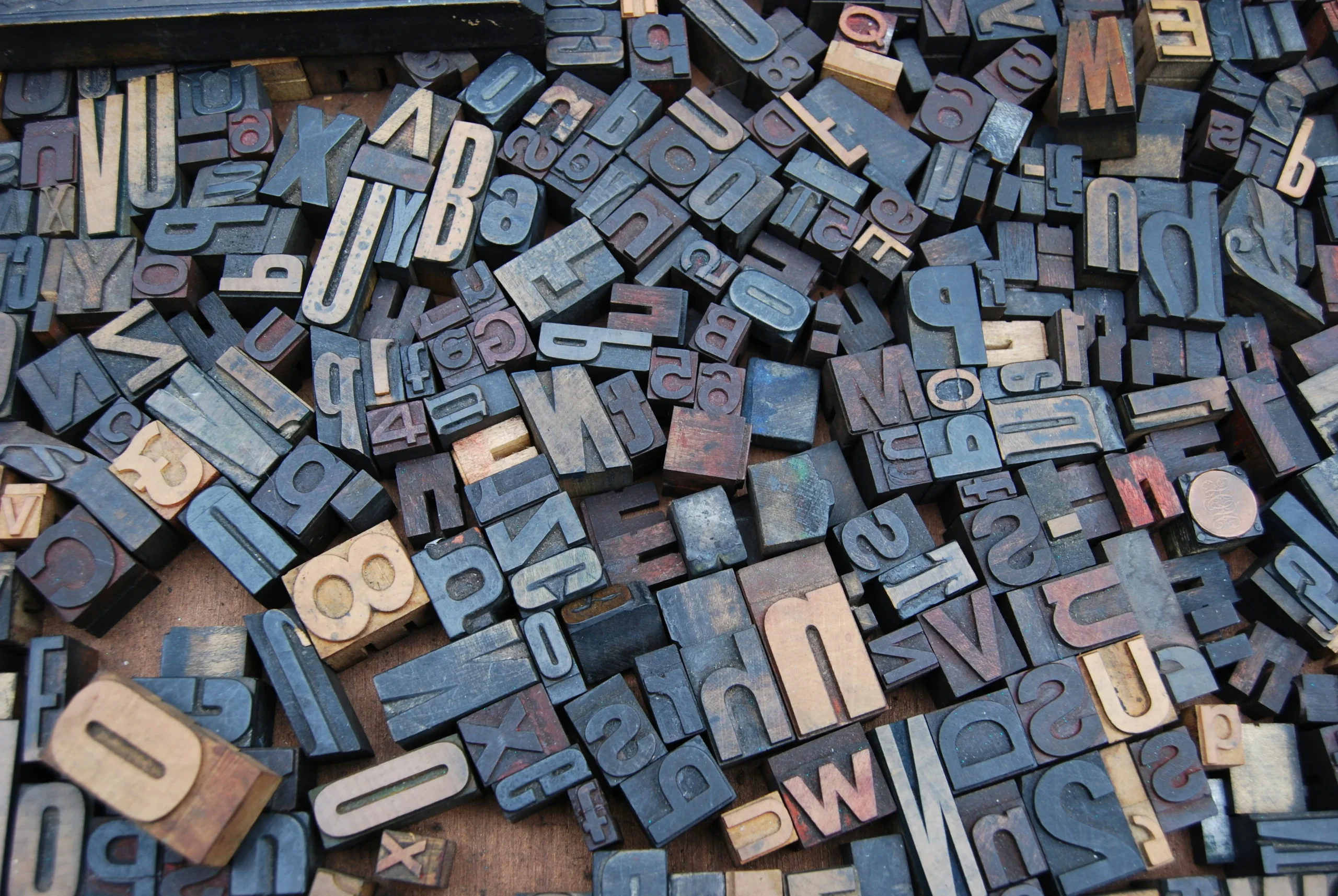
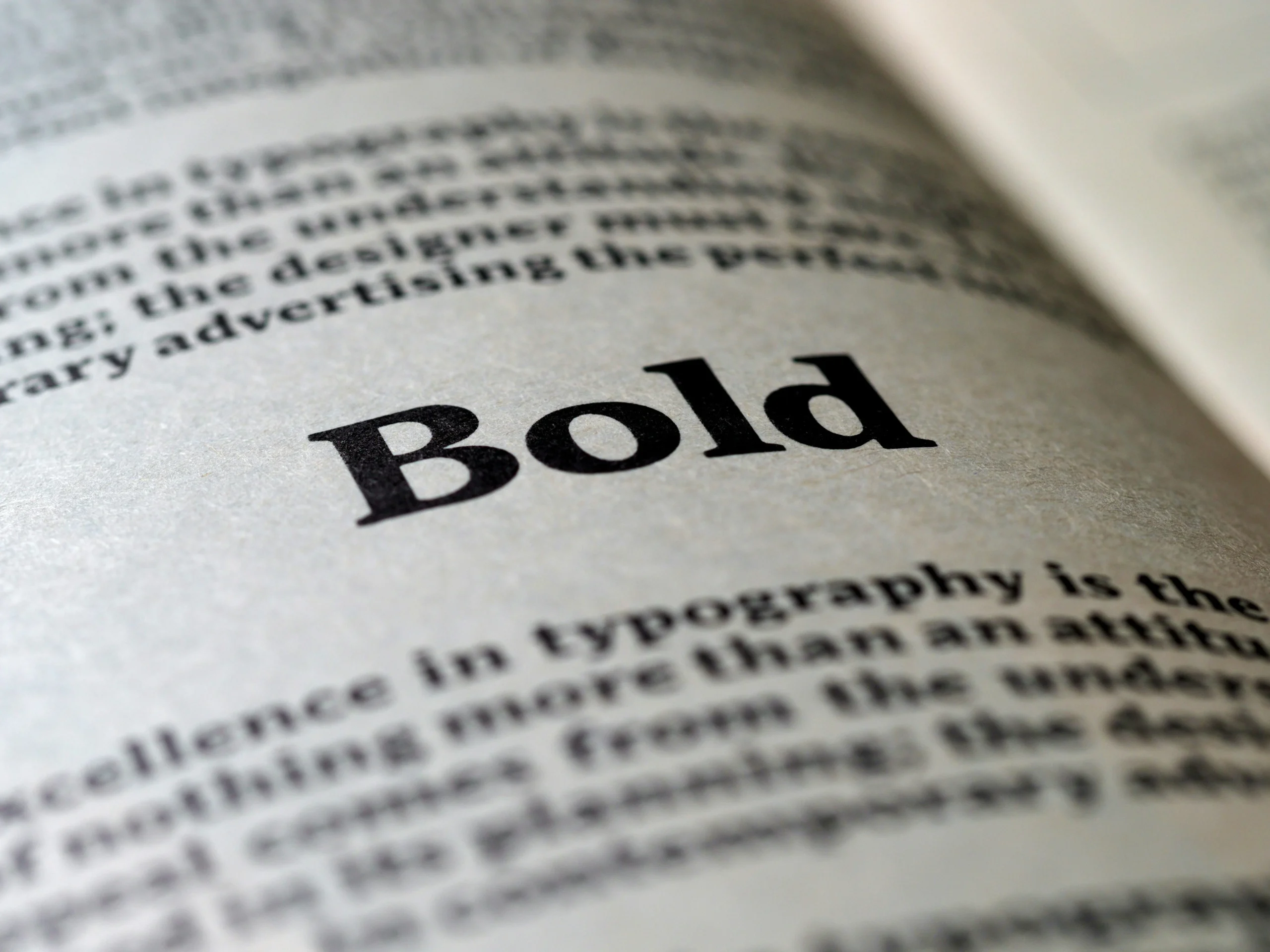
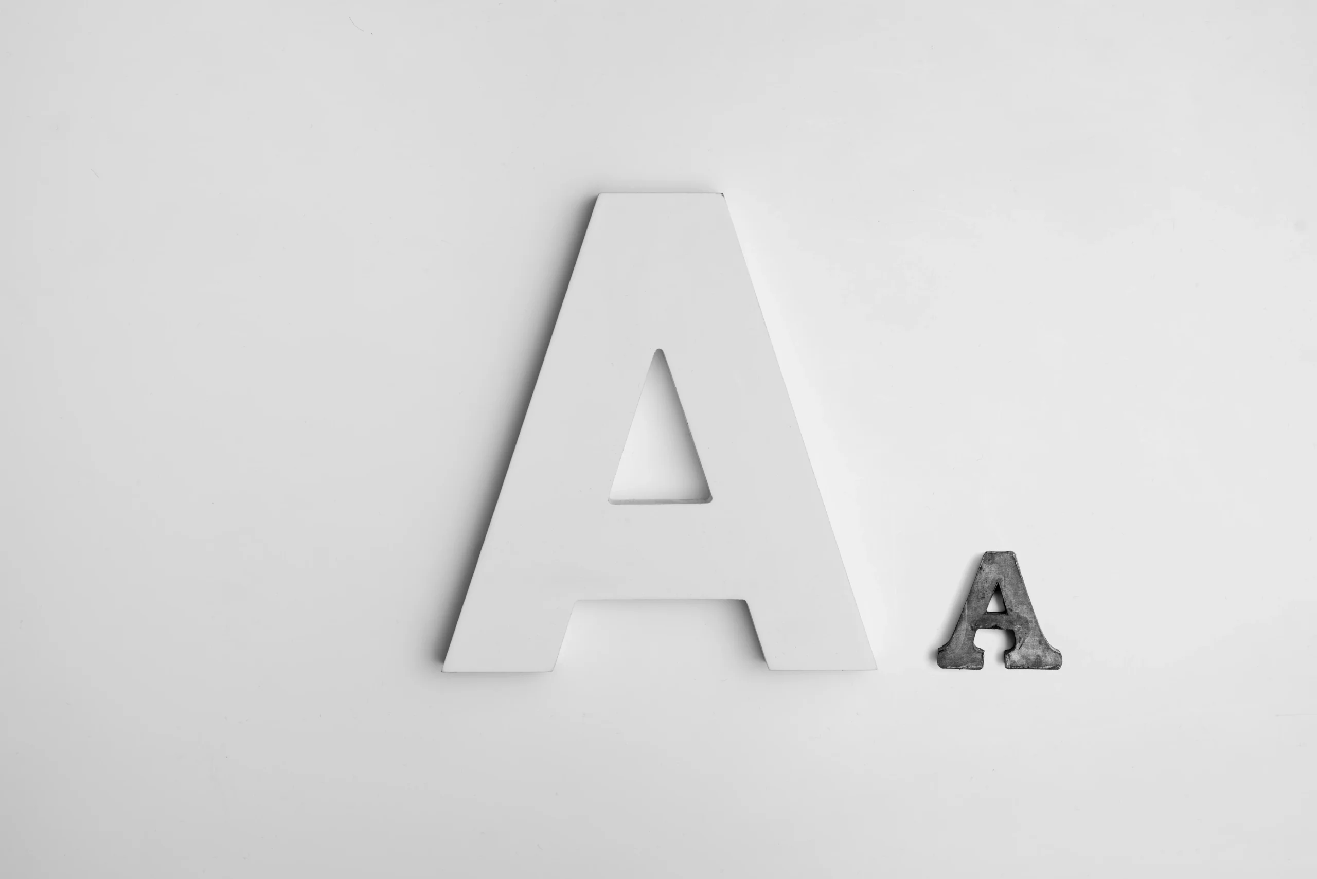
What is a Serif Font?

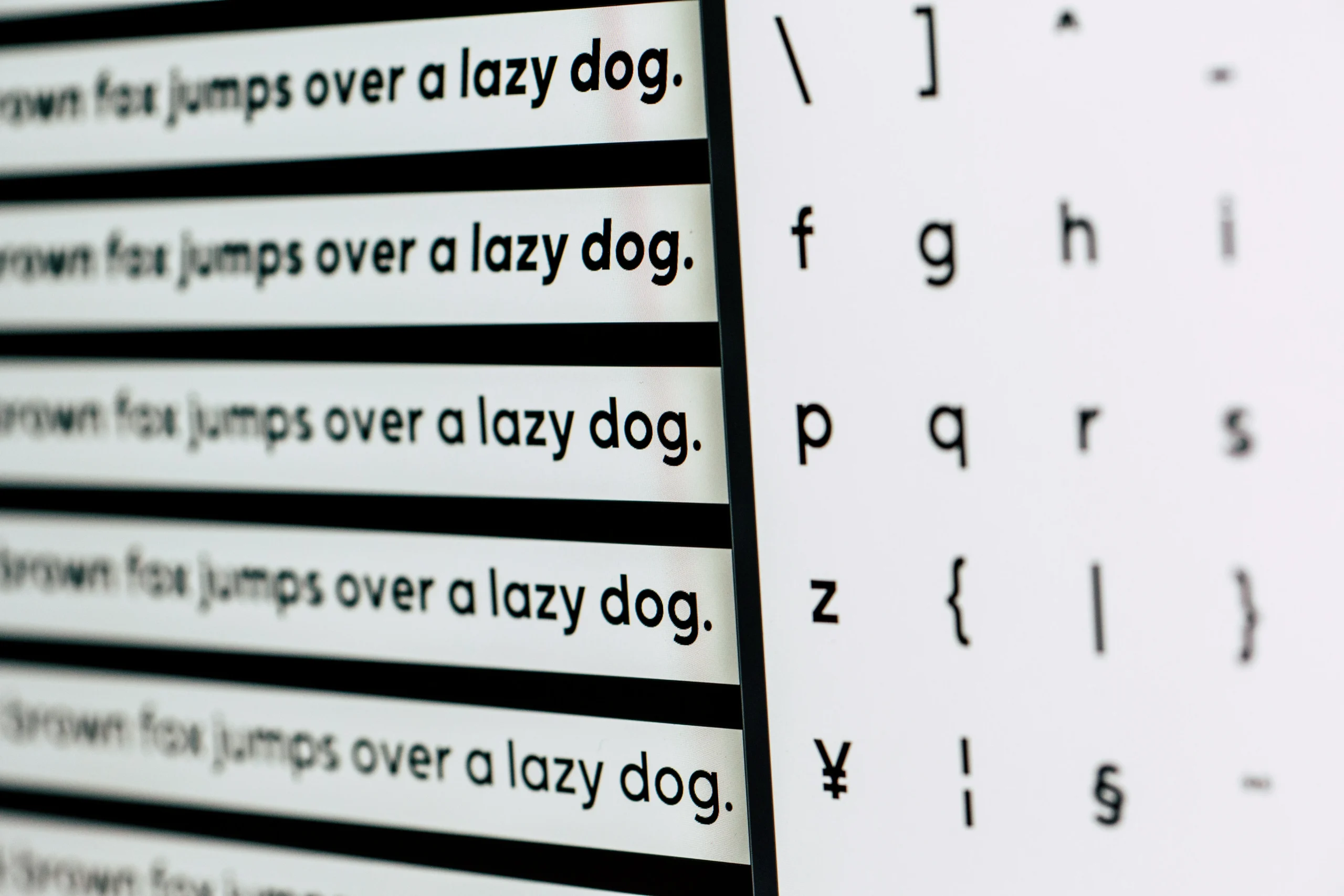
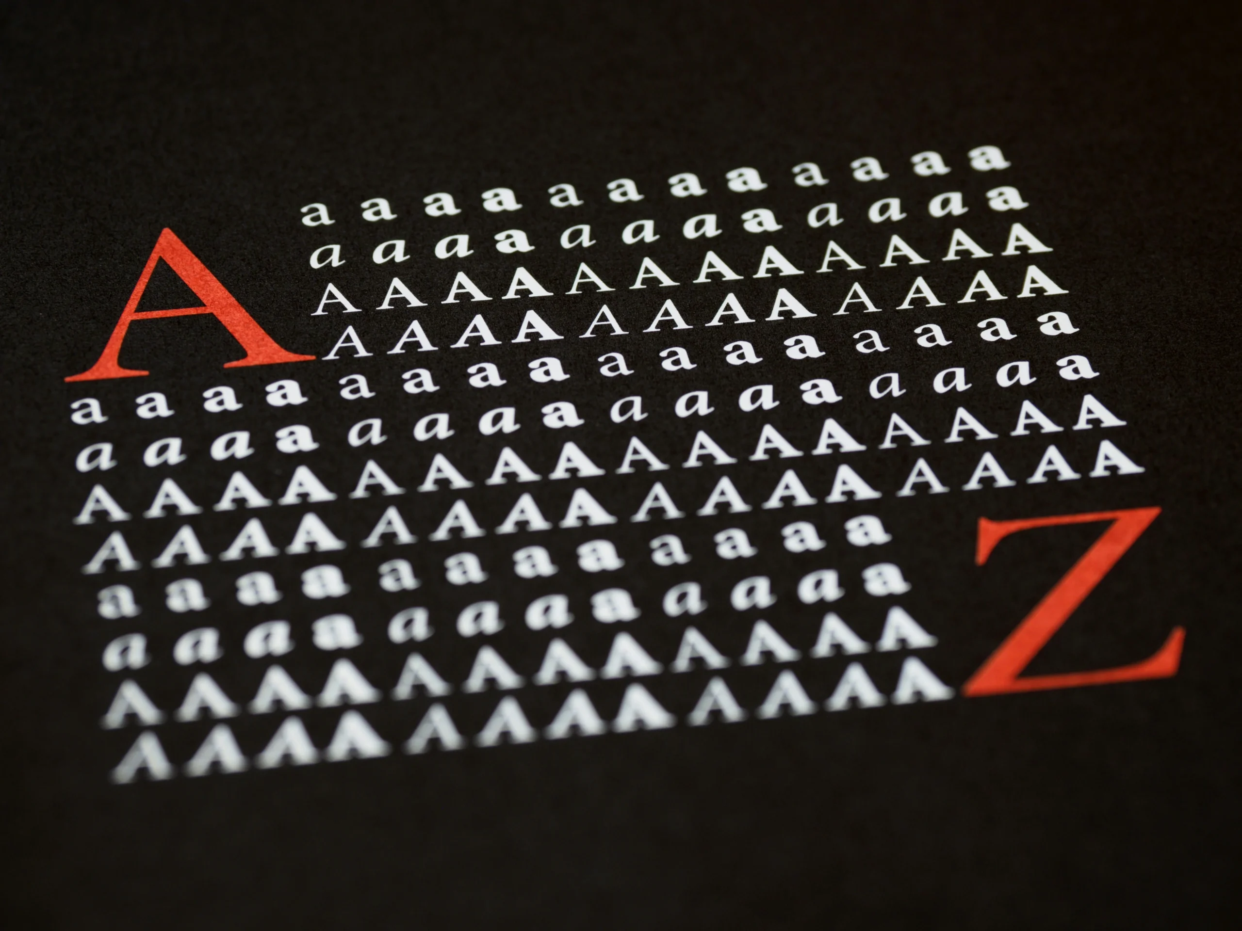
A serif font is characterized by the small lines or extensions at the ends of its characters. These extensions, known as serifs, give the font a classic and sophisticated look. Serif fonts are often used in print media but have found a significant place in digital design due to their readability and timeless appeal.

Why Choose Serif Fonts for Your Website?

People choose to use serif fonts for various reasons, each contributing to the effectiveness and appeal of their design projects. Here are some key reasons why serif fonts are often preferred:

1. Enhanced Readability

Serif fonts are known for their readability, especially in printed materials and long-form content. The serifs, or small lines at the ends of characters, guide the reader’s eye along the lines of text, making it easier to read for extended periods.

2. Classic and Elegant Aesthetic

Serif fonts have a timeless and sophisticated look that can convey a sense of tradition, authority, and professionalism. This makes them a popular choice for formal and serious content, such as books, newspapers, and academic publications.

A white poster with black contemporary serif fonts on it.

3. Versatility in Design

Modern serif fonts have evolved to be highly versatile and suitable for digital and print media. They can be used effectively in various contexts, from body text to headlines and across different industries, from fashion to finance.

4. Establishing Brand Identity

Serif fonts can help create a distinct brand identity by conveying certain values and emotions. For instance, a law firm might use a serif font to project reliability and trustworthiness, while a luxury brand might use it to exude elegance and exclusivity.

5. Creating Visual Hierarchy

Serif fonts often come in multiple weights and styles, which can be used to establish a clear visual hierarchy on a webpage or in a document. Bold serif fonts can draw attention to headings and important information, while lighter weights can be used for body text.

6. Historical and Cultural Association

Serif fonts have a rich history dating back to early Roman inscriptions and Renaissance print. This historical association can lend a sense of credibility and gravitas to the text, making it feel more authoritative and established.

7. Professional Appeal

In professional settings, serif fonts are often chosen to create a polished and formal appearance. This makes them ideal for business documents, official communications, and corporate websites.

Serif fonts are chosen for their readability, aesthetic appeal, versatility, and ability to convey specific brand values. Whether for printed materials or digital media, serif fonts offer a range of benefits that make them a valuable tool in the designer’s toolkit. At Almax Design Agency, we recognize the importance of selecting the right font to elevate your design and effectively communicate your message.

A page of serif font text in a book.

Top Features to Look for in Contemporary Serif Fonts

When choosing contemporary serif fonts for your website, consider the following top features:

1. Legibility

Ensure the font is easily readable at various sizes, both on desktop and mobile devices. Look for clear and distinct letterforms that prevent eye strain.

2. Versatility

A good contemporary serif font should work well in different contexts, such as headings, body text, and captions. It should be flexible enough to suit various design elements on your website.

3. Character Set

Choose a font with a comprehensive character set, including special characters, numerals, punctuation, and multilingual support. This ensures your content is accurately represented.

4. Aesthetic Appeal

Select fonts with an elegant and modern appearance that align with your brand’s visual identity. The aesthetic should enhance your website’s overall look and feel.

5. Weight and Style Variations

Look for fonts that offer multiple weights (light, regular, bold) and styles (italic, condensed). This allows for greater design flexibility and hierarchy in your typography.

6. Kerning and Spacing

Well-designed kerning (the space between letters) and consistent spacing are crucial for a polished and professional look. Poor spacing can make text appear cluttered or uneven.

7. Compatibility

Ensure the font is compatible with web usage and loads efficiently on different browsers and devices. Web fonts should be optimized for performance to avoid slowing down your site.

8. Scalability

The font should maintain its quality and readability in various sizes. It should look sharp and clear whether it’s used for small body text or large headings.

9. Customizability

Some fonts offer customizable features, such as alternate characters, ligatures, and stylistic sets. These options can add a unique touch to your typography.

10. License and Usage Rights

Check the font’s licensing terms to ensure it can be used legally for your website’s intended purpose. Some fonts are free for personal use but require a license for commercial projects.

By focusing on these features, you can select contemporary serif fonts that not only enhance the visual appeal of your website but also improve user experience and readability.

A woman writing font on a piece of paper.

Best Contemporary Serif Fonts for Websites

Here are some of the best contemporary serif fonts that can elevate the look and feel of your website:

  1. Merriweather: Known for its readability and versatility, making it ideal for both headings and body text.
  2. Lora: Offers a perfect balance between traditional serifs and modern design elements.
  3. Playfair Display: A sophisticated font that adds elegance to your website.
  4. Georgia: A classic choice that remains highly readable on digital screens.
  5. Crimson Text: Inspired by old-style typefaces, it provides a warm and personal touch.

Bold Serif Fonts

Bold serif fonts are excellent for creating a strong visual impact and drawing attention to key elements on your website. Some popular bold serif fonts include:

  1. Bitter: A robust font perfect for bold headlines.
  2. Roboto Slab: Combines modern aesthetics with classic serif elements.
  3. Arvo: Known for its geometric shapes and bold appearance.
  4. Alegreya: A dynamic font with a rich and varied texture.

A large letter "A" next to a small letter "A".

How to Choose the Right Contemporary Serif Font for Your Brand

Selecting the right contemporary serif font for your brand involves considering your brand’s identity, target audience, and overall design goals. Here are some tips:

  1. Understand Your Brand: Choose a font that reflects your brand’s personality and values.
  2. Consider Readability: Ensure the font is legible across different devices and screen sizes.
  3. Test Multiple Options: Experiment with different fonts to see which one best fits your website’s design.
  4. Seek Professional Advice: Consult with design experts to make an informed decision.

Combining Serif Fonts with Other Font Styles

Combining serif fonts with other font styles can create a visually appealing and balanced design. Here are some tips:

  1. Pair with Sans-Serif Fonts: The contrast between serif and sans-serif fonts can enhance readability and create a modern look.
  2. Use Different Weights: Combine different weights of the same font family to establish a visual hierarchy.
  3. Maintain Consistency: Ensure the fonts complement each other and align with your overall design theme.

Case Studies: Successful Websites Using Serif Fonts

Many successful websites utilize serif fonts to create a professional and engaging user experience. For instance, popular news websites often use serif fonts for their body text to ensure readability. Additionally, luxury brands use elegant serif fonts to convey sophistication and exclusivity.

Many well-known websites utilize serif fonts effectively to enhance their design and convey their brand message. Here are some examples of famous websites that use serif fonts well:

1. The New York Times

The New York Times is a prime example of a website that uses serif fonts to establish credibility and readability. The main body text is set in a serif font, which helps readers engage with long-form articles and news reports. The elegant and traditional look of serif fonts complements the prestigious reputation of the publication.

2. Vogue

Vogue’s website uses serif fonts to exude sophistication and luxury, aligning with its brand identity as a leading fashion magazine. The use of serif fonts in headlines and body text enhances the visual appeal and maintains a high-end, elegant feel throughout the site.


Conclusion: Elevate Your Website with the Perfect Contemporary Serif Fonts

Choosing the perfect contemporary serif font can significantly enhance your website’s design and user experience. At Almax Design Agency, we are dedicated to helping you grow your business through top-quality design and development. With our expertise and custom approach, we can help you select and implement the ideal serif fonts for your website. Contact us today to see how we can help you!

Good Body Text Fonts for Modern Apps

Good Body Text Fonts for Modern Apps

Did you know that using the right font can increase site engagement by almost 40%? At Almax Design Agency, we understand that selecting the appropriate body text fonts is crucial for your app’s success. The right font enhances readability, ensures a smooth user experience, and contributes to a visually appealing design. In this blog, we will explore good body text fonts for modern apps, focusing on easy-to-read fonts and how they can improve your app’s overall performance.

Introduction to Body Text Fonts

Body text fonts are the primary fonts used for the main content in your app. They form the backbone of your content, ensuring that users can read and comprehend the information presented. Choosing the right font for body copy can significantly impact user engagement and satisfaction. The right body text font not only enhances readability but also contributes to the overall aesthetic and usability of the app.

Hands texting on a cell phone.

Why Easy to Read Fonts Matter in App Design

Easy to read fonts are essential for app design because they enhance the user experience by making content accessible and comfortable to read. When users can effortlessly read your content, they are more likely to engage with your app and find value in it. Additionally, easy to read fonts reduce eye strain, particularly in apps that involve long reading sessions. This is crucial in retaining user attention and ensuring they spend more time on your app.

Easy to read fonts also contribute to accessibility, making your app usable for people with visual impairments or reading difficulties. By prioritizing readability, you demonstrate a commitment to inclusivity and user-centric design.

Key Characteristics of Good Body Text Fonts

Text on two sides of a screen showing easy to read fonts.

  1. Legibility:
    • Clarity: The font should be easily readable without straining the eyes. This means avoiding overly decorative fonts for body text and ensuring the design of each character is straightforward and not overly complex.
    • Distinct Characters: Each character must be easily distinguishable to prevent confusion. For instance, the lowercase ‘l’ should not look like an uppercase ‘I’ or the number ‘1’. This is crucial for avoiding misinterpretation, especially in apps where precise information is key.
  2. Readability:
    • Comfortable Reading Flow: A good body text font should support a comfortable reading experience, allowing users to read long blocks of text without fatigue. This involves a balance between character spacing (kerning), word spacing, and line length.
    • Proper Line Spacing: Adequate line height (leading) is essential to avoid crowding and enhance readability. A general rule is to have the line height 1.2 to 1.5 times the font size, ensuring each line of text has enough breathing room.
  3. Scalability:
    • Versatility Across Sizes: The font should remain legible and visually appealing in various sizes, from small captions to larger text blocks. This ensures consistency in the user experience, whether on a small mobile screen or a larger tablet display.
  4. Consistency:
    • Uniform Stroke Width: The thickness of strokes within characters should be consistent, contributing to a balanced and harmonious appearance. Inconsistent stroke widths can make a font look uneven and disrupt the visual flow.
    • Proportional Widths: Characters should have proportional widths to ensure even spacing between letters and words. This prevents the text from looking cramped or overly spaced, enhancing readability.
  5. Style:
    • Appropriate Aesthetics: The font should align with the app’s overall design style and aesthetic. For instance, a modern app might use clean, sans-serif fonts, while an educational app might opt for a more traditional serif font.
    • Neutrality: A neutral font does not distract from the content but rather complements it. Overly stylized fonts can draw attention away from the message and make the text harder to read.
  6. Support for Multiple Languages:
    • Extended Character Set: The font should include a comprehensive set of characters to support multiple languages, especially if the app has an international audience. This includes diacritics, special characters, and symbols.
  7. Accessibility:
    • High Contrast: Ensure there is a high contrast between text and background to enhance readability for all users, including those with visual impairments. This involves choosing font colors that stand out against the background color.
    • Adjustability: The font should allow for adjustments in size and weight without losing readability or style. This is crucial for accessibility, enabling users to customize the text according to their needs.
  8. Performance:
    • Optimized for Digital Use: The font should be optimized for screen use, ensuring fast loading times and minimal impact on app performance. Web fonts that are lightweight and well-hinted for screen rendering are ideal for maintaining a smooth user experience.

By focusing on these detailed characteristics, you can ensure the selected body text fonts enhance user experience, maintain readability, and align seamlessly with the overall design of your modern app.

Letters on yellow blocks spelling out "font".

Good Body Text Fonts for Readability and User Experience

To achieve a high level of readability and user experience, select fonts that offer clarity and comfort. Fonts like Roboto, Open Sans, and Lato are excellent examples of easy to read fonts that enhance the readability of your app’s body copy. These fonts are designed to be clear and legible at various sizes, ensuring that users can comfortably read long passages of text without straining their eyes.

Roboto: Developed by Google, Roboto is a sans-serif font that offers a modern, clean look with excellent readability. It is widely used in Android apps and provides a professional appearance without compromising on legibility.

Open Sans: Another popular choice from Google, Open Sans is a versatile sans-serif font known for its clarity and friendly appearance. It performs well in both small and large sizes, making it suitable for various types of content.

Lato: Lato is a sans-serif font that combines a sleek, modern design with high readability. It has a slightly rounded feel, giving it a warm and approachable look that works well for body text in many app designs.

The serif letter A written over and over to form a square. It starts with a bold red "A" and ends with a bold, red "z".

Sans-Serif vs. Serif: Which is Better for Your App?

When choosing between sans-serif and serif fonts for body text, consider the context of your app. Sans-serif fonts like Arial and Helvetica are often preferred for digital content due to their clean and modern appearance. They lack the small strokes at the ends of letters (serifs), which can make them look simpler and more streamlined on screens.

Serif fonts like Times New Roman and Georgia can be suitable for apps that require a more traditional or formal look. Serif fonts have small strokes or lines attached to the ends of their letters, which can create a sense of elegance and sophistication. However, they can sometimes be harder to read on smaller screens, so they are often used in larger sizes or for headings.

Consider the overall aesthetic and purpose of your app when choosing between these two styles. For most modern apps, sans-serif fonts tend to be the better choice due to their simplicity and readability on digital devices. However, serif fonts can be effective for certain types of content or apps that aim to convey a sense of tradition or formality.

The word "hello" written in cursive on an ipad showing easy to read fonts.

Google Fonts: Free and Reliable Choices

Google Fonts is an extensive library of free, open-source fonts that designers and developers can use to enhance the visual appeal and readability of websites. Launched by Google in 2010, this service offers a wide variety of font families, including serif, sans-serif, display, handwriting, and monospace fonts. Here’s an overview of what makes Google Fonts an invaluable tool for web design:

1. Wide Selection of Fonts

Google Fonts offers over 1,000 font families, providing designers with a vast array of options to choose from. This includes popular serif fonts like Merriweather, Playfair Display, and Crimson Text, as well as many contemporary serif fonts that can give your website a professional and elegant look.

2. Ease of Use

Integrating Google Fonts into a website is straightforward. Designers can browse the library, select the fonts they like, and embed them into their website using a simple line of code. The service also allows for easy customization, including adjusting the weight, style, and subset of each font.

3. Performance Optimization

Fonts from Google Fonts are optimized for fast loading times, which is crucial for maintaining good website performance. The service uses a global content delivery network (CDN) to ensure that fonts load quickly and efficiently, no matter where the user is located.

4. Cross-Browser Compatibility

Google Fonts are designed to work seamlessly across all major browsers and devices. This ensures that your website’s typography looks consistent and professional, whether viewed on a desktop, tablet, or smartphone.

A woman working on a laptop.

5. Customization and Flexibility

Google Fonts provides numerous options for customization. Designers can choose from various font weights, styles, and character sets, allowing for a high degree of flexibility in creating unique and visually appealing typography.

6. Open Source and Free

One of the most significant advantages of Google Fonts is that they are open-source and completely free to use. This makes high-quality typography accessible to everyone, from individual bloggers to large corporations, without worrying about licensing fees.

7. Typography Trends and Insights

Google Fonts also provides valuable insights into typography trends. Designers can see which fonts are popular and widely used, helping them make informed decisions about which fonts might work best for their projects.


Google Fonts is an essential resource for anyone involved in web design and development. Its vast library of free, high-quality fonts, combined with ease of use, performance optimization, and cross-browser compatibility, makes it an ideal choice for enhancing the typography of any website. Whether you’re looking for contemporary serif fonts, bold serif fonts, or any other style, Google Fonts has something to meet your needs.

Best Practices for Implementing Easy to Read Fonts in Your App

To implement easy to read fonts in your app, follow these best practices:

  1. Test Fonts at Various Sizes: Ensure readability across different screen sizes. Test the font in both small and large sizes to ensure it remains legible and visually appealing.
  2. Maintain High Contrast: Use high-contrast colors for text and background. This enhances readability and makes your content accessible to users with visual impairments.
  3. Optimize for Performance: Choose fonts that are lightweight and load quickly. This ensures that your app runs smoothly and provides a positive user experience.
  4. Provide Font Adjustability: Allow users to adjust font size and weight for better accessibility. This ensures that your app can cater to users with specific needs and preferences.
  5. Consistent Use: Maintain consistency in font usage throughout your app. Use the same fonts for similar types of content to create a cohesive and professional design.

By following these best practices, you can ensure that your app’s fonts enhance readability, accessibility, and overall user experience.

Conclusion: Choosing Good Body Text Fonts for Modern Apps

In conclusion, selecting the right body text fonts is essential for creating a user-friendly and visually appealing app. Focusing on easy-to-read fonts and considering key characteristics such as legibility, readability, and scalability will enhance your app’s design and user experience. The right font can make a significant difference in how users engage with your content, ensuring that your app stands out in a competitive market.

By understanding the importance of font choice and implementing best practices, you can create an app that not only looks great but also provides a comfortable and enjoyable reading experience for your users. At Almax Design Agency, we are committed to helping you choose the best fonts for your modern app, ensuring your content is accessible, engaging, and visually harmonious.

Contact Almax today to see how we can help you with your design challenges!

Design Principles: Drawing Emphasis Using Contrast

Design Principles: Drawing Emphasis Using Contrast

Did you know that 90% of information transmitted to the brain is visual, and people process visuals 60,000 times faster than text? At Almax, we understand the power of effective design in engaging viewers, and one of the most powerful tools at our disposal is contrast. By using contrast effectively, our designers can guide the viewer’s eye, highlight important elements, and create a visual hierarchy that enhances the overall user experience. In this blog post, we will explore the importance of drawing emphasis, how contrast can be used to achieve it, and practical techniques for implementing these principles in your designs.

Why Drawing Emphasis Is Important

Drawing emphasis is crucial because it helps communicate the most important information to the viewer quickly and clearly. In art and design, emphasis and subordination are key principles that ensure some elements stand out while others recede into the background. This hierarchy allows the designer to control the viewer’s focus, making the design more effective and engaging.

An abstract painting of yellow, blue, black and brown streaks on a white background.

Emphasis and Subordination in Art

Emphasis

Emphasis in art refers to the technique used by artists to draw attention to a particular area or element within an artwork. This is often achieved by manipulating various elements such as color, size, shape, texture, or placement to make a specific part stand out. Emphasis helps to create a focal point, guiding the viewer’s eye to the most important part of the composition.

Subordination

Subordination is the counterpart to emphasis, where certain elements are made less noticeable to support the focal point. This technique ensures that the emphasized part of the artwork stands out more prominently by reducing the visual impact of other components. Subordination helps maintain a balanced composition and prevents the artwork from becoming too chaotic or overwhelming.

Understanding How Contrast Can Draw Emphasis

Contrast is one of the most powerful tools for drawing emphasis. By placing different elements in opposition to each other, such as light against dark or large against small, designers can create visual interest and direct attention where it’s needed most.

Ways to Draw Emphasis: Types of Contrast

Color Emphasis and Contrast: Making Elements Stand Out

Color contrast is a highly effective way to draw emphasis. By using contrasting colors, designers can make certain elements pop, ensuring they capture the viewer’s attention. For example, a bright red button on a neutral background immediately stands out, making it clear that it is an important call to action.

The words "bold" in bold on the pages of a book to draw emphasis on the word.

Contrast in Typography: Emphasis Lines

Typography contrast, such as using bold or italicized text, can also draw emphasis. Emphasis lines, created by varying font weights or styles, help important text stand out from surrounding content, guiding the reader’s eye through the design.

Size and Scale: Creating Visual Hierarchy

Using size and scale to create contrast is another effective technique. Larger elements naturally draw more attention than smaller ones, establishing a clear visual hierarchy. This technique is particularly useful for headlines, images, and key content.

Texture and Pattern: Adding Depth and Interest

Contrasting textures and patterns can add depth and interest to a design. By juxtaposing smooth and rough textures or simple and complex patterns, designers can create areas of emphasis that stand out from the rest of the composition.

Emphasis by Isolation

Isolating an element from the rest of the design can also draw emphasis. By surrounding an important element with whitespace or a different background, it becomes the focal point, ensuring that the viewer’s attention is directed to it.

How to Draw Emphasis in Your Website Designs

Using Contrast to Guide the Viewer’s Eye

In web design, using contrast to guide the viewer’s eye is essential for effective navigation. By strategically placing contrasting elements, designers can lead users through the site in a logical and intuitive way.

Enhancing Readability with Contrast

Enhancing readability with contrast involves ensuring that text is easily distinguishable from the background. This can be achieved by using high-contrast color combinations and sufficient font sizes to make reading comfortable and effortless.

A yellow lightbulb on a blue background.

Creating Focal Points through Contrast

Creating focal points through contrast helps highlight the most important parts of a webpage. This can be done using techniques such as color contrast, size contrast, and isolation to ensure key elements like calls to action and important information stand out.

Drawing Emphasis: Tips and Techniques

Balancing Contrast for Harmony

While contrast is important, it’s crucial to balance it to maintain harmony in the design. Too much contrast can be overwhelming, while too little can make the design dull. Finding the right balance ensures a cohesive and aesthetically pleasing result.

Avoiding Common Contrast Mistakes

Avoiding common contrast mistakes is vital for effective design. Common errors include using too many contrasting elements, which can create visual chaos, or not enough contrast, leading to a lack of emphasis. Ensuring that contrast is used purposefully and sparingly is key.

Tools and Resources for Effective Contrast

Various tools and resources can help designers use contrast effectively. Color contrast checkers, typography tools, and design software with contrast features can assist in creating designs that draw emphasis appropriately.

Case Studies and Examples

Analyzing Successful Designs: On the Grid Website

A screenshot of a website that uses emphasis well.

The On the Grid website provides excellent examples of using contrast to draw emphasis and improve user experience. Here are some screenshots and explanations of how the site uses contrast effectively:

In this screenshot, the main call to action, “Choose a City,” is emphasized using a high-contrast button that stands out against the background image. The text “Explore the world” is in bold, large font, drawing immediate attention and guiding the viewer’s eye to the primary message.

A screenshot of a website using colour contrast to draw emphasis.

The website also uses color contrast to help indicate to the user what city they are selecting. The highlighted city, Amsterdam, uses a lighter background, drawing emphasis compared to the darker background of other cities. This not only makes it stand out but also guides the user’s focus, improving navigation and user experience.

You might also like to see Bad UX: Top Examples of What to Avoid

Emphasis Examples in Art

“The Last Supper” by Leonardo da Vinci

The last supper painting showing how artist draw emphasis.

In “The Last Supper,” Leonardo da Vinci uses several techniques to draw emphasis to the figure of Jesus at the center of the composition:

  • Central Placement: Jesus is placed at the exact center of the table, making him the focal point.
  • Converging Lines: The architectural lines of the ceiling and walls converge towards Jesus, directing the viewer’s eye.
  • Contrast in Lighting: Jesus is highlighted with a brighter background, creating a stark contrast with the darker surroundings.

“Starry Night” by Vincent van Gogh

Starry night painting by Vincent van Gough.

Vincent van Gogh’s “Starry Night” uses color and movement to draw emphasis to the swirling night sky:

  • Color Contrast: The vibrant, swirling blues and yellows of the sky contrast with the darker, more muted colors of the village below.
  • Dynamic Lines: The swirling, dynamic lines of the sky create a sense of movement and energy, drawing the viewer’s eye across the canvas.

“The Creation of Adam” by Michelangelo

The creation of adam painting showing how artists draw emphasis.

Michelangelo’s fresco “The Creation of Adam” in the Sistine Chapel emphasizes the moment of creation:

  • Isolation and Placement: The nearly touching hands of God and Adam are centrally placed and isolated against a relatively plain background, drawing immediate focus.
  • Use of Light: The figures of God and Adam are highlighted against the darker background, emphasizing their importance.

Conclusion: Drawing Emphasis

In conclusion, mastering the use of contrast to draw emphasis in design can significantly enhance the effectiveness and visual appeal of your projects. By understanding and applying principles of emphasis and subordination, you can create clear visual hierarchies that guide the viewer’s eye and highlight key elements. From color contrast to typography, size, texture, and isolation, each technique offers unique ways to make your designs more engaging and impactful.

At Almax, our team of skilled designers is adept at leveraging these techniques to create stunning and effective designs. Contact us today to see how we can help you elevate your designs with expert use of contrast and emphasis.

Bad UX: Top Examples of What to Avoid

Bad UX: Top Examples of What to Avoid

Did you know that 90% of users stop using an app if it performs poorly? At Almax, we understand the crucial role that user experience (UX design) plays in the success of digital products. In this article, we’ll delve into some of the most common UX pitfalls that can derail your projects. From poor navigation and inconsistent design to accessibility issues and more, we’ll explore real-world examples like eBay and Hulu to highlight these mistakes. Additionally, we’ll provide actionable tips to help you avoid these pitfalls so you can create a seamless, user-friendly experience.


What Makes Bad UX?

Bad user experience (UX) can arise from various issues that hinder a user’s ability to effectively and efficiently interact with a product or service. Here are some common factors that contribute to bad UX:


  1. Poor Navigation:
    • Complicated menus
    • Lack of a clear structure
    • No search functionality
  2. Slow Loading Times:
    • Pages or elements that take too long to load can frustrate users and increase bounce rates.
  3. Non-Responsive Design:
    • Websites or applications that don’t work well on different devices (e.g., mobile phones, tablets).
  4. Cluttered Interface:
    • Overwhelming amount of information or options on a single page.
    • Lack of whitespace.
  5. Inconsistent Design:
    • Different fonts, colors, or styles throughout the site/app.
    • Lack of a cohesive visual theme.
  6. Poor Accessibility:
    • Lack of features that support users with disabilities (e.g., screen readers, keyboard navigation).
    • Insufficient contrast or small text sizes.
  7. Confusing User Flows:
    • Users struggle to understand how to complete tasks.
    • Unclear calls-to-action or next steps.
  8. Lack of Feedback:
    • No confirmation or feedback after an action is taken.
    • Users are unsure if their actions were successful.
  9. Broken Links or Errors:
    • Links that lead to 404 pages.
    • Frequent bugs or crashes.
  10. Overuse of Pop-ups and Ads:
    • Intrusive advertisements.
    • Excessive use of pop-ups that disrupt the user experience.
  11. Poor Content Quality:
    • Unclear or jargon-heavy language.
    • Spelling or grammatical errors.
  12. Security Concerns:
    • Lack of HTTPS makes users feel unsafe.
    • Overly intrusive data collection.
  13. Unnecessary Complexity:
    • Requiring too much information for simple tasks.
    • Complicated forms with too many fields.
  14. Lack of Customization:
    • No ability to personalize settings or preferences.


Improving UX involves understanding user needs and behaviors, conducting usability testing, and continuously iterating on the design based on feedback and data.

How Bad UX Can Ruin Your Project

Bad UX can significantly undermine the success of a project in several ways:


  1. User Frustration and Abandonment:
    • Frustrated users are more likely to abandon a product or service altogether. Bad UX can result in high bounce rates and low retention rates, leading to a loss of potential customers.
  2. Negative Perception and Brand Damage:
    • A bad user experience can tarnish a brand’s reputation. Users are likely to share negative experiences with others, leading to poor word-of-mouth and potentially harmful reviews.
  3. Reduced Engagement and Conversion Rates:
    • Poor UX can decrease user engagement and lower conversion rates. Users may struggle to find what they need or complete desired actions, such as making a purchase or signing up for a service.
  4. Competitive Disadvantage:
    • In a competitive market, products with poor UX can quickly fall behind those with better-designed experiences. Users have plenty of alternatives and are likely to switch to competitors offering superior usability.
  5. Loss of Revenue:
    • Bad UX can directly impact revenue by reducing sales and increasing churn rates. In e-commerce, for instance, a complicated checkout process can lead to cart abandonment, resulting in lost sales.
  6. Negative Impact on SEO:
    • Poor UX can affect search engine rankings. High bounce rates and low dwell times signal to search engines that users are not finding the content valuable, which can negatively impact a site’s SEO performance.
  7. Decreased User Loyalty:
    • Users are less likely to stay loyal to a product or service that does not meet their needs or expectations. Building a loyal user base is crucial for long-term success, and bad UX can undermine this goal.


In summary, bad UX can lead to a cascade of negative outcomes, from immediate user dissatisfaction to long-term financial losses and competitive disadvantages. Prioritizing good UX design is essential for the success and sustainability of any project.


Bad UX Design Examples

Websites With Bad UX: eBay

Despite being one of the pioneers in online marketplaces, eBay exhibits several significant UX flaws that can negatively impact user satisfaction and overall experience. Here are key points illustrating why eBay’s UX is subpar:


Inconsistent with E-commerce Site Standards

Misleading Button Actions:

  • The “List item” button on the sale listing page, instead of immediately posting the listing, directs users to payment methods. This deviation from the expected flow frustrates users who anticipate a straightforward listing process.

Problematic Dynamic Auto-Fill:

  • The dynamic auto-fill feature for the Sell search bar leads users to a different page, disrupting their workflow and causing confusion. Users expect auto-fill to assist their current task, not redirect them.


Lengthy Information

Irrelevant Content for Sellers:

  • The Sell home page is cluttered with irrelevant content, making it difficult for sellers to find essential tools and information. Over half of user task participants struggled when directed to this page, highlighting a significant usability issue.


Disorganized Help Articles and FAQs:

  • Help articles and FAQs are filled with endless text and multiple external links, with no clear organization. This makes finding specific information tedious and time-consuming for users.


Inconsistent Visual Design

Lack of Cohesive Design:

  • eBay lacks a consistent visual theme, with inefficient use of color, unusually large text, and poor utilization of negative space. This inconsistency creates a disjointed and unprofessional appearance.

Cluttered Product Pages:

  • Different item descriptions from various sellers result in messy and cluttered product pages. This lack of standardization makes it difficult for users to compare items and detracts from the overall shopping experience.


Inefficient Display of Features

Repetitive Help Links:

  • Multiple help links redirect users to the same page, adding unnecessary redundancy and clutter to the interface.


Poor Visibility of Key Features:

  • The “Sell” link on the homepage is small and easily overlooked despite being a critical component of eBay. This poor prioritization of features can hinder user engagement and participation in selling activities.


Lack of Feature Descriptions:

  • eBay fails to explain clearly the differences between Auction and Buy It Now features, causing confusion among users. In user tests, two-thirds of participants were uncertain about these options.


In summary, eBay’s UX is hindered by inconsistent standards, disorganized content, poor visual design, and inefficient feature display. These issues lead to user frustration, confusion, and a preference for competitors like Amazon. Addressing these UX flaws is essential for eBay to improve user satisfaction and remain competitive in the e-commerce market.


Apps With Bad UX: Hulu’s 2017 App Design

While Hulu’s 2017 app design may be visually appealing, it suffers significantly from poor navigation, which compromises the overall user experience. Here are the key navigation issues:


Overemphasis on Aesthetics

Aesthetics Over Functionality:

  • The design prioritizes aesthetics, resulting in a visually pleasing app at the expense of accessibility, simplicity, and intuitiveness. This focus on appearance overlooks the importance of making the app easy to use for all users.


Accessibility Issues

Poor Accessibility:

  • The app fails to support accessibility features effectively. For instance, the contrast of text over colored backgrounds is insufficient, and thin fonts are difficult to read. The app also struggles with basic navigation for users with accessibility needs.


Navigation Complexity

Default View Limitations:

  • When opening the app, users only see one show at a time, making it difficult to browse through content efficiently. Unlike other media apps that display multiple options at once, Hulu’s design forces users to scroll extensively.


Confusing Navigation Hierarchy:

  • The top-level navigation fades off the screen, making it unclear if users should navigate through the top options or use the bottom app navigation. This confusion disrupts the user’s ability to find and access content quickly.


My Stuff View Issues:

  • The “My Stuff” view, intended to provide easy access to saved content, also shows only one title before requiring users to scroll. This layout fails to maximize screen space and user convenience.


Intuitiveness

Learning Curve:

  • The app deviates from familiar media app interfaces, making it harder for users to learn and use. Hulu’s design forces users to adapt to a new, less intuitive interface by not leveraging established user behaviors from other media apps.


Consistency

Inconsistent with Other Systems:

  • While the app maintains internal consistency, it does not align well with other media apps. This inconsistency disrupts user expectations and learned behaviors from similar platforms.


Despite its attractive design, Hulu’s app falls short in providing a user-friendly experience. Key UX principles like accessibility, simplicity, and intuitiveness are compromised, making the app frustrating to use. To improve, Hulu should balance aesthetics with functionality, ensuring the app is both beautiful and easy to navigate.


Tips to Avoid Bad UX Design

  1. Understand User Needs:
    • Conduct thorough user research to understand the needs, behaviors, and pain points of your target audience.
  2. Prioritize Accessibility:
    • Ensure your design is accessible to all users, including those with disabilities. Use high-contrast colors, readable fonts, and provide alternative text for images.
  3. Keep it Simple:
    • Simplify navigation and interface elements. Users should easily find what they need without unnecessary complexity.
  4. Consistent Design:
    • Maintain consistency in design elements like colors, fonts, and button styles throughout the app or website.
  5. User Testing:
    • Regularly test your design with real users and iterate based on their feedback.
  6. Clear Feedback:
    • Provide clear feedback for user actions, such as loading indicators and confirmation messages.
  7. Responsive Design:
    • Ensure your design works well on various devices and screen sizes.
  8. Intuitive Navigation:
    • Design intuitive and straightforward navigation structures that users can easily understand and follow.


By focusing on these principles, you can create a user-friendly and effective UX design.


Conclusion: Bad UX: Top Examples of What to Avoid

In conclusion, bad UX design can significantly hinder the success of digital products by frustrating users, damaging brand reputation, and reducing engagement and revenue. As seen with examples like eBay and Hulu, issues such as poor navigation, inconsistent design, and accessibility problems can drive users away and give competitors an edge. Prioritizing user needs, simplicity, and accessibility is crucial for creating effective and enjoyable digital experiences.


If you want to ensure your project has the best custom-designed UX, contact Almax Design Agency today. Let us help you create a seamless and user-friendly experience that delights your users.